How to Create a Progress Bar in WordPress

A progress bar is a powerful indicator that tells users how much progress they’ve made with a certain task or skill. It informs them about the remaining download and loading times, or how much money has been gathered in a fundraiser they took part in, and much more.
Progress bars are practical and provide feedback that makes users feel engaged and motivated to stick around until the fulfillment of their goals. They see the progress they’ve made through a specific process, and they’re highly driven to fully complete it. That sense of accomplishment activates some feel-good chemicals in their brains so they become happy and content with themselves. Furthermore, a progress bar annihilates a sense of anxiety users can experience when they’re about to start a multi-page online survey, as it tells them exactly how long the survey is or how many questions they have yet to complete.
To create a progress bar in WordPress, the easiest and the fastest way to go about that is by installing a plugin to add this functionality to your website, as the platform doesn’t pack it by default. We will show you how to do it by using the Qi Addons for Elementor plugin. Furthermore, we will also talk about adding a reading progress bar to your posts with the help of the Worth the Read plugin, in case you’d like to inform users about the reading progress they’ve made. And since there are also some premium themes on the market that allow users to build progress bars without having to use a plugin, we will walk you through that process as well and use our Bridge theme as an example.

While there are numerous plugins that enable users to add progress bars to their websites, the one we’d like to recommend is our very own Qi Addons for Elementor.
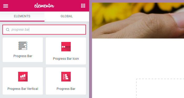
With this plugin, you get access to a collection of 60 free widgets that enhance the power of the Elementor page builder. You can use them to add a myriad of functionalities to your site with ease, but in this article, we will focus on three addons that enable you to create three different types of progress bars – vertical, horizontal, and radial. We will introduce you to the options they include and demonstrate how you can use them to create beautiful progress bars.
Let’s start off by showing you how to use the Vertical Progress Bar addon.
With this widget, you can display the progress of your projects using highly malleable vertical bars that you can customize to your taste.
If you would prefer to watch a video tutorial rather than read the article, we have created an easy-to-follow video guide:
Getting Started With the Vertical Progress Bar
To be able to use the widget, the first thing you need to do is add the Qi Addons for Elementor plugin to your site. Look for it in Plugins > Add New and then install and activate it. As mentioned earlier, this assortment of widgets works exclusively in Elementor, so you have to switch to that page builder in order to use it.
Once the plugin is activated, go ahead and open a new page or post (or edit an already existing one) in Elementor. Then, find the Vertical Progress Bar addon in the Elements tab and drag it to a column on your page. The default vertical progress bar looks like this:
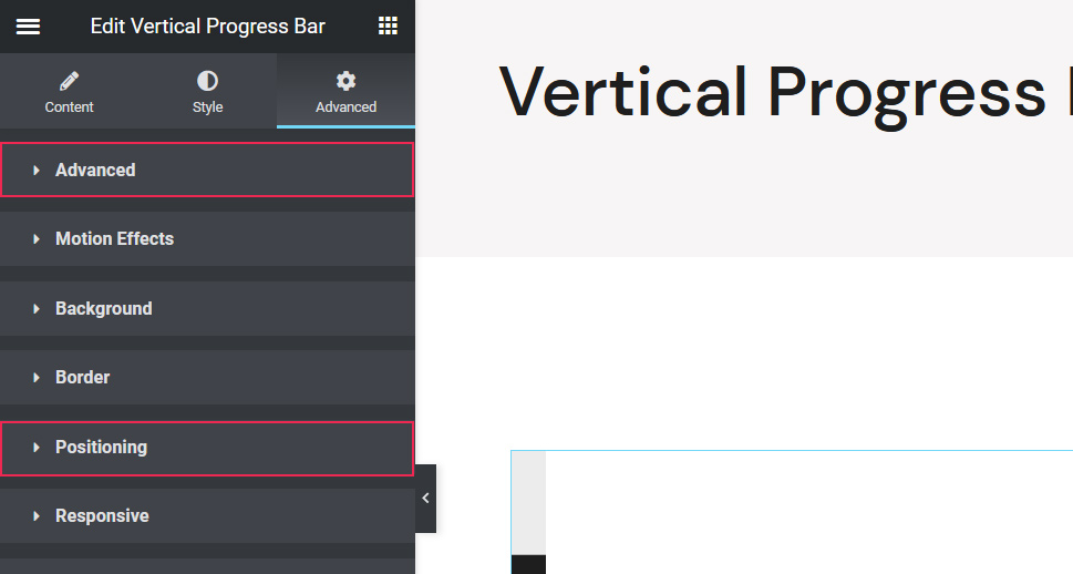
N.B. If you plan on displaying several vertical progress bars on your page, WordPress will place them one below the other by default. That means you would then have to customize them all separately. To modify them all at once and position them side by side in one column, this is what you should do.
Let’s say you wish to display three vertical progress bars on a page, just like we do. Click on the one you just added to select it and go to Advanced > Positioning.
Then, click on the Width option and select Inline.
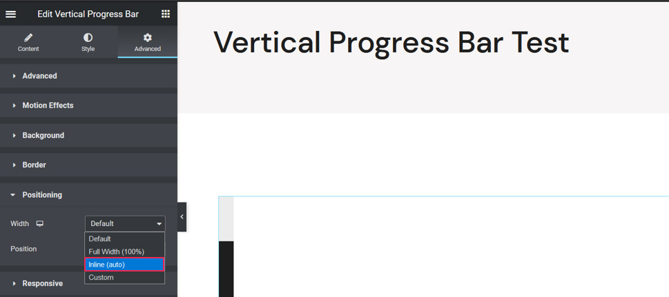
Apply the same setting on the remaining progress bars and they will all appear one next to the other in one column.
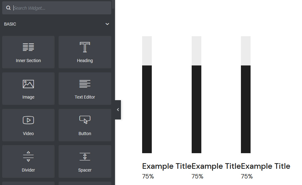
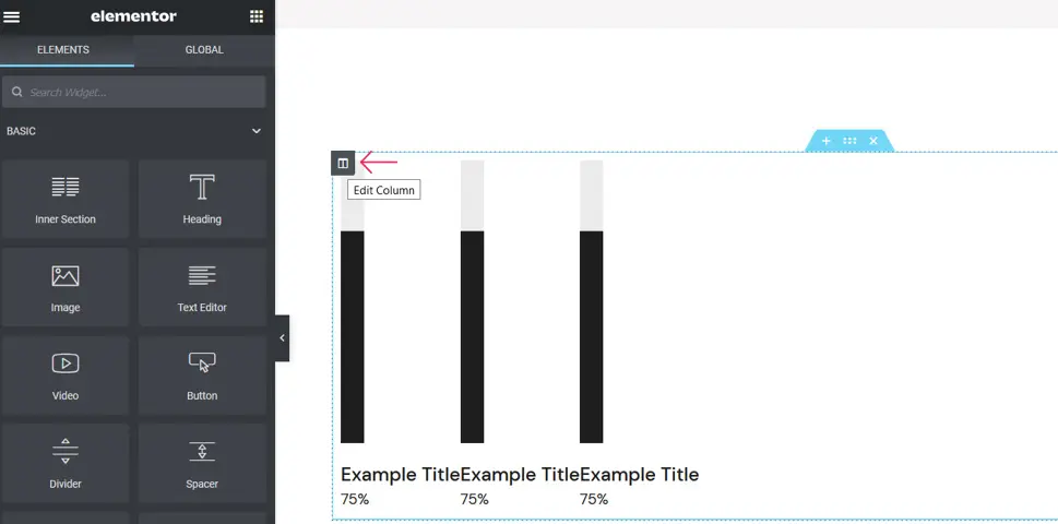
Once the progress bars are added to a page, chances are that they will be positioned either too close or too far apart. In that case, you have to adjust the spacing between them. To do it, click on the Edit Column option.
If you would like to distribute all elements evenly within one section, under Horizontal Align select Space Between.
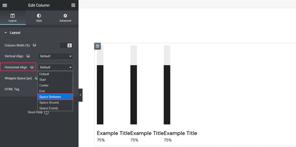
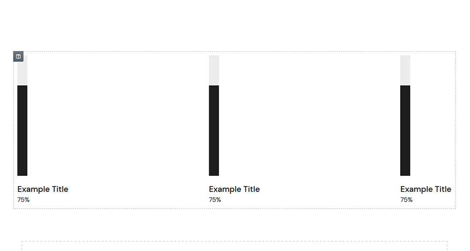
Depending on your preferences, you can also try out other types of alignment, but for testing purposes, we will stick to the Space Between type. Our progress bars look like this:
At this point, we can customize them all at the same time.
Styling the Vertical Progress Bar
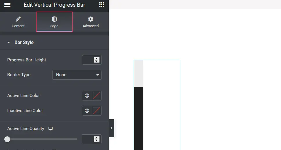
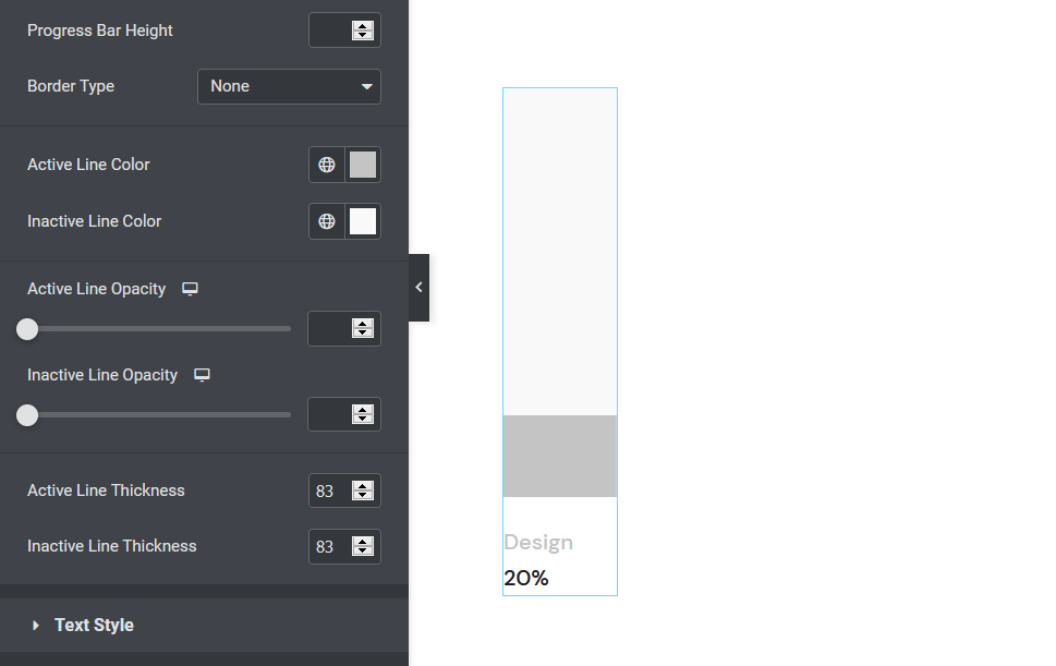
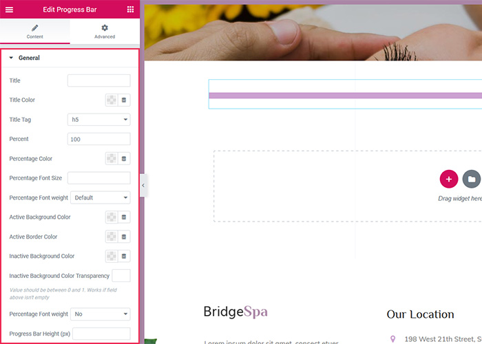
The Vertical Progress Bar widget lets you change the appearance of your progress bar within the Style tab. Here you can adjust the progress bar height, select a specific border type (depending on what you select, some additional customization options may appear), set active and inactive line colors, and change the opacity of active and inactive lines as well as their thickness.
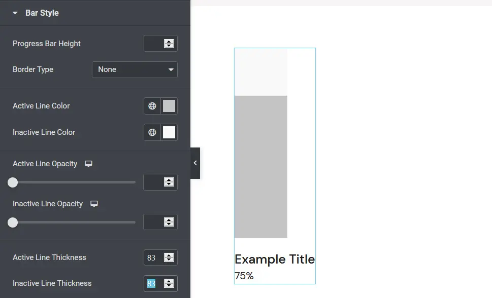
We chose not to have borders on our bars so we selected None under Border Type. We changed the active line color (the part of the bar colored in black) to #c4c4c4 and the inactive line color (the section of the bar above the dark area) to #f9f9f9. We did not tweak the opacity levels, but we did set both the active and inactive line thickness to 83.
As for the final Text Style option, we will come back to it in a minute. We should first enter the text that accompanies the progress bar so that we have some textual content to style. To do that, let’s head over to the Content section.
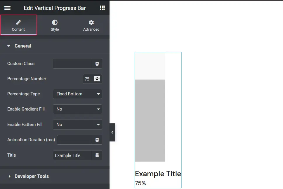
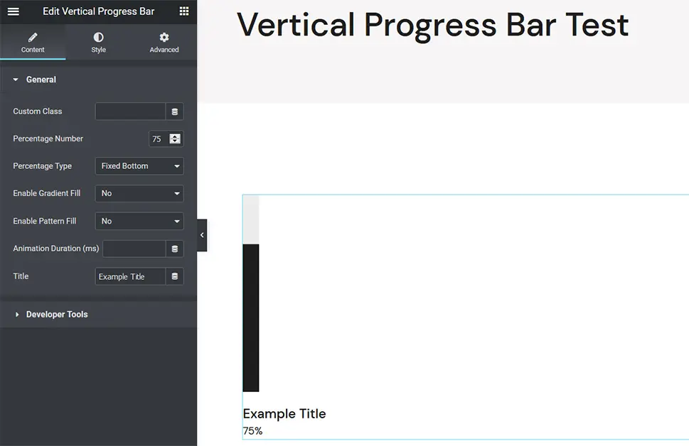
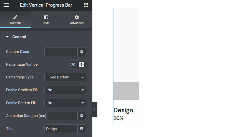
Here, you have the possibility not only to modify textual content but also to enter a custom class, specify the percentage number, and choose the position of the text relative to the bar. Moreover, the widget enables you to set a two-color gradient fill for the active part of the progress bar line. You can select whichever two colors you wish, so you can easily make them match the colors of your brand or the general color palette on your site. As for the inactive part of the progress bar line, you can customize its appearance by uploading a pattern photo to your liking. The Animation Duration option lets you specify the speed of the animation that makes the bar appear as if it’s loading. And lastly, you can enter a custom title for your progress bar.
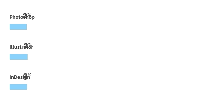
We’ve set the percentage number to 20 and chose the Fixed Bottom option under Percentage Type. We did not apply any gradient or pattern fills, nor did we change the default animation speed. We also changed our progress bar title to “Design” but you should input whatever works for you here.
Since we’re done with the settings in the Content tab, let’s go back to the Style section and explore the Text Style option.
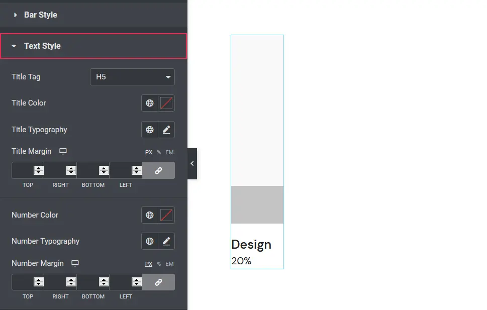
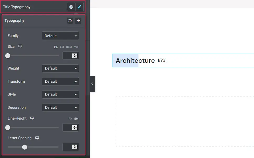
This is where you can set a title tag, choose title color, and make typography changes. By clicking on the Title Typography option, you will open a number of new settings.
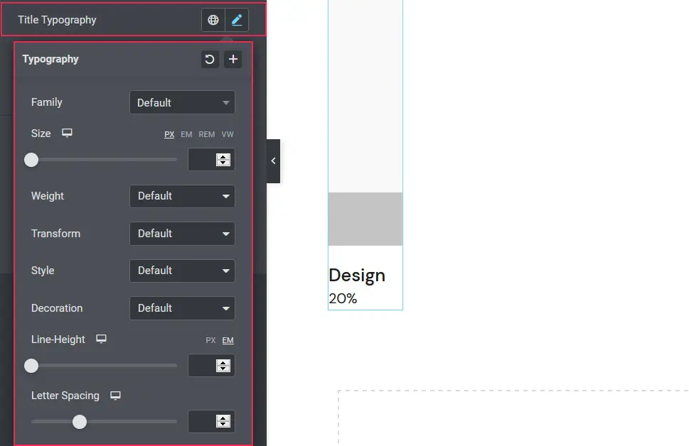
You can change fonts, set the desired letter size and weight, transform letters (you can make them uppercase, lowercase, capitalize them, or use the normal setting), select a specific style (normal, italic, bold, and oblique), as well as add decoration in form of an underline, overline, or a line through the letters. You have the option to change the line height, i.e. increase the space between the text and the progress bar. And lastly, you can change the spacing between the letters.
Right below the typography settings, you will also have the possibility to input specific text margins in ems or pixels. By changing one, the same value will be applied to all other margins. However, if you click on the Link Values Together button, you will be able to specify the size of each margin individually.
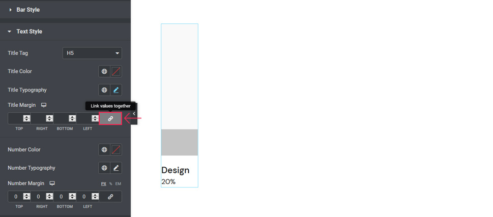
Underneath all of these title settings, you will see a set of options regarding numbers. You can modify the number color, typography (the options are the same as for titles), and change margin values for numbers.
We decided to go with the H6 title tag and we adjusted the color of the title so that it matches that of the progress bar – #c4c4c4. We also set the top text margin to 21px, changed the number typography weight to 500, and increased the top margin for the number to 2px.
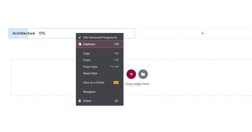
Once you finish creating one progress bar, you may want to duplicate it and display several of them on your page. To go about that, right-click on the bar you made and select Duplicate.
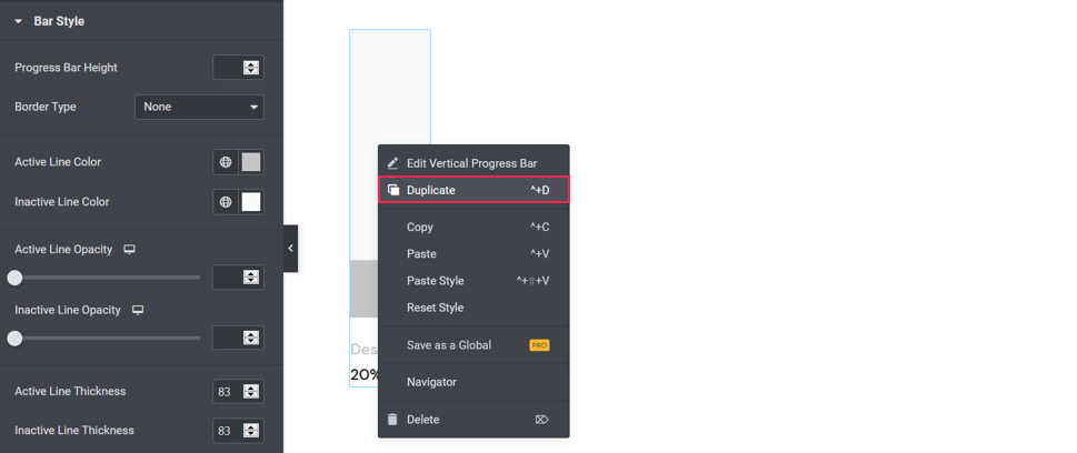
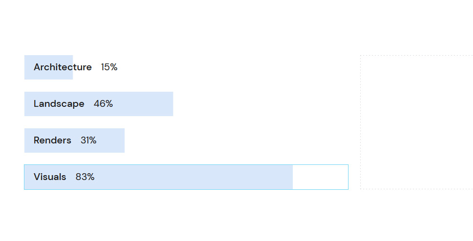
We ended up duplicating our progress bars 11 times and then modified the Percentage Number and Title for each of them.
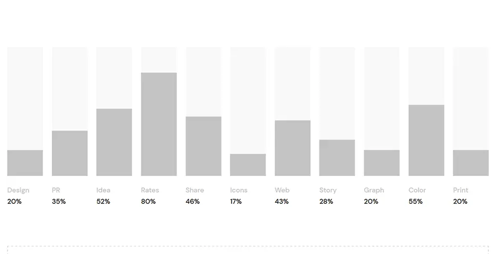
You can make all of your progress bars look the same or stylize them separately. It all depends on the overall aesthetic you wish to create on your site.
To showcase the progress of an activity with horizontally arranged progress bars, choose the practical Horizontal Progress Bar widget from the Qi Addons for Elementor’s pack. This widget packs a myriad of customization options, allowing you to effortlessly create informative and beautiful progress bars.
Once again, we’ve also prepared an in-depth video tutorial explaining you how to best use the widget:
Getting Started With the Horizontal Progress Bar
To start creating beautiful horizontal progress bars, you need to find the Horizontal Progress Bar widget in the Elements section and then drag it to an empty section of your page or post. This is what the default horizontal progress bar looks like:
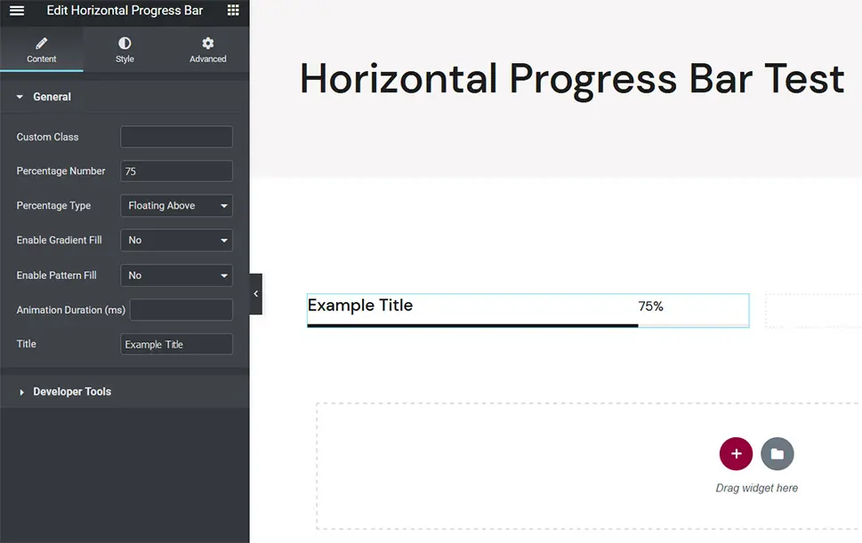
Just like the vertical progress bar, this one, too, consists of the title, percentage number, and the bar which is comprised of two parts – active and inactive. Our horizontal progress bar looks a bit narrow because we split the section on our page into two columns. In case there’s only one column per section, the progress bar will appear far wider.
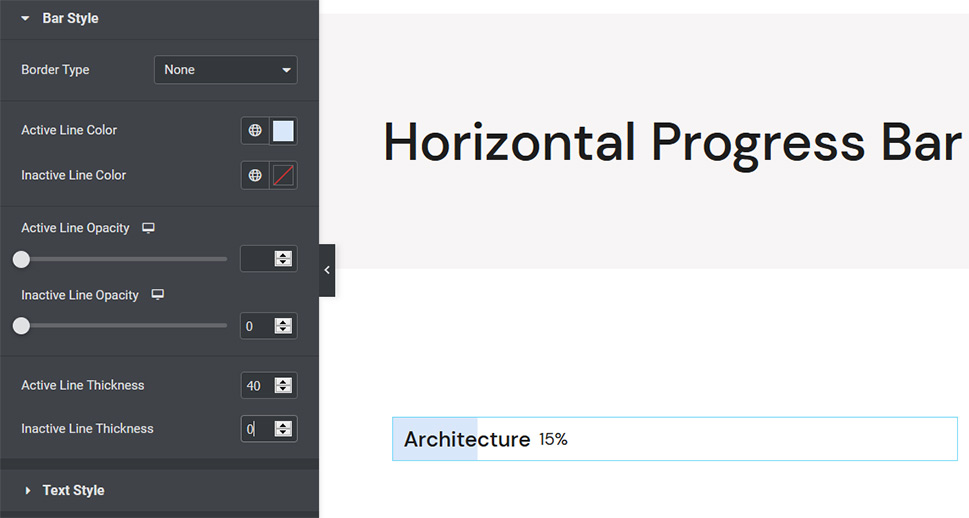
In order to better showcase all of the widget’s options, we’ve slightly altered the appearance of our default progress bar. In the Style section, we’ve set the active line color to #d9e7fa and the thickness of both active and inactive lines to 40px.
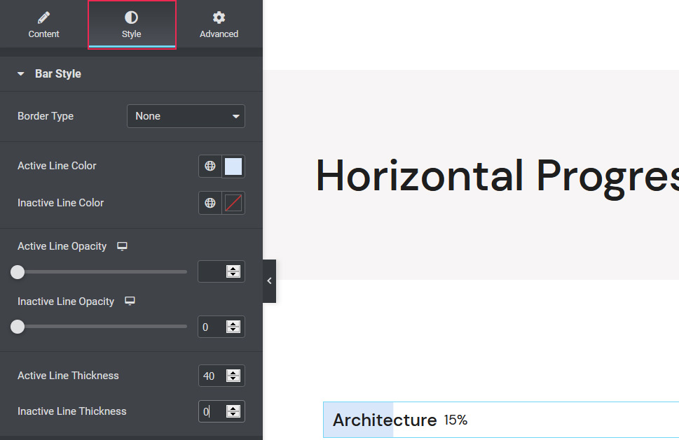
Styling the Horizontal Progress Bar
To start customizing the progress bar, let’s head over to the Content tab.
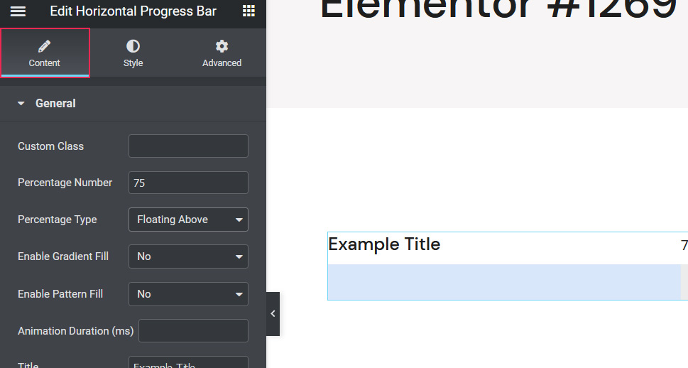
The options match those of the Vertical Progress Bar, meaning you can enter a specific percentage number, specify its position, input the progress bar title, as well as color active and inactive parts of the bar in a gradient between two colors and specify the speed at which the bar is loading. If you like, you can also upload an image that will be displayed in the inactive part of the bar. That option will appear if you set the Enable Pattern Fill option to Yes.
We first changed the percentage number and title of our progress bar. For the percentage number type, we chose Fixed On. We also decided to forgo gradient and pattern fills, as we quite like the simplicity of the bar as it currently is. We left the animation duration at its default value.
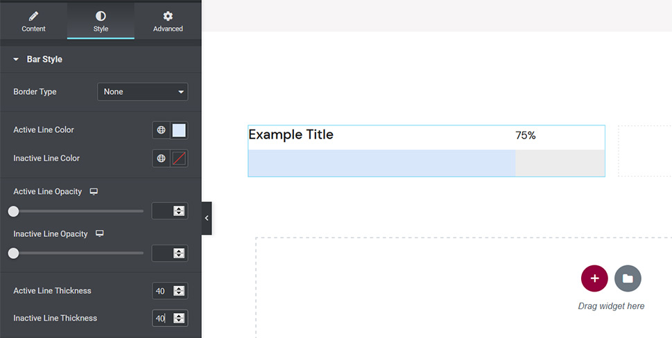
The Style tab includes a number of settings that allow you to further alter the appearance of your horizontal progress bar.
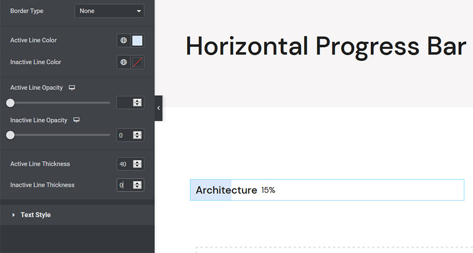
Within the Bar Style tab, you can choose a border type for your bar (if you want to add borders to your bar, you’ll also have the option to specify the width for each border and choose their color), select hues for the active and inactive parts of the bar (we already modified that when we added the bar to our page), and change opacity levels and the thickness of active and inactive lines.
At this point, we wanted to make the inactive part of our bar transparent so we set its opacity level to 0 and then erased the thickness value we previously entered.
After you tweak the look of your progress bar to your liking, you can change the appearance of the textual content in the Text Style tab.
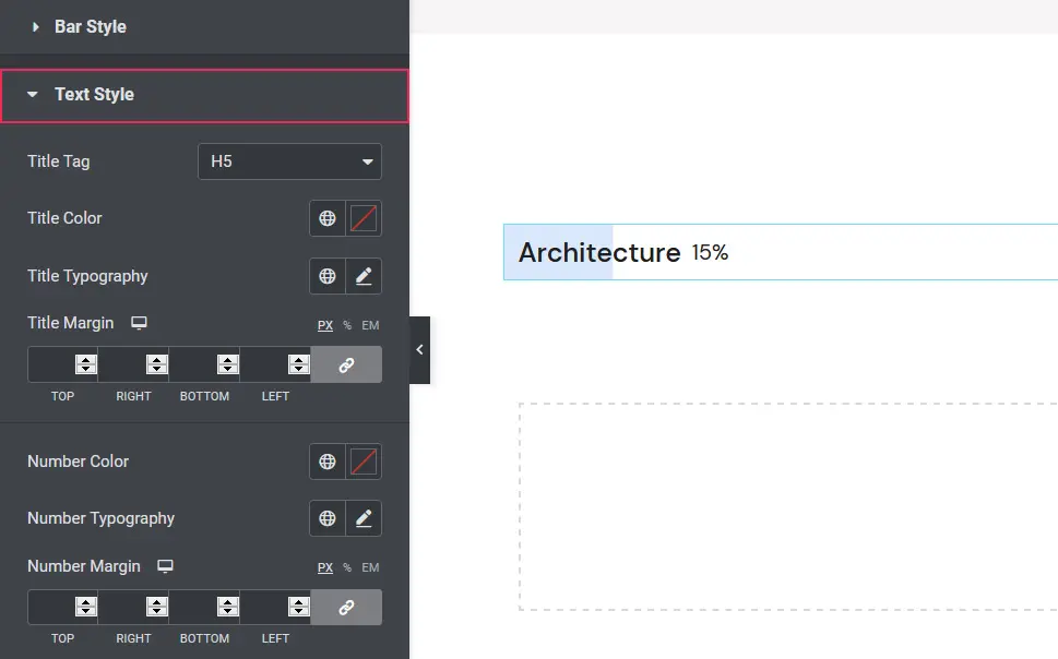
The widget lets you select a specific title tag and modify the color of the title. When you click on Title Typography, a dropdown menu will appear, inviting you to make numerous typographic changes to the progress bar text.
You can select a specific font, modify the size and the weight of the letters, transform them into uppercase or lowercase as well as capitalize them. The Style setting lets you display your text as italic, bold, oblique, or normal while the Decoration option offers the possibility of adding an underline, overline, or a line through the letters. You can also modify the line height and change the spacing between the letters.
Let’s close the typography options now and head back to the Text Style tab. The Horizontal Progress Bar widget allows you to input values for text margin sizes. To change each margin individually, don’t forget to click on the Link Values Together button.
Lastly, you can make style adjustments to numbers, including their color, typography, and margin sizes.
For our horizontal progress bar, we’ve set the title tag to H6 and changed the size of the bottom and left margins for both the text and the number to 2 and 15px respectively.
If you wish to display several horizontal progress bars on your site and you’re happy with the way the one you just created looks, right-click on it and select the Duplicate option.
We duplicated ours four times and made adjustments to the Percentage Number and the Title.
You can combine the Horizontal Progress Bar widget with other elements or use it on its own. As you could see, this addon is truly flexible and malleable, allowing you to manipulate the appearance of your progress bars with utmost ease.
The Radial Progress Bar widget, as its name suggests, allows you to create beautifully styled radial progress bars. Just like the previous two addons we introduced you to, this one is chock full with cool options that allow for effortless progress bar creation.
In addition to this article, we also created a video tutorial to introduce you to the widget and show you how easy it is to use it:
Getting Started With the Radial Progress Bar
To display a radial progress bar on your site, you must add the Radial Progress Bar widget to your page or post first. Look for it in the Elements tab and drag it to an empty section on your page or post.
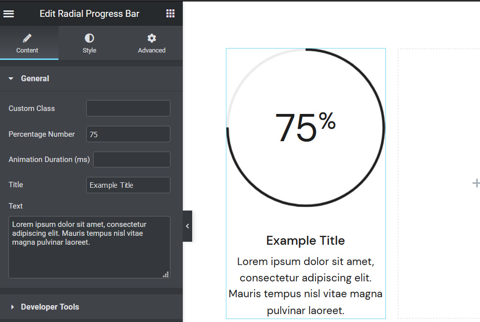
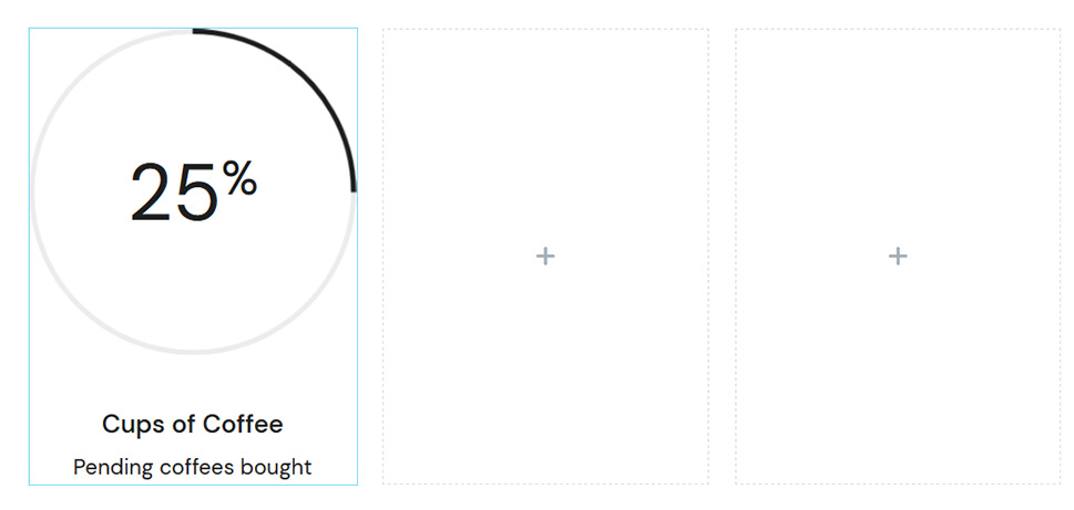
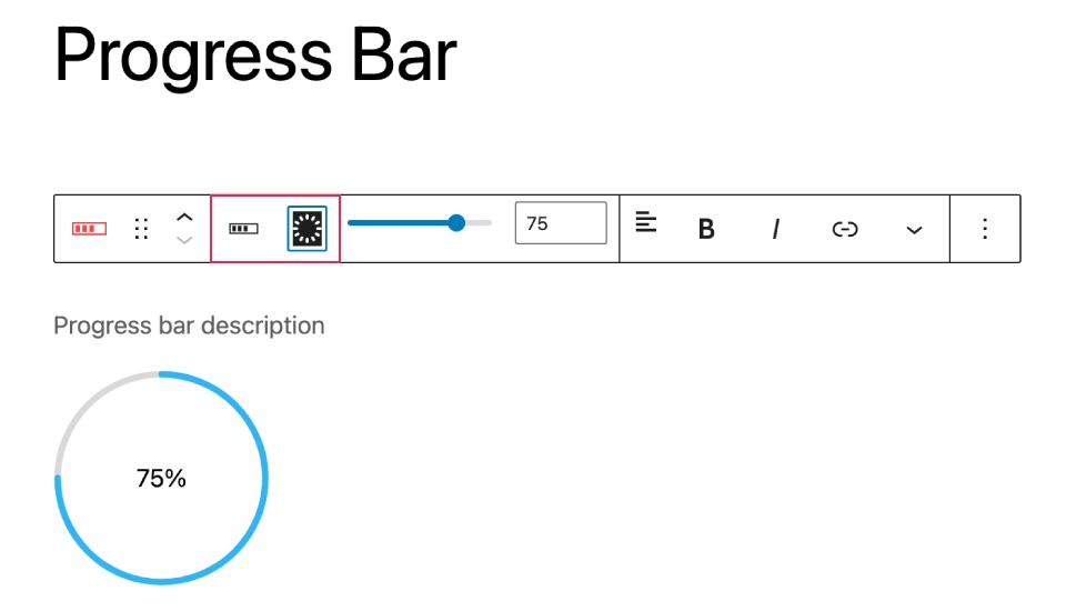
This is what the default radial progress bar looks like. You can start customizing it by opening the Content tab.
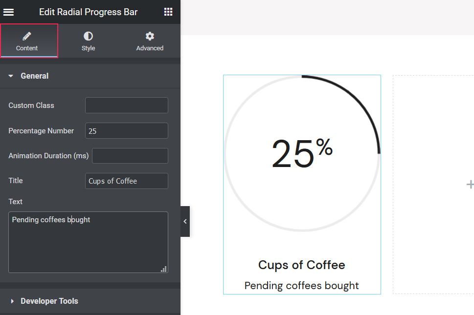
The options are similar to those in the Content tab of the previous two progress bar widgets. This is where you can add a percentage number and the progress bar title, set animation duration, but also input a description to accompany the title.
We’ve customized the percentage number and the title, and entered a description in the Text box. You should input your own text and numbers here.
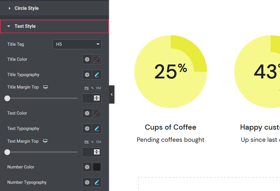
Styling the Radial Progress Bar
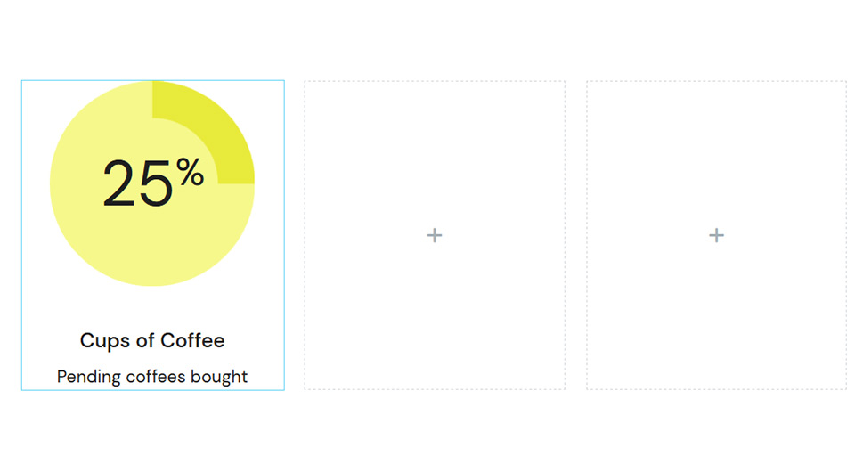
In the Style tab, you can alter the appearance of the progress bar and the text that accompanies it. The Circle Style section includes settings that allow you to change colors and thickness of active and inactive lines, select the circle fill color, and specify the size of the circle, i.e. of your radial progress bar.
The color of our active line is #e8ea3b, while our inactive line is #f6f88b. The thickness of both lines is set to 36. We wanted to match the color of the inactive line with that inside the circle, so we set the #f6f88b hue as the circle fill color as well. Our progress bar is 200px large.
The Text Style options help you choose a specific title tag and title color, as well as modify typography settings for the text.
This widget includes numerous Title Typography options that are identical to those of the Horizontal and Vertical Progress Bar widgets, enabling you to alter the appearance of the progress bar text to the smallest of details.
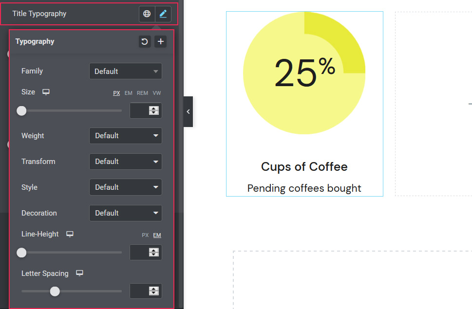
Below the typography settings, you will find the Title Margin Top option, where you can determine the distance between the circle and the text. You can also change the color of the text, make typography changes to the description text, as well as set the text margin top size. Moreover, you can make adjustments to the style of the progress bar numbers by changing their color and experimenting with typography options relative to numbers.
We’ve set our title top margin to 40px and the text top margin to 8px. The number color is #1e1e1e, its size is 55px, and the weight is 500.
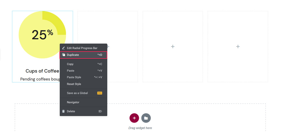
If you would like to duplicate your radial progress bar, simply right-click on it and select the Duplicate option.
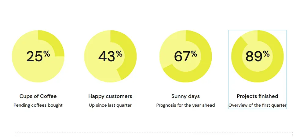
Our final design includes four radial progress bars that differ in titles and percentage values.
As you could see, all three widgets are practical, highly-flexible, and bustling with options that ensure the creation of beautiful progress bars. And best of all, you can get them and another 57 remarkable widgets for free simply by installing the Qi Addons for Elementor plugin on your site.
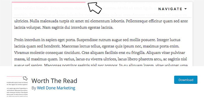
The next thing we’d like to show you is how to add a reading progress bar to your posts. That way, you could let users understand how far they have scrolled through a specific page.
The easiest way of going about it is by installing the Worth the Read plugin.
This plugin is minimal and simple, and the reading progress bar doesn’t show up on the screen until users start to scroll down the page. When the scrolling stops, the bar is gone and it’ll reappear only when a user continues to explore the content.
You can add it to pages, posts, and custom post types. The plugin lets you choose the placement of the progress bar, offset, include comments, and style it to your taste. It’s possible to change the thickness of the bar, foreground and background colors, the color of the comments, enable shadow, and more.
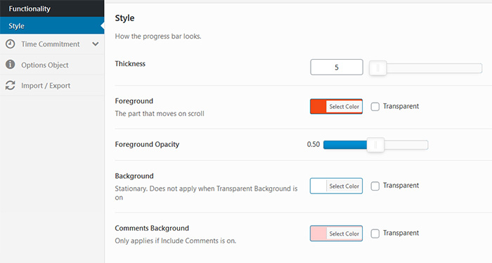
We especially liked the Time Commitment feature that can be added above or below the title and above the content. You can specify the average number of words users are expected to read in one minute, and that number varies greatly from one language to the other. For instance, the average reading speed of English-speaking adults is about 200 – 250 words per minute, so you can set the default value to 200.
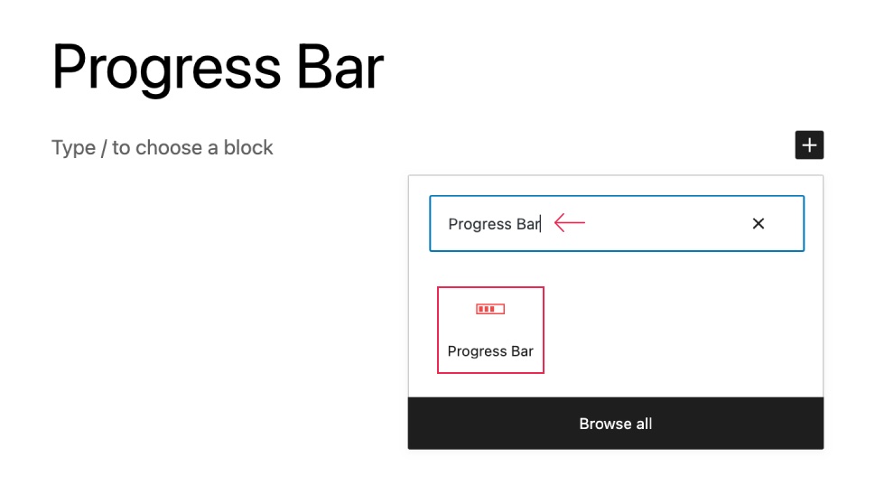
When it comes to adding a progress bar in the WordPress Block Editor, it’s better to use a blocks plugin. Ultimate Blocks is the plugin that lets you add both horizontal and circular progress bars. And it’s very easy to use.
Let’s install the plugin first. Just go to your WordPress Dashboard and navigate to Plugins > Add New. Then search for ‘Ultimate Blocks’ and click on the ‘Install Now’ button.

After activating the plugin, go to the post or page where you want to add a progress bar. Then click on the + sign and search for the ‘Progress Bar’ block.
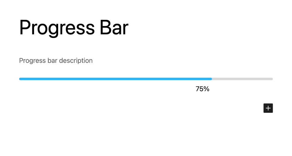
Insert the block by clicking on it. A horizontal progress bar will be added.
If you want, you can change the horizontal bar to circular bar. Just click on the circular icon from the block toolbar menu.
You can customize things like thickness, value, and color from the right-hand side options panel.
The easiest and fastest way of adding a progress bar to your website is by using a theme that packs the Progress Bar shortcode. That way, you won’t have to look around for third-party services to enhance the functionality of your site, as all you need comes bundled with the theme.
Bridge is a versatile premium theme that packs a collection of whopping 515+ demos that can be used to build pretty much any kind of website you have in mind. It packs a compendium of practical shortcodes, one of them being the Progress Bar shortcode that enables you to effortlessly add a progress bar to your site. And we’ll show you now how to go about that.
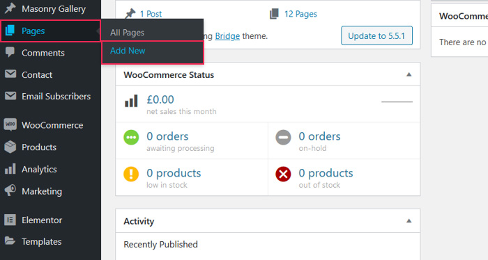
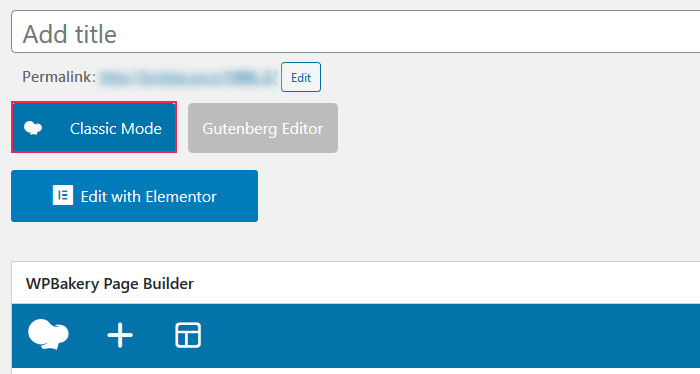
For starters, go to the page where you wish to display the progress bar or create the new one. We’ll start from scratch so we’ll select Pages > Add New.
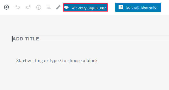
We’ll explain how to create the progress bar using the three most popular builders – WPBakery Page Builder, Elementor, and Gutenberg. Let’s kick things off with the WPBakery Page Builder.
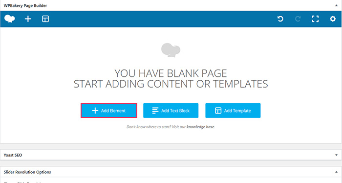
Once you’ve selected the preferred page builder, click on Add Element.
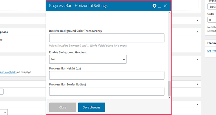
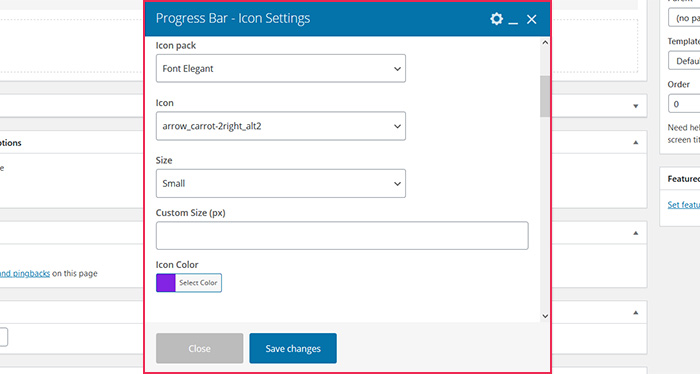
Then, type Progress Bar in the search field. Bridge comes with three progress-bar-related shortcodes, one of which allows you to customize the progress bar icon, while the other two enable you to add either a vertical or a horizontal progress bar to your site. For testing purposes, we’ve selected the Progress Bar – horizontal shortcode.
The shortcode itself lets you customize numerous details to your liking, including the title, title color, percentage, percentage color, percentage font size and weight, active and inactive background color, border color, progress bar height, and much more.
Once you adjust all the settings to your requirements and you’re happy with how things look, save your changes.
In Elementor, once again, you can find the shortcodes by using the search option placed at the upper left corner of the screen.
Select the shortcode you need for your site and drag it to the appropriate field on the right. Customization options are displayed on the left, and you can adjust the progress bar so that it meets your needs.
And lastly, let’s see how to create a progress bar in WordPress using Gutenberg.
To insert custom shortcodes to your page, it’s necessary to add the Custom HTML block first.
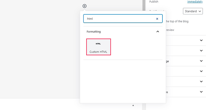
Then, you need to paste the shortcode snippet into the block. We’ve opted for the Progress Bar – Horizontal shortcode and this is the snippet we’ve added to the block:
[progress_bar title_tag="h3" percent_font_weight="600" gradient="yes" title="Test" title_color="#dd3333" percent="72" percent_color="#1e73be" percent_font_size="30px" active_background_color="#81d742" active_border_color="#eeee22" noactive_background_color="#000000" noactive_background_color_transparency="0.5" height="150" border_radius="20px"]
You can adjust all parameters that are placed between quotation marks according to your preferences.
If you want to use another progress-bar-related shortcode or you’d like to make alterations without having to bother with hex codes etc., the best way to go about it is to create a new page using the WPBakery Page Builder. Next, add the shortcode you want and alter it to your liking.
Save the changes and then switch to Classic Mode.
The shortcode will appear in the text editor.
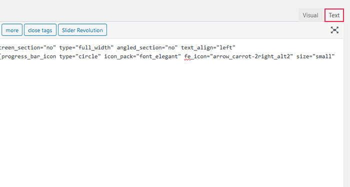
All that’s left to do is copy it and then add it to the Custom HTML block. You can use this method to add any custom shortcode you like to Gutenberg.
Conclusion
Progress bars are useful additions to websites as they act as strong motivators and encourage people to keep going until their complete tasks. They also help brands be more transparent with users, as people will always know at what point they stand. We introduced you to several methods of creating a progress bar in WordPress, but now it’s up to you to choose the way that works best for you. Our advice would be to either go with the Qi Addons for Elementor plugin and its three widgets – the Vertical, Horizontal, and Radial Progress Bars, or install a premium theme that already includes the Progress Bar shortcode. The former is a great solution that allows for great flexibility and won’t cost you a dime. As for the latter, it ensures your progress bar will perfectly match your theme and all its features from the get-go. Whichever of the two you choose, you will be able to easily craft functional and eye-appealing progress bars.
