How to Create a Product Category List in WordPress
An important part of sales is presentation, that much is a given. But, for online stores, presentation is not just about making a sale: it’s also about projecting a professional and trustworthy image, it is about aesthetics, and it is about the user experience even if no money changes hands. In this article, we will be talking about creating a product category list for your WooCommerce store. This enticing display could be a great addition to your website.
You can get a product category list ready and picture-perfect within minutes. You can find out how in the video below. However, if you prefer your tutorials in step-by-step textual form, you can find everything you need below the video.
But let’s take a step back: what is a product category list in the first place, and what do you need to do to set it up? You’ll find the answers in this article. If you are confident all you need is the tutorial section, you can find it in the table of contents below.
Here’s what we’d like to discuss:

One of the core features of WooCommerce is the product custom post type, and these product posts can be sorted into categories. Based on what you are selling, these categories may include such groupings as menswear and ladieswear for apparel, for instance, fiction and nonfiction for literature, vegan or vegetarian for food or cosmetics, and so on.
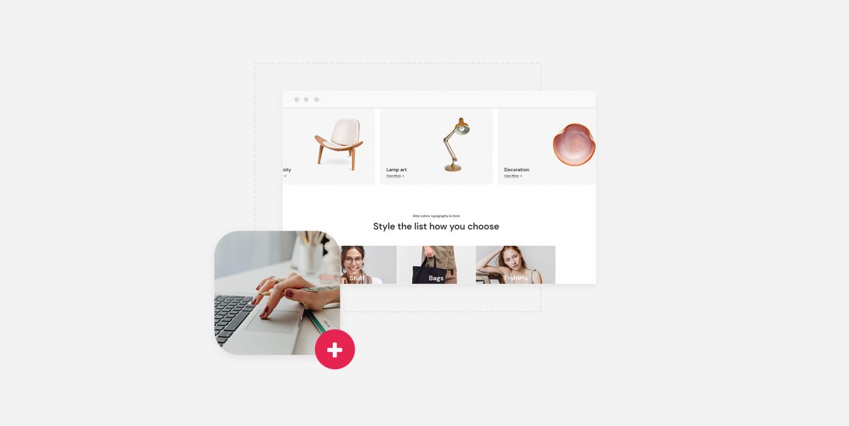
A product category list presents your shoppers with a set of categories they can choose from – something like subheadings in a restaurant menu. Product category lists are, in other words, a presentation and navigation feature. They are useful if you have more than just a few products in your store, and if they can be organized into categories.
In order to edit your website, you first need to have a website. So far, so good. Similarly, to make use of WooCommerce product categories, you need also to have created a WooCommerce store on your website.
Once you have done that, you need to have created product categories. In our demonstration, we will be using a clothing store with four categories, plus the default category of Uncategorized.
Finally, you need to install and activate two WordPress plugins: Elementor and Qi Addons for Elementor. We will be using our very own Qi Addons plugin, which contains sixty beautifully designed and easy-to-use widgets. The WooCommerce product category list is just one of them. To use the Qi Addons plugin, you need to use Elementor, the premier visual editor, as your page editor. The latest version, free or premium, will do. Qi Addons will not work with other page editors.
So, to reiterate, you need to:
-
install WooCommerce
-
create product categories
-
install Elementor, and
-
install Qi Addons for Elementor
Having done all of the above, you can get started with your product category list.
We will show you how to create a product category list as part of a page. To start with, we have created a page, given it a title, and clicked the Edit with Elementor button in the page editor header.
Find the widget in the left-hand side menu, and drag it to where you want it on the page.
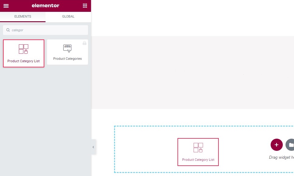
The widget is now in place. You can see that it has all the categories in our store, including the Uncategorized category.
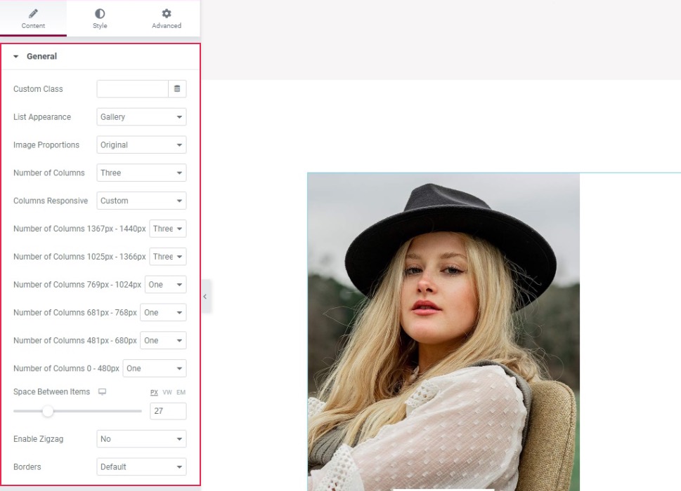
General Tab, General Section
The widget’s General tab should be opened, and within it, the General section. In the List Appearance menu, you can choose between the Gallery and Masonry display types. We will leave it at the default value of Gallery. In the Image Proportions menu, you can select the image size and type of crop (Thumbnail, Square, Portrait, and so on). We will be using the default Original setting for this demonstration.
The Number of Columns menu can be set to a value of one to eight, as well as Default. We will leave it at Three. In the Columns Responsive menu, you can choose between Predetermined and Custom. Selecting Custom will let you select the number of columns for a variety of devices sorted by display width. We have gone with Three columns for the larger two devices, and One for the rest.
The Space Between Items slider controls the border between the items of your product category grid. We will set ours to 27 pixels. The Enable Zigzag option lets you offset every other tile in the grid, while the Borders menu lets you set a different type of border for your grid items. We won’t be needing either option here.
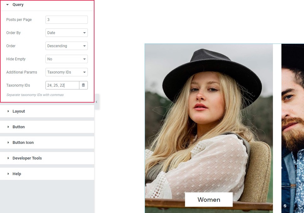
General Tab, Query Section
Now, in the Query section of the General tab, the first option is Posts per Page: the number of posts displayed in the grid. We will be setting ours to 3. The next two options, Order By and Order let you set up the order in which your grid tiles will appear to the visitor. We haven’t changed the default value, sorting the categories by date and in descending order. The Hide Empty control lets you hide the categories without any products. Finally, the Additional Parameters control lets you choose the categories you wish to use in your grid, provided you know their IDs. We do, and so we went with our three categories. You can learn the ID of your product category as you would with any category. Consult the linked article for an in-depth explanation.
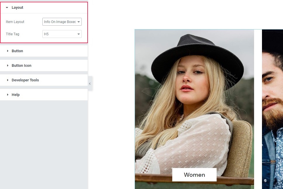
General Tab, Layout Section
The Layout section of the General tab lets you choose how the category name (title) is displayed in your grid. The Item Layout menu lets you choose between Info On Image Boxed, which is the default, and which we will stick with, Info On Image, and Info Side With Button. The Title Tag lets you choose the heading status of the category title. The default is H5, and we will keep it for this demonstration.
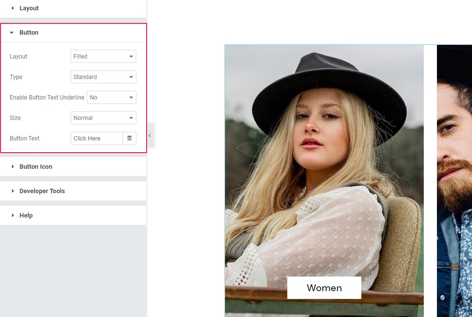
General Tab, Button Sections
The next two sections of the General tab are Button and Button Icon. Since we have not chosen the Info Side With Button option for our product category list, they will do nothing. However, you can use them to customize your button. The Layout and Type menus let you choose the kind of button you want. You can have a Filled, Outlined, or Textual Layout, for instance, combined with a Standard, With Inner Border, or Icon Boxed type of button. The Enable Button Text Underline control is pretty much self-explanatory, as is the Size menu. Finally, you can enter whatever Button Text you like in the bottom field.
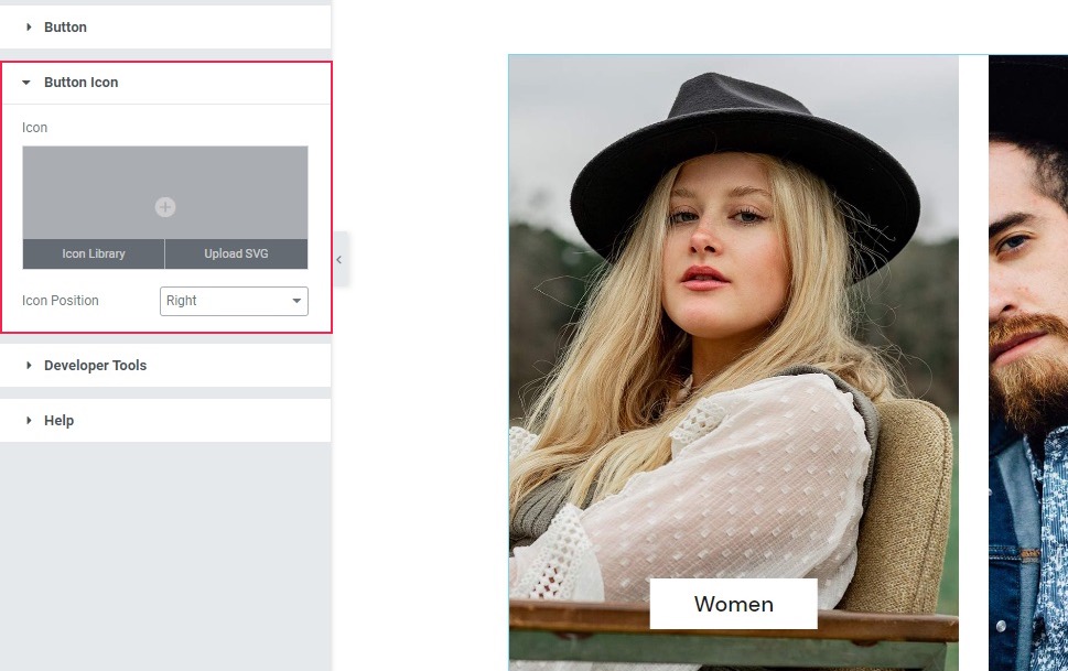
In the Button Icon section, you can upload an .svg file for your button icon or choose one from the icon library, and use the Icon Position control to position it to the left or the right of the button text. Again, since we are not using buttons for this design, these controls are irrelevant for this demonstration, but you can use them to style your own product category lists to your liking.
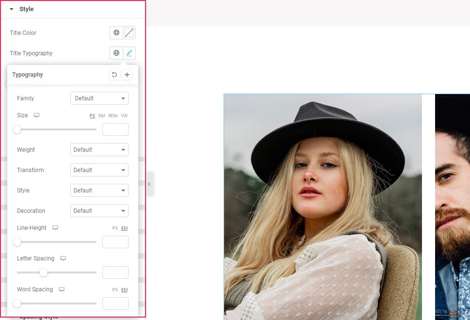
Style Tab, Style Section
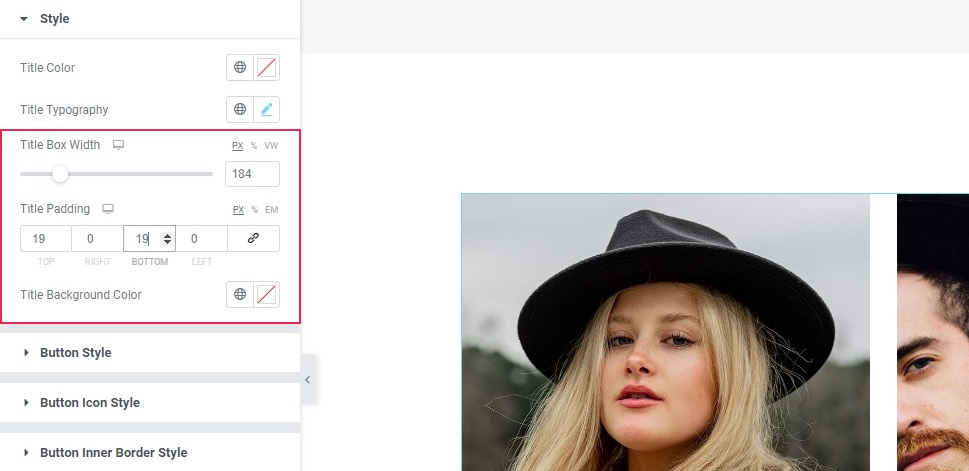
In the Style tab, the first section up is the Style section. Here you can style the category title in your grid. You can select the Title Color using a picker or by entering a color hex code. In the Title Typography section, you have the usual suspects in terms of typography options: font family, size, weight, spacing, and so on. We are happy with our title settings, so we won’t be using these options for our product category list.
The Title Box Width control lets you set the width for your title box. We will set it to 184 pixels. The Title Padding options affect the distance between the title text and the box edge. We will unlink the values by clicking on the link button, and set the padding values: 19 pixels for Top and the same for the Bottom field. The Title Background Color option lets you choose a color for the box behind the title. We will leave it at the default white.
Style Tab, Button Sections
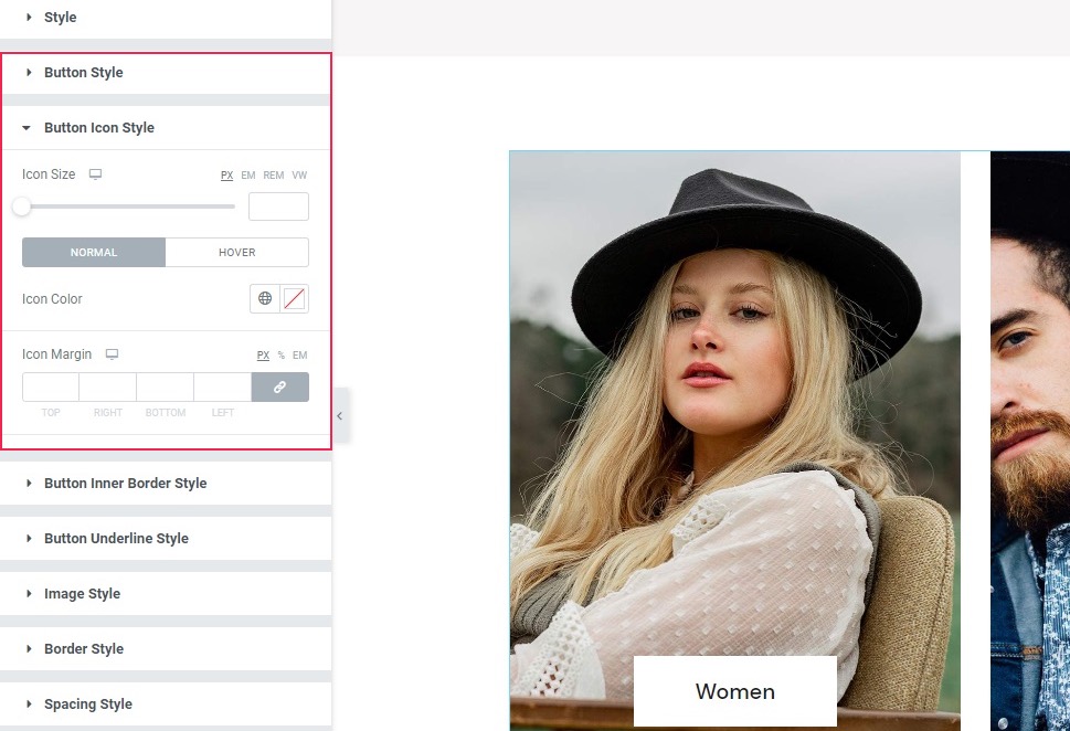
The following few sections govern the style and behavior of a button, in case you have opted for one – which we haven’t. Still, the Button Style, Button Icon Style, Button Inner Border Style, and Button Underline Style sections of the Style tab offer a plethora of styling options for both the normal button look and the on-mouse-hover behavior of the button and the icon.
Style Tab, Image Style Section
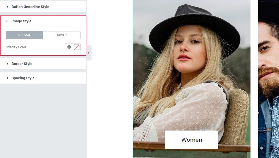
In the Image Style section of the Style tab, you can see the Normal/Hover switch. This lets you set the behavior for the image when a user hovers their mouse over it. In the Normal view, all you can do is set a color overlay for each image using the Overlay Color control.
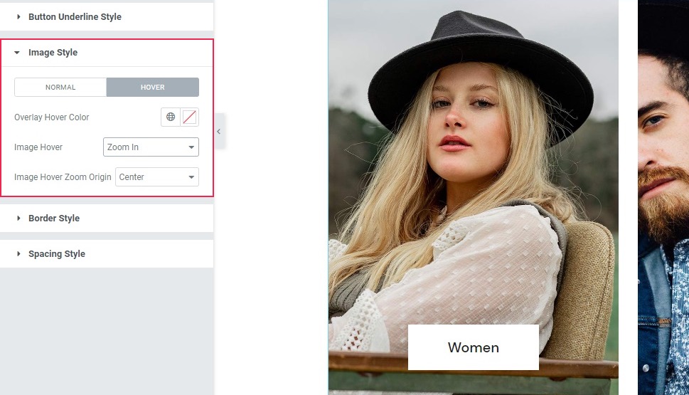
In the Hover view, you can again use the Overlay Hover Color to set an overlay for when a user hovers their mouse over the image. Using the Image Hover control, you can select the type of on-hover animation, while the Image Hover Zoom Origin lets you choose the focus of the animation effect in case one is selected. For this demonstration, we will use the Zoom In option for the Image Hover, and the Center option for Image Hover Zoom Origin – the default values.
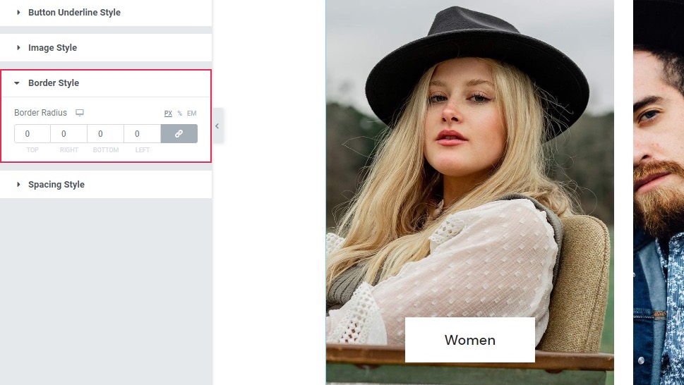
Style Tab, Border Style Section
The Border Style section of the Style tab lets you set a number of pixels (percentages, or ems) by which the corners of an image can be rounded. We will not be using that effect for this demonstration.
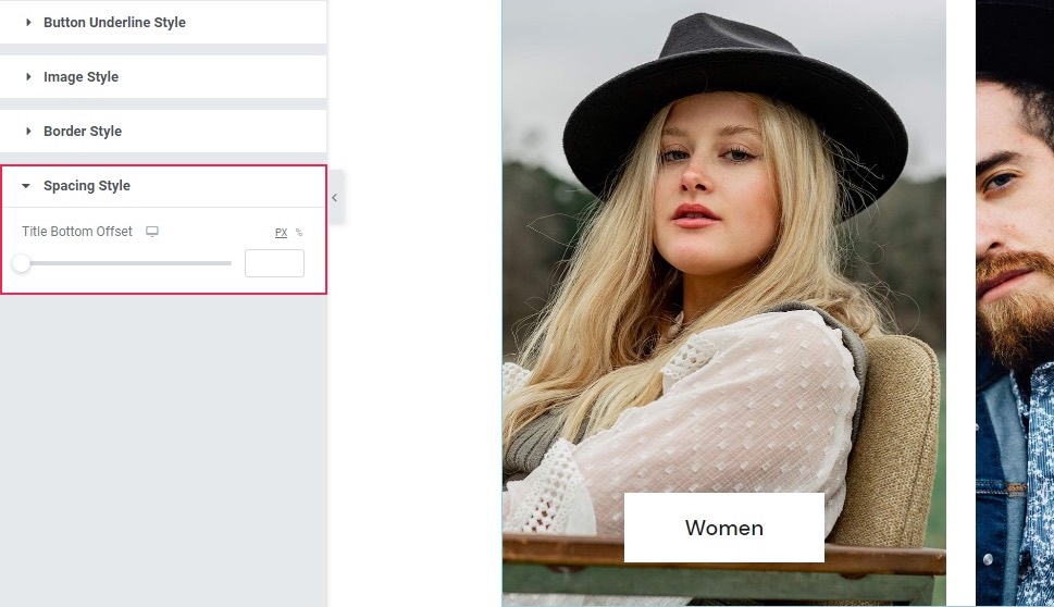
Style Tab, Spacing Style Section
Finally, we arrive at the Spacing Style section. This only has one control: Title Bottom Offset, and it represents the distance between the bottom of the image and the title. You can choose the value using a slider or enter a value you like. We are, once again, happy with the default, and will not be using this option.
And, as you can see, you can set up a product category list and customize it to your liking within minutes! All you need is Elementor and Qi Addons.
In Conclusion
As we have shown in this quick demo, you can have a beautiful, if minimalist, product category list within a few minutes, with just a few clicks of the mouse and using mostly default options. However, that’s far from all: there is a myriad of styling and button options we haven’t used, but with which you can make your WooCommerce product category list fit virtually any website layout or style. And none of it need cost you a penny.
