How to Add a Pricing Calculator in WordPress

Despite the general pricing strategy you decide to go for, allowing your potential customers to learn all about the pricing of your products and/or services is a must. Of course, showcasing your pricing in various effective and user-friendly ways – like adding a pricing list or using a pricing table – is always recommended. But what if we told you there’s a way to make things even more practical (and somewhat engaging) for your customers during the process of their purchase-making decision? You can do this by adding a simple but attractive pricing calculator element to your WordPress site.
Pricing calculators are great as they allow your visitors to simply select the items they are interested in purchasing using the toggle switch. Once they select the prices using the switches, they will be able to instantly see the total calculated price on the screen. They can easily add or remove any items they like (or don’t like) and then they can simply hit the buy button once they’re ready to make their purchase.
To create a pricing calculator on your own WordPress site, you first need the help of a suitable plugin – and if you ask us, there’s a no better choice than the powerful Qi Addons for Elementor and its versatile Pricing Calculator widget.
So, this time around, we will share with you all the options that come packed with this practical widget and show you the steps you need to take to set up a neat-looking pricing calculator for your site.
Here goes:

With over a 100 freemium, fully customizable widgets, the Qi Addons for Elementor plugin has a truly unique selection of elements you can use to create any section or page imaginable for your site – be it a creative element, a showcase addon, or one that can be a good fit for your eCommerce store or any other business. And speaking of the latter, there’s the Pricing Calculator widget. This widget is great as it contains numerous toggleable features, allowing you to display pricing deals in an innovative, practical, and flexible manner all at once. You will be able to add different prices, currencies, and periods, stylize switch buttons, change colors and typography, and more.

With that said, let’s take a look at how you can add, customize and style the Pricing Calculator widget on your own site. Also, if you prefer to watch videos over reading, we’ve covered the same subject in a video:
First things first, you should go to the backend of your Elementor page.
You should note that we’ve added a section where we plan to add the pricing calculators in advance. There’s the section background image, title text, as well as four different columns for the pricing calculators (that we added using the Inner Section element).
Adding the Pricing Calculator Widget

Find the “pricing calculator” element in the Elementor sidebar. Drag it over to the page on the right (to the first column).


As you can see, the widget is transparent by default and includes some placeholder text with minimal styling. Also, the widget is a bit hard to see because of our background image, so we plan to fix that in a few moments.
Setting Up the Look of the Widget Field
But first, let’s take a look at the first option in the Content tab (General settings) – Layout. It’s set to the Side setting by default, but the Simple setting fits our example better, so that’s what we’ve chosen.

This layout puts the price at the top and the items in the middle, while the description and the button are located at the very bottom of the widget.
With that out of the way, we can quickly switch over to the Style tab to change the Background Color of our element. We’ve chosen plain white (#FFFFFF).

We’ve also set the Border Color, an option available right below (the hex code we’ve used is #e1e1e1).
Last but not least, we’ve increased the Border Width to 1 pixel to make the border a bit more noticeable.

Of course, you can feel free to adjust all these options entirely to your liking.
Now, let’s return to the Content tab to show you the rest of the content-related options.
Now that we’re back in the Content tab, it’s time to start editing the content of the widget. There are some general options here that also include the ability to adjust the content of the button and individual items. Let’s take a look at all these options in more detail.
Editing General Content Options
The first available option here (after Layout) is for replacing the default Description, allowing you to add your own.

Next, the Currency field allows you to add the desired currency into the field next to the price. This is the text field, so whatever you enter here will get displayed on the page. We’ve decided to stick with the dollars for ours.
The same goes for the field below, called Period – we’ve left the /mo (month) sign here. Once again, you can replace this text with anything you like.

Then, there’s the Button Text – we’ve only made a slight change here and corrected this option so that our button reads “Purchase” instead of “Purchase now”.
The Button Url allows you to add a URL to your button. As we’re only creating this example for our tutorial, we’ve just added a hashtag as a placeholder text here.

Customizing the Items
Next is the Child Elements section. This section has three different Items by default – they actually correspond to the three-line items that serve to make the calculation on your page. As we didn’t need three items for our example, we deleted one item and decided to stick with two items only. But if you want to add more items to your element, simply hit the “+Add Item” button.

Each item has its own options. The first option you can find within one item is Price – you can enter your numerical value for the said item here. Also, the Title field allows you to enter the name of your item (like we did).

Next, there’s the toggle switch right underneath named Item Active which allows you to decide whether the item will be active and included in the price calculation by default. If you switch it to Yes, you can see that the first item is now also switched on within the item itself. Also, the total pricing changed automatically the moment the first item got included in the calculation.

That being said, your visitors will still be able to deactivate the item within the element on your page before they decide to make their purchase.
For the second item, we changed the price to $22. Instantly, you’ll be able to see the calculation has changed accordingly (as both items are marked as active).
We’ve changed the title as well and decided to keep the second item active, too.

Setting the Button and Button Icon
Next are the Button settings, allowing you to change the button layout, type, and size, as well as enable or disable the button underline. We’ve already made a separate article on how to add, customize and style the button element where we talk about these options in full detail, so make sure to check that out for more info.
Also, we’ve decided to keep the default button settings for our example.

The Button Icon section allows you to add an icon that will be placed next to the button text. You can either use one from the icon library or upload an SVG.
Also, you can change your Icon Position.
We’ve uploaded an SVG for our example.

Make sure to hit the Insert Media button once you choose your icon.
Now, we’re going to move on to the Styling options. We’ve already changed a few of the first options available earlier. These are the first three options in the Style section – Background Color, Border Color, and Border Width.

The one option left in this section is called Padding. With it, you can adjust the space around the content. We’ve delinked the fields here and adjusted the top padding to 56px while we set the rest at 52px.

Switcher Style
Next is the Switcher Style section which lets you style the look of the toggle switches themselves. The options here can be divided into two different sections – Normal, which serves to style the options for the inactive switch display, and Switch, which is used for the activated switch.

Let’s start with the Normal set options – there is the Button Color (we’ve changed it using the hex code #ffffff for white color), and Background Color which changes the switch background (we’ve set the #e1e1e1 hex code here). There is also the Border Color that will frame the toggle switches altogether.

Under the Active set of options, you’ve got three similar settings – Active Button Color, Active Background Color, and Active Border Color.
We’ve entered a hex code #d1b17d for the Active Background Color because we wanted the inactive and active switches to differ in some way.
You can increase the Border Width as well as help both Normal and Active border colors become more visible (so, this setting works for both displays).

Item Title Style
Moving on to the Item Title Style – the first available option here is the Title Tag.
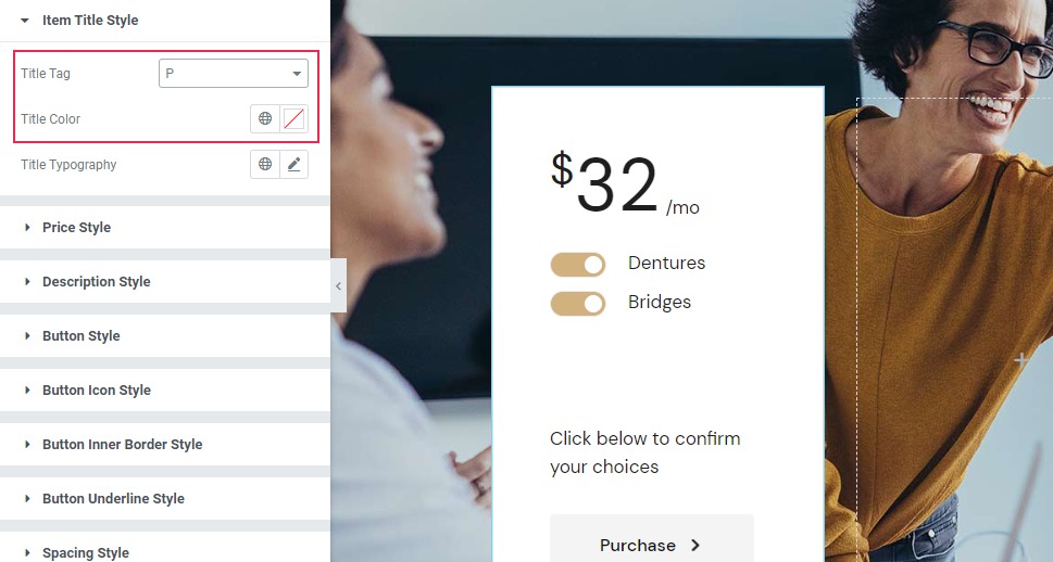
You can set anything from H1 to P (we’ve set it to the P tag). There’s also the Title Color if you want to change the color of your title text and the Title Typography. The latter option contains a comprehensive number of settings related to the typography of your title text. These include the font family, size, weight, and so on.

Price Style and Description Style
The name of the Price Style section is pretty self-explanatory – it allows you to set the style of your calculated price. The options include Price Color (we used the #1e1e1e black color hex code) and Price Typography (the same as the Title Typography). We’ve changed the font size and font weight here to 70px and 500, respectively.

Moving on, the Currency Color allows you to set the color of the currency next to the price total. We’ve used the same color #1e1e1e (that we also used for the number).
The Currency Typography is the same as all other available typography options. We’ve set the weight to 500 here.

Next is the Period Color which lets you set the color of the period related to the price (the text that reads “/mo” in our example). We’ve set the same #1e1e1e hex code we’ve been using until now.
Finally, you’ve also got the Period Typography with all familiar typography-related settings (we’ve decided not to change anything here).

The Currency Margin can be used to insert more space around the currency symbol. Similarly, the Period Margin allows you to insert more space around the period text, but only on the bottom and on the left (due to the period text position). We’ve delinked these fields and put 5 pixels on the bottom and 8 pixels on the left.

Last but not least, the Description Style set of options has two options for styling the description text of your pricing calculator – Description Color and Description Typography, both of which are self-explanatory.

Button Style
Now, the Button Style options allow you to completely style the look of your Purchase button.
The first thing available here is another set of Typography options which has all the standard options we’ve already mentioned above. We didn’t change anything for our example, but you should feel free to change any setting you like here.

Next, there are two switches again – Normal (it lets you style the button when it’s displayed regularly) and Hover (for styling the look of your button when it’s hovered over).
For the Normal settings, there’s the Text Color – we’ve set the hex code #ffffff which is plain white.

The Background Color is the color of the button itself. We’ve set the hex code #d1b17d for it to match the active button switches.

Also, if you choose the button Border Color, you will also be able to use the option right below it, called Border Width. This option will affect both Normal and Hover switches.

On the other hand, the Border Radius option will work regardless if you use the border color or not as it simply lets you curve or sharpen the button corners. We’ve removed the radius here to get the button with sharp corners.

The Padding option allows you to change the space around the button text and thus affect the size of your button. You can either increase all sides evenly or delink the fields and set each size separately (which is what we did).
We’ve set 14px at the top, 40 on the right, 13 on the bottom, and 40 on the left.

The Hover switch reflects a similar set of options under the Normal one. So, there’s the Text Hover Color, Background Hover Color, and Border Hover Color.
If you set different background colors for the Hover and Normal switches, you can also use the Reveal Background option. It allows you to add an animated transition effect (horizontal or vertical) once you hover over the button.

Button Icon Style
The Button Icon Style set of options lets you adjust the style of any icon you’ve added to your button.
This includes the Icon Size (we’ve set ours to 6px).
Then, there are the Normal and Hover switches for normal and icon hover options. Under Normal, there is the Icon Color option. We’ve set it to white (#ffffff) to match the button text color.
Under Hover, there is the Icon Hover Color option which adds a different color to the icon when hovering over it. Also, you can use the Move Icon option here, which allows you to choose the icon animation effect that shows up when you hover over the button. We’ve kept the default, Horizontal Short setting for ours.
Right underneath, you’ve also got the Icon Margin option which simply lets you create more space around the icon. We’ve delinked the fields here and set 1px at the top and 8px on the left while keeping the rest at 0px.
Before we move on to the final section, we have to mention that the Button Inner Border Style section has no options as we’re not using the button with the inner border. The same goes for the section below this one, called Button Underline Style. We haven’t enabled the button text underline, so we can’t style this set of options.

Spacing Style
And we’ve reached the last section, called Spacing Style. This section contains many different settings for adjusting the look of your margin. Different options allow you to increase or decrease the space between different elements. For example, the Item Title Margin Left option lets you adjust the space between the item titles and the switches (we’ve added 13px).
Then, the Button Margin Top will let you add more space between the button and the description. We’ve set 28px here.

The Price Margin Bottom is the next available option here, allowing you to add more space below the calculated price. We’ve put 24px.
Then, the Space Between Items option lets you add more space between the items you’ve added to your calculator. We’ve entered 10px for ours.
Finally, the Items Holder Margin Bottom lets you add more space under the items as a group (the space between the items themselves and the description). We’ve set 91 pixels for our example.

Since the page we’ve prepared has three empty columns, instead of wasting your time on making three new elements entirely from scratch, you can simply duplicate the pricing calculator element you’ve already created in the first column.
To do this, simply right-click your element and choose the Navigator option.

Then, right-click on the element again and hit Duplicate. Now, simply drag the copy of the element to the desired place, or, use the Navigator to drop the right element to its intended place.

So, to do this within the Navigator, all you need to do is drag the second pricing calculator (located in the first column) to the second column.

Then, repeat the similar process for the third and fourth columns as well.
Now, all you have to do is adjust the look of your content. If you’d like, of course, you can also change the style if you want to create some variations in your pricing calculator element group.
We won’t explain all the options when changing the look of the other items again – we will only run through them quickly as we make the changes.
In our second element, we’ve changed the price for both the first and the second items.

Then, in the third element, we’ve also changed the pricing for the first and second items, but we marked the second item as inactive.

Continuing with the third element, we headed over to the Style tab, and then we changed the Background Color of this pricing calculator to black. Also, we adjusted the Border Color to match (#333333).

In Switcher Style options, we’ve made sure to improve the visibility and contrast of our element by changing the inactive button color (or rather, the “Normal” Background Color of the button) to a paler shade (#dddddd).

To do something similar for our text, we’ve gone to Item Title Style settings and changed the Title Color to white (#ffffff).

Then, we’ve done the same to all the colors available in Price Style (Price Color, Currency Color, and Period Color). In Price Typography, we’ve added the font family Playfair Display and set the Weight to 300. In the Currency Typography, we’ve added the same font family as in Price Typography and set the Weight to default.

Finally, in the Description Style, we’ve changed the Description Color to white (#ffffff) as well.

This is only one example of how you can make one element stand out from the rest of the elements, even if you group them all together. Feel free to make any adjustments of your own.
For the final column, we’ve simply copied the second pricing calculator and styled only some of the elements a bit differently.

Finally, close down the Navigator and Publish/Update your page once you’re done.

And here’s the final look at our pricing calculator widget.

Wrapping Things Up
That completes all the options available in the Qi Addons for Elementor’s highly flexible Pricing Calculator widget. As you can see, you’ve got plenty of different customization and styling options you can play around with to create different visually appealing looks for your element. You can go as in-depth as you like, adjusting the switch button colors and borders, setting different button looks, adding and styling button icons, adjusting different margins, and plenty more.
Regardless of the design you end up going for, just make sure to follow the instructions we’ve shared with you above carefully. By doing so, you’ll surely be able to create practical pricing calculator elements for your WordPress site and help make things a lot easier for your customers while they’re deciding on their purchase.
