34 Impressive Examples of Fullscreen Navigation Menus

Navigation is one of the most important elements of a website because it guides users to the content they are interested in. Considering its importance, we could even call it the backbone of a site. When you organize and design it well, it will ensure excellent website usability and a smooth navigation experience for your users. And at the end of the day, that is exactly what you need. If people can’t find what they want in a matter of seconds, the way your website looks won’t matter much. They’ll be gone in a blink of an eye.
We all have preconceptions about user experience as well as some expectations from it. The moment we visit a website, we instantly presume where the menu may be placed and what its icon could look like. But as designers, we always need to be mindful of our users. While striking animations and cool micro-interactions can give a navigation its character, it primarily needs to be intuitive and logical. It should always tread the line between familiar and creative, regardless of how experimental we want to make it.
Since fullscreen navigations are initially hidden, it may seem that they don’t exactly stick to these guidelines. But there’s a reason why they’ve become dominant on the web in recent years. They allow for experimentation without jeopardizing a website’s functionality or confusing the user. And since they are accessed through a single icon, there’s a lot of room for other page elements. Users can access such menus anytime, no matter which section of a site they may be browsing. They can also see the entire menu structure splayed over the whole screen and easily reach the section that interests them. Everything looks simple, effective, logical, and is easy to use.
In this article, we will introduce you to the power of a fullscreen navigation menu and share with you some beautiful examples from the web:

Before we start with examples, let’s see what elements are paramount for a good fullscreen menu.
Key Elements of a Good Fullscreen Menu Navigation
To make your fullscreen menu work like a charm, there are several things you need to ensure.
Simplicity
Navigation mustn’t be complicated. Every site, without exception, should come with the simplest possible navigation structure to ensure users can get around the content with ease. Your navigation should reflect your website and contain only those pages that are absolutely necessary.
Clarity
The structure of a fullscreen navigation menu needs to be clear, without any additional explanations needed. Users must know at all times how to get from point A to point B.
User Orientation
Users always need to know where they are and how to navigate back to the pages they’ve previously browsed.
Consistency
A good menu navigation system needs to look the same on all pages, with no exceptions.
Now that you’re familiar with the key characteristics of a great fullscreen menu, let’s explore the websites that have perfected the fullscreen navigation.
Fullscreen Menu Themes
View Collection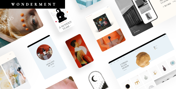
Wonderment
Agency Theme
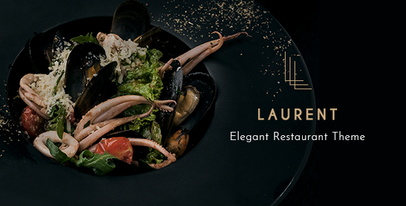
Laurent
Elegant Restaurant Theme
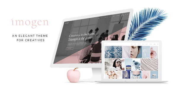
Imogen
Theme for Designers and Creative Businesses
Huge fonts and great microinteractions are a pairing we’ll often see on this list, but both are very prominent on the Canals Amsterdam’s website. The entire project is about contrasting colors and sizes, and the same principle is obvious in the fullscreen menu, too. The menu background is in fiery red while the letters are black. The name of the page you’re currently browsing becomes strikethrough, and as you hover over other menu items, the color of the numbers placed next to their name turns from black to white. The menu is animated in a beautiful, subtle way (just like the rest of the website), and exploring it surely is an enjoyable experience.
Oui Will is a digital agency that opted for a fullscreen menu on their “Disrupt” project. They created a great, unusual menu that reflects their creativity. When you open it, the menu items appear written in simple, small letters on the left-hand side of the screen. As you hover over every item, its name also shows up on the right side in a much larger font, along with a mysterious 3D object. On the far right, there are also vertically-placed helpful links, such as Close (to close the menu), Sound On/Off (to turn on or off the background music), and Contact (it enables users to reach out to the brand), which is always good to include in the menu. The shapes, animations, interactions, and the color palette used in the menu are the continuation of what you can see on the rest of the website, and this cohesive union guarantees a good user experience.
Wannabe’s website comes with two types of menus. One is the always-visible horizontal header menu, and the other one is a fullscreen menu that includes more menu items than the classic counterpart. The distinction between primary and secondary links is highlighted in two ways. Firstly, the fonts used for the two are not the same size, and secondly, they’re organized into two columns split by a vertical line and a huge “X” (Close) button placed at the center of the screen. So internal links that take you to various sections of the website are positioned on the left, while external links such as the brand’s email address and social media accounts are on the right.
The entire Badass website looks fantastic and the fullscreen menu is not any different. The menu icon has the form of an illustrated eye that follows your cursor movement the entire time. It even blinks! The only time the eye is closed is when you open the menu. Huge, black letters and the contrasting yellow background are an attractive pairing that has been used throughout the whole site to capture the visitor’s attention. On the left side of the fullscreen menu, there’s a large logo of the brand. The links that help you navigate the website are centrally placed. On the right, you have the option to close the menu, choose a language, or visit the brand’s social media channels. Badass has made sure to incorporate every element a photography and film services website should have into this online presentation.
Culture Manual’s website is another example of a website with two menus. The top navigation menu is not sticky, but the fullscreen menu placed on the left side of the screen is. This means you can access whatever section of the site you want at all times. Both menus come with short textual explanations telling you what each page of the website is about. The fullscreen menu is designed and animated in a lovely way. It’s very easy to understand thanks to the pictograms placed next to the name of each item menu. The letters are outlined, but as you hover over them, they gain color and become black.
The USSR Design Almanac website comes with a fullscreen menu that contains only numbers representing decades from the 20s to 90s. But, since this project is all about celebrating USSR design from 1922 to 1991, this kind of a menu makes perfect sense. The decades are listed chronologically and the sections dedicated to each decade are placed in a one-page layout. This website looks very striking, vividly depicting the atmosphere of those years. The designers have achieved that by combining the elements of pop-art and brutalism with beautiful animation effects making the site look like a collage.
Mixlegno Group’s website is a great example that demonstrates how different font sizes help distinguish primary menu items from the secondary ones. While this is something you’ve probably noticed on other websites from the list as well, that distinction is the most obvious on Mixlegno’s site. Because of that, it’s easier for users to navigate the website. The overlay menu looks rich, adorned with interesting graphic solutions that represent each menu item. The whole site is wonderfully animated, with great transition effects and microinteractions. There’s even a background video depicting how they make products at Mixlegno. Everything is minimal, clean, easy to use, and perfectly in sync with the company’s values.
Cusp’s website is stunningly animated and the wave effect that’s applied to images when you hover on them is particularly prominent. The site implements an infinite scroll, making your browsing adventure seem never-ending. The same effect is visible in the fullscreen menu, too, even though there are only four links in it. Next to each link you’ll notice Roman numerals (I, II, III, and IV). And while you scroll, the same four numerals show up on the screen over and over again, further indicating that the menu items appear on loop. At the bottom left corner of the menu, there’s an icon that, when clicked, redirects you to the brand’s image gallery. You can explore it by using the infinite scroll or with the drag of your mouse. The infinite scroll effect is dominant on the whole site, and because of it, everything looks soft, fluid, and very pleasing on the eye.
Thanks to their size, fullscreen menus allow for experimentation with different elements, including pictures, videos, or anything else you wish to add to a menu. That way, you can make it look more striking, but without jeopardizing its usability. Pol Studio’s website is a great example of that. Next to each link in the menu, there is a corresponding image. And thanks to the attractive imagery, this fullscreen menu doesn’t look that different from any other page on the site. The menu consists of five links, and the page that you’re currently browsing is marked with a big black circle on the left side of the menu item. The menu looks clear, minimal, and in line with the vibe of the entire website.
Ashley & Co is a minimal online shop filled with alluring imagery that suits the tone of the brand. Their fullscreen menu has two layers. The first one contains a list of all the pages of the site. And when you select any page, a second layer appears introducing you to the sections that page includes. For example, if you choose Products, numerous product categories will appear. And not only that. As you move from Wash, Body, and Hair to Accessories and Kits, images that correspond to each category change on the right side of the screen. Another interesting menu item is Scents. Here, the designers have used not only imagery that reminds you of some smells, but the background menu color also changes as you move from one scene to the next. The whole website, including the menu, is made using a pastel color palette.
If you’re thinking of including a lot of links in your fullscreen menu, that’s perfectly fine. The Klym Type Foundry overlay menu features numerous links, but it doesn’t look overcrowded at all. The designers have, once again, played with the typeface sizes, which allowed them to separate the primary links from the secondary ones. The four main links are on the left, written in large typography. As you hover over them, the background images that match the atmosphere of each link change. On the right, there’s a collection of secondary links divided into three categories. The font size is significantly smaller, so the links will not distract you, but they’re still prominent enough for you not to miss them. This menu is very clear, easy to navigate, and its colors are unobtrusive, making it look very eye-pleasing.
Mathieu Lévesque’s portfolio website is all about minimalism. The fullscreen menu features a list of all the projects Mathieu has worked on. Next to the name of each work, you can see a number indicating how many photographs the selected project features. On hover, an image or a video representing that work appears. It covers up the names of surrounding works, making you focus solely on the project at hand. The animation timing is spotless. While you move the mouse cursor over menu items, the time frame between one animation ending and the other one starting lets you easily choose the project you’d like to see, despite the accompanying images covering a large part of the menu. On the right from the menu items, there is a rotating black circle with Video Reel written on it. To see a video presentation of Mathieu’s works, simply hover your pointer over the button. Some other internal and external links are placed on the far-right side of the screen, too, such as social network links, etc.
Everyday Needs is an online shop that beautifully demonstrates how you can showcase your products within the fullscreen menu itself. This is something you’re probably used to seeing within header or side navigation menus, but it looks even better within the overlay menu, as this site shows. When users hover over the listed menu items, they can see a preview image of what awaits inside without even opening the link. The Everyday Needs’ menu features a wide variety of links organized into multiple categories. But you don’t get overwhelmed by that amount because, again, the difference between primary and secondary links is very clear. The typefaces they’ve used also look delicate and the colors are very subtle. The menu icon is particularly interesting. On the first slide, you don’t even see it. However, as you begin to explore the page and scroll down, the name of the brand (written in the top left corner) morphs into three lines that symbolize the menu. And it’s not very often we see the brand logo disappear in favor of a navigation favicon, which only further tells you how important a fullscreen menu is.
FPP is a shopper marketing agency with a stunning website that shows how animations and micro-interactions can turn a simple fullscreen menu into an impressive work of art. Everything about this website is very simple yet so effective. As you move your mouse pointer over menu items, the color of the letters changes from black to white and a wavy underline appears below the selected item name. Simultaneously, corresponding background images appear. They consist of rotating 3D elements that follow the movement of the user’s cursor.
Violence Conjugale’s website is yet another example that shows how stellar animations and micro-interactions can help deepen the connection between a brand and a user. This interactive project is all about introducing people to the most common forms of violence that happen in relationships. There are five “textversations” you can engage in. They’re showcased on the homepage in the form of clickable animated stickers or within the fullscreen menu, in textual form. The menu is simple, with a black background, and the names of each scenario are written in bright colors. On hover, parts of textversations start to float around the letters, giving you a preview of what awaits inside. This astounding project helps people not only realize what other people may be going through but also recognize the shapes of violence they might’ve been enduring without even realizing it. After every textversation, you’ll see links encouraging you to seek help if you need it.
Square is a platform where designers from all over the globe gather and exhibit their works. The whole website looks experimental, with interesting imagery, lots of flashy elements, and retro music playing in the background. The fullscreen menu is equally cool and quirky. It consists of designers’ names written in outlined letters. On hover, they fill with color and begin to float from one side of the screen to the other in an unusual, slightly curved way. Next to the name of each designer, you can see their picture as well as an image from one of their projects (you can explore projects by clicking on the preview image). The way the names of designers appear on scroll makes you feel as if you’re in some kind of a virtual cylinder that looks unlike anything you’ve seen before and is very fun to explore.
The first thing we notice about Zipeng Zhu’s website are the bold colors and its idiosyncrasy. The website is rich in simple, all-caps typography, with a unique-looking fullscreen menu. The menu appears to be divided into 8 black and white columns, each representing one of Zhu’s projects. On hover, the columns “come to life”, with lots of flashy colors and animations ambushing the screen, inviting you to explore his works. When you click on any of them, you can start browsing the gallery. If you move your pointer to the left or the right side of the screen, the names of the previous and next project appear, respectively. This horizontal way of exploring Zhu’s portfolio is a beautiful continuation of the fullscreen menu’s horizontal logic. Together, the two create a lovely, cohesive website experience for users to enjoy.

Furrow Studio is a video production studio with a black website that is very creative and fun. As you move your mouse over the dark backdrop, you slowly reveal a video displayed in the background. The fullscreen menu is vibrant red, with bold, black letters. But once you place your cursor on any of the listed works, the screen splits in two – a smaller portion of the screen on the left stays red while a video introducing you to that particular project takes up the rest of the screen. This site is wonderfully designed and it leaves a strong impression on all visitors.
Dogstudio’s website features a fantastic 3D wolf in the background that is a constant on this site, even in the overlay menu. Depending on the position of the mouse pointer, the perspective from which you observe the wolf will slightly change. The color palette used on the site, the graphics, the bird song, and the eerie melody in the background together create the feeling of magical realism on the site that leaves no one indifferent. The entire website is aesthetically pleasing on the eye and quite striking, perfectly conveying the Dogstudio’s vibe.
Every year, the Mirage Festival launches a new website to introduce their program to the public. And each time, they come up with a site that exudes brutalism and minimalism. The 2020 edition is possibly the version where those two styles are the most obvious, which especially shows in the overlay menu. The menu comes with a white background and black letters, divided into multiple rows, with textual content in a loop. When you place your mouse over a row, the letters become colorful, while the row’s hue turns to black. The way you move from one row to the next feels very rigid and sharp, which complements the overall brutalist vibe of the site. This kind of a menu gives us a glimpse into the creativity of the people behind the Mirage Festival. Each year, they manage to push the creative boundaries and introduce unique projects to the public.
The fullscreen menu on the Bounds Studio’s website looks simple but effective. The colors are dark and perfectly complemented by spectral background music. The menu items are positioned horizontally and they subtly change their hue when you move your mouse over them. No matter the element you click on, the action is followed by a “woosh” kind of sound that follows the switch from one section of the website to the next. The menu is clean, easy to navigate, practical, and also amusing thanks to the accompanying audio effects.
The Artery’s website is a terrific example that shows us how a fullscreen menu and a grid layout can be a winning combination. This pairing can be seen throughout the whole site, but the menu section is particularly fun. The menu is split into 8 squares, each with a menu link inside and a 3D animation that appears on hover. In fact, the whole site is divided into squares, with rotating 3D objects that show up on scroll symbolizing the company’s multidisciplinary work.
A Is for Albert is an interactive alphabetical website that was developed as a side project by one dad. Every letter is showcased using comical and cute animations, accompanied by fun sound effects. The overlay menu consists of “Full Video” and “About” sections, along with the 26 letters of the alphabet, each placed in a separate box. Since the letters are so beautifully laid out, you can jump straight to the letter that interests you the most. On hover, a sliding animation appears, splitting a box into four triangles while the letter stays firmly placed in the middle. The site is bursting with colors and cute animation effects, and kids are guaranteed to love it.
Each year, the website Color of the Year announces the most popular hue during the previous 12 months, and in 2019, that was the color “Living Coral”. The fullscreen menu is designed using hues similar to the winning one, and the way it appears on the screen is particularly interesting. When you click on the menu icon, the menu starts to build up from the bottom left corner of the screen, with rectangles and square shapes slowly filling out the entire screen. Each menu item has its own designated box. The cursor is shaped like a small green dot, but when you move it over the menu items, it becomes bigger and acts as a magnifying glass enlarging the letters.
The Prior Holdings website comes with an interactive animation that suits the idea behind this brand, which is to connect hearts and minds. There’s some sort of a virtual ribbon that travels through a starry universe, following the movement of the cursor, immersing users in this terrific online experience. The ribbon is present at all times, even when you open the overlay menu. The menu links are written using elegant, serif letters. When you place your mouse over a menu link, the other items become translucent while the selected one remains in full color. Browsing this website is a pleasant experience, made all the more enjoyable by the accompanying soft music.
Animal’s website is proof of how less is definitely more. It’s fun from the get-go, with various words written across the screen that disperse as soon as you place your pointer over them. As you start to explore the site, you’ll see some examples of their work and also meet the people behind this agency. The fullscreen menu is divided into two sections, each containing just one link – “Our Work” and “About Us”. At the bottom of the screen, there are also three secondary links written in significantly smaller letters. The menu looks clean and simple. But most importantly, it is highly functional.
Sound on a music website is what video on a video production company’s site is. Carl Nielsen International Competition is a competition for the clarinet, violin, and flute, and the sounds of these instruments are imbued into this site. The fullscreen menu appears and disappears with an interesting audio-visual transition. The menu items are vertically placed, and the movement of your mouse over them is followed by pleasant clarinet sounds. The way the website makers have incorporated music into this site is smart, as the melodies give visitors a hint of what the whole thing is about (even if they have never heard about this competition).
BrandStudio’s site is astounding and quite experimental-looking. You navigate through the site by clicking and dragging through remarkable illustrations while eccentric, circus-like music playing in the background. The cursor is shaped like an animated cut-off arm that makes grabby movements when you click on any element. The sounds and illustrations are implemented in the menu as well, except that the music is more silent compared to the rest of the site. On hover, menu items start to make xylophone-like noises. Our attention is fully drawn to the links displayed in the menu, but thanks to its interactivity and the authors’ experimentation with interesting graphic and audio elements, this studio has managed to create a memorable website that showcases the creative genius of its team.
Teatr Lalka is Warsaw’s oldest puppet theater. Their website is filled with different kinds of puppets that symbolize the plays this theater is famous for. The puppets move from one side of the screen to the next, and when you click on them, they make a noise and start moving for a few seconds until they return to their place. The primary links in the menu are accompanied by cute illustrations that are seemingly hung on a rope as if they were showcased in a real-life theater. The secondary menu links are tucked on the left side of the page, while the contact info, social network links, and a newsletter subscription form are all subtly displayed at the bottom of the menu.
The Stedelijk Museum Amsterdam is a modern and contemporary arts museum with a website designed in an entirely brutalist fashion. The background is white while the letters are black, but once you click on the menu, the colors invert. The links are displayed on the far left, in all capital letters, but there are also details concerning the opening hours, ticket prices, contact information, a link that takes you to an online presentation of the museum’s entire collection, and more. The latest exhibitions are listed as well, along with the corresponding photos. This menu contains all the useful information a visitor may need, displayed in an attractive and unusual way.
Basic is a branding and digital agency with a stellar website. It’s essentially quite minimal, but stunning transitions and attention to detail make it stand out in the crowd. There is a header menu that includes all the important links that might be of use to visitors, while the fullscreen menu looks wilder and features the projects and initiatives the agency has been involved with. To explore the content, you need to drag the mouse, which is suggested by the word “Drag” written on the pointer. When you hover the mouse over any project, you can discover more details about it, as well as see a link that leads you to an in-depth presentation of the selected work.
Barkli Gallery’s website looks very elegant and crisp, and the way the fullscreen menu is designed is not something you see every day. The section of the website you were exploring before you opened the menu minimizes and it’s then displayed at the right side of the menu. Its slides continue to change as if you were still on the page. At the same time, the structure of the website is visible on the left, and you can immediately jump to any other page you wish by clicking on its link. This kind of a menu looks very refined and visually pleasing, and some other brands have incorporated it into their websites as well, including Union and Citicon.
Oto Nove Swiss is a website that doesn’t contain the classic fullscreen menu, but it does come with something quite similar to it that’s based on the same principles. The navigation looks as an integral part of the site and it feels as though the overlay menu is constantly there. On the right-hand side, you can see several vertical sections containing the name of a specific menu item. Upon clicking on them, the selected page opens, taking up the whole screen. This unusual kind of a menu is always there. It’s easy to use, not to mention it makes the website all the more amusing and memorable. The same thing was done on the Nouvelle Etiquette and Off Season Creative websites.
Bruno Simon’s website looks nothing short of astounding. While there isn’t a typical fullscreen menu anywhere in sight, Bruno proves how far you can go and how experimental you can be using the elements we normally see in overlay menus. This interactive project looks like a game that we can explore either by dragging the mouse around or, even better, by using arrow keys to move a cursor i.e. a car all over Bruno’s webestate. That way, we can learn more about this creative developer while simultaneously feeling like we’re in the midst of a game.
Final Words
When designing a fullscreen navigation menu, it’s important to remember that, no matter how creative and unique your solution may be, ultimately what matters the most is for a user to easily find their way around it and effortlessly reach the section of your site that interests them. All the examples in our list illustrate how successful and striking the pairing of beauty and effectiveness can be. However, in order to achieve all that, you need to think well about how to organize the website’s content and how many menu categories you’re going to have. Logical thinking is a must, as in the end, you don’t want to jeopardize a good user experience and drive people away by having a confusing website.
