13 Beautifully Designed Property Websites
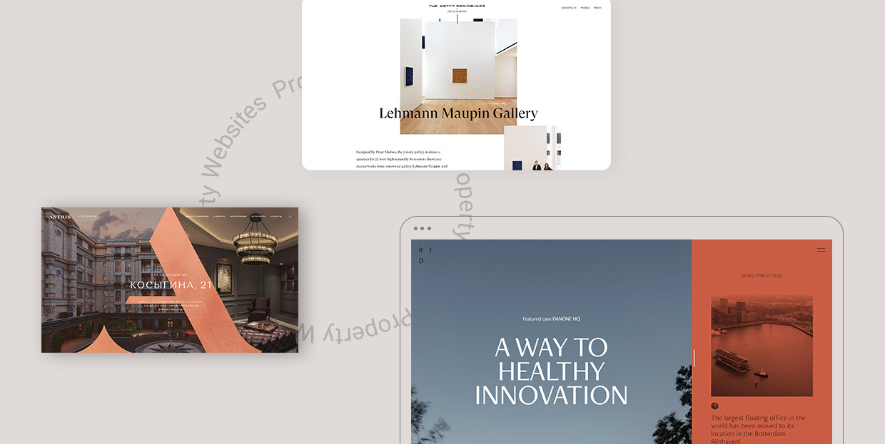
With new residences relentlessly sprouting up around every corner, property management companies and realtors are finding it challenging to reach prospective buyers. Online audiences have high expectations and are now more spoiled than ever, so if you thought that simply sharing photos of a property will help you seal the deal, you might want to think again.
Before they even start thinking of making such a significant purchase, people will want to gather as much information about a property as possible, inspect it from all angles, take a look inside, and learn more about the neighborhood they might move into. To showcase estates and their surrounding communities in all their glory, property managers nowadays rely on beautiful visuals, informative, compelling copy, and even appealing animation effects. They understand that pinpointing just technical details does not suffice. Instead, they aim to create aesthetically appealing property presentations that deliver a strong visual and emotional punch to viewers. Engaging photographs, walk-through tours, video presentations, and interactive maps are indispensable elements that help present not just the property itself, but also every single aspect of the surrounding neighborhood, from its cultural heritage to best spots for entertainment and relaxation. The more striking and engaging the visuals, the easier it is for viewers to picture themselves living in a new place.
Buying any kind of real estate is a serious investment and the property websites we will introduce you to understand that well. They are designed in a way that ensures buyers can quickly and easily find the information that may be of their interest, saving them time and energy. But more importantly, these websites pack stunning visuals and engaging effects that help establish an emotional connection with viewers that is often detrimental for business success. These websites are clean, professional, easy to navigate, creative, and their attractive aesthetic is sure to pique the interest of the target audiences. We will talk about:
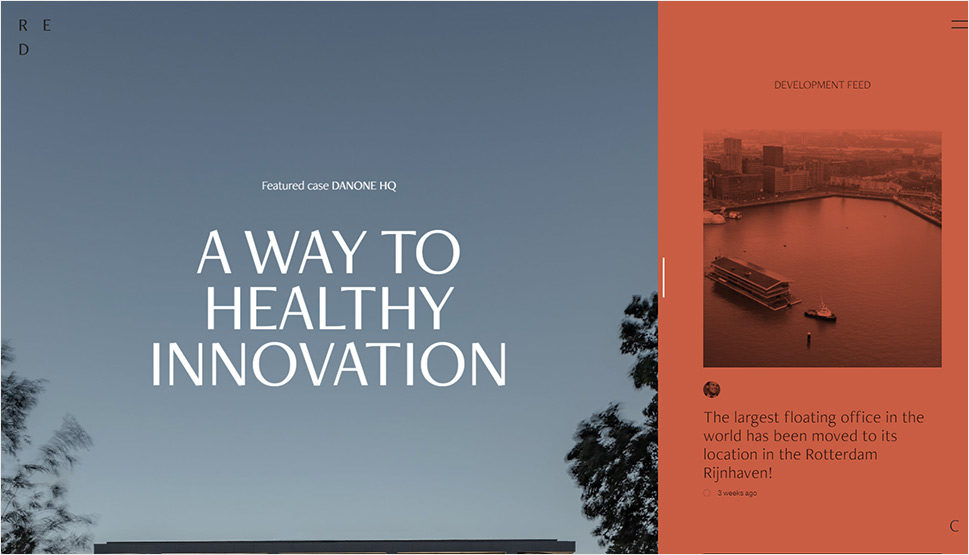
RED Company or REDC is a real estate development company from Rotterdam and this website beautifully depicts their projects, goals, and ideas. It is simple, elegant, and it relies on gorgeous visuals and subtle animation effects to bring viewers closer to their properties. The fullscreen image of their most recent project is placed at the top of the homepage, immersing you into REDC’s world of estates from the get-go. The picture is followed by a short description of that project and an invitation to either explore it in greater detail or view the rest of the company’s portfolio. Single property pages provide a detailed overview of every estate and their sleek design is highly pleasing to the eye. As you scroll down, photos that appear in the viewport become larger, bringing you visually closer to the property in question.
On the right side of the screen, there is a hidden area that contains the company’s “Development Feed”, i.e. information about their latest projects. This section is marked with a “Drag to View” button, inviting you to use your mouse to reveal the featured content. The color palette on the site is unobtrusive, with occasional splashes of brick red. This hue is predominantly used to color the sections that are about to disappear from your view as well as the inactive areas (for example, when you open the Development Feed area on the right side of the screen, the content on the left that you’re not actively exploring will turn to brick red). The hidden menu contains links to Projects, About, and Contact pages. The Projects section in the menu is particularly interesting because it contains photos of estates, their name, but also a number that tells you how many times a project has been viewed.
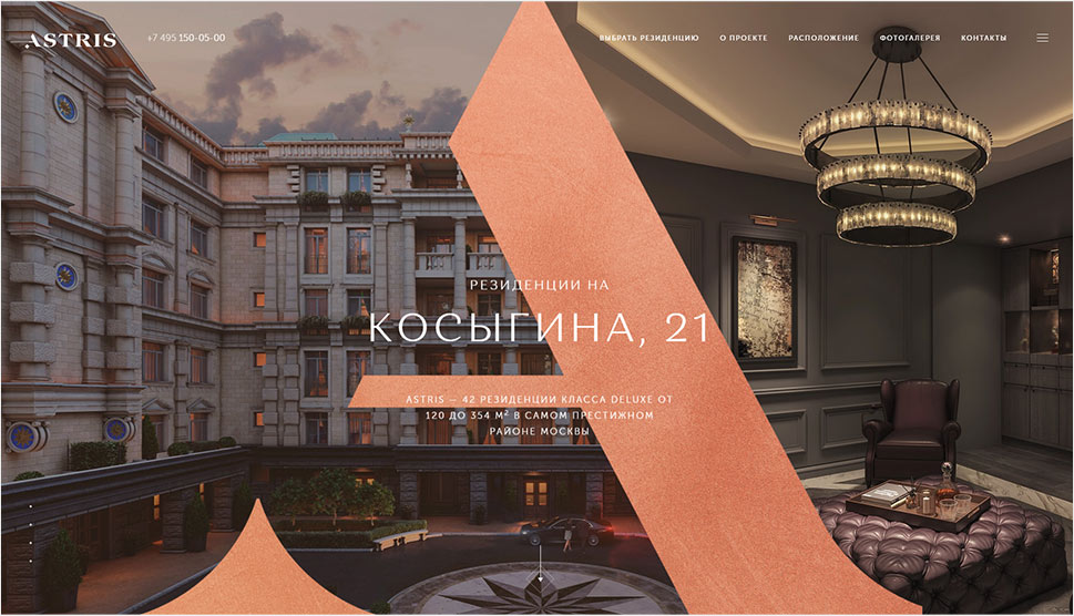
Astris is a high-end property situated in one of Moscow’s prestigious neighborhoods and the website created to introduce it to the world is nothing short of astounding. The word astris is a plural form of the Latin astrum, meaning “from the stars”. The moment the site loads, numerous stars appear on the screen, slowly assembling into the Astris building, surrounded by the dark, starry sky. The site is content-heavy, but it is so well organized and captivatingly designed that at no point do you become bored or feel overwhelmed. The main navigation is displayed at the top of every page, but there’s also a sticky hidden menu enabling you to go to any section of the site whenever you want. The refined aesthetic matches the neoclassical look of the building. You can learn more about the project itself, take a look at the apartments and the materials used to construct them, explore the history of the location and the architectural style of the property, discover places where you can educate and entertain yourself or go for a walk. The pages are bustling with engaging visuals, fullscreen photos, horizontal sliders, image sliders, panoramic photographs, as well as stunning illustrations. Animation and transition effects are subtle yet captivating. As you scroll down, the content elegantly appears, often with a smooth parallax effect, immersing you in the stunning Astris experience. The authors’ attention to detail is awe-inspiring and the end result is a commanding website that you won’t be so quick to forget.
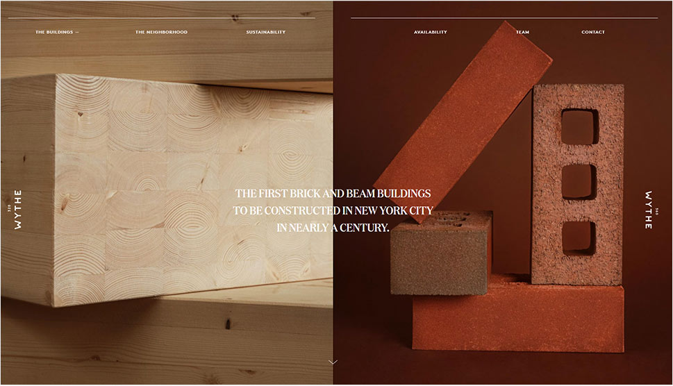
320 and 360 Wythe is a website dedicated to two buildings constructed on Wythe Avenue, in the Williamsburg area of Brooklyn, in New York City. What makes these two properties special is the fact that they are the first brick and beam buildings built in NYC in almost a century (the construction was completed in 2018). This website introduces you to both structures in an interesting way. The homepage is divided into two parts, with the left side dedicated to the property in 320 Wythe Ave. and the right to that in 360 Wythe Ave. Timbre and brick were heavily used during the construction and the photos of the two materials are the first thing you see on the opening slide. On scroll, information about the buildings and images of them appear on either side of the screen. The sticky menu is elegantly placed at the top, enabling you to jump to any section of the site with ease. Each page is bathed in a warm, earthy, sepia-like color palette, perfectly complementing the choice of construction materials. You can explore the neighborhood where the buildings are located, take a look at the floor plans, meet the team behind the project, and discover other useful information that might convince you to get your own space in 320 or 360 Wythe Avenue.
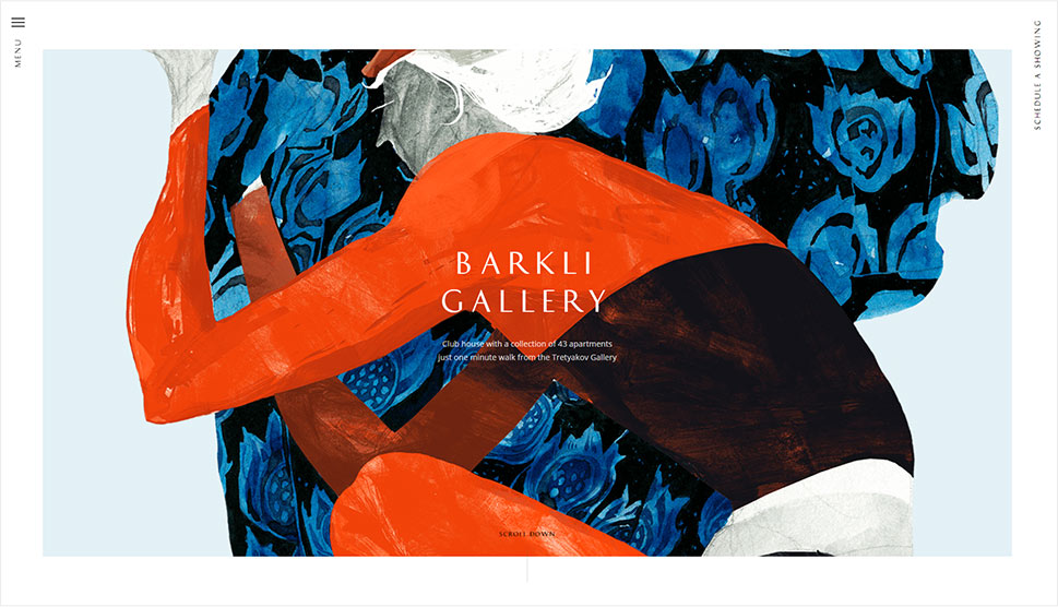
Barkli Gallery is a residential house situated in Moscow. Its architecture and interior design are heavily inspired by the early 20th-century art, in particular by the works of the Russian artist Leon Bakst, and the website’s design mirrors the same aesthetic. In fact, navigating this site at times feels more like exploring an art gallery than a residential property. The words “Menu” and “Schedule a Showing” appear at the top of every page of the site and are vertically placed, framing the opening sections. The menu itself is hidden. When you click to open it, the screen splits in two – the menu links appear on the left, while the section of the site you were viewing becomes smaller, taking up the right-hand side of the screen. The homepage contains several images and video sliders that elegantly bring the house closer to the viewers. There is also an illustrated map of the neighborhood with the most important cultural buildings and parks marked on it. Each of those spots includes a Vimeo video embed, taking you on a short tour around the selected place. The site packs a myriad of practical elements that highlight the property’s best features and help you envision your life in Berkli Gallery. For instance, you can explore every house floor, take a look at floor plans, see apartments from the inside, or enjoy a .pdf presentation of the building.
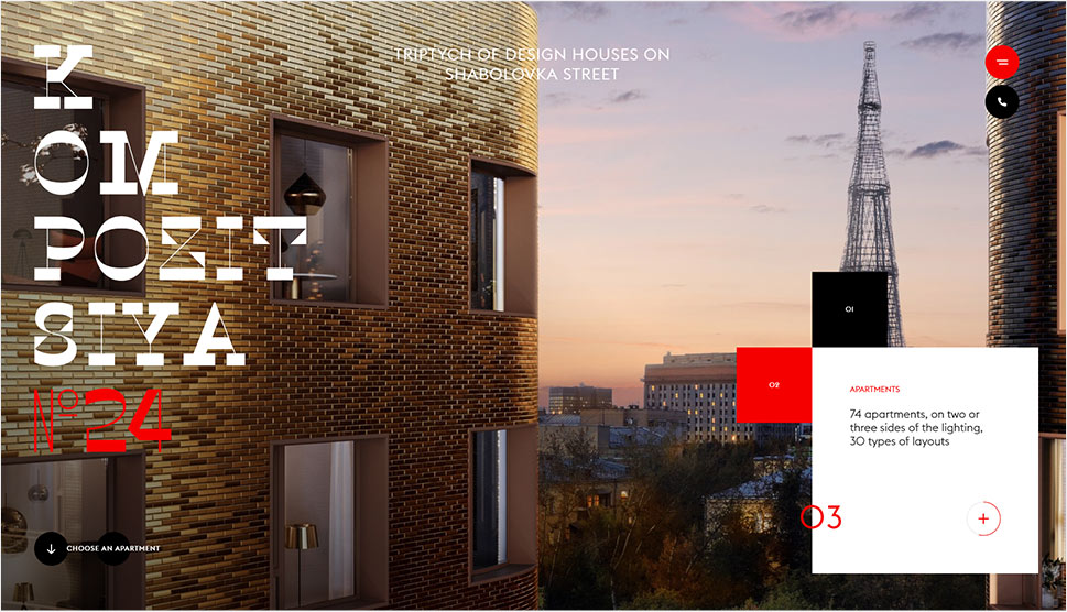
Kompozitsiya No. 24 is a luxurious residential complex located in Moscow’s Shabolovka district. The majestic website that introduces viewers to the complex has a clear constructivist aesthetic, which is evident from the very get-go. While you wait for the site to load, a plethora of various geometric shapes and lines appear on the screen from all sides, slowly assembling into a 3D illustration of the Kompozitsiya No. 24 buildings. The complex itself consists of three buildings colored in black and golden ochre with a red roof above the main lobby. Those three colors, along with the white and grey hues are dispersed throughout the entire website. The online presentation of the buildings is scroll-triggered with lots of layout changes, and that quality makes the site particularly engaging for the user. The homepage is bustling with action, rearranging itself on every scroll, with certain sections becoming bigger and smaller, making room for enticing visuals and details about the complex. Its introductory slides contain an animated fullscreen showcase of the complex and the surrounding area. On top of those photos, there are three squares glued to each other. As the slides in the background change, so does the size of the squares. This interesting design element is a shortcut that on click reveals in-depth presentations of the most important aspects of the complex, including its location, the apartments, and its private gardens. Inner pages are as exciting as the homepage, with the majority of the content gradually and smoothly appearing in the viewport. They are filled with engaging visuals and smooth image sliders that, in combination with cool typography choices, hold the viewer’s attention from the first scroll to the last. The “Gallery” page is fun to explore because its categories are displayed as interactive, see-through, outlined links. As you hover over them, they turn white, while images appear in the background, giving you a preview of the selected building area.
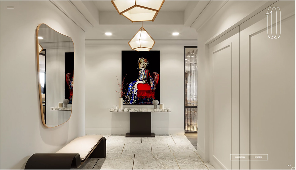
10 Prince Arthur is an upscale residence in downtown Toronto and this website perfectly showcases its grandeur. It all starts with a simple, solid pink background containing the residence’s logo, and an animated arrow inviting you to scroll down. Once you do, you’re drawn into a fully immersive fullscreen video tour of one of the apartments, making you feel as if you were there in person. The arrow is visible on all pages and it stays in the middle of the screen as long as there’s more content to explore. Browsing this site feels like flipping the pages of an editorial, especially while exploring sections that include images. Most photos appear on the screen with the alluring parallax effect. They are also quite large, often taking up the entire screen. The copy is concise, informative, and written using refined fonts. The navigation is particularly well-thought-out. The hamburger icon is sticky and visible at all times. On click, it reveals a fullscreen menu. While you move the cursor over menu links, fullscreen images appear in the background, illustrating each menu section. There is also an animated downward-pointing arrow at the bottom of the screen, signaling that there is more content to be seen on the selected page. And when you reach the bottom of the homepage, the menu automatically appears, inviting you to continue exploring the site. The showcase of the 10 Prince Arthur residence also includes an illustrated, grayscale interactive map of the neighborhood, which further adds to the site’s appeal. When you hover over the featured buildings, corresponding photos appear next to illustrations in full color.
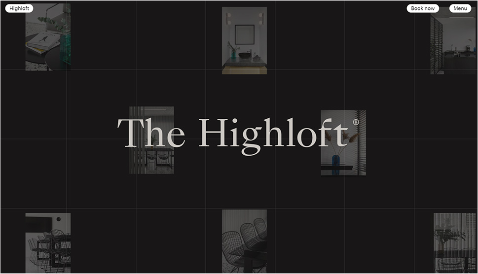
The Highloft is a space in Athens that you can rent for any type of event. The loft contains lots of tiles and blinds, and that characteristic translates into the website’s design. The pages are divided into squares, i.e. tiles. When you click on any of the site’s links and wait for them to load, the screen splits into several parts. Each section then gradually turns to black and disappears from view, revealing the content and mimicking the closing and opening of blinds. At the top of the screen, three practical buttons ensure easy and efficient navigation – one takes you to the homepage, the other to the booking form, while the third button launches the fullscreen menu. When you move the cursor over each menu link, corresponding preview images appear as visual cues for visitors. The homepage starts off with just the name of the space and several photos of it placed in the background. As you move the cursor around the page, the images will start to follow the mouse movement. A bit further down the homepage, there is a short introduction to the Highloft placed on notes that, after several scrolls, disappear from the screen, one after the other. There are several image sliders peppered throughout the site, as well the floor plan of the loft and detailed information about the space. The scrolling “Book Now” text is displayed at the bottom of every page, inviting you to click on it. The color of the background on every page alternates between black and white and so does the color of the fonts. The typography is simple and perfectly matches the industrial vibe of both the site and the loft.
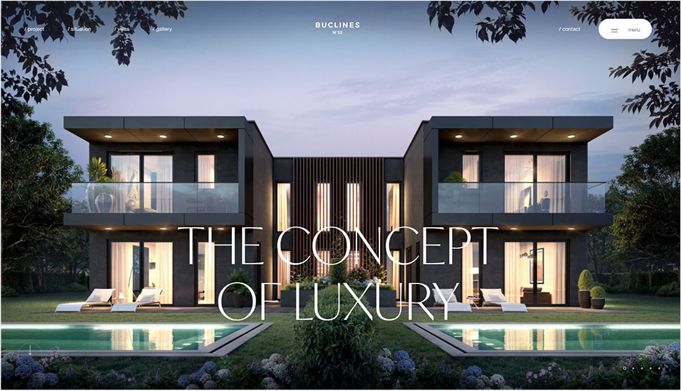
Buclines N°32 is a residential project that consists of two villas located in Geneva. The website’s aesthetic matches that of the houses – it is modern, sleek, refined, andvoid of superfluous detailing. Finding your way around the site is easy. Links to inner pages are placed in a sticky header. The hidden menu icon is visible at all times as well, granting you quick access not only to every section of the site but also to the social channels dedicated to the project. As you hover over the menu items, corresponding images appear next to every link, as a sort of visual cue. The black background helps place the content into the spotlight. On every page, visuals and text elegantly slide up on the screen from the bottom, subtly revealing useful information about the villas. The elegant font combinations of sans serif and serif typefaces beautifully complement the aesthetic of the project. The site contains lots of engaging imagery that sometimes stretches across the entire screen and appears in the viewport with the parallax effect. Almost all pages feature some sort of a 3D geometric shape, such as a cube, a pyramid, or a circle, further adding to the site’s contemporary feel. There are also video presentations of the villas both from the inside and the outside, as well as all the necessary details about the rooms. You can even download brochures about the villas and their floor plans, to ensure they are the right fit for your needs.
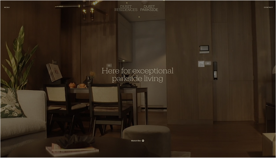
Duisit Residences are luxurious properties located next to Bangkok’s Duisit Central Park. The website starts off with a fullscreen preview of a movie highlighting the benefits of living parkside in these apartments. The menu is located in the top left corner. When you open it, it slides onto the left-hand side of the screen. It is semi-transparent, so you can still catch a glimpse of the content behind it. As you scroll away, the slider disappears with a smooth parallax effect, and you are introduced to a striking combination of beautiful visuals and succinct copy, revealing a compelling story about Duisit Residences. You can explore the featured map to discover more about the neighborhood, find nearby fitness centers, hospitals, etc. Moreover, the site contains a practical news section, where you can keep up with the latest announcements regarding the residences and the Duisit Central Park.
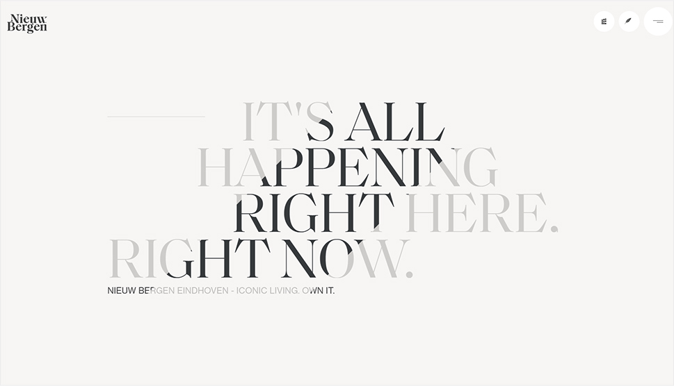
Nieuw Bergen is a residential complex located in Eindhoven. It consists of seven extraordinary buildings with 45°-angled roofs. Each property is named after one of the seven colors from Newton’s color spectrum – red, yellow, orange, green, blue, indigo, and violet, and this website accentuates their unique architecture. One of the first things you see on the site is the presentation of the Nieuw Bergen project designed as an animated timelapse. You witness the evening turn to night and watch the lights illuminate these astounding buildings. Large typography and huge images appear as you move further down the page, revealing informative and interesting details about the project. The content appears on the screen with smooth entry animations, further adding to the site’s captivating vibe. There are two types of hidden menus – the “grid” icon opens a horizontal slider with images of the seven buildings, while the hamburger icon opens the main site navigation. Pages containing individual presentations of the buildings include large and fullscreen images that look like posters from a magazine, fully immersing the viewer into the Nieuw Bergen experience. The site also has a map of the area with all the most important locations marked on it, as well as a handy list of nearby schools, restaurants, bars, cultural spots, etc.
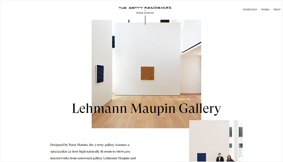
The Getty is a high-end building that consists of five unique residences, a private art museum, and an art gallery. It was designed by the famous architect Peter Marino, known for his work with the world’s largest fashion houses, such as Armani, Chanel, Dior, and many others. The building is constructed as a place that unites art and the luxurious lifestyle, and this website embodies that idea as well. The presentation of the Getty project is sleek, simple, yet striking. Marino’s quote that the Getty project is his work of art is displayed at the top of the homepage, along with video footage of Marino being interviewed. Aside from breathtaking photos of the residences from the inside and featured project sketches, each page also includes numerous quotes about the project and Marino from notable magazines and newspapers, such as The New York Times, Vogue, Architectural Digest, and many others. Each residence presentation contains several images of the place that slowly slide in on the screen. There are also descriptions of every apartment as well as floor plans, helping viewers understand the position and size of each room.
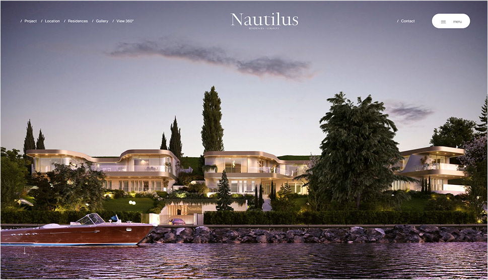
Nautilus is a project that consists of three residences situated in Cologny, overlooking the lake Geneva. The website was designed by EWM Swiss – the same company that created the Buclines N°32’s site. Aesthetically speaking, the two sites look very much alike. The digital showcase of Nautilus also has a dark backdrop which serves as an ideal canvas for displaying large images of the residences and the surrounding scenery. There’s also a video tour of Nautilus, showcasing the property’s impressive features in all their glory. Navigation is intuitive and simple, with the fixed menu and an arrow that cues visitors to scroll down and discover more about this lakeside project. What sets Nautilus’ website apart from that of Buclines N°32 and other sites on the list are the 360° views of residences. This fully immersive experience makes viewers feel as if they were visiting the property in person, exploring it from all sides and in great detail.
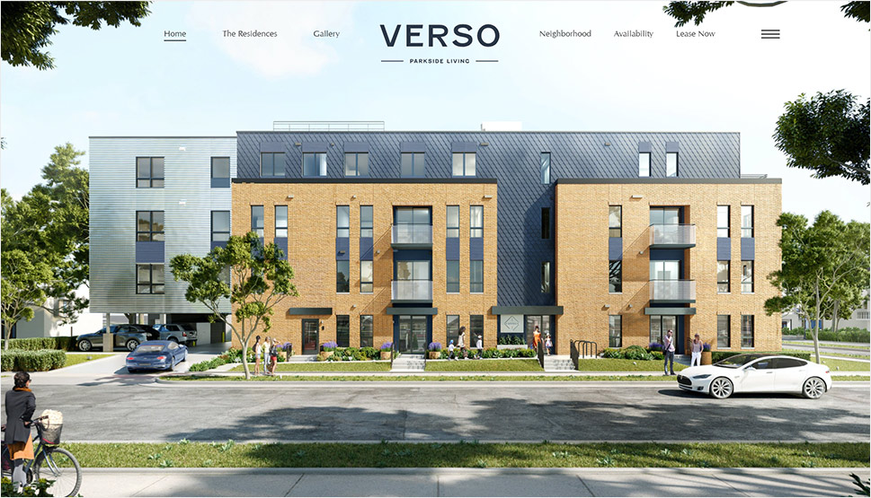
Verso’s mission was to create residences that connect people with nature, and that idea translates into the website’s design. The background is adorned with charming illustrations of flora, while many of the featured images accentuate the greenery surrounding the property. The site enables you to view floor plans of each apartment, explore the map of the entire neighborhood, learn more about the places surrounding Verso, check apartment availability, schedule a virtual or in-person tour of the place, as well as reserve your spot in the building. To ensure you can enjoy an unobstructed view of the site’s content, the menu is hidden from immediate view. You can see it either by clicking on the hamburger icon or by using the menu links placed at the top of a page. Of all sections on the site, the masonry image gallery is particularly fun and appealing to the eye because of its interesting layout. The entire site is rich with appealing photos and informative copy, creating a vibrant illustration of what life in Verso is like.
Closing Words
Designing a property website allows for a lot of creativity. As the examples on our list illustrate, you can showcase an estate in a number of gripping ways simply by using beautiful visuals and alluring effects.
The parallax effect is particularly popular, but there are other interesting animation and transition effects you can use to highlight the benefits of a property. Creating video tours is especially effective, and not just of the property itself but of the entire neighborhood. It’s important people can get to know the entire area better so they can understand if it’s the right fit for them. Interactive or regular maps are another useful addition. Not only do they allow you to display the location of the property, but also mark cultural spots in the area, restaurants, schools, and other places that could be of prospective buyers’ interest. You could also consider enabling potential residents to schedule a virtual or in-person visit, as that might help you finalize deals and make sales.
These are just some of the most common elements featured on property websites, but of course, you don’t have to use them all. Try to put yourself in the shoes of the buyer and consider what sort of information you would find useful, and then work on the presentation. Experiment with effects and styles, but most importantly, ensure that your website is intuitive, informative, and that it provides a beautiful and immersive introduction to your property portfolio.


