What is a Landing Page and Why Is It Important
You’ve set up a beautiful WordPress website and visitors are streaming in daily. But barely any of them are converting into customers and you have no idea why. Well, odds are you’re not using landing pages.
Landing pages are different than any other page on your website. They are one of the most practical tools for turning page visits into profit. If you manage to hone yours in a way that’ll whet the appetite of your target audience, you’re sure to turn visitors to leads, and ultimately, into paying customers. But what exactly is a landing page and why is it important to your business? Let’s take a closer look and find out how you can use landing pages to your advantage.
What Is a Landing Page?
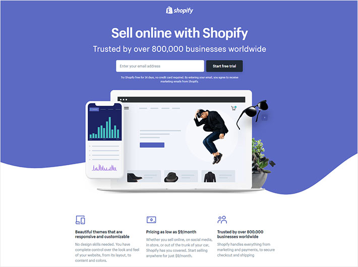
The page visitors land on after clicking an ad, a post, or a CTA in an email is called the landing page. These standalone pages help direct the attention of your visitors to a single objective, which makes them crucial in terms of reaching your marketing and sales goals.
The sole purpose of landing pages is to convert. They offer feasible solutions to visitors and are crafted with the purpose of persuading them to take further action. Whether you wish to promote teeth whitening services, offer a free trial for a game you’ve developed, or get people to register for a webinar, landing pages are the way to go.
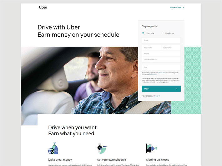
Since they come with a narrow purpose, if crafted well, you’ll see no navigation on landing pages. The goal is to incite visitors to take further action, and not have them wander off elsewhere. You don’t want to risk harming your conversion rates in any way. Which is why landing pages should be conversion-centric and navigation-free.
If you decide to run multiple marketing campaigns, make sure to set up a dedicated landing page for every single promotion. The more landing pages you have, the better for your business. You don’t want your products to ‘steal’ traffic or conversions from each other, do you?
Ideally, each landing page should have one goal and one call-to-action button.
Why Is a Landing Page Important?
If you truly want to create a prosperous business and run a successful company, simply setting up a website and then forgetting about it just won’t do. In other words, you need to make an effort to reach your audience and convert them into paying customers. Landing pages offer a highly targeted approach that helps you do just that.
Not using landing pages, on the other hand, can be detrimental to your marketing efforts. Especially when it comes to online advertising.
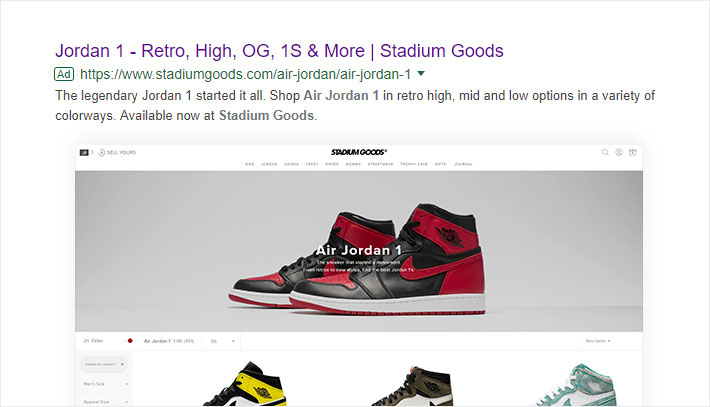
Let’s say you’re using Google Ads to advertise your products. If you haven’t set up separate post-click landing pages for each of your campaigns, Google could penalize you. For example, if Google decides the content on your landing page isn’t relevant or that it doesn’t relate closely enough to your ad’s text and keywords, your ad might not be as visible in search results. This could mean less traffic and, ultimately, fewer sales.
But it’s not all about paid ads either. Remember: landing pages are essential for all your marketing.
Suppose you’re planning a newsletter campaign with the goal of boosting the sales of a specific product. You don’t want someone clicking on your “Buy Now” button only to land on the homepage of your site and have to search through all your content in order to make a purchase. Instead, you want to lead them to a landing page that explains all the benefits of the product in detail and gives them a quick and convenient way of buying it. You want to focus their attention and get them to take action, without any distractions.
Landing Page vs. Homepage
In most cases, your homepage will be the first page visitors see when they stumble upon your website. Since it’s not easy to predict their behavior and understand what they might want to do next, every homepage comes with a navigation bar and internal links. This enables visitors to easily find and learn about whatever interests them.
In the world of online marketing, it’s not that uncommon to see advertisers that have set their homepage as the landing page. However, if your goal is to increase conversion rates, this actually isn’t the best option to go with. Picture this. You’re running a sports store, and at some point you decide to promote basketball shoes through a paid ad. Someone stumbles upon your link, clicks it, and ends up on your homepage where there’s a little bit of everything, from hoodies to weight plates, numerous CTAs and far more. In order to find the basketball shoes you promised though, they have to dig further. Since you have about 8 seconds tops to capture their attention, chances are people will most likely leave your web page.
The thing is, your visitors want specific information served up immediately, without having to scroll too much and browse through various sections of your website. And that’s where standalone landing pages come into play.
The more choices you give your visitors, the harder it’s going to be for them to decide. So don’t give people the option of jumping to other pages of your website. And don’t overexplain things or try to include everything you consider important about your business or the product you’re selling. Focus on one message. A relatively short page that contains relevant information and a single strong Call to Action is usually a winning formula.
The Anatomy of a Landing Page
When crafting the content for your landing page, there are several things you need to be mindful of.
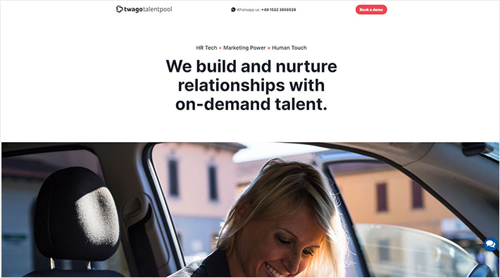
The first thing visitors will see on your landing page is the headline. So make sure to create a compelling one that will entice them to stay on the page. It’s a good idea to introduce your unique selling proposition (USP) in the headline, and immediately let visitors know why they should choose you over the competition.
The goal of the headline is to grab attention and convince potential customers that they’ll find a solution to their problem right then and there. Consider starting with a ‘‘How to…’’, as that tells the customers that they’ll learn something, or use a headline that calls to action. Everyone wants to find a solution to their problem quickly, which is why it’s important to get straight to the point.
Even though it may not be necessary, it could be useful to add a subheading after the headline. This is where you can further talk about your offer and your USP, and go more into the details of what makes your offer completely irresistible.
In order for your landing page to be as effective as possible in converting, make sure it delivers precisely what you phrased in the add. In the field of digital marketing this is called the message match. It refers to just how much the content of your landing page matches with the ad. Deliver what you promised, and by doing that, you’ll convince people that they’ve come to the right place. As a result, you won’t have to fret about the bounce rate.
Talk about the benefits of your offer. Tell the visitors what’s in it for them, and what they’d gain if they were to move further down the conversion funnel.
An attractive call-to-action button is what will bring you closer to your conversion goal. Its purpose is to encourage people to complete an action, which can range from signing up for something to making a purchase, etc. Pay attention that the message in the CTA corresponds to what you said in the heading, in order not to confuse the visitors.
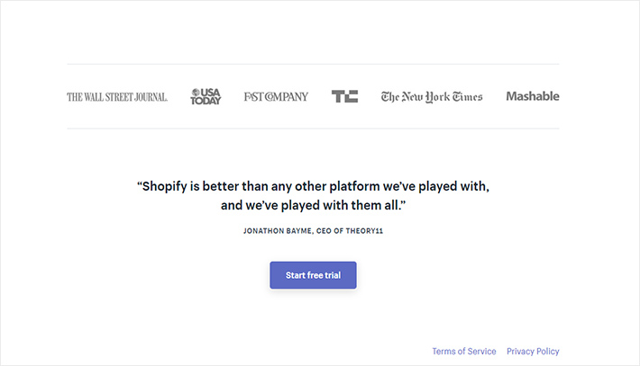
Consider featuring testimonials and achievements as well in order to win the trust of your crowd. For instance, you could add the logos of the companies that use your services, or even some simple statistics. Don’t overdo it though, as you don’t want to create distractions. Simply let everyone know that your brand is proven to be trustworthy.
Last but not least, include social share buttons at the bottom of your landing page, as that can significantly increase the virality of your content.
It’s well known that a picture is worth more than 1000 words, which is why every good landing page should contain visuals. Whether that’s an informative image or an explainer video, it’s good to show to the visitors how they would benefit from using your product.
Testing Landing Pages
To see what works best for your brand, it’s necessary to A/B test your landing pages. Run tests up to a week, or even longer if needed. You need to obtain relevant results and keep an eye on the statistics. You might find out you need to change the overall look of the page and the data you require in forms, enhance the copy content, or tweak the design a bit to make the page convert better.
Don’t forget who your target audience is and work on creating content that’ll fit their taste. The thing is, by constantly working on improving your landing pages you’ll get better results, the page will perform to its full potential and you’ll get closer to conversions.
Different Types of Landing Pages
There isn’t just one type of a post-click landing. In fact, there are numerous types that you can choose from, depending on your needs. Here are some of the most commonly used ones.
Lead Generation Landing Page
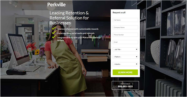
These pages, as their name suggests, are crafted for capturing leads and for establishing a large contact database. You want to identify as many potential clients as possible, since that’ll help you eventually expand your brand. This type of landing pages is mostly used for B2B marketing, so you can engage with your prospects and send them relevant information over time.
Click-Through Landing Page
Click-through landing pages come without a form to fill out. You need to make sure they are super engaging, since their purpose is to incite your visitors to click through to another page. The ingredients that a high-converting click-through landing page should have are: a compelling headline, a subheading where you’ll provide more explanation, a hero shot or a short video about the product you’re trying to sell, a user review, and lastly a CTA button. Avoid adding a Buy button on a landing page, though. Your goal at this stage is to persuade people to go to another page where they can take further action, such as purchase your product.
Squeeze Page
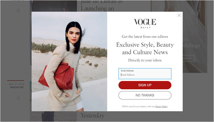
This sort of page is created with the sole purpose of capturing the visitors’ email addresses. They are usually very simple, with only a short form on it and the content which briefly explains what you have to offer. This kind of pages is normally followed by a thank you email.
Sales Page
Sales pages are crafted with the purpose of promoting only one offer and ensuring the sales of a specific service or product. They can be either short or long in form, depending on how much you want to go into detail. A sales page should have an alluring headline, top quality copy content, a CTA button, and testimonials.
Infomercial
These pages are usually filled with text, and you can use them to inform your target crowd about the product or the service that you’re offering. Beside text, infomercial pages can sometimes contain a product image or a video, so that the visitors can get a better picture of your offer.
Splash Page
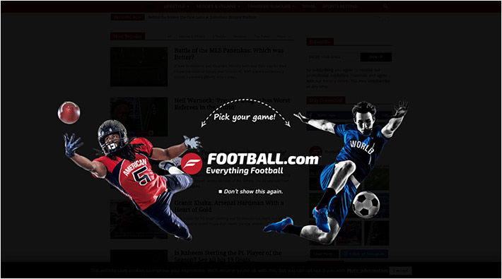
This isn’t an actual page, but more of a large window that pops up on the visitors’ screen before they end up on their final e-destination that you’ve set. Normally, you don’t ask any of their details on a splash page, but rather provide important information to them. You can make an announcement, let them choose a language of the page that will follow, feature a giveaway to make them excited about what comes next, etc.
Viral Landing Pages
The goal of a viral landing page is to be spread to as many people as possible. It’s not enough to have visitors just sign up for something, you also want them to talk to others about what they found. It’s important to keep the content of the page interesting and engaging, and to include social share buttons, so that the page can properly go viral.
Landing Page Design
The design of a landing page is just as important as its content. It’s essential the design supports (and, in the best cases, enhances) the copy. You want to create a visually stunning page that resonates with your target market in order to pull visitors in.
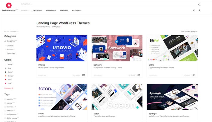
If you’re not comfortable with designing a landing page from scratch, you can always hire someone to do it for you, or use a professionally designed WordPress theme as your starting point. Still, there are certain principles you should stick to, even if you’re just customizing an existing design to fit your needs. Use images that could evoke the emotions you want from your target audience and keep things simple. Don’t go overboard with colors, harmonize them, and stick to a total of 3 or 4 colors. Another thing that you should pay attention to is contrast. It’s important to highlight the headline and the CTA, so go for the colors which will make them stand out from the rest of the page.
The logo of your brand should be immediately visible, in order to gain the visitors’ trust, so it’d be for the best to place it at the top of a page.
Last but not least, make sure your page is fully responsive and that it loads fast on mobiles. You don’t want to risk a high bounce rate just because it takes too much time for the images to load.
Wrapping Up
Landing pages help you turn visitors into leads, and eventually, into paying customers. They enable you to reach your target audience and offer them something of interest. Keeping your landing pages free of anything even potentially distracting is a must. You don’t want anything that could prevent people from clicking the call-to-action button or filling out the sign-up form. It’s for the best to keep them uncluttered and designed in a simple but captivating manner. Most importantly, they need to meet the expectations your visitors have when they first see your ad. Stick to these straightforward principles and your landing page will surely start converting better.
