How to Create an Info Box in WordPress

If you wish to add more credibility to your brand and engage your visitors in a practical, but captivating manner, info boxes are just what you need. By incorporating these handy elements into your site, you can convey all sorts of useful messages to your visitors. An info box can help you effectively present anything and everything related to you and your brand – from offering useful information about your company or the people you work with to sharing useful links and showcasing any pieces of content you’re proud of, all the way to highlighting important characteristics about your products and services.
This time around, we will show you how you can easily create, stylize, and add an info box to your WordPress site using the Qi Addons for Elementor plugin and its versatile Info Box widget. This widget is packed full with tons of different customization and stylization options, allowing you to craft all sorts of diverse and engaging info boxes and add them anywhere you want on your site. We are going to go through all the steps needed to create one such element from scratch, and share most of its available options, so make sure to keep reading.

Creating an Info Box in WordPress With the Qi Addons for Elementor Plugin
Coming with 60 premade custom widgets, Qi Addons for Elementor is easily one of the most versatile collections of Elementor addons on the market, including anything from creative and showcase addons all the way to WooCommerce and business-oriented ones. It allows you to build and add all sorts of beautiful and practical elements to make your website pages and sections appear more unique, professional, and engaging as a whole.
One such element is the widget we will talk about today – Info Box. Not only is this widget extremely practical and easily customizable, but it also comes with all sorts of stylization options that will allow you to style your text, icons, and buttons, as well as add different kinds of backgrounds and background images, set borders and paddings, and plenty more. In short, you’ll get everything you need to present any kind of information to your visitors in a visually appealing and captivating manner.

Without further ado, here’s our step-by-step guide you can use to learn how to create info boxes using the Info Box widget to help improve your user engagement and ultimately increase conversions on your WordPress site. And if you prefer to watch videos, we suggest that you check out our video tutorial on the same subject:
Adding the Widget to Your Page and Customizing Its Content
Once you go to your Elementor page, first you need to search for an Info Box widget in the Elementor sidebar.

Drag it to the right side of the screen, and you will see what the info box widget looks like by default. It consists of a title, subtitle, and text field.

To start off, you should replace the default subtitle text with your own in the Subtitle field (located in the General options section on the left), just like we did:

Then, right below, there’s the Title field, where you will get to insert your desired title.

Finally, in the Text field, you will be able to place your text.
This text will appear in the larger section of your widget, right below the title and subtitle:

Then, by clicking on the Icon Type field, you will open the icon library where you will be able to change your icon.
We’ve searched the library to find the chart icon because that’s what we wanted to use for our example:
You should select your desired icon here and then hit the Insert button.
Here’s what our new icon looks like when inserted within the info box widget:
Next, you can make your info box clickable if you add a link in the Link field. We’ve only set a hashtag as a placeholder, and this will be enough for the button to appear in our widget:

The Enable Link Overlay option will allow you to choose whether the link you’ve selected will cover the entire info box like an overlay or not. By selecting Yes, the entire widget will become clickable – wherever you hover with your cursor (this is the option we’ve selected for our widget). And if you select No, only the button, the title, and the icon will be clickable. We’ve enabled the link overlay for our info box widget.

Next, by clicking on the Button section, you will open a whole new set of options dedicated to the button settings.

The first one is the Layout option that allows you to choose the type of button you will use – Filled, Outlined, or Textual (this is the one we’ve set for our button):

Afterward, you can also choose whether you want to Enable Button Text Underline, and replace the Button Text, like we did:

Next is the Button Icon section where you can pick an icon for your button. Once again, you will be able to choose the icon from the library or hit the Upload SVG button to upload your own.
We’ve used an SVG that is already in our library. Just make sure to hit the Insert Media button once you’re done.

You can also choose whether the Icon Position will be on the left or on the right of the button text (we’ve chosen the latter for ours):
Styling the Info Box Widget
Now, we will explore another set of options located in the Style tab. Here you will be able to set the styling of your info box in complete detail.

First and foremost, in the Style section, you will be able to set the minimum height (Min Height) of your widget. You won’t see the changes right away if you start increasing its values, but once the values surpass the default ones, you will see that the height of your info box has increased.

Then, you can use the Content Vertical Alignment option to move the position of your widget’s content. You can place it at the top, in the middle, or at the bottom.
We’ve put ours at the top and restored the minimum height, since we only wanted to show you how the space around your widget can change depending on the options you pick.

Similarly, the Alignment option will let you align your content to the left, middle, or right. You should note, however, that this option does not affect the icon – there’s a separate option for that, but more on that later. As for our content alignment, we set it to Center:

Next, you will be able to use the Normal and Hover toggle switches to set the background type option underneath and determine what your background will look like when the info box is displayed normally and on hover. We will be showing you how to set this option when the switch is set on Normal first.
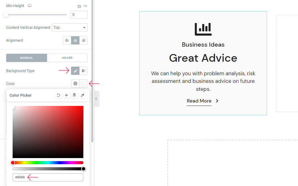
The Background type option itself has two options – Classic and Gradient. The classic background type lets you add an image as your background or choose a solid color instead.

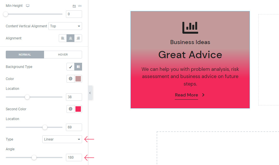
The second, gradient type allows you to set the gradient, two-colored background. After you pick the first color, the second color will activate automatically. Of course, you can change the second color according to your preferences as well. We’ve picked the hex code #C39A9A for the first, and #F2295B for the second background color, just to show you a quick example of what this background type can look like.

You can also use the Location option to determine how much space the color will take up. The same option is available for the second color as well.

The Type option will allow you to pick the Linear or Radial gradient background type. If you choose the Linear option, you will also be able to use the Angle option and shift the angle where the colors blend.
By choosing Radial, you get the possibility to choose the origin point of the first color from the dropdown. Some of the available origin points include Center Center, Center Left, Center Right, Top Center, and so on.

These were just a few examples of what your info box can look like if you opt for the Gradient background type. Of course, you should feel free to play around with the options until you find the combination of colors that work the best for you.
If you choose the Classic background type, you will be able to pick one color either by using the color selector or entering a hex code. We’ve chosen a light gray color for ours using the hex code #f9f9f9.
All these settings were related to the Normal display of the info box widget. Once you switch to Hover, you will be able to set the option called Hover Color. This option will allow you to choose the background color that will appear when you hover over your info box. We’ve used the hex code #f3f3f3 that will make this background color just a tad darker than the normal background color:

Next, you can use the options to style your text. The first one is the Title Tag option that will allow you to choose the title tag from H1, H2, H3, etc. We’ve used the H2 title tag for ours.

The Title Color option allows you to set the color of your title, while the Title Hover Color lets you choose the color that will appear when you hover over your title. Here’s an example of what your title can look like when you hover over it:

The Title Typography is a whole separate set of options you can use to further adjust the look of your title’s fonts, including picking the font family, font size, weight, style, using the decoration options, and so on.

Then, you have a similar set of options for the Subtitle – including the Subtitle Tag (we’ve chosen the P tag for ours), Subtitle Color, and the Subtitle Typography with the same set of options like the Title Typography. The only thing we’ve changed in the Subtitle Typography options is the Weight, which we’ve set to 500.

Finally, you also have the Text Color (allowing you to choose any color you like for the text) and Text Typography options (the same as Title and Subtitle Typography options).

Moving on to the Icon Style section – here you will find a list of options allowing you to style the icon of your info box widget.
The first option allows you to set the Icon Alignment, like the text alignment option we’ve mentioned in the beginning. You can use this option to make the icon match the alignment of your text. We’ve left ours at the center to match with the text content.
As its name indicates, the Icon Size option allows you to determine the desired size of your icon. We’ve put 50px here.
The Icon Color uses the standard color picker to choose the color of your icon. We’ve added a hex code (#dbdbdb) and made our icon appear light gray.
Last but not least, you have the Icon Hover Color – keep in mind, however, that this option will work only if you don’t have the link overlay option enabled. So, in case the color you picked for the icon isn’t showing on hover, you should go back to the Content tab, disable the Enable Link Overlay option, and the setting you picked will work.
The next, Spacing Style section, takes care of all the options related to the spacing of the elements in your info box.
One such option is the Holder Padding which creates more space around your info box content. You can set the same values for each field at once, or delink the values to enter the separate value for each field (top, left, right and bottom). We’ve delinked the values and entered 93px for the top, 103px for the bottom, and 0px for the right and left field.

Right after, there’s the Subtitle Margin Bottom option you can use to add more space under the subtitle. We’ve put 7px here.

The Title Margin Bottom option allows you to do the same, only for the space under the title so you can have more space between the title and the text (we’ve set it to be 15px).

The Text Margin Bottom lets you put more space below the text and thus push the button in your info box lower. We’ve entered 29px here.

The Text Padding option will let you create more space all around your body of text. We’ve delinked the fields to set different values for each field and used percentages. So, we’ve put 12% for the right and left text padding:

Finally, the Icon Margin is the last option, allowing you to increase the space around the icon (we’ve set it to 24px).
The Button Style settings contain a whole other set of options you can use to style your button.
Once again, there are the Normal and Hover switches containing a separate set of options to style the look of your button when displayed normally and on hover.
In the Normal toggle switch, you can see there’s the Text Color option. As our button is set to be pretty minimalist, there’s only one option available. But if you were to choose a Filled or Outlined button type, for example, this is where you will also be able to set their background and border colors, respectively.

Another set of options you will only be able to use if you pick a FIlled or Outlined button type are Border Width, Border Radius, and Border Padding.
So, here’s what this section can look like if you choose one of the other two available button types:

In the Hover toggle switch, there is the option allowing you to set your Text Hover Color (with the Background Hover Color and Border Hover Color options also available if you choose one of the two other button types).

Finally, there’s also the Typography option in the Button Style settings which has the same settings we’ve mentioned in other typography options so far. We’ve used these options to set the button text size to 17px.

Moving on to the Button Icon Style section – here you will be able to use the options to adjust the icon that appears on the right of your button text. You can move the icon slider or set the size in the box next to it (we’ve made it to be 6px).
You can also change the Icon Color that appears in the normal display setting.
Now, the Hover switch has only one option named Move Icon that allows you to choose the way your icon will move when hovered upon (which will create a small animation of sorts). You will be able to choose from Horizontal Short (which is our default), Horizontal, Vertical, Diagonal, and None.
Here’s an effect one of these options can have on your button icon when you hover over it:
Afterward, you can use the Icon Margin option to set the values and change the position of your icon (and move it closer or further away from the button text by doing so). We’ve delinked these fields and put 3px at the top and 10px on the left (leaving the others blank).
The Button Inner Border style set of options is empty because we are using the Textual button layout for our button example. So, to use these options, you need to pick the inner border layout instead.

On the other hand, the Button Underline Style is an option that we were able to use since we’ve enabled the Button Text Underline option in our Content settings tab earlier.
Once again, there are Normal and Hover switches. Under the Normal switch, you will have the option to choose the Underline Color (so you can set the color of the underline only without affecting the button text or its icon).

The similar option (Underline Hover Color) is available in the Hover display. It allows you to set the underline color that will appear only when you hover over your button.

Another option is the Underline Hover Width (with the same version available under the Normal switch called Underline Width). We’ve left both of these settings at default, but if you want, you can use these two options to change the width of the underline.

Another option in the Hover settings is the Enable Hover Underline Draw option that allows you to add an effect to your underline that will appear on hover. Here’s what this effect will look like when you switch this setting to Yes:

Apart from the settings in the Normal and Hover tabs, there’s also the Underline Offset option that lets you move the underline closer or away from the button text. We’ve set 6px for ours.

The Underline Thickness is another option available here that can be used to make your line thicker.

Last but not least, the Underline Alignment option allows you to use the dropdown and choose Left, Right, or Center.

As this can be seen more easily if we change the Underline Width, we will change this option as well for only a moment to show you what this can look like. So, we’ve set the underline width to 38px and then changed the underline alignment from left to right (the same will happen if you move it to Center). Now you can easily see the way the underline moves its place:

We’ve reset the last two options as we only wanted to use them to demonstrate how this can change the appearance of your button.
The last tab, Advanced, has a few useful options related to the positioning of your widget, responsiveness, entrance animations, etc. However, since this tab and its settings are available for all other widgets, we won’t be covering them in this tutorial.

And one last thing – in case you wish to use more than one info box at once but you like the look of the one you’ve created already, you can simply duplicate the one you’ve made and work from there. To do this, simply right-click on your widget and choose Duplicate.

Then place your duplicated info box(es) into the desired column(s) and you’ll be all set.
Here’s the final look of the three different info boxes we’ve added. We’ve changed the content in the other info boxes slightly and changed the icons while keeping the rest of the settings the same:

Wrapping Things Up
And that completes our guide on adding and customizing the info box widget in WordPress using the Qi Addons for Elementor plugin. The example we’ve used for this tutorial is just one of the countless info box designs you can create, and it should give you a good idea of what you can expect by using some of its many available customization and stylization options. To get more familiar with some of the possible design examples and variations, we suggest that you visit the official widget’s page. No matter whether you end up copying one of the available design suggestions or decide to make a unique info box that will be customized completely according to your preferences, we hope this tutorial has helped you get better acquainted with the possibilities the Info Box widget provides.
