Zermatt Multi-concept Agency Theme: A Case Study
January 14, 2022
About the Project
Zermatt is a multi-concept agency theme inspired by the rawness of brutalist designs and the simplicity typical of the Swiss Style. Its distinct visual identity and strong character developed from melding the core principles of the two styles with contemporary design tendencies.
The Approach
We’ve always strived to transcend common web design practices and set new trends. Each new project presents a chance for our creatives to challenge their inventiveness and experiment with various styles and techniques. So, when the time came to create a new multi-concept theme, we decided to craft a somewhat idiosyncratic project that eschews the subtle, polished visual identity. Instead, we were interested in devising a raw, bold, yet appealing look, suitable for digital agencies, architecture studios, museums, galleries, and magazines.
We decided that the best way to achieve this was to amalgamate brutalism with the Swiss Style a.k.a. the International Typographic Style.
Both of these styles are known for their inclination toward functionality and the heavy use of typography. They focus on readability and stripped-away, clean designs, void of superfluous embellishments. But no matter how crude these two styles may be, they are by no means prosaic. In fact, they offer a lot of room for experimentation, resulting in the creation of aesthetically pleasing and exciting designs. We considered those principles a perfect fit for our project and we used them as guidelines for Zermatt, an authentic multi-concept agency theme that personifies and celebrates the hallmarks of brutalism and the Swiss Style.
The Design
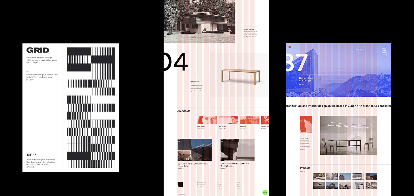
The use of a mathematical grid and sans-serif typography is one of the most obvious characteristics of the Swiss Style, with the latter heavily deployed in brutalist works as well. From the moment we started developing the first moodboards for Zermatt, we decided that precisely those two elements should be the staples of the theme’s design.
Throughout history, grids have always been used to stimulate user’s content comprehension. Even the first manuscripts and books relied on a grid system to arrange words in a way that would make them easier to read. Today, grids are applied in all media forms – wherever there are photos and texts there’s also a grid system. In print, digital, and, in particular, interactive design, grid lines act as somewhat of a backbone for a project. We use them to achieve hierarchy, create a better layout structure, and organize content by placing it into rows and columns. But horizontal and vertical grid lines do more than just merely separate the content. In fact, the omnipresent grid system in Zermatt creates a connection between page elements no matter how divergent or separated they may be. It also ties all of the theme’s layouts into a visually cohesive unit and provides them with a sense of consistency. Moreover, the grid system ensures all sections attract an equal amount of viewers’ attention and incites a more fluid visual communication with the observer.
As for typography, we held tight to the idea that less is more and upheld the Swiss Style principle that fonts, as one of the fundamental elements of design, should be simple in order to communicate with viewers in a clear way. We knew that, if we wanted to ensure great readability on Zermatt, a sans serif typeface would be our best choice. We experimented with various fonts and finally settled on Google’s DM Sans font – a clean, easy-to-read sans serif type we ended up applying throughout the theme. We ruled in its favor not only for its simplicity but also because of its subtle geometric character that complements Zermatt’s somewhat robust character.
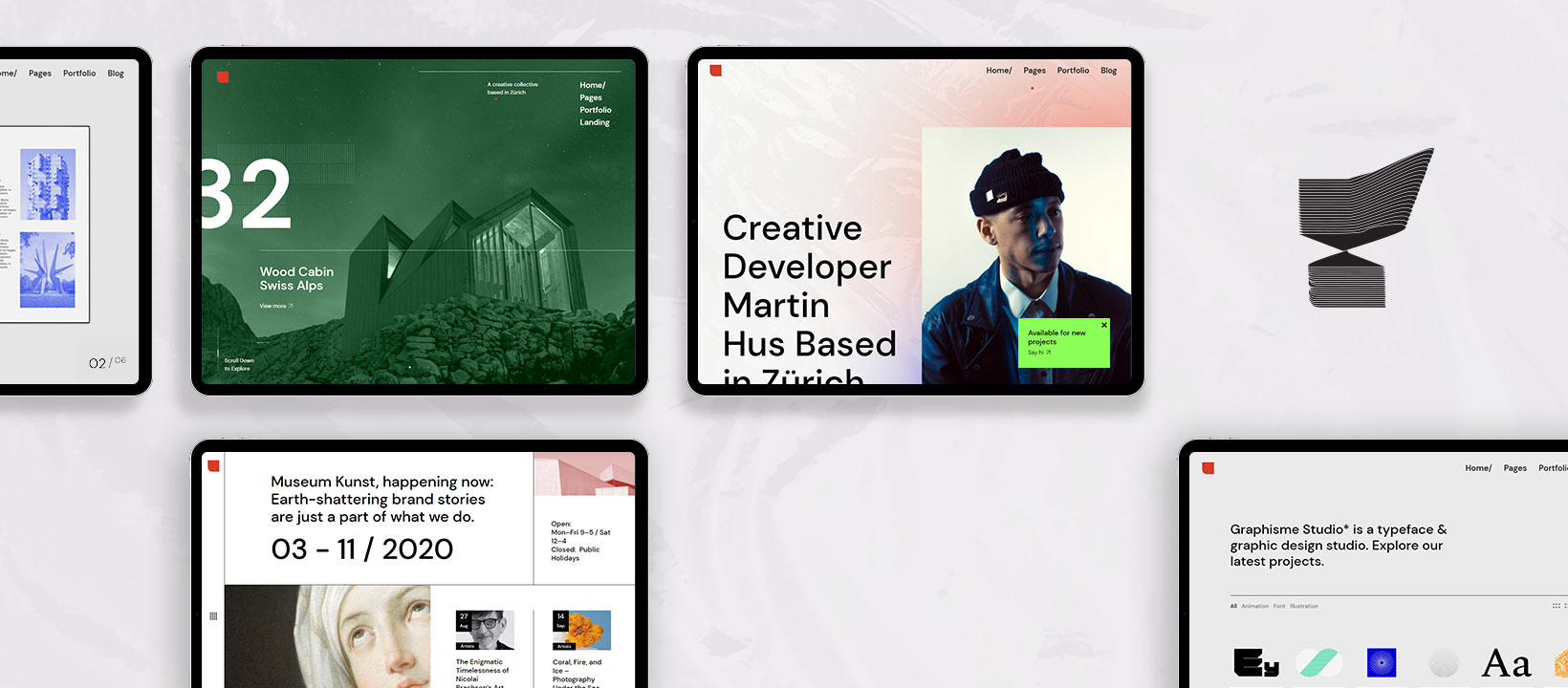
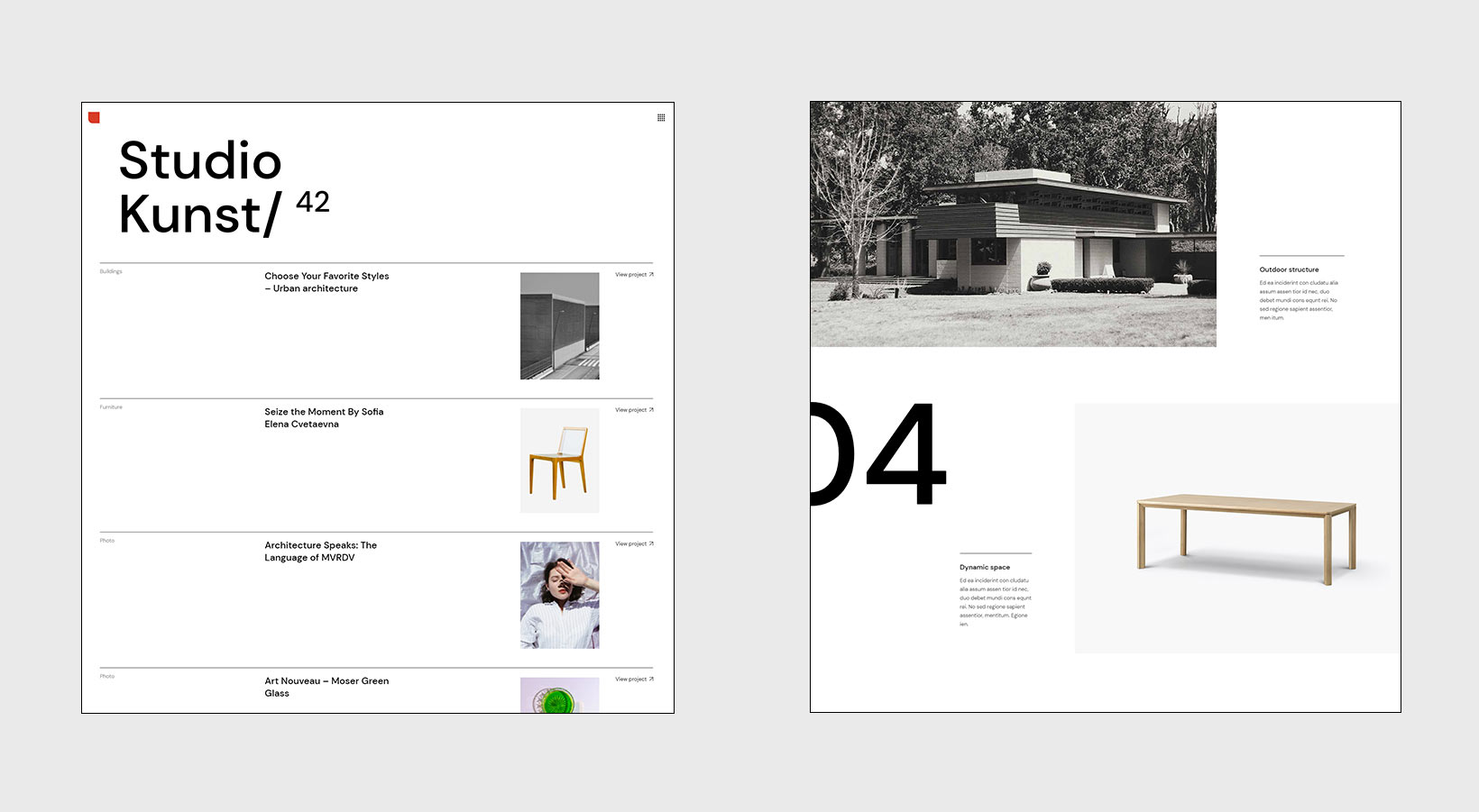
We wanted to ensure typographic hierarchy on most layouts, and we managed to achieve it by using appropriate font sizes in headlines and body text as well as by opting for the uniform flush-left and ragged-right text alignment – another recognizable trait of the Swiss Style. While we did keep the letter size and weight pretty tame on most pages, we imbued the theme with sporadic large headlines in a typical brutalist fashion, as seen on the Studio Minimal layout. There is a huge title at the top that takes up a big portion of the screen, instantly and selfishly capturing the viewers’ undivided attention. Another element we wanted to play with were numbers. On the Architecture Studio page, there are perhaps a bit unexpectedly gigantic and thick numerals that clash with the surrounding content size-wise. They surprise and excite the viewer, further adding to the theme’s brutalist appeal.
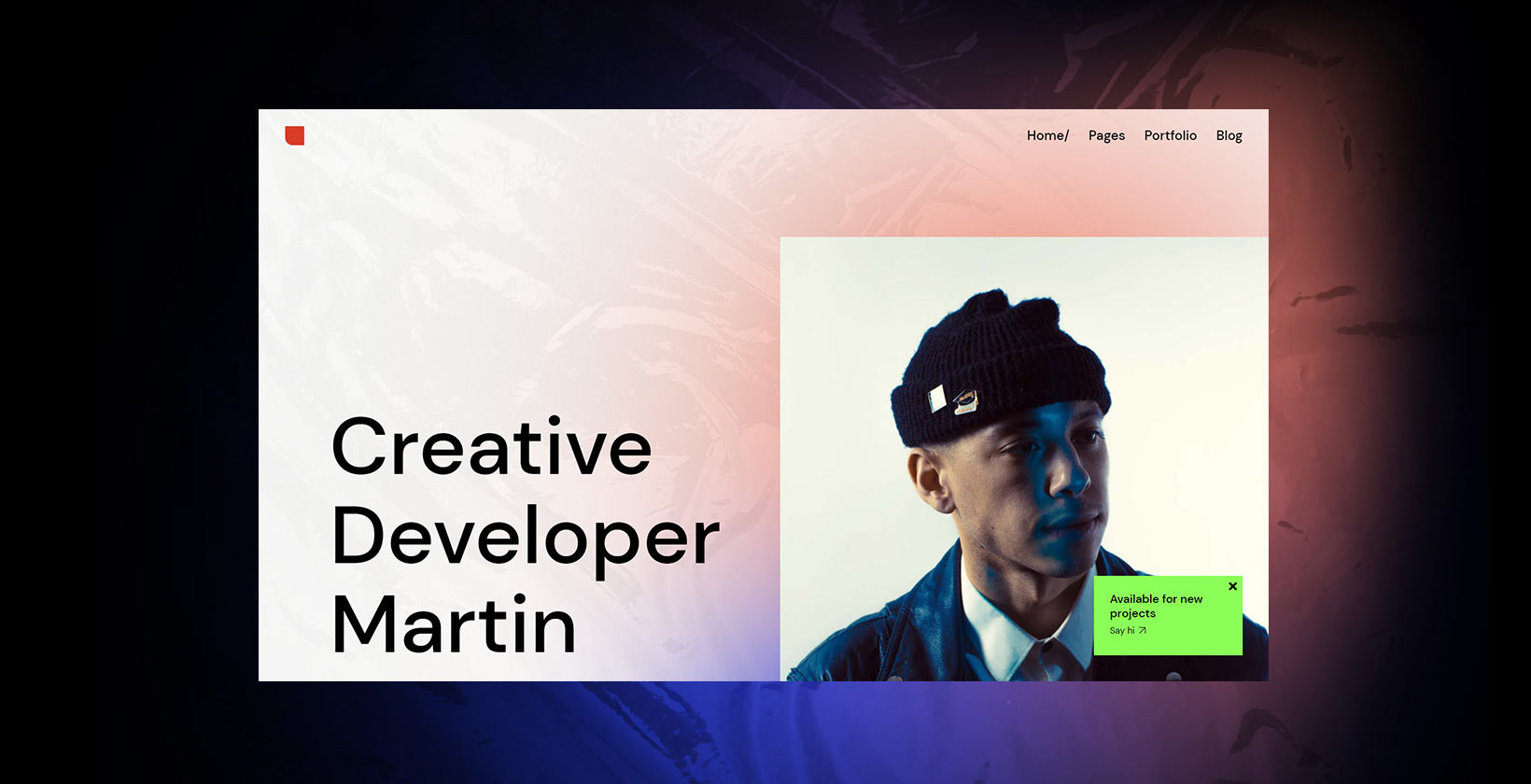
Regarding font colors, we painted letters predominantly in black and white hues and used a light grey shade for inactive links. The moment users hover over them, the links abandon their dormant state and turn either white or black. In general, we tried not to go overboard and experiment with too many color combinations. As for background colors, we also mostly relied on black and white. But we couldn’t forgo grey here either, as it is the color of concrete, a material widely used in brutalist architecture. The content is mainly painted in elementary hues, with occasional splashes of the neon green color which is popular among brutalists. However, we didn’t want to blindly follow brutalist ideas regarding colors, so we peppered the theme with some warm-colored gradients, making the content more charming and easier to consume.
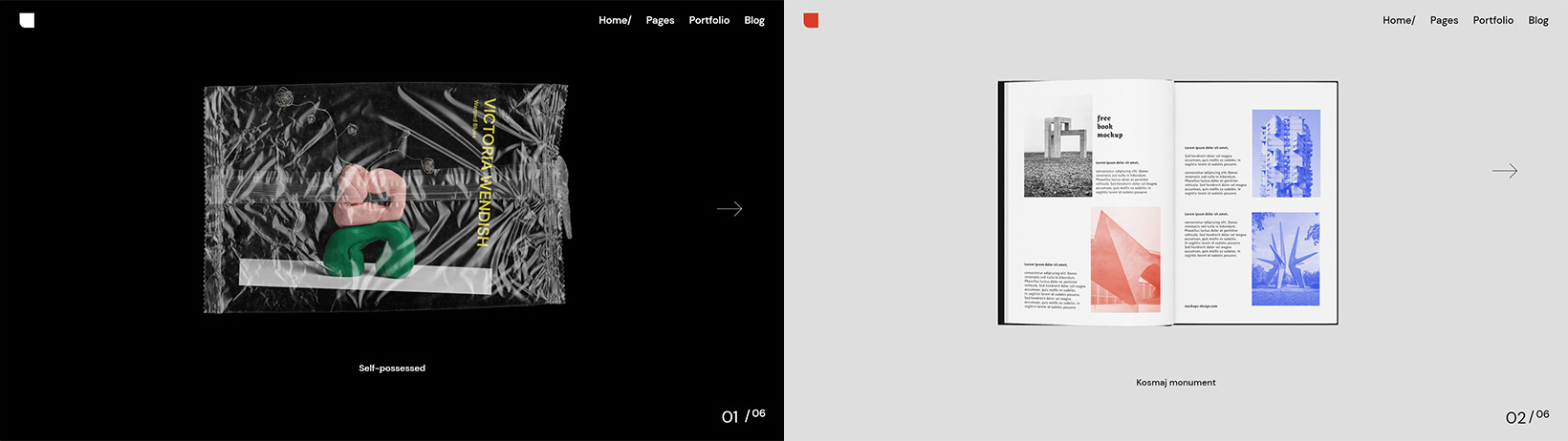
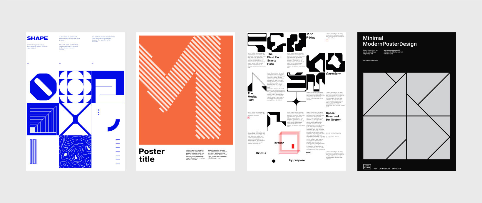
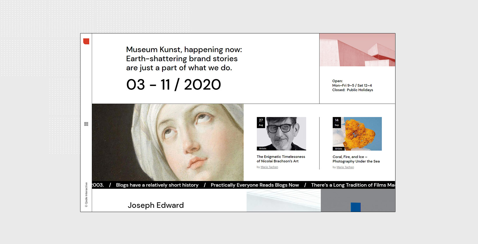
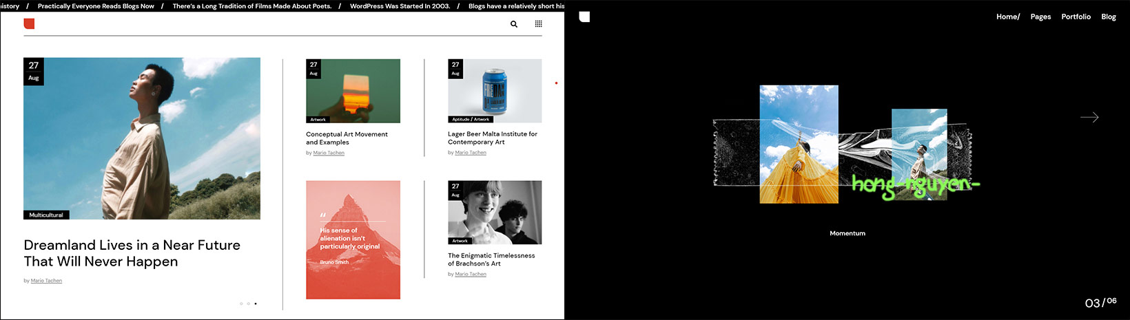
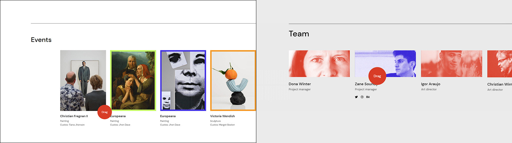
The deliberate overall simplicity of Zermatt’s typography and its color palette allowed us to go slightly more wild with the rawness and abstractness of visuals. We injected layouts with animated and distorted circular shapes, geometric elements, as well as shapes with billowy lines and abstract patterns – all commonplace in the works of brutalism and the Swiss Style. We used mostly photographs instead of illustrations and presented the photos as posters, creating a magazine-like atmosphere in the theme, which is another unmistakable trait of the Swiss Style. On the other hand, Zermatt’s imagery oozes almost exclusively raw brutalist vibes. This is evident in the photos showcasing the rugged beauty of brutalist architecture but also in pictures depicting objects wrapped in nylon (e.g. the Animated Projects page) as well as on layouts with plastic-bag-like backgrounds, such as the Personal Presentation page.
The Animations
When it comes to Zermatt’s animations, we were adamant about not wanting to disrupt the overall simplicity and functionality of the theme. We kept effects fairly subtle, complementing Zermatt’s brutalist spirit and encouraging the viewer to stay focused on the content at all times.
On almost all pages, we shaped the cursor as a circle, a form popular among brutalists, but we brought it to life with some playful microinteractions. Once placed on clickable elements, the circle becomes larger and some text appears inside of it, informing users they can interact with the content in some way – either by clicking on it or by dragging it with their mouse. In some sections, the cursor assumes the form of an arrow pointing in the direction viewers should go if they wish to explore more of Zermatt’s content.
And while the animations are, for the most part, unobtrusive, we did weave in a few surprising effects here and there, just as one would expect to see on a brutalist website. To break the typographic color monotony, we brought particularly large titles to life with some light analog movement. You can spot this in the top section on Zermatt’s landing page, where the text appears to be undulating, juxtaposing the inertia of the surrounding letters. And on the Conference and Personal Presentation layouts, we went a bit more wild with the featured effects. On the former, we adorned one of the two enormous letters with neon-colored, lightning-like animated lines, bringing the typography to life. The latter page, on the other hand, exemplifies the use of a gripping scroll-triggered animated gradient that complements the layout’s creased background and the oscillating imagery.
Zermatt’s hover animations further enhance the theme’s magazine vibe. By moving the cursor over some photos, effects typical of print design appear, such as the blue and red duotone and holographic effects. We also balanced out the simplicity of some layouts by ensuring elements of brutalism and the Swiss Style appear on hover. That is especially obvious on the Interactive Showcase page, where various images and geometric and abstract shapes appear in the viewport the moment you hover on a link. The concoction of these subtle and stirring effects amplifies Zermatt’s alternative appeal and fortifies the magnetic and ubiquitous synergy of brutalism and the Swiss Style the theme is centered on.
Closing Words
Zermatt is raw, strong, sharp, geometric and warm, classic yet modern – all at the same time. We created its unique character by challenging the principles of brutalism and the Swiss Style, experimenting with them, and placing them in a contemporary setting. In doing so, we devised an environment in which grid design, the menacing nature of brutalism, pure functionality, and an appealing visual personality combine into a both aesthetically and thematically cohesive unit.