Attika Restaurant Theme: A Case Study
December 16, 2020
About the Project
Inspired by contemporary gastronomy, the Attika WordPress theme deconstructs the traditional mode of restaurant website design. It remodels industry norms through experimentation and a playful approach. Much like molecular cuisine, it takes the standard elements apart, reshapes them and puts them back according to its own sensibilities.
Attika’s layouts are subtle but dynamic, elegant yet lively. They rely on the delicately emphasized asymmetry present throughout. This authentic, refined fusion is further supported by a carefully orchestrated atmosphere that pervades the theme with its pastel overtones and sophisticated typography selection.
The Approach:
We believe that given enough thought and care, anything can be made into art. This is probably why we were so attracted to the concept of haute cuisine – a culinary movement that embraces the idea of designing a plate, both in terms of flavor and from an aesthetic, purely visual standpoint. Proponents of haute cuisine are as concerned with the presentation of each dish as they are with its meticulous preparation.
The perfect combination of tastes, smells, colors, and compositions turn each haute cuisine kitchen into a small art project. And the Attika theme is our response to this exalted form of culinary mastery. Our way of showing appreciation toward other professionals who approach their craft with such consideration and attention to detail that they inevitably elevate it and push it forward.
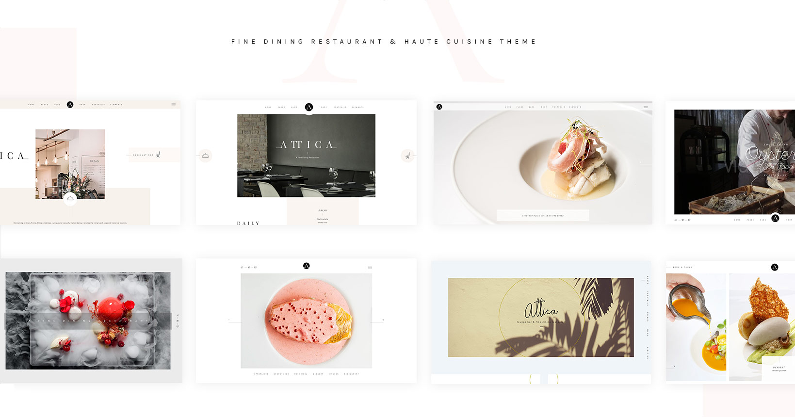
Inspired by the work of renowned chefs like Albert Adriá, Massimo Bottura, Grant Achatz, and Jordi Roca, we decided to create a restaurant theme for fine dining establishments. And just as each chef has a unique perspective on the art of cooking, so is each homepage in Attika designed to showcase different culinary concepts and support individual approaches to the realm of haute cuisine.
The Design:
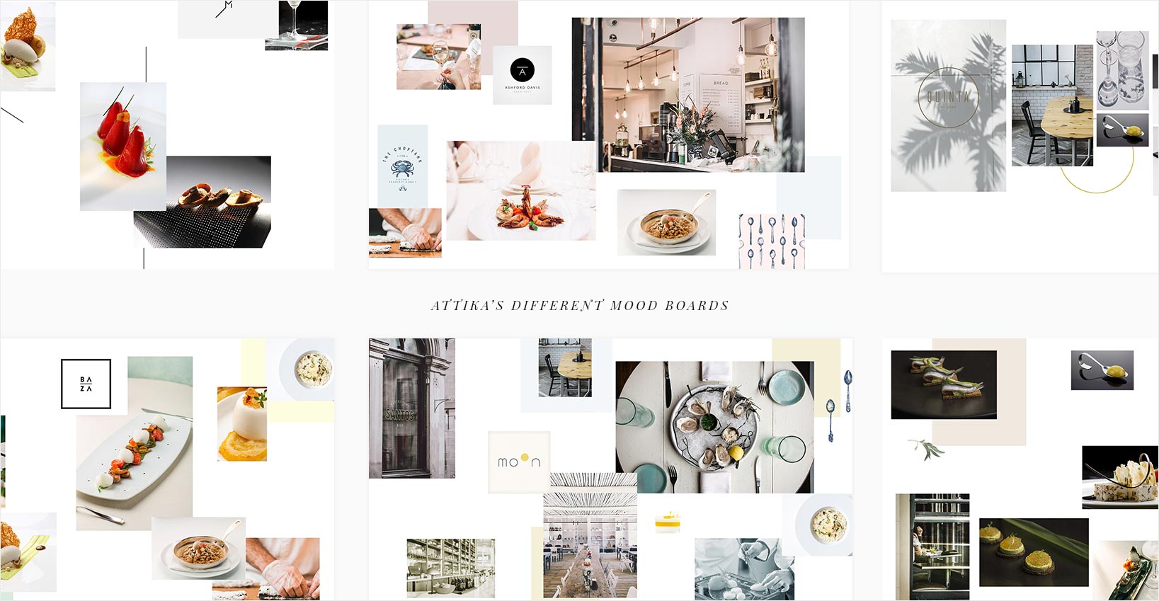
Our process began with the creation of eight separate mood boards, which grew into Attika’s eight homepages. This, however, was not our initial intention. In fact, we were going to choose only one of the mood boards to guide the theme’s design. But we soon noticed that despite their disparate color schemes, layouts, and atmospheres, they all shared certain stylistic characteristics.
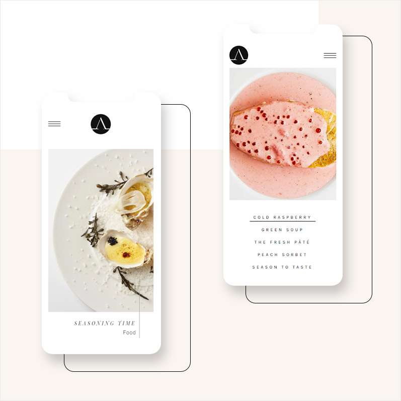
One of the unifying characteristics of Attika is its minimalistic atmosphere. The homepages are predominantly laid out on white, clean backgrounds. These backgrounds are occasionally interrupted with gently colored surfaces that appear from a variety of directions and without any obvious order, reminding us that greatness, whether culinary or otherwise, is often a product of bending the rules and ignoring common practices.
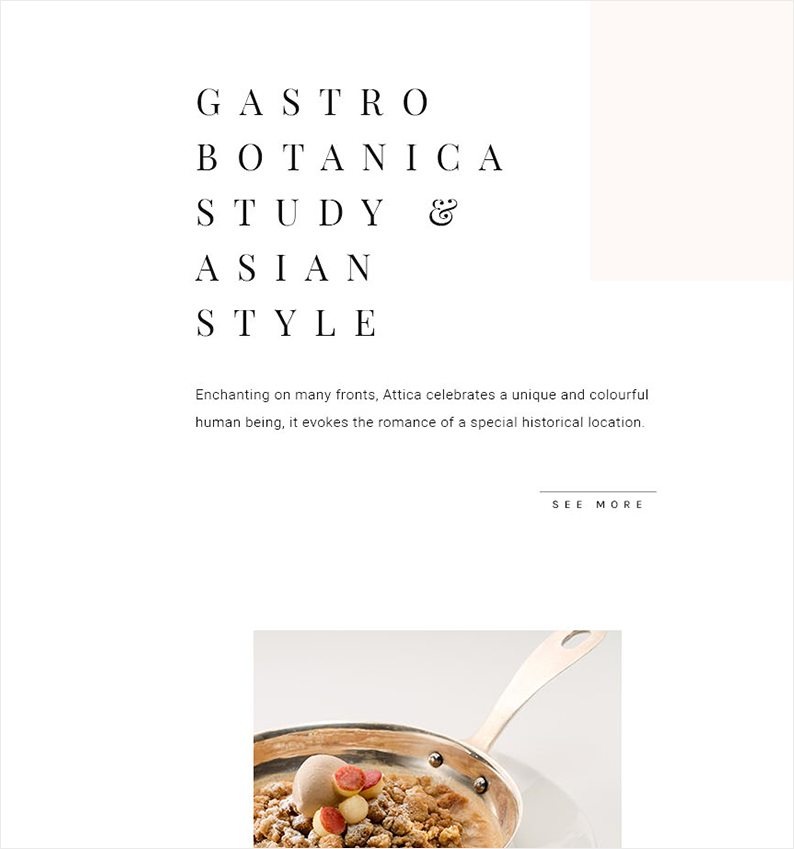
Another common element of Attika’s homepages is their shared typography. Since we wanted each aspect of the theme to reflect the philosophy of haute cuisine, we viewed the type as an artistic element of the design instead of merely a utilitarian one. This allowed us to imbue a measure of elegance and grace into a design component that is traditionally viewed as practical.
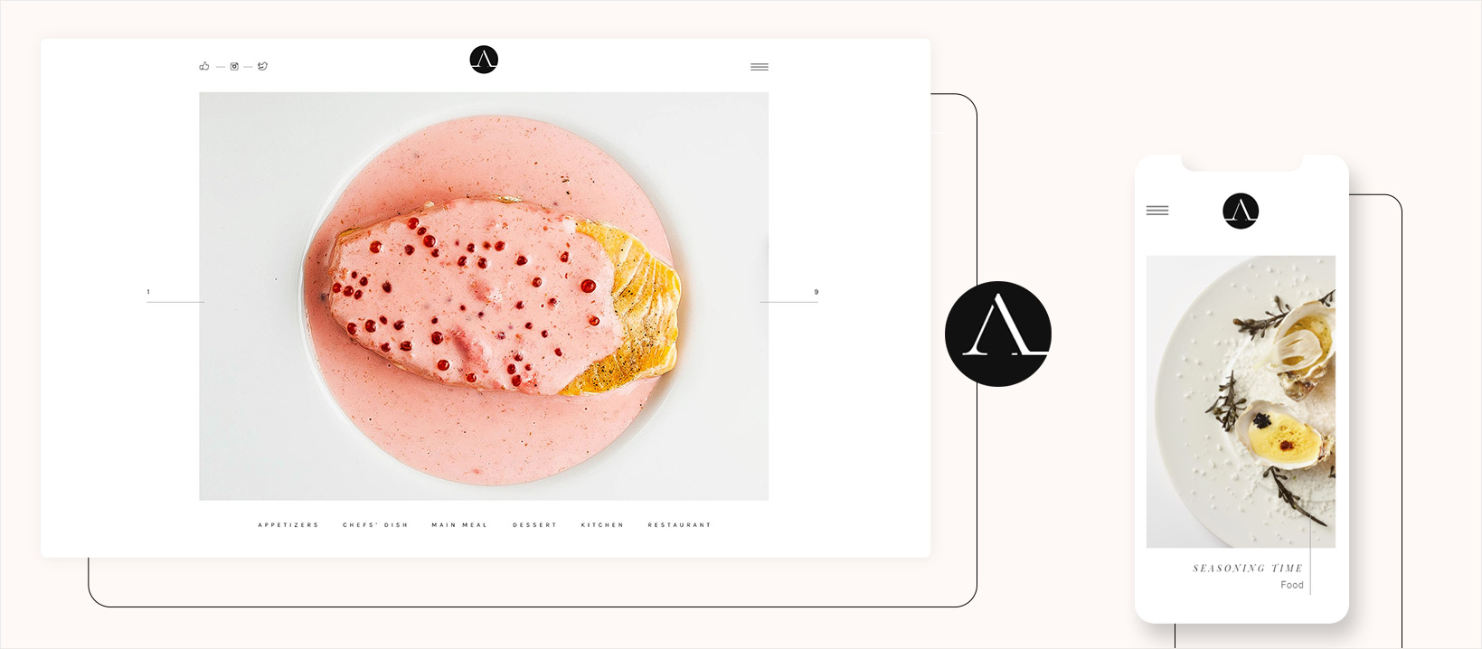
For the theme’s titles, we used both the italic and regular versions of the Playfair Display serif font, achieving that artistic touch by increasing the font’s kerning and paying close attention to the placement of line breaks. By carefully positioning words one beneath the other, we achieved an interplay of form and negative space that intensifies the visual aspect of the lettering. The content throughout the theme is served in the more conservative Hebbo sans-serif typeface, while another sans-serif font – Karla – is used for the typography on buttons and other elements of the interface.
At first, Attika’s typography was colored in light shades of grey. This, when combined with the pastel hues, created a refined, sophisticated atmosphere. But we noticed that it also resulted in a lack of character. So we shifted the typography from grey to black, creating a stronger contrast and a distinct sense of identity. This is further enhanced through the details of the interface, like the subtle lines and thin, wiry vector icons that appear throughout the theme and give it a dignified feel.
You might notice, however, that the initial idea of grey, softer typography wasn’t completely scrapped, but instead made its way into the hover animations on icons, menu items, and other elements of the interface. In this way, we preserved the initial atmospheric touch the combination of grey and pastel colors provided.
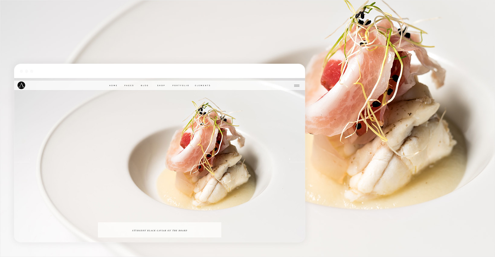
The entire aesthetic of Attika is completed by the selection of imagery. The chosen photographs are minimalistic and work in symbiosis with all other design elements in the theme. By predominantly portraying aspects of molecular gastronomy, the images unite all three major stylistic beacons of the theme – the luxurious, the contemporary, and the clean.
One of the greatest challenges in designing Attika was the creation of a compact presentation that could successfully integrate and stylistically connect all eight homepages. The final version of the landing page is a vertically scrolling full-screen slider. This layout let us avoid any stylistic clashes and provided enough space for all eight home pages to breathe. Like unique dishes, each slide is served separately and has a tight focus on its subject matter.
The Animations:
When it came to animating Attika, our mission was twofold. On the one hand, we wanted to preserve the grace and elegance that permeates the entire design, while on the other we knew we had to add some much-needed tactility to the theme. We experimented with a wide range of animations before finally opting for a set of subtle yet rapid motions that complement the theme’s spacious and asymmetric layouts.
We wanted to let Attika slowly unfold in front of the viewers’ eyes, just like a painstakingly prepared dish unfolds, revealing a new layer of taste with each bite. This idea is reflected in the various reveal animations that occur throughout the theme, each with distinct transition speeds and easing values that were carefully set depending on the immediate surroundings of the animated elements. The animations resemble masking effects, so it seems like the elements are being created or drawn out on the spot. Most of these reveals are triggered as elements enter the viewport – making users feel like they’re discovering new aspects of the design as they scroll through each page.
Parallax is another effect that’s key to Attika’s graceful atmosphere. Instead of a standard parallax animation, we decided to use a depth parallax effect that makes elements seem as if they’re floating above the flat content of the page. By setting different speeds for different floating elements, we created a depth perspective effect that makes certain elements pop out from the screen. When combined with the reveal animations, this effect gains an even greater impact and gives the theme a distinctly dynamic feel.
Besides enhancing the theme’s atmosphere, we also wanted to make sure that every user action was clear. We achieved this by animating the vector elements that enrich the theme’s interface. Through the small lines that appear as they enter the viewport or change sizes when hovered on, we subtly point users to the interactive elements of the theme. There are a lot of variations between the animations on these minuscule elements, but they all maintain similar easing curves in order to keep with the relaxed, luxurious flow of Attika.