Qode Interactive Catalog: Case Study
December 16, 2020
About the Project
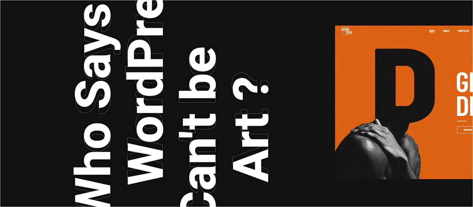
Qode Interactive Catalog is a curated compilation of creative WordPress themes designed by Qode Interactive with the aim of showcasing an original approach to contemporary web design in a streamlined fashion. The compiled themes share distinct aesthetic features inspired by various forms of art, all framed inside the Catalog’s minimalist, modern context.
The Approach:
From the onset, it was clear that we wanted the Qode Interactive Catalog to be a showcase of all the bold, innovative directions a WordPress theme could be taken in. An exhibition, so to speak, of just how creative a theme could get. The fact that we already had an extensive back catalog of themes certainly was an advantage in itself. But it also brought on one of the major challenges we faced while working on this project.
The first dilemma surfaced during the process of theme selection. In the early stages, the number of themes we chose to focus on was well over 20. But upon taking a closer look at this collection, we realized that it was, perhaps, too much. Too many of the themes were competing with each other in terms of both design and functionality. This is when it became apparent that we needed to trim down the number of showcased themes and keep the emphasis only on the design aspects we wanted to put in the spotlight.
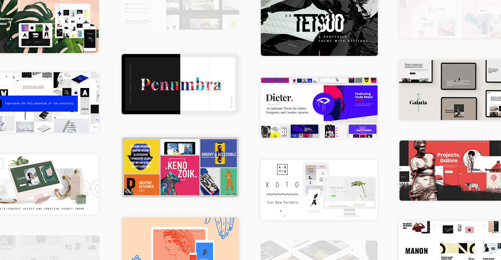
This led to the cornerstone decisions in terms of the Catalog’s design – we would focus on a toned down, monochromatic style, and typography would be the linchpin that brought everything together into a compact, unified whole.
The main underlying trait of all the themes in the Catalog is their subtle reliance on elements inspired by or borrowed from different forms of visual art, be it classical or modern. This prompted us to figure out the most appropriate way to create individual theme presentations, and the smooth, horizontally scrolling, animation-rich layouts of the Catalog came to us rather naturally.
The Design:
The main navigation page of the Catalog, or effectively the theme list, went through several stylistic revisions. It started off as a carousel slider, then morphed into an interactive slider with large theme previews popping up when a theme was selected, and after some further refinement and tweaking it grew into a minimalistic, interactive list which displays handpicked elements from each of its themes on hover.
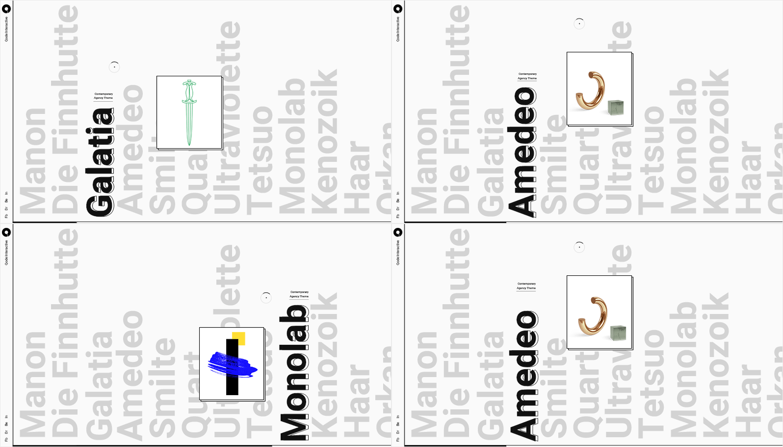
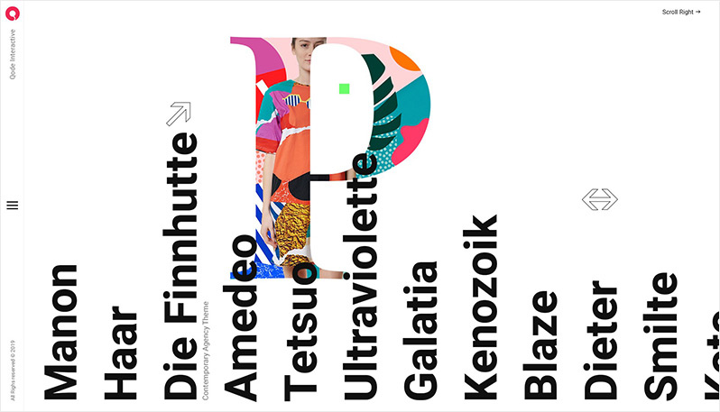
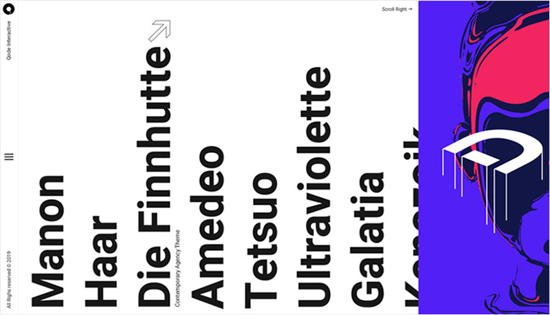
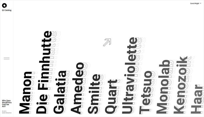
Throughout this discovery process, the overarching concept behind Qode Interactive Catalog remained true to our original vision. The final version of the Catalog’s home page is predominantly typographic, centered around the simple, yet distinct, Heebo font family. By combining drastically large font sizes and animated details (e.g. large theme names with significantly smaller descriptions scrolling below them), we imbued the page with some additional playfulness and created an interface that would engage viewers.
This same concept was later carried over to the individual theme presentations, which are also based on strong typography, with dynamic details and kinetic texts rounding out the design and forming the connective tissue between prominent headings and graphic elements. We also made sure to leave sufficient room for each individual designer to highlight the unique character of their respective themes through the choice of color palettes and additional artistic elements.
All the showcased themes have their own personalities and unique visual identities. However, they stand firmly as a whole within the Catalog. They are held tightly together by their collective, artistically tinted disposition, manifested in the many elements inspired by works from numerous spheres of art.
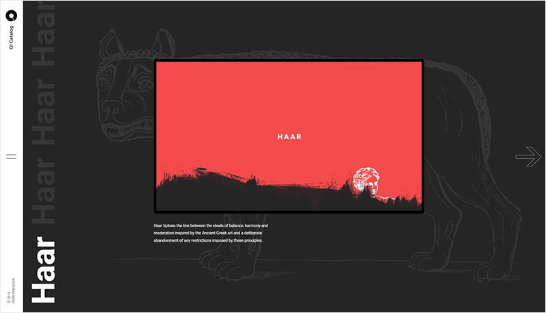
Sometimes these elements are simple hints, slight nods to an artistic movement or an artist’s body of work. In other instances, they are overt and intentionally emphasized. These influences range from the ancient works of classical art, to the dystopian landscapes of Katsuhiro Otomo and Philip K. Dick, as well as the vibrancy of modern collage art, and the undulating expressionism in the works of Egon Schiele.
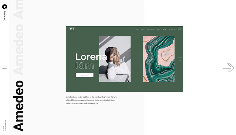
Of course, we wanted to give these elements a contemporary point of reference as well, which is why we thought they would work perfectly together with clean, spacious layouts, charged with modern minimalistic tendencies. It is this blend of modern design and art, this distinct synergy that represents the essence of what we were aiming for with the Qode Interactive Catalog.
The Technology:
Our general approach was set on establishing an animation-driven, smooth feel that would accompany the project’s modern aesthetics. In that sense, the core of the site’s navigation experience are AJAX transitions which utilize BarbaJS. Taking into account the Catalog’s graphic-heavy nature, and its reliance on images and videos for the majority of the content, introducing lazy-loading was paramount. To truly stay faithful to this high-speed idea, and to set the presentation in line with the rising trend of static websites, QI Catalog’s development approach was right up to snuff – most of the code runs at build time, as opposed to runtime, rendering Nunjucks templates with their JSON data to static HTML pages and compiling ES6 modules into browser-ready vanilla JavaScript.
Single layouts, or individual theme pages, each had to be tailored to the unique styles of their showcased themes. Implementing a horizontal scroll layout can pose a challenge in its own right, and it can be approached in at least a few different ways. Here, we have the Smooth Scrollbar doing all the heavy-lifting, as it provides various methods and callbacks useful for content interactions. Each section of the single layout has its own style of interactive behavior, and these are mostly scroll-based. Prefetching the content, triggering videos as they come in and out of the viewport, and utilizing requestAnimationFrame for most of the skew and translate effects are just a few concepts we used to help reduce the paint costs and stays as close as possible to that 60fps mark.
Company Info:
Qode Interactive is a team of more than 100 dedicated professionals whose aim is to set new standards in the WordPress theme and template business. Spearheaded by its team of over 30 UI and UX experts, graphic designers, visual artists and illustrators, Qode delivers only the most beautiful products which all carry their authentic vibe.