Nillé eCommerce Theme: A Case Study
December 16, 2020
About the Project
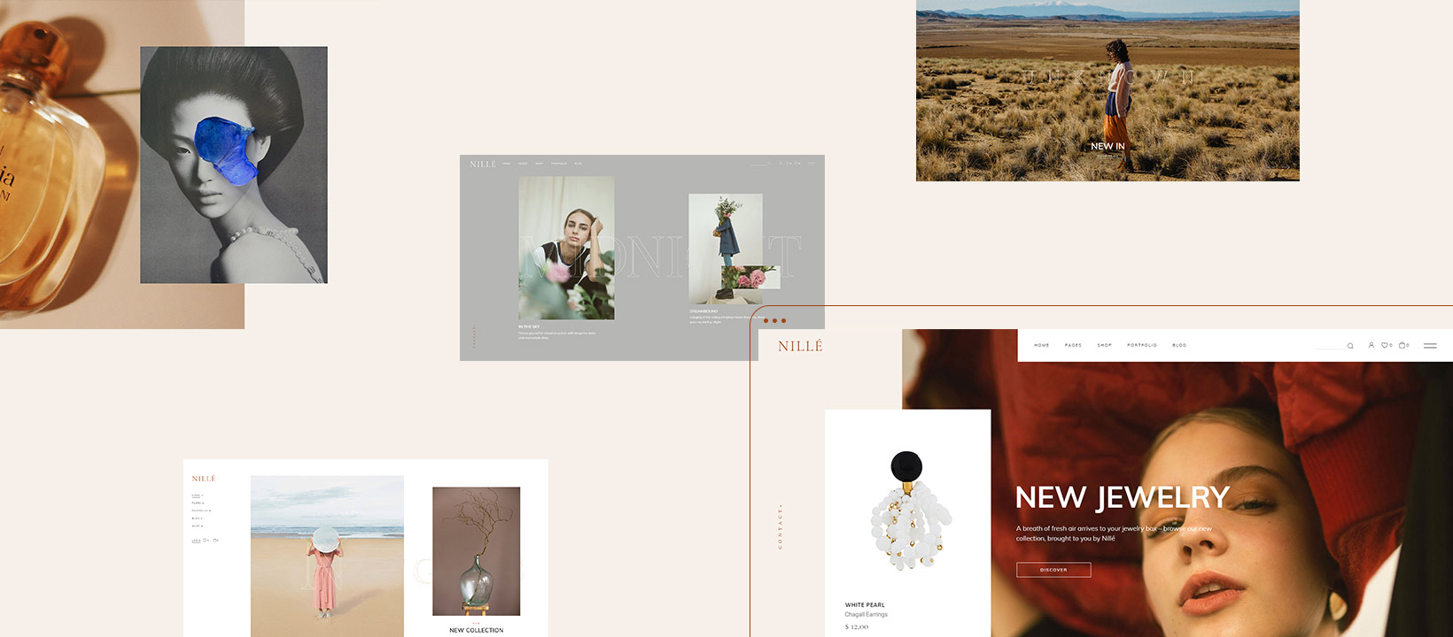
Nillé is an elegant eCommerce theme characterized by its unique aesthetic personality. Nillé’s identity is carried by its symbiotic character which consists of tone-rich, nature inspired nuances on one side, and distinctly clean, refined visuals on the other.
The Approach
When this project was first conceived, it had a straightforward goal – we set out to create an eCommerce theme. By analyzing the market we came to a significant conclusion: there really weren’t many proper examples of eCommerce themes that truly embody the contemporary spirit of elegance and femininity. This is when we further defined our intention regarding Nillé. We decided to design an eCommerce theme that will go on to represent the epitome of sophistication and refinement on the marketplace.
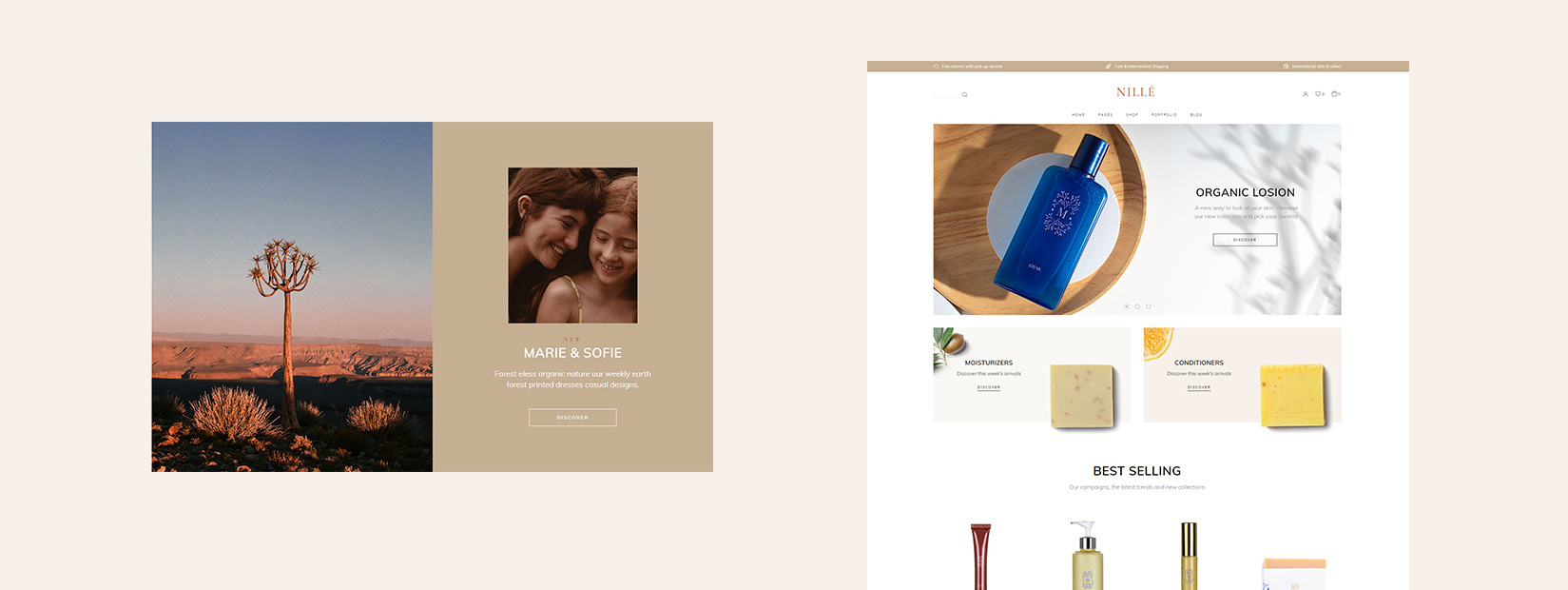
Contemporary eCommerce is often synonymous with functionality. These types of websites first and foremost focus on providing the user with a quick and easy way to go through the entire purchase process. However, there are many instances where functionality is not the only stand out eCommerce feature. More and more modern brands frequently use emotional approaches in order to generate conversions. Furthermore, complex presentations are a commonplace on the web when it comes to this niche. These types of presentations usually utilize high-end photography work and videos, paired with equally well-crafted websites, from their UI elements all the way to the UX design. Constant envelope-pushing innovations also surfaced as a part of recent trends in this field. Many examples of this type of practice can be seen on the Awwwards website – from experimental product collection collages and virtual gallery boutiques, to interactive presentations fashioned as full-blown video games. All this information solidified our intentions with Nillé – we were to design a fully functional eCommerce website, all while concentrating on molding a visual style that evokes the notions of affection and femininity.
Our definition of contemporary elegance & sophistication in design is inseparably tied to the philosophies championed by ethical and sustainable clothing brands. Nature and ecology reign supreme as the primary principles of these types of brands, and they served as our chief inspiration during the development of this project. Nillé’s design direction is meant to speak to the nature lover inside of every one of us in a very subtle way
The Design
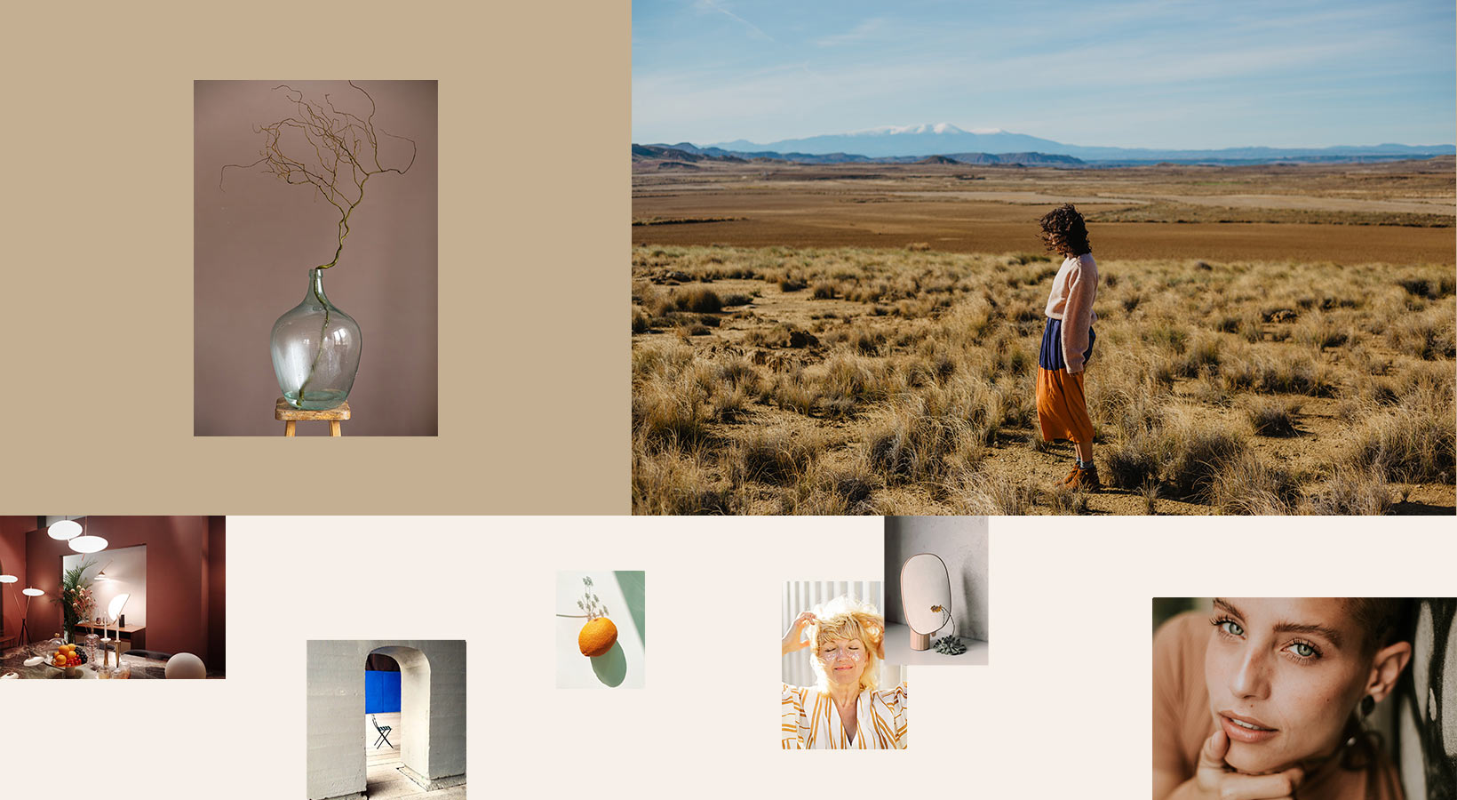
The overall character of Nillé began to crystalize from the very first mood boards our design team crafted for it. The mood boards bore a serene, almost cinematic feel accentuated by a gentle, feminine atmosphere. We opted to use graceful, artistically tinted imagery to set the kind of mood we wanted to achieve.
The correlation between the beauty of nature and the way man experiences and perceives it was another key motif we wanted to explore. Nillé is unquestionably inspired by the great outdoors, the sun, the desert, the water and the skies. But in order to convey a real, relatable message and speak to the viewer on a tangible emotional level, we wanted to incorporate a specific type of imagery to hint at the human omnipresence in this nature-inspired domain.
The images depict people and a whole spectrum of man-made artefacts, all outlined together by a fine artistic sentiment. They also bear a distinct feminine touch, and use their analogue photographic temperament to expand upon the theme’s tranquil ambiance. Glass objects, products created from organic substances and other similar items are showcased to draw an additional line between the human experience and nature itself.
Being an eCommerce theme, Nillé had to bear hints of minimalism. However, it was clear to us that this stripped down disposition also had to have its counterpart in a warm, color rich environment. We wanted to juxtapose the spaciousness of contemporary eCommerce layouts with a sense of warmth by framing them inside a purely nature-driven context. This made room for a more complex composition, which we set out to create in the first place.
We used several different approaches to imbue Nillé with the atmosphere we intended for it. Color selection proved to be a pivotal point in this process. Nillé’s finely spun color palette relies on mellow earth tones, with desert yellows, clay browns, burnt oranges, beige and Indian khaki tones meticulously interweaved with ultramarine and sky blue hues. We felt that we could build upon the soft, dreamlike imagery showcased throughout Nillé by instilling it with a nuanced color palette directly inspired by sand, earth, and nature with mild hints of the afternoon sunglow.
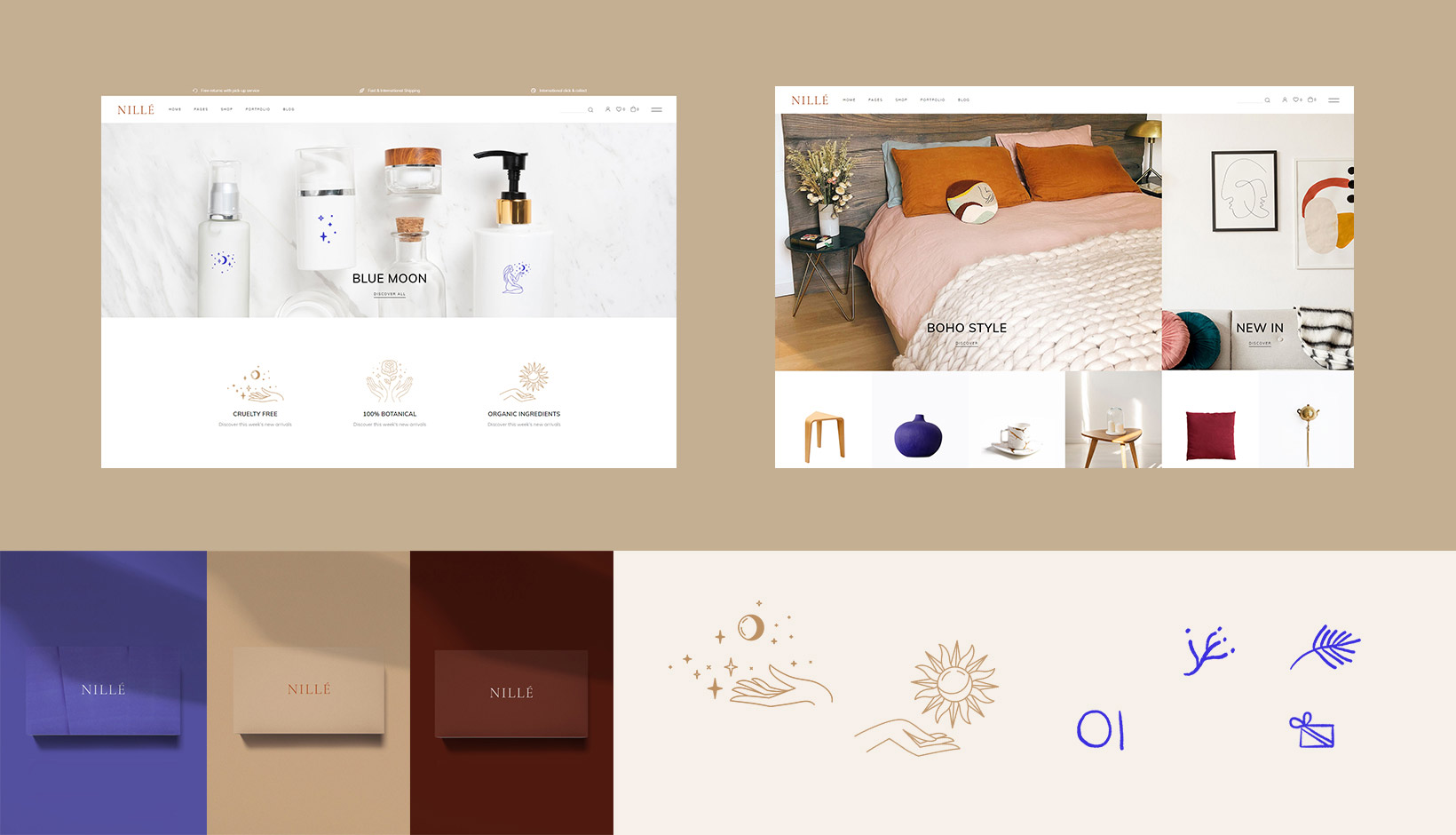
To be more precise, as the name of the theme suggests, Nillé’s tones draw inspiration from the visual impact taken from the coloration of the sun-drenched banks of the river Nile, the sand dunes surrounding the river, and the calmness of the skies reflected on the water surface. This seemingly unusual compound of elements rounded up the basic concept of what we sought to highlight with Nillé.
The gold-tinged warm colors were chosen specifically to evoke a blend of summery Mediterranean climate paired with a desert ethos that the valley of the river Nile is so well known for. Desert and dusty yellows, cosmic latte and paper beige establish Nillé’s overall scenery. We introduced sky blue hues and ultramarine to instill an air of freshness and in a way contrast the dominant earth tones. All these colors together serve to open up the colder white spaces that make up the bare foundation of the theme’s design, permeating them with a sense of familiarity and comfort. This unique combination of tones comes together to create a one of a kind interplay of light, reminiscent of what photographers so faithfully named the golden hour.
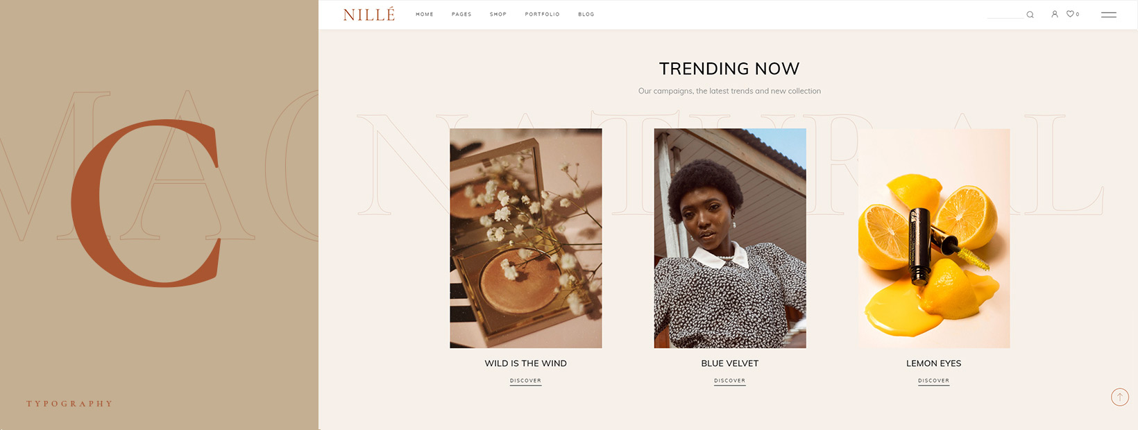
Nillé makes use of the Cormorant font incorporated in various manners. The typography goes hand in hand with the airiness of the imagery and the color selection, adding an additional layer of refinement and elegance to the overall design. Large outline fonts stand tall in the background, connecting and holding different sections together.
The Animations
The inclusion of smooth animation effects is another important factor that rounds up the paradigm of Nillé’s warm, sophisticated personality. It was our intention to add a level of movement into the mix, all while not disturbing Nillé’s soothing, calm spirit. This is why animations had to be unobtrusive and subdued, yet they needed to introduce a supple and dynamic component into the greater picture. We wanted Nillé, like the waters of the great river Nile, to represent life and its slow, graceful flow.
The theme chiefly makes use of a sideways, left-to-right motion, which can be seen throughout the presentation. Most of the elements such as images, simple or outlined buttons and separator lines incorporate various shapes alongside them. These shapes are usually SVG lines or rectangles, animated in the left-right fashion. We used this type of movement to effectively let the users know that a specific element is clickable or can be interacted with in some other way. Whether they simply highlight a section, generate movement, or hint at a micro interaction, these animations range from more discernible, like the inclusion of thin lines under links, to subtler ones, like the background images featured in shop banners.
The big text shown throughout Nillé uses staggered animations, with words that pop up in the viewport letter by letter, be it on page load or scroll. This applies to both the text shown in the sliders and the large typography placed behind other elements. This type of text is split into individual characters that come into place one by one. We also applied mask and fade animations here to reinforce that slick, soft sensibility we wanted to go for with Nillé.
We always fine tune our sliders so that they focus on showing a timeline or telling a story on each slide. This is achieved by manually setting slider delays, easings and transitions to build a powerful first impression for the viewers. This is especially true when it comes to interactive full screen sliders that change on user scroll. The most illustrative instance of this is probably Nillé’s Dual Product Slider homepage. Another homepage with an interesting example of these sequenced animations is the Floating Products home where we wanted to display the background text initially, with images gradually appearing on scroll over the text one by one.
The Floating Products homepage also displays another important feature when it comes to animation. Since it is a one-page layout fashioned like a fixed section, with text that always appears in the same predetermined position, we included smooth scroll which can be performed even on mouse devices that do not support this feature natively. In technical terms, we achieved this by virtually transforming the page on the Y axis with added easing, instead of going with the traditional scroll.
Closing Words
Nillé is a modern eCommerce theme designed to be one of the torchbearers of contemporary elegance and refinement. It paints a landscape that lets the viewer take a stroll along the banks of the river Nile and bask in the desert sun, enjoy the openness of the clear blue skies and almost feel the texture of sand – all while never leaving the cutting-edge digital sphere to which Nillé so unmistakably belongs.