Die Finnhütte Architecture Theme: A Case Study
December 11, 2020
About the Project
Die Finnhütte is an architecture and interior design theme with an innately contemporary aesthetic. Everything in Die Finnhütte, from its layouts and interface to its imagery and typography, developed naturally from the core foundations of minimalism and clarity of form.

The Approach
As a company with quite a few trained architects in its collective, we’ve always remained mindful of Mies van der Rohe’s credo that “Less is more”. While many today consider this a cliché or perhaps even a truism, its importance to generations of architects (and designers) cannot be overstated. And it’s a concept we held firmly in our minds when planning out Die Finnhütte. Farnsworth House, Villa Savoye, and Glass House are just a few of the buildings we looked to for inspiration. Each of these architectural achievements attests to the strength of der Rohe’s principle and displays a deep understanding of the importance of clear forms, defined shapes, and carefully selected details. So we decided to apply this moderate approach as faithfully as possible to Die Finnhütte’s layouts and interface.
The Design
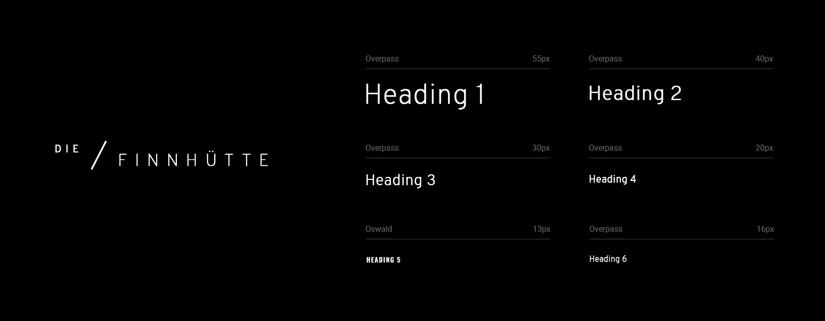
One of the first things we created for Die Finnhütte was its logo. We wanted the logo to be purely typographical, so we started experimenting with a selection of fonts. Overpass, the typeface we ultimately chose, is based on clear, well-defined lines, reminiscent of thin, modern columns. These lines further inspired the design of some of Die Finnhütte’s main interface elements, like its menu openers, navigation, hover animations and active item markers. Apart from these extremely restrained and functional forms, the theme has no additional decorative elements.
Sticking to the principle of less is more, we decided to use Overpass throughout the theme. What we found so interesting about this typeface is that even though it’s built on these clear lines, it still isn’t quite perfect. Some of its strokes, like those on the letters “d” and “n”, are thicker, giving it some warmth and perhaps even a certain charm. We balanced this out with the sturdier, condensed Oswald font used above the main titles.
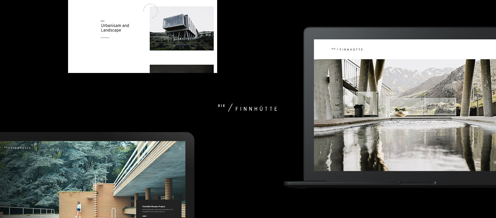
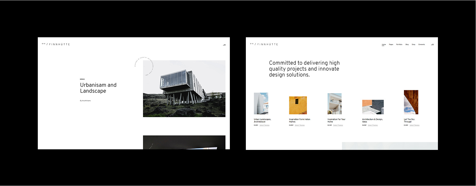
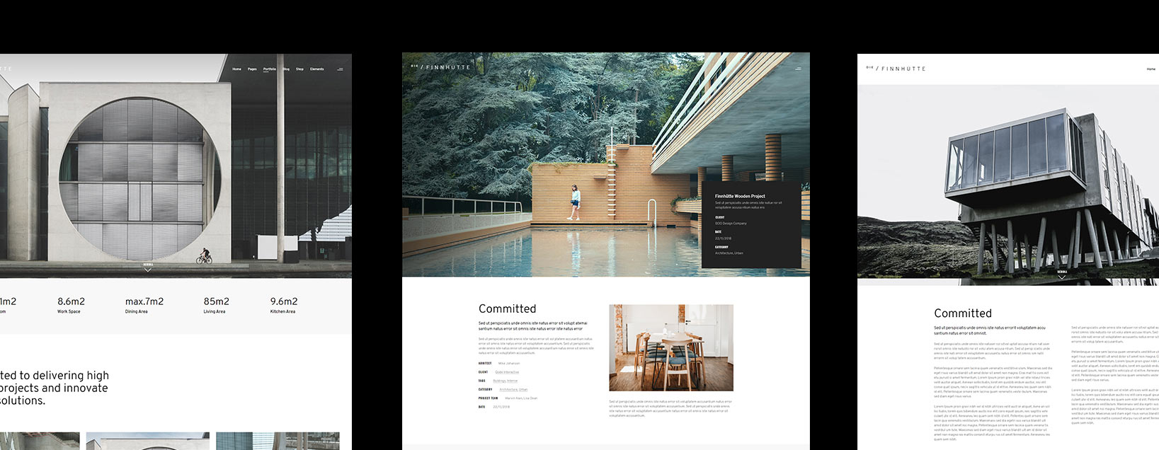
When it came to designing the theme’s layouts, our goal was to make sure the portfolio projects and imagery had sufficient breathing room. We knew this was the content our clients would care most about. So we created large, light areas around these focal points, as evident right from the get-go on Die Finnhütte’s main home. Notice the asymmetrical arrangement of imagery and white space within the slider and the way the entire page is composed of spacious, alternating sections of white and light grey. Most of the theme’s homepages are based on this idea of “airy” layouts.
We also developed a few brand new layout concepts specifically for Die Finnhütte, including several custom portfolio single designs, as well as a fresh take on the vertical project showcase. We did extensive research for the portfolio singles, carefully choosing the most important information to display on each one. The vertical showcase, on the other hand, came somewhat naturally. It played perfectly into the theme’s airy feel, with the projects unraveling as you gently float past them.
The Animations
With der Rohe’s words still in mind, we decided to base all motion in the theme around one core set of animations. And since imagery is such a key component of Die Finnhütte, mask animations seemed a natural choice. By placing an opaque mask layer above our images, and then removing it in a smooth motion, we created the effect of slowly revealing each image in the theme. This is especially noticeable in the uncovering animations. As you scroll through each page, the most important elements unfold before you, drawing your attention and imbuing the theme with a subtle but significant dynamicity.
We also used the mask effect in our sliders, but we added a slight twist. Instead of removing an opaque layer to reveal the image, we integrated the mask animation into the slide transitions. As one slide moves aside, it reveals the one beneath it. By adding an overlay image and some additional horizontal motion between transitions, we created a sense of continuity in our sliders.
The hover effects in Die Finnhütte also evolved from mask animations. Lines, SVG objects, and similar shapes can be seen uncovering, unrolling, or extending in a certain direction. This is visible throughout the theme – on buttons, menu openers, filters, etc. Even certain textual elements appear from a mask, like the logo on Die Finnhütte’s landing page.
Closing Words
Despite its moderate nature, minimalistic values, and airy ambiance, Die Finnhütte retains a strong sense of sturdiness and reliability. By focusing on a few carefully considered motifs, we created a compact framework within which we could safely experiment with symmetry, space, and motion, as well as deconstruct familiar design elements and repurpose them in new ways. This conflicting fusion of the familiar and the innovative not only bolsters Die Finnhütte’s contemporary character, but also contributes to the theme’s thoroughly unique feel.