Breton Creative Agency Theme: A Case Study
May 14, 2021
About the Project
Breton is a contemporary portfolio theme that blends its brutalist roots with modern overtones, building a raw visual character around an intense primary color palette. Aimed chiefly at creative agencies, Breton is designed to transcend beyond the utilitarian nature of brutalism, while remaining faithful to the style’s most prominent traits.
The Approach
When crafting a theme, our usual first step is to set the aesthetic direction that we want to pursue. With Breton, it was rather clear from the start: we wanted to explore different aspects of Brutalism, recontextualized through the prism of modern web design.
Breton’s raw visual character hails directly from the principles of Brutalism – an architectural style that rose to prominence in the 1950s only to transcend into other creative fields, including, eventually, web design. The actual term “Brutalism” comes from the French “béton brut,” meaning “raw concrete.”
Lately, though, an alternative interpretation of the term arose, stemming from its similarity with the word “brutal.” While there certainly are currents in modern web design that follow the second interpretation of the word, our approach was more in line with its original meaning.
This particular style rejects the predominant levity of today’s web design tendencies and directs its focus on the content – and its intended consumer. And that is precisely what we aimed to achieve with Breton: a design centered on the dynamics between the content and the consumer, achieved through the reduced brutalist aesthetics and their historical development across different media.
The Design
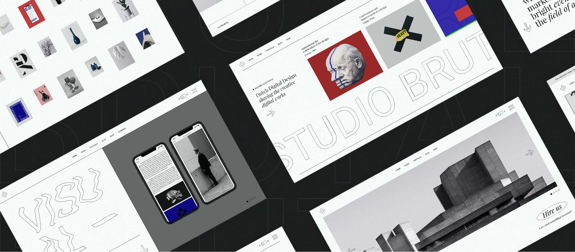
Well aware that Brutalism is a style with an intense, highly recognizable character, we dived into the enormous base of brutalist works and started our research. Right from the beginning, we decided we wouldn’t go into the extremes of the style, and that, instead, we needed to pursue a harmonious balance between brutalist aesthetics and a contemporary approach to the web. Starting from the palette, we opted for a typically brutalist one – revolving around elementary colors. This choice helped us further filter out the imagery we would use throughout the theme, creating a clear and coherent base of works.
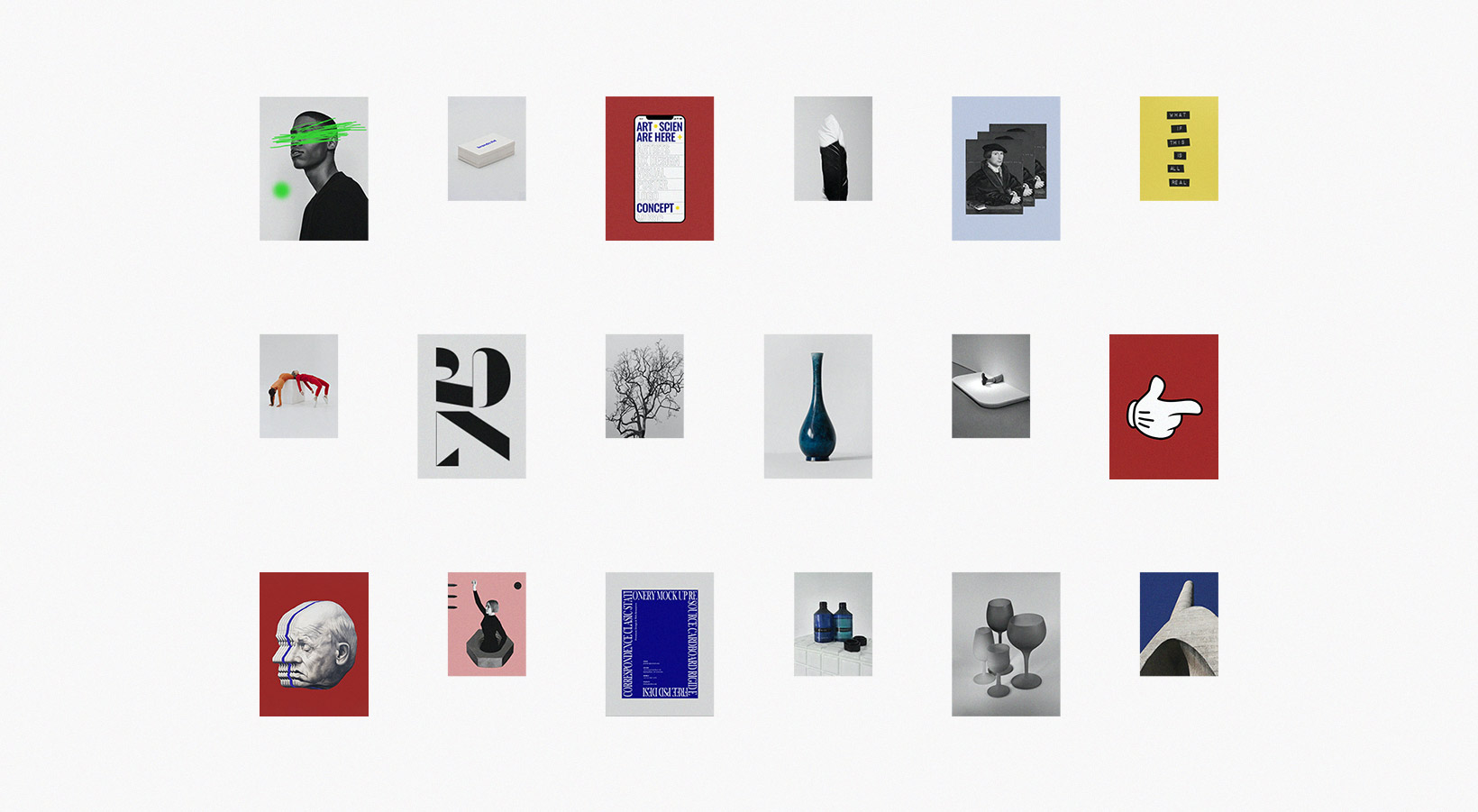
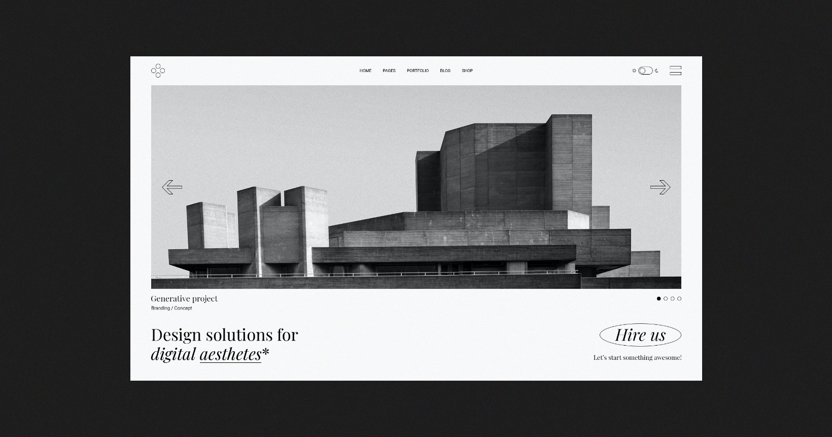
These were to carry brutalist hints throughout the theme, both in their palette and in their motifs, underlining its character. Some examples can be found right there on the Main Homepage: a man’s face scribbled over in toxic green, a renaissance portrait repeated several times in a row, a glitchy intervention often seen in brutalism, or the black and white portrait on red background in the Horizontal Portfolio demo, flirting with Pop Art, as well as with Dadaism. These images create a sort of paradox, a portrait without portrait, and produce a daring mix of epochs and styles. As Brutalism often flirts with iconic pop imagery, we wanted to play with the famous Mickey Mouse glove, featured as one of the presented works, as well as the “arrow” pointing to the location on the theme’s Contact Us page. Finally, there are images of brutalist architecture, as a direct link between the style and its origin, various textual elements and print design examples, direct references to Brutalism in web design, as well as accents typical of avant-garde graphic design.
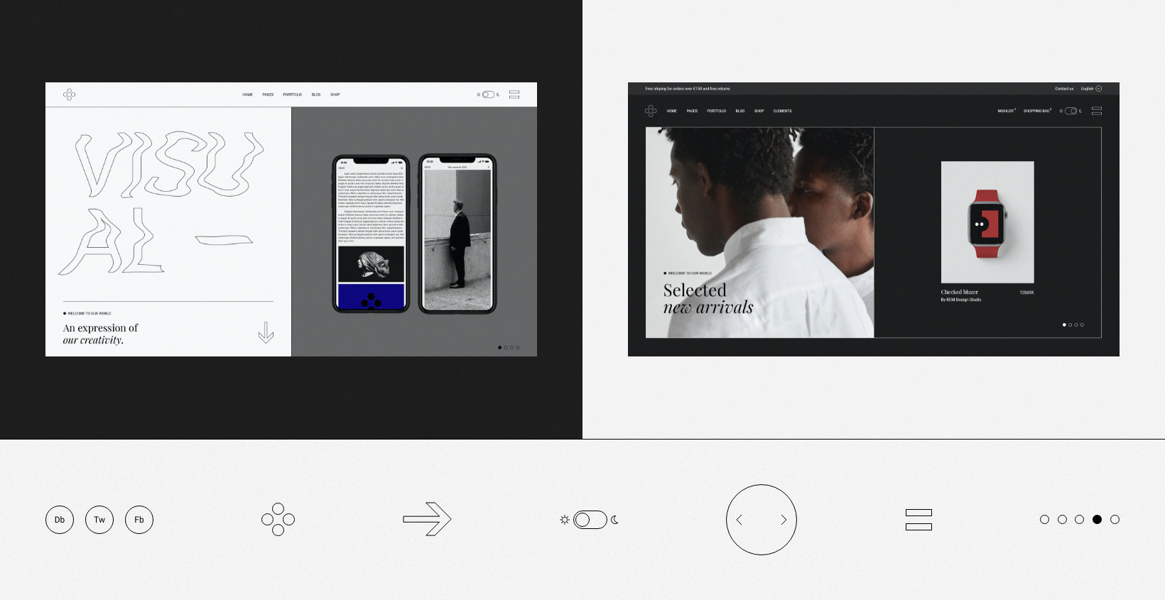
We also decided to add a color switcher to Breton, offering the users not one, but two completely different visual experiences of the theme. This particular UX element, when clicked, changes the color of the entire background, and therefore the very atmosphere of the website. However, as a radical change of background can affect the way other interface elements work and feel, we had to carefully investigate how each element, image and detail would fit into two background modes, focusing on the contrast, energy, visibility, and, of course, functionality.
The works used throughout the theme already bore a certain visual intensity, so the interface elements we were going to use had to be lighter, airier, more minimalistic and scaled-down, in order to prevent cluttering and to maintain a fine visual balance. For instance, we introduced thin separator lines dividing various units/sectors of the layouts on pages, which proved to work remarkably well with the empty space and the imagery in both color modes, subtly underlining their character. We also opted to make most of the interface elements outlined or hollow, instead of filled. The logo, the menu opener, the color switcher, arrows and buttons, the Back to Top icon, social media links, bullets, the drag cursor, etc…all of these elements are merely outlined, which allowed us to make them somewhat larger and more prominent without becoming obtrusive.
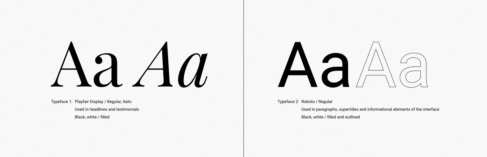
As for the typography, we looked for a serif font that would soften the theme’s atmosphere and give it a subtler note. After trying out several typefaces, we decided that Playfair Display was the best fit. We experimented with the playful combination of regular and italic styles in one piece of textual content and it worked excellent, so we decided to use it as a default for all the titles, too. As for the paragraphs, supertitles, and smaller informational elements of the interface, we decided to use the Roboto typeface. The dynamics of thin interface lines was a great fit with the large Roboto outline text as well, forming a refreshing contrast with the heavier elements of the theme. They also clicked well with the serif Playfair Display font, so we decided to use this typeface as a bona fide design element – we even used it for the video play button. As for Roboto, the sans serif outline proved to be particularly interesting for the animations. We didn’t want to animate it throughout the entire theme, so we alternated between static and animated sans serif outlines, triggered either by the cursor position or by the scroll.
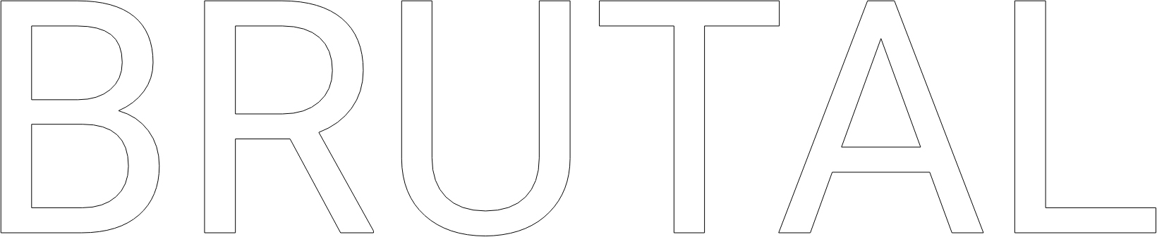
As for the buttons, in addition to the standard-shaped ones, we wanted to create something a bit more divergent. We designed a large, star-shaped, blue “Subscribe Now” button with a circular animation. Sharp and jagged, the star is one of the favorite brutalist shapes, stemming most likely from avant-garde graphic design. In web design, playing with such pronounced shapes always leads to visually exciting results and is great for drawing attention to important UX elements such as CTA buttons. On the other hand, we designed several circular, or, more precisely – oval buttons, which are quite popular in brutalist web design – the vertical oval for the “Back to Top” button and the large horizontal “Hire Us” button in the Passepartout Slider demo. The combination of text and fine circular lines, congruent with the linear layout separations, creates an exciting dynamic and helps make the button stand out in a subtle, unobtrusive way.
Speaking of the cursor, we decided to instill the brutalist ethos in this UI element on some of Breton’s homepages. For instance, for the Interactive Project Scroll homepage we designed a quite oversized cursor. What we wanted to do here is take a web object as omnipresent and familiar as a cursor, and give it a completely new perspective, rendering it slightly uncanny. The cursor of the mouse is, in a way, a digital extension of ourselves, something we perceive as part of ourselves to the extent of not even noticing it anymore. The mere change of its size turns it into a completely new digital object, reminding us of its existence and purpose and creating a short (and entertaining) cognitive jolt.
A bit less extravagant but equally unorthodox is the cursor we created for the Portfolio Categories and Portfolio Minimal homepages. Shaped as a hollow plus sign, this cursor adheres to the vein of outlined interface elements we used throughout Breton. It is followed, as per some sort of magnetism, by the portfolio item’s title and categories, remaining faithful to the utilitarian nature of brutalist design.
The Animations
In devising the animations for Breton, the imperative was, again, to adhere to the principles of brutalism, while making sure, at the same time, the animations are congruous with the theme’s overall design. That’s how we came up with the disappearing outline for the social icons, as well as the “Back to Top” and “Hire Us” buttons.
For some of the animations, we went with raw and abrupt transitions – the color switcher is a particularly good example of that . Similarly, hover animations for many of the images are rather blunt, as the images transform or even disappear abruptly, with no transitions at all, in a classically brutalist manner.
Another distinctly brutalist animation type is what we used in certain portions of textual content – words in sequences of three or four turn from regular to italic, and back. This animation is not dependent on any user interaction, such as hover, click or scroll, and its autonomy keeps it in line with brutalist principles.
On the other hand, as our approach to Breton aimed towards an amalgamation of pure brutalism and contemporary web design, we balanced these brutalist animations with more subtle ones, such as the large outline text moving with the scroll, soft zoom-in on hover for portfolio images, certain images softly interacting with the cursor in a floating motion, arrows changing direction upon hover, the slide effect on the Horizontal Project Reel homepage, and so on. All these animations are brutalist in their essence but still rather toned down, creating a balanced union between brutalism and a contemporary approach to the web.
Closing Words
In a way, Breton can be read as a dynamic exchange of references between styles and approaches. Using Brutalism as its main aesthetic denomination, Breton occasionally moves away from the canon to find a visual language of its own. Brutalism itself bears irreverence as one of its main traits, so this stepping away or toning down of some of the style’s most notable features makes Breton a meta-project of sorts, an endeavor that, at the same time, pays homage and builds upon its origin.