Qi Addons for Elementor
- created: 03/29/2022
- latest update: 03/11/2026
- by: Qode
- helpcenter.qodeinteractive.com/
Qi Addons for Elementor - The Largest Free Collection of Elementor Widgets
Welcome
Welcome to the Qi Addons for Elementor documentation file, where we will be taking a closer look at the 62 free as well as additional 48 Premium custom widgets for Elementor that you get with this plugin and all the options and features you get with them.
Each widget was designed with ease of use in mind, topped of with the top-notch design that the Qode Interactive development team has become known for.
Installing Qi Addons for Elementor
First off, here's a list of minimum requirements as well as recommended hosting parameters for running Qi Addons for Elementor plugin:
Minimum Requirements
- WordPress 5.0 or greater
- PHP version 5.6 or greater
- MySQL version 5.0 or greater
Recommended Hosting Parameters
- PHP version 7.0 or greater
- MySQL version 5.6 or greater
- WordPress Memory limit of 128 MB or greater
There are two ways you can go about installing the Qi Addons for Elementor plugin:
Installing From Your WordPress Dashboard
- Navigate to your WordPress Dashboard -> Plugins -> Add New
- Search for Qi Addons for Elementor plugin
- Install and Activate Qi Addons for Elementor from your Plugins page.
Installing Directly From wordpress.org
- Locate and download Qi Addons for Elementor on wordpress.org
- Upload the qi-addons-for-elementor directory to your ‘/wp-content/plugins/’ directory using your preferred method (ftp, sftp, scp, etc…)
- Install and Activate Qi Addons for Elementor plugin from your Plugins page.
Developer Tools
Each of the widgets that come with the Qi Addons for Elementor plugin has a Developer Tools option sub tab, located under the Content tab, at the very bottom; here you can choose to show shortcode snippet for each shortcode/widget.
In effect, this provides you with a html version of that element which developers can use to further adjust and configure the element manually.
Without further ado, lets delve into the widgets and all they have to offer. Have fun creating your beautiful new website using Qi Addons for Elementor!
Accordions and Toggles
Accordions and Toggles custom widget for Elementor lets you easily configure and display visually appealing strings of text divided into individual sections that can be expanded when their corresponding titles are clicked on – here you can feature your FAQs or any other important bits and pieces of textual information.
Using the Accordions and Tabs widget

1. Adding the Accordions and Toggles widget
First off, you should simply locate the widget by typing its name in the ‘Search Widget…’ field positioned in the upper left under the ‘ELEMENTS’ tab. After this, you should just drag-and-drop the widget to a desired section on the right side of the screen.

2. Accordions and Toggles widget Content settings
First off we’ll go through the options available in the Content tab, or to be more specific, all the settings that you can adjust in the General sub-tab.

Right off the bat, you have the Behavior dropdown where you can opt for using the Accordion or Toggle widget layout. Accordion behavior type enables opening only one section of the element at a time – once a section is clicked on to be expanded, the previously opened one will close. Toggle behavior type allows for multiple sections to be expanded simultaneously.

Next up, regardless whether you selected the Accordion or Toggle behavior, you can adapt the Style of the element. These include Standard, Boxed, Border Top and Border Between predefined styles. Depending on the look you wish to achieve, pick the corresponding element layout and you’ll be able to see the new settings applied on the fly on the right side of your screen.
Standard layout features no borders, Boxed places a border around the entire element, Border Top displays borders above items in the accordion/toggle, and Border Between lays down borders between each item you decided to include
.
The Open Icon and Close Icon fields let you pick an icon or an SVG you wish to display in the element. Depending on the state of the section (active or passive), these icons will be displayed on them – close icon for already expanded sections and closed sections on mouse hover, and the open icon for all passive/closed sections.

Under the section titled Items you can add each individual item/section you wish to feature in your Accordion or Toggle. Here you can input a title and add & customize the content for each of the items you wish to display.

3. Accordions and Toggles widget Style settings
After you have picked a behavior type, style, set up the open & close icons and added individual items for sections, you can move on to styling the element. To access these settings, simply click on the tab titled Style, located next to the Content tab in the upper-left side of the screen.

Here you have a multitude of completely intuitive options for applying different stylizations to the titles, content, borders, as well as the icons. Note that in the event that you selected the Standard element behavior type, you’ll also have the option to set the spacing between the items.
Add to Cart Button
Add to Cart Button custom widget for Elementor lets you display customizable add to cart buttons for your products.
Using the Add to Cart Button widget

1. Adding the Add to Cart Button widget
Simply locate the widget by typing its name in the ‘Search Widget…’ field positioned in the upper left under the ‘ELEMENTS’ tab. After this, you should just drag-and-drop the widget to a desired section on the right side of the screen.

2. Add to Cart Button widget Content settings
Now we are going to take a look at the options available in the Content tab which contains 3 sub-tabs; general, button, and button icon. First off, let’s go through the settings that you can adjust in the General sub-tab.
General Sub-tab

Here you can input the ID corresponding to the product you wish to assign the button to.
Button Sub-tab

Here you can make the basic adjustments to your button. First off you have the option to pick one of three button layouts: filled, outlined and textual.
For both filled and outlined buttons you can alter the button size and select one of three types: standard, with inner border, and icon boxed. You can also enable a button text underline, and set a size for the button.
Button Icon Sub-tab

Here you can add an icon or an SVG you wish to display inside the button, and pick a position for the icon relative to the button.
3. Add to Cart Button widget Style settings
After you have finished with the basic set up of your add to cart button, you can move on to styling the element. To access these settings, simply click on the tab titled Style, located next to the Content tab in the upper-left side of the screen.

Here you’ll find 4 sub-tabs; button style, button icon style, button inner border style, and button underline style. First off, let’s go through the settings that you can adjust in the Button Style sub-tab.
Button Style Sub-tab

Here you can adjust the button text typography and color, button background and border colors, border width, radius, as well as the button padding. Note that you can alter the colors for the button in both its normal and hover states.
Button Icon Style Sub-tab

Next up is the icon style sub-tab where you can adjust the icon size, set icon margins, and make different stylistic choices for your button icon in its normal (idle) and hover states; you can select the icon color in its normal state, and choose one of four behavior types for the button when it is hovered on.
Button Inner Border Style Sub-tab

Here you can set the inner border color, offset and width, as well as pick a hover style and adjust the hover border color for your button with inner borders; please note that in order for these settings to become visible, you need to pick the With Inner Border button type from the content sub-tab Button (this button type is only available for Outlined and Filled button layouts).
Button Underline Style Sub-tab

This section lets you customize the button underline. Please do note that in order for these settings to become visible, you need to set the Enable Button Text Underline option to ”Yes” from the content sub-tab named Button.
Button Underline Style sub-tab lets you apply different styles to button underline for both its normal (idle) and hover states.
Animated Text
Animated Text custom widget for Elementor provides you with a simple and straightforward way to display captivating sections with animated textual content.
Using the Animated Text widget

1. Adding the Animated Text widget
Simply locate the widget by typing its name in the ‘Search Widget…’ field positioned in the upper left under the ‘ELEMENTS’ tab. After this, you should just drag-and-drop the widget to a desired section on the right side of the screen.

2. Animated Text widget Content settings
Now we are going to take a look at the options available in the Content tab which contains two sub-tabs; genera, and appear animated. First off, let’s go through the settings that you can adjust in the General sub-tab.
General Sub-tab
In the first sub tab you can input the text you wish to display.
Appear Animation

In the second sub-tab you can choose how you wish to split the title; you can animate the text word by word, or letter by letter.
You can also pick an appear animation style here, and adjust the animation delay period.
3. Animated Text widget Style settings
After you have finished with the basic set up of your animated text, you can move on to styling the element. To access these settings, simply click on the tab titled Style, located next to the Content tab in the upper-left side of the screen.
Style Sub-tab

In the style sub-tab you can choose an alignment for the element, set a heading tag, color, typography, and input padding values for the title.
Banner
Banners custom widget for Elementor provides you with a straightforward way to create captivating, fully customizable banners where you can display your important announcements, ads or anything else you wish to draw the attention of your visitors to.
Using the Banners widget

1. Adding the Banners widget
Simply locate the widget by typing its name in the ‘Search Widget…’ field positioned in the upper left under the ‘ELEMENTS’ tab. After this, you should just drag-and-drop the widget to a desired section on the right side of the screen.

2. Banners widget Content settings
Now we are going to take a look at the options available in the Content tab which contains 4 sub-tabs; general, content, button, and button icon. First off, let’s go through the settings that you can adjust in the General sub-tab.
General Sub-tab

Here you can make the basic adjustments to your banner. You can pick from two predefined banner layouts: Standard, which places the banner content directly over the banner image, and In Box which puts the content on top of the banner image in a boxed layout.

After you’ve picked a layout you wish to apply to the element, you can move on to adding the banner image and selecting one of eight proportions for the banner image.
You can also choose whether you wish to include a button inside the banner, and input a URL you wish the button to lead to, as well as to choose if the link opens in a new or the same browser tab.
Content Sub-tab

As its name suggests, in this sub-tab you can add the content for your banner; a banner title, subtitle and some additional text. You can choose what to include, e.g. if you wish to display a title only, simply leave the remaining two fields empty. You can also style the title, subtitle and text of your banner separately, but more on that in a bit.
Button Sub-tab
Here you can make the adjustments to the button, in the event that you selected to display one in your banner. First off you have the option to pick one of three button layouts.

Textual
Pick this layout if you wish to display a simple button with some text and a transparent background placed over the banner image. You can enable an underline for the button text, and input the text you wish to display on the button.
Filled
This button layout lets you display filled buttons – buttons with borders and colored button backgrounds. You also get to choose from three button types with this layout; standard, with inner border & icon boxed. In addition to this you can enable an underline for the text, choose a button size, and of course input the text you wish to show on the button.
Outlined
This button layout has the same options as the filled button layout, the key difference being the fact that outlined buttons have borders, but their backgrounds are transparent.
Button Icon Sub-tab

In this sub-tab you can add an icon or an SVG you wish to display in your button, and you get to pick where the icon is positioned relative to the button itself.
3. Banners widget Style settings
After you have finished with the basic set up of your banner, you can move on to styling the element. To access these settings, simply click on the tab titled Style, located next to the Content tab in the upper-left side of the screen.

There are seven sub-tabs for setting up various stylizations for your banner.
Content Style Sub-tab

Here you can adjust the banner padding, set the banner border radius, customize the banner box shadow, pick a vertical & horizontal alignment for the banner, adjust the content background color, border radius, padding, width, and pick an alignment for the textual content.
Style Sub-tab

In this sub-tab you can adjust heading tags, colors and typography for your titles, subtitles and text.
Spacing Style Sub-tab
Simply click and drag to set the top margins for titles and text.
Button Style Sub-tab

Here you can adjust the button text typography, and make different stylistic choices for your banner button in its normal (idle) and hover states.
Button Icon Style Sub-tab
A set of options dedicated to the button icon. You can pick an icon size, and apply different stylizations for your banner button icon in its normal (idle) and hover states.
Button Inner Border Style Sub-tab
Here you can set the inner border color, offset and width for your button with inner borders; please note that in order for these settings to become visible, you need to pick the With Inner Border button type from the content sub-tab Button (this button type is only available for Outlined and Filled button layouts).
Button Underline Style Sub-tab
This section lets you customize the button underline; you can apply different styles to button underline for both its normal (idle) and hover states. Please do note that in order for these settings to become visible, you need to set the Enable Button Text Underline option to ”Yes” from the content sub-tab named Button.
Before/After Comparison Slider
Before/After Comparison Slider is a custom widget for Elementor that lets you effortlessly create interactive before/after style image presentations with draggable handles that gradually reveal one of two provided images depending on the side they are dragged towards.
Using the Before/After Comparison Slider widget

1. Adding the Before/After Comparison Slider widget
Simply locate the widget by typing its name in the ‘Search Widget…’ field positioned in the upper left under the ‘ELEMENTS’ tab. After this, you should just drag-and-drop the widget to a desired section on the right side of the screen.

2. Before/After Comparison Slider widget Content settings
Now we are going to take a look at the options available in the Content tab, or to be more specific, the settings that you can adjust in the General sub-tab.

Here you can add an image you wish to display for the before stage, and an image for the after stage. You can also input the text that will be displayed on the draggable slider handle, pick an orientation style for the slider, and input a value for the default image offset.
If you wish to position the draggable slider handle centrally (and effectively leave half of each image visible), simply leave this field empty as the default value set here is 50%.
3. Before/After Comparison Slider widget Style settings
After you have finished with the basic set up of your slider by providing the images, inputting the handle text, choosing a slider orientation and adjusting the image offset, you can move on to styling the element.
To access these settings, simply click on the tab titled Style, located next to the Content tab in the upper-left side of the screen.

Here you have the option to set the size of the circle displayed on the slider handle, adjust borders, handle text color and typography, and the color of the draggable slider handle itself.
Blockquote
Blockquote custom widget for Elementor provides you with a simple way to display eye-catching quotes and style them the way you choose.
Using the Blockquote widget

1. Adding the Blockquote widget
Simply locate the widget by typing its name in the ‘Search Widget…’ field positioned in the upper left under the ‘ELEMENTS’ tab. After this, you should just drag-and-drop the widget to a desired section on the right side of the screen.

2. Blockquote widget Content settings
Now we are going to take a look at the options available in the Content tab, or to be more specific, the settings that you can adjust in the General sub-tab.

First you have the option to go with one of two blockquote layout styles; Inline, which aligns the quote icon with the text, and Top which places the icon above the quote text.
After you have selected a layout style, simply input the quote text in the text field, and set an icon or an SVG to display at the beginning of the quote.
3. Blockquote widget Style settings
After you have finished with the basic set up of your blockquote by selecting a layout, inputting the quote text, and adding an icon or an SVG, you can move on to styling the element.
To access these settings, simply click on the tab titled Style, located next to the Content tab in the upper-left side of the screen.

There are four sub-tabs for setting up various stylizations for your blockquote.
Style Sub-tab
In the first section of the Style tab you can choose how you wish to align the quote text relative to the rest of the content, pick and define a background style for your blockquote, and choose whether you wish to display quote borders. In the event that you select one of five blockquote border styles, you’ll also have the option to set the border width and color.

Text Style Sub-tab
Here you can pick a heading tag for the text and set the text color and typography.
Icon Style Sub-tab
Pick an alignment, size and set a color for the blockquote icon.
Spacing Style Sub-tab
Adjust the holder padding, top margin for the text, and margins for the blockquote icon.
Blog List
Blog List custom widget for Elementor lets you display a captivating list with your blog posts in a number of captivating ways.
Using the Blog List widget

1. Adding the Blog List widget
Simply locate the widget by typing its name in the ‘Search Widget…’ field positioned in the upper left under the ‘ELEMENTS’ tab. After this, you should just drag-and-drop the widget to a desired section on the right side of the screen.

2. Blog List widget Content settings
Now we are going to take a look at the options available in the Content tab which contains 6 sub-tabs; general, query, layout, layout spacing, read more button, and read more button icon. First off, let’s go through the settings that you can adjust in the General sub-tab.
General Sub-tab

Here you can make the core adjustments to your blog list element. First off you have the option to select one of two list appearance styles: gallery and masonry.
You can also set proportions for the image, pick a number of columns you wish the list to have and choose between predefined responsive settings and inputting different column values for different responsive stages yourself. The last two options let you choose a size for the space between list items and choose whether you wish to display pagination bullets in your list.
Query Sub-tab

Here you can set a maximum number of posts that you wish to display per 1 page, and select how you wish to order the items in the list.
If you wish to limit the list to certain items, you can select additional parameters that will define the items you wish to show.
Layout Sub-tab

In this sub-tab you can pick one of six different item layout styles which define how the posts are shown in the list: boxed, date boxed, info on image, minimal, side image, and standard.
You can use the options found below to set a heading tag for item titles, choose whether you wish to display post excepts in the list and set excerpt length, pick whether you wish to center the content in the list, show media, info icons, choose if you wish to display dates for posts, categories, post authors and decide whether you wish to display the read more button.
Depending on the item layout style you selected from the field above, some of these options may not be available.
Layout Spacing

In the layout spacing sub-tab you can define the bottom margin for post info sections, titles, and text, as well as input values for the content padding.
Read More Button Sub-tab

Here you can make the basic adjustments to the read more button, if you decided to display it in your list from the sub-tab Layout. First off you have the option to pick one of three button layouts: filled, outlined and textual.
For both filled and outlined buttons you can alter the button size and select one of three types: standard, with inner border, and icon boxed. You can also enable a button text underline, set a size for the button, and choose how the link opens.
Read More Button Icon Sub-tab

Here you can add an icon or an SVG you wish to display inside the read more button, and pick a position for the icon relative to the button.
3. Blog List widget Style settings
After you have finished with the basic set up of your blog list, you can move on to styling the element. To access these settings, simply click on the tab titled Style, located next to the Content tab in the upper-left side of the screen.

Here you’ll find 7 sub-tabs; style, read more button style, read more button icon style, read more button inner border style, read more button underline style, content style, and date style. First off, let’s go through the settings that you can adjust in the Style sub-tab.
Style Sub-tab

Here you can further define the appearance of your list. You can set a main color and a hover color for the titles, adjust title typography, and choose whether you wish to display an underline for titles on hover.
You can also set a color and adjust typography for post excerpts, configure info section main and hover colors & typography, and define image hover style and overlay colors.
Read More Button Style

In the event that you decided to display the read more button for items in the list (this option is located in the Layout content sub-tab) Here you can adjust the button text typography and color, button background and border colors, border width, radius, as well as the button padding. Note that you can alter the colors & background for the button in both its normal and hover states.
Read More Button Icon Style

Next up is the read more button icon style sub-tab where you can adjust the icon size, set icon margins, and make different stylistic choices for your button icon in its normal (idle) and hover states; you can select the icon color in its normal state, and choose one of four behavior types for the button when it is hovered on.
Read More Button Inner Border Style

Here you can set the inner border color, offset and width, as well as pick a hover style and adjust the hover border color for your button with inner borders; please note that in order for these settings to become visible, you need to pick the With Inner Border button type from the content sub-tab Read More Button (this button type is only available for Outlined and Filled button layouts).
Read More Button Underline Style

This section lets you customize the read more button underline. Please do note that in order for these settings to become visible, you need to set the Enable Button Text Underline option to ”Yes” from the content sub-tab named Read More Button.
Button Underline Style sub-tab lets you apply different styles to button underline for both its normal (idle) and hover states.
Content Style

In this sub-tab you can set a background color for the content and define item shadows for your list.
Date Style

If you enabled showing post dates, you can define how they appear in your lists here.
Blog Carousel
Blog Carousel custom widget for Elementor provides you with a great way to showcase your blog posts in fully customizable, captivating carousel slider layouts.
Using the Blog Carousel widget
1. Adding the Blog Carousel widget
Simply locate the widget by typing its name in the ‘Search Widget…’ field positioned in the upper left under the ‘ELEMENTS’ tab. After this, you should just drag-and-drop the widget to a desired section on the right side of the screen.
2. Blog Carousel widget Content settings
Now we are going to take a look at the options available in the Content tab which contains 6 sub-tabs; general, query, layout, layout spacing, read more button, and read more button icon. First off, let’s go through the settings that you can adjust in the General sub-tab.
General Sub-tab
In the general sub-tab you can define the basic appearance and how your slider behaves.
You can enable slider loop if you would like the slider to start over from the first image when it comes to the end of the blog list, choose whether you wish to align the slides centrally, enable automated slider play, and input a value for the slide duration and the slide animation duration.
On top of that, you can choose whether you wish to display slider navigation arrows & pagination bullets, set the proportions you wish to apply to images in the slider, enable displaying partial slider columns, choose a number of columns you wish the carousel slider to contain, choose a predefined number of columns for different screen sizes or input custom values for separate responsive stages, and choose a size for the space between the items in your slider.
Query Sub-tab
Here you can set a maximum number of posts that you wish to display per 1 page, and select how you wish to order the items in the list.
If you wish to limit the list to certain items, you can select additional parameters that will define the items you wish to show.
Layout Sub-tab
In this sub-tab you can pick one of six different item layout styles which define how the posts are shown in the list: boxed, date boxed, info on image, minimal, side image, and standard.
You can use the options found below to set a heading tag for item titles, choose whether you wish to display post excepts in the list and set excerpt length, pick whether you wish to center the content in the list, show media, info icons, choose if you wish to display dates for posts, categories, post authors and decide whether you wish to display the read more button.
Depending on the item layout style you selected from the field above, some of these options may not be available.
Layout Spacing
In the layout spacing sub-tab you can define the bottom margin for post info sections, titles, and text, as well as input values for the content padding.
Read More Button Sub-tab
Here you can make the basic adjustments to the read more button, if you decided to display it in your list from the sub-tab Layout. First off you have the option to pick one of three button layouts: filled, outlined and textual.
For both filled and outlined buttons you can alter the button size and select one of three types: standard, with inner border, and icon boxed. You can also enable a button text underline, set a size for the button, and choose how the link opens.
Read More Button Icon Sub-tab
Here you can add an icon or an SVG you wish to display inside the read more button, and pick a position for the icon relative to the button.
3. Blog List widget Style settings
After you have finished with the basic set up of your blog list, you can move on to styling the element. To access these settings, simply click on the tab titled Style, located next to the Content tab in the upper-left side of the screen.
Here you’ll find 9 sub-tabs; slider navigation style, slider pagination style, style, read more button style, read more button icon style, read more button inner border style, read more button underline style, content style, and date style. First off, let’s go through the settings that you can adjust in the Slider Navigation Style sub-tab.
Slider Navigation Sub-tab
In the first sub-tab you can make various adjustments to the slider navigation. In order for these settings to become available, you first need to enable slider navigation from the content sub-tab General.
Here you can choose where you wish to place the navigation relative to the slider, pick a resolution below which the navigation arrows are hidden, and set a vertical and horizontal offset for the navigation arrows.
You can also add an icon or an SVG for both previous and next navigation arrows, set the arrow main & background color, arrow hover color and behavior, arrow size, and navigation arrow holder width and height.
Slider Pagination Style Sub-tab
In this sub-tab you can customize the slider pagination. In order for these settings to become available, you first need to enable slider pagination from the content sub-tab General.
Here you can choose where you wish to position the pagination bullets relative to the slider, alter the offset for pagination, and apply different stylizations for the pagination in its normal (idle) and active states.
Style Sub-tab
Here you can further define the appearance of your carousel list. You can set a main color and a hover color for the titles, adjust title typography, and choose whether you wish to display an underline for titles on hover.
You can also set a color and adjust typography for post excerpts, configure info section main and hover colors & typography, and define image hover style and overlay colors.
Read More Button Style
In the event that you decided to display the read more button for items in the list (this option is located in the Layout content sub-tab) Here you can adjust the button text typography and color, button background and border colors, border width, radius, as well as the button padding. Note that you can alter the colors & background for the button in both its normal and hover states.
Read More Button Icon Style
Next up is the read more button icon style sub-tab where you can adjust the icon size, set icon margins, and make different stylistic choices for your button icon in its normal (idle) and hover states; you can select the icon color in its normal state, and choose one of four behavior types for the button when it is hovered on.
Read More Button Inner Border Style
Here you can set the inner border color, offset and width, as well as pick a hover style and adjust the hover border color for your button with inner borders; please note that in order for these settings to become visible, you need to pick the With Inner Border button type from the content sub-tab Read More Button (this button type is only available for Outlined and Filled button layouts).
Read More Button Underline Style
This section lets you customize the read more button underline. Please do note that in order for these settings to become visible, you need to set the Enable Button Text Underline option to ”Yes” from the content sub-tab named Read More Button.
Button Underline Style sub-tab lets you apply different styles to button underline for both its normal (idle) and hover states.
Content Style
In this sub-tab you can set a background color for the content and define item shadows for your list.
Date Style
If you enabled showing post dates, you can define how they appear in your lists here.
Working Hours
Working Hours custom widget for Elementor provides you with a great and intuitive way to display your business’ working hours in easily styled elements.
Using the Working Hours widget

1. Adding the Working Hours widget
Simply locate the widget by typing its name in the ‘Search Widget…’ field positioned in the upper left under the ‘ELEMENTS’ tab. After this, you should just drag-and-drop the widget to a desired section on the right side of the screen.

2. Working Hours widget Content settings
Now we are going to take a look at the options available in the Content tab which contains 4 sub-tabs; general, separator, separator border image, and separator icon. First off, let’s go through the settings that you can adjust in the General sub-tab.
General Sub-tab

In this sub-tab you can input the basic info you wish to display in the element. You can add a subtitle, a title, and some additional textual content. You can also choose a screen resolution below which you wish to apply the predefined responsive layout for the element, and choose whether you wish to display a separator line between the items in the element.
You can add individual Working Hours items (days) by clicking the + ADD ITEM button located at the bottom of this sub-tab.
For each individual item you can add an icon or an SVG, name of the day, input the working hours, and set a color for the item.
Separator Sub-tab

The separator sub-tab can be used to define the separators in your element. Here you can pick from three separator layout styles; standard, border image, and with icon. You can also choose how you wish to position the separator line. Please note that in order for these options to have effect, you first need to enable displaying the separator in your element from the General content sub-tab.
Separator Border Image Sub-tab

Here you can add a separator border image you wish to display, input the values for the image slice you wish to use as a border image (these values should be provided in the top-right-bottom-left fashion e.g. 20 10 15 20), and choose an image repeat style you wish to use. Please note that in order for these options to have effect, you first need to choose the border image separator layout from the Separator content sub-tab located above.
Separator Icon Sub-tab

In the separator icon sub-tab you can add an icon or an SVG you wish to place on your separator line. This option becomes available once you select the with icon separator layout from the Separator content sub-tab located above.
3. Working Hours widget Style settings
After you have finished with the basic set up of your working hours, you can move on to styling the element. To access these settings, simply click on the tab titled Style, located next to the Content tab in the upper-left side of the screen.

There are six sub-tabs for setting up various stylizations for your carousel.
Item Style Sub-tab

In this sub-tab you can adjust the appearance of your working hours items; you can set an icon color, size, set a heading heading tag, color & typography for the day name, set a color & typography for the hours, and choose a line & border type you wish to display.
General Style Sub-tab

Here you can make basic adjustments to the general look of the element; you can define the element background and define borders.
Text Style Sub-tab
Here you can configure the appearance of all the textual content in the working hours element.
Separator Style Sub-tab
If you enabled displaying the separator in your counter from the General content sub-tab, you can further define the separator line here. You can choose one of three separator border styles, and adjust separator width, thickness, and both bottom and top margins.
Separator Icon Style Sub-tab

This set of options relates to the with icon separator layout. Here you can set a color, font size and margins for the separator icon.
Button
Button custom widget for Elementor lets you create fully customizable buttons the easy way.
Using the Button widget

1. Adding the Button widget
Simply locate the widget by typing its name in the ‘Search Widget…’ field positioned in the upper left under the ‘ELEMENTS’ tab. After this, you should just drag-and-drop the widget to a desired section on the right side of the screen.

2. Button widget Content settings
Now we are going to take a look at the options available in the Content tab which contains 2 sub-tabs; general and icon. First off, let’s go through the settings that you can adjust in the General sub-tab.
General Sub-tab

Here you can make the basic adjustments to your button. First off you have the option to pick one of three button layouts.
Filled

This layout lets you display filled buttons – buttons with borders and colored backgrounds. You also get to choose from three button types with this layout; standard, with inner border & icon boxed. In addition to this you can enable an underline for the text, choose a button size, and of course input the text you wish to show on the button alongside a button link.
Outlined

This button layout has the same options as the filled button layout, the key difference being the fact that outlined buttons have borders, however their backgrounds are transparent.
Textual

Pick this layout if you wish to display a simple button with some text and a transparent background. You can enable an underline for the button text, input the text you wish to display on the button, add a URL for the button link & choose how the link opens.
Icon Sub-tab

Here you can add an icon or an SVG you wish to display inside the button, and pick a position for the icon relative to the button.
3. Button widget Style settings
After you have finished with the basic set up of your button, you can move on to styling the element. To access these settings, simply click on the tab titled Style, located next to the Content tab in the upper-left side of the screen.

There are four sub-tabs for setting up various stylizations for your button.
Style Sub-tab

Right below the Style tab is the eponymous Style sub-tab. Here you can adjust the button text typography and color, button background and border colors, border width, radius, as well as the button padding. Note that you can alter the colors for the button in both its normal and hover states.
Icon Style Sub-tab
Next up is the icon style sub-tab where you can adjust the icon size, set icon margins, and make different stylistic choices for your button icon in its normal (idle) and hover states; you can select the icon color in its normal state, and choose one of four behavior types for the button when it is hovered on.
Inner Border Style Sub-tab
Here you can set the inner border color, offset and width, as well as pick a hover style and adjust the hover border color for your button with inner borders; please note that in order for these settings to become visible, you need to pick the With Inner Border button type from the content sub-tab General (this button type is only available for Outlined and Filled button layouts).
Underline Style Sub-tab
This section lets you customize the button underline. Please do note that in order for these settings to become visible, you need to set the Enable Button Text Underline option to ”Yes” from the content sub-tab named General.
Button Underline Style sub-tab lets you apply different styles to button underline for both its normal (idle) and hover states.
Call to Action
Call to Action is a custom widget for Elementor that lets you effortlessly create visually appealing messages for your visitors and encourage them to take a certain action.
Using the Call to Action widget

1. Adding the Call to Action widget
Simply locate the widget by typing its name in the ‘Search Widget…’ field positioned in the upper left under the ‘ELEMENTS’ tab. After this, you should just drag-and-drop the widget to a desired section on the right side of the screen.

2. Call to Action widget Content settings
Now we are going to take a look at the options available in the Content tab which contains 3 sub-tabs; general, button, and button icon. First off, let’s go through the settings that you can adjust in the General sub-tab.
General Sub-tab

In the general sub-tab you can input the title (main text) of your call to action message, and input some additional text if you choose to.
You can also choose a screen size below which the button will not be displayed, and make the entirety of the call to action element clickable by setting the Enable link overlay option to “Yes”.
Button Sub-tab
Here you can make the adjustments to the call to action button. First off you have the option to pick one of three button layouts.
Filled
This button layout lets you display filled buttons – buttons with borders and colored button backgrounds. You also get to choose from three button types with this layout; standard, with inner border & icon boxed. In addition to this you can enable an underline for the text, choose a button size, and of course input the text you wish to show on the button and add a URL for the button link.
Outlined
This button layout has the same options as the filled button layout, the key difference being the fact that outlined buttons have borders, but their backgrounds are transparent.
Textual
Pick this layout if you wish to display a simple button with some text and a transparent background placed over the call to action element. You can enable an underline for the button text, input the text you wish to display on the button, and add a URL for the button link.
Button Icon Sub-tab
In this sub-tab you can add an icon or an SVG you wish to display in your button, and you get to pick where the icon is positioned relative to the button itself.
3. Call to Action widget Style settings
After you have finished with the basic set up of your call to action, you can move on to styling the element. To access these settings, simply click on the tab titled Style, located next to the Content tab in the upper-left side of the screen.

There are six sub-tabs for setting up various stylizations for your call to action.
Style Sub-tab
In this sub-tab you can adjust heading tags, colors and typography for your titles, subtitles and text, as well as to define backgrounds and borders for your call to action element.
Spacing Style Sub-tab
Easily set up the holder padding, adjust the top margin for the text, right content padding, and set button margins.
Button Style Sub-tab
Here you can adjust the button text typography, and make different stylistic choices for your call to action button in its normal (idle) and hover states.
Button Icon Style Sub-tab
A set of options dedicated to the button icon. You can pick an icon size, and apply different stylizations for your call to action button icon in its normal (idle) and hover states.
Button Inner Border Style Sub-tab
Here you can set the inner border color, offset and width for your button with inner borders; please note that in order for these settings to become visible, you need to pick the With Inner Border button type from the content sub-tab Button (this button type is only available for Outlined and Filled button layouts).
Button Underline Style Sub-tab
This section lets you customize the button underline; you can apply different styles to button underline for both its normal (idle) and hover states. Please do note that in order for these settings to become visible, you need to set the Enable Button Text Underline option to ”Yes” from the content sub-tab named Button.
Cards Gallery
Cards Gallery custom widget lets you easily create an interactive presentation with multiple images stacked on top of each other; once a piece of an image that is set under the currently displayed image is clicked on, that image moves to the top of the stack.
Using the Cards Gallery widget

1. Adding the Cards Gallery widget
Simply locate the widget by typing its name in the ‘Search Widget…’ field positioned in the upper left under the ‘ELEMENTS’ tab. After this, you should just drag-and-drop the widget to a desired section on the right side of the screen.

2. Cards Gallery widget Content settings
Now we are going to take a look at the options available in the Content tab, or to be more specific, the settings that you can adjust in the General sub-tab.

First off you have the option to pick a target for the links; you can choose whether the links will open in the same or a new browser tab. The links are added separately to individual items, more on that in just a bit.
Next up you have three image shuffle styles to choose from. Depending on the one you go with, the images will appear stacked to the right, left, or in the left-right style.

Now we get to adding individual images to your card galleries. To add a new image item, click the + ADD ITEM button located beneath the Image Items section.
After you have done so, you’ll have the option to add a link and an image for each of the items you wish to display in the gallery.
3. Cards Gallery widget Style settings
After you have finished with the basic set up of your cards gallery, you can move on to styling the element. To access these settings, simply click on the tab titled Style, located next to the Content tab in the upper-left side of the screen.

Here you can simply click and drag the sliders and set the scale step (scales the bottom images), and the offset step (defines how much of the bottom image(s) is visible beneath the currently displayed top image).
Pie and Donut Charts
Pie and Donut Charts custom widget for Elementor lets you display fully customizable pie charts as well as donut charts in a simple and completely intuitive manner.
Using the Pie and Donut Charts widget

1. Adding the Pie and Donut Charts widget
Simply locate the widget by typing its name in the ‘Search Widget…’ field positioned in the upper left under the ‘ELEMENTS’ tab. After this, you should just drag-and-drop the widget to a desired section on the right side of the screen.

2. Pie and Donut Charts widget Content settings
Now we are going to take a look at the options available in the Content tab, or to be more specific, the settings that you can adjust in the General sub-tab.

Here you can add the individual items you wish to feature in your chart. For each individual item you can input a data value, data label, set background & hover background colors, add a pattern image if you wish to feature it for that specific item, and set border and hover border colors.
In addition to adding individual items and their properties, here you can also input a title for your chart, and include some additional text if you wish.
3. Pie and Donut Charts Style settings
After you have finished with the basic set up of your chart, you can move on to styling the element. To access these settings, simply click on the tab titled Style, located next to the Content tab in the upper-left side of the screen.

There are four sub-tabs for setting up various stylizations for your chart.
Chart Style Sub-tab

First off, the chart style sub-tab lets you select how the chart will be aligned on your page; you can display charts on the left, right, and centrally.
The next dropdown labeled Chart Type lets you select the type of chart you wish to create. You can create either a Pie Chart or a Doughnut Chart.
You can also adjust the chart width, border width, and border width on hover.
Text Style Sub-tab
In this sub-tab you can adjust the text alignment, color, and typography. In addition to this you can pick a heading tag for your title, set a color for the title and alter title typography & top margin.
Legend Style Sub-tab
This sub-tab is all about letting you display & customize chart legends. You can choose whether you wish to display the legend, pick where you wish to position legends, set the legend bar width & height, set a size for the space between legend items & set legend bar and legend holder margins.
Moreover, you can adjust the legend label color & typography here.
Spacing Style Sub-tab
In this sub-tab you can set the top margin for the text and input text padding values.
Clients List
Clients List custom widget for Elementor lets you display a captivating list of your clients or business associates the easy way.
Using the Clients List widget

1. Adding the Clients List widget
Simply locate the widget by typing its name in the ‘Search Widget…’ field positioned in the upper left under the ‘ELEMENTS’ tab. After this, you should just drag-and-drop the widget to a desired section on the right side of the screen.

2. Clients List widget content settings
Now we are going to take a look at the options available in the Content tab, or to be more specific, the settings that you can adjust in the General sub-tab.
General Sub-tab

Here you can make basic adjustments related to appearance and behavior of the element. You have the option to select one of eight predefined image proportions, or to input custom image width and height on your own.
The next set of options is related to list columns; here you can pick a number of columns for your list, choose predefined settings for columns on smaller screens or pick the number of columns for each responsive stage separately, and adjust the size of the space between the list items. You can also choose to include borders for your list if you wish, with two border types available.
After you made these adjustments, you can move on to adding individual items to your list.

To include an item in the list, simply click the +ADD ITEM button located at the bottom of the section. You can feature as many items as you decide.
You have the option to set a main image and an image that appears on hover for each client item. You can also add a title and some additional text, as well as add a link for each of the items and set targets for said links.
3. Clients List widget Style settings
After you have finished with the basic set up of your client list, you can move on to styling the element. To access these settings, simply click on the tab titled Style, located next to the Content tab in the upper-left side of the screen.

There are two sub-tabs for setting up various stylizations for your list.
Border Style Sub-tab

In the first sub-tab you can make various adjustments to the list borders. In order for these settings to become available, you first need to enable one of two types of borders for your list from the content sub-tab General.
Here you can choose a color for your borders, pick a border style, and set border width. There are three border types to choose from: solid, dashed and dotted.
Style Sub-tab

In the style sub-tab you can further define the look and feel of your list. Here you can set an alignment type for the list, pick a heading tag for item titles, set color for item titles and adjust typography, and pick a color & set typography for the additional item text.
On top of that you can adjust bottom margins for titles and images in your list, and input padding values for the element.
Clients Carousel
Clients Carousel custom widget for Elementor provides you with a great way to showcase your clients or business partners in fully customizable carousel slider layouts.
Using the Clients Carousel widget

1. Adding the Clients Carousel widget
Simply locate the widget by typing its name in the ‘Search Widget…’ field positioned in the upper left under the ‘ELEMENTS’ tab. After this, you should just drag-and-drop the widget to a desired section on the right side of the screen.

2. Clients Carousel widget Content settings
Now we are going to take a look at the options available in the Content tab, or to be more specific, the settings that you can adjust in the General sub-tab.

In the general sub-tab you can define the basic appearance and how your slider behaves.
You can enable slider loop if you would like the slider to start over from the first image when it comes to the end of the clients list, choose whether you wish to align the slides centrally, enable automated slider play, and input a value for the slide duration and the slide animation duration.
On top of that, you can choose whether you wish to display slider navigation arrows & pagination bullets, set the proportions you wish to apply to images in the slider, enable displaying partial slider columns, choose a number of columns you wish the carousel slider to contain, choose a predefined number of columns for different screen sizes or input custom values for separate responsive stages, and choose a size for the space between the items in your slider.
After you have made all the adjustments to the element, you can start adding Clients Carousel items to your slider.

To include an item in the carousel, simply click the +ADD ITEM button located at the bottom of the section. You can feature as many items as you decide.
You have the option to set a main image and an image that appears on hover for each client item. You can also add a title and a link for each of the items, as well choose a target for said link.
3. Clients Carousel widget Style settings
After you have finished with the basic set up of your carousel slider, you can move on to styling the element. To access these settings, simply click on the tab titled Style, located next to the Content tab in the upper-left side of the screen.

There are three sub-tabs for setting up various stylizations for your carousel.
Slider Navigation Style Sub-tab

In the first sub-tab you can make various adjustments to the slider navigation. In order for these settings to become available, you first need to enable slider navigation from the content sub-tab General.
Here you can choose where you wish to place the navigation relative to the slider, pick a resolution below which the navigation arrows are hidden, and set a vertical and horizontal offset for the navigation arrows.
You can also add an icon or an SVG for both previous and next navigation arrows, set the arrow main & background color, arrow size, and navigation arrow holder width and height.
Slider Pagination Style Sub-tab

In this sub-tab you can customize the slider pagination. In order for these settings to become available, you first need to enable slider pagination from the content sub-tab General.
Here you can choose where you wish to position the pagination bullets relative to the slider, alter the offset for pagination, and apply different stylizations for the pagination in its normal (idle) and active states.
Style Sub-tab

In this section you can further define your carousel slider. You can pick an alignment for the carousel, set a heading tag for the item titles, apply a color of you choosing to the titles, customize title typography, and adjust the bottom margin for slider images.
Contact Form 7
Contact Form 7 custom widget for Elementor lets you display a wide variety of fully flexible contact forms using the free Contact Form 7 plugin.
Using the Contact Form 7 widget

1. Adding the Contact Form 7 widget
Simply locate the widget by typing its name in the ‘Search Widget…’ field positioned in the upper left under the ‘ELEMENTS’ tab. After this, you should just drag-and-drop the widget to a desired section on the right side of the screen.
2. Contact Form 7 >widget Content settings
Now we are going to take a look at the options available in the Content tab, or to be more specific, the settings that you can adjust in the General sub-tab.
General Sub-tab
Here you can select one of the previously created Contact Form 7 form templates.
3. Contact Form 7 widget Style settings
Now we are going to take a look at the options available in the Style tab which contains nine sub-tabs for adjusting various stylistic features of your contact form. These are label style, input style, checkbox style, radio style, button style, spacing style, global style, error style, and response style. First off, let’s go through the settings that you can adjust in the Label Style sub-tab.
Label Style Sub-tab
In the first sub-tab you can adjust the contact form label typography and text color.
Input Style Sub-tab
Here you can make various stylistic choices related to input in both active and normal (idle) states. You can adjust typography, color, background color, pick one of 5 border styles, and input values for border radius.
Checkbox Style Sub-tab
In this sub-tab you’ll find options for adjusting the contact form checkbox; you can alter checkbox input size and space between checkboxes, and input values for checkbox input margins and checkbox holder margins.
Radio Style Sub-tab
Here you can make adjustments to the radio button in your contact form; you can adapt radio input size and set a size for the space between radio buttons, and input values for radio input margins and radio input holder margins.
Button Style Sub-tab
This is where you can adjust button typography, and set button color, background color and border color in both normal and active states, and input values for button border width and border radius.
Spacing Style
In this sub-tab you can adjust element spacings. You can values for form item space, input padding, set button margins and padding.
Global Style Sub-tab
Here you can pick an alignment style for the contact form.
Error Style Sub-tab
Here you can configure the error message style. You can pick error alignment, adjust typography, color, and input values for error margins.
Response Style Sub-tab
In this sub-tab you can adjust contact form response styles. You can configure typography, text color, input values for padding and margins, pick one of 5 border styles and adjust the response background.
On top of that you can set colors for sent border, failed border, spam border, and invalid message border.
Countdown
Countdown custom widget for Elementor provides you with a straightforward way to announce anything you wish by displaying eye-catching countdowns to a date you input.
Using the Countdown widget

1. Adding the Countdown widget
Simply locate the widget by typing its name in the ‘Search Widget…’ field positioned in the upper left under the ‘ELEMENTS’ tab. After this, you should just drag-and-drop the widget to a desired section on the right side of the screen.

2. Countdown widget Content settings
Now we are going to take a look at the options available in the Content tab which contains 2 sub-tabs; general, and label. First off, let’s go through the settings that you can adjust in the General sub-tab.
General Sub-tab

In the general sub-tab you can input the date and the hour you wish to element to countdown to. In addition to this, you can choose a format for your countdown; you can display the remaining months, days, hours, minutes and seconds, or choose to hide one of the aforementioned by selecting your preferred format style.
Labels Sub-tab
In the labels sub-tab you can input custom labels of your own for each time unit displayed, both when the digits for corresponding units are in their singular and plural forms. If you wish to leave the default values (months, days, hours, minutes, seconds), simply leave these fields empty.
3. Countdown widget Style settings
After you have finished with the basic set up of your countdown, you can move on to styling the element. To access these settings, simply click on the tab titled Style, located next to the Content tab in the upper-left side of the screen.

There are two sub-tabs for setting up various stylizations for your countdown.
Style Sub-tab

There’s a number of options for customizing your countdown in the style sub-tab. You can choose how you wish to justify items in the countdown and choose an alignment style for them. Aside from this you can also alter the digit color and typography, as well as change the color, typography and set the top margin for the item labels.
Item Style Sub-tab

In the item style sub-tab you can further define the stylization for your countdown. Here you can customize countdown item background, and set width, height and margins for countdown items.
Counters
Counters custom widget for Elementor lets you display all your important numbers in fully customizable and captivating counter layouts.
Using the Counter widget

1. Adding the Counter widget
Simply locate the widget by typing its name in the ‘Search Widget…’ field positioned in the upper left under the ‘ELEMENTS’ tab. After this, you should just drag-and-drop the widget to a desired section on the right side of the screen.

2. Counters widget Content settings
Now we are going to take a look at the options available in the Content tab which contains two sub-tabs; general, and separator icon. First off, let’s go through the settings that you can adjust in the General sub-tab.
General Sub-tab

In the general sub-tab you can make all basic settings related to your counter. First off you can input a start digit, an end digit, step between digits, step delay and digit label.
Start digit is a field where you can input a number from which the counter starts; namely, as the counter element appears in the viewport on your pages, as its name suggests, start digit is the first number displayed in the counter.
In the end digit field you can input the number you wish to display in your counter; this number will be displayed as the definitive value in your counter.
Step between digits refers to the way in which the counter will switch from the initially displayed start digit to its destination, the end digit (e.g. if you set the starting digit to 0 and input 5 in the step between digits field, the element will count by fives in the 5, 10, 15… manner).
The step delay lets you input a number of milliseconds that each step of the counter takes up.
The digit label input field can be used to display some additional text right next to the counter digits.
You can also choose whether you wish to display an icon and a separator in your counter, and add a counter title and some additional text.
Icon Sub-tab

In the icon sub-tab you can set an icon or an SVG you wish to display in your counter, and set icon color & size. Naturally, for these options to have effect you first need to enable displaying the icon in your counter element from the General content sub-tab.
Separator Sub-tab

The separator sub-tab can be used to define the separators in your counter element. Here you can pick from three separator layout styles; standard, border image, and with icon. You can also choose how you wish to position the separator line. Please note that in order for these options to have effect, you first need to enable displaying the separator in your counter element from the General content sub-tab.
Separator Border Image Sub-tab

Here you can add a separator border image you wish to display, input the values for the image slice you wish to use as a border image (these values should be provided in the top-right-bottom-left fashion e.g. 20 10 15 20), and choose an image repeat style you wish to use. Please note that in order for these options to have effect, you first need to choose the border image separator layout from the Separator content sub-tab located above.
Separator Icon Sub-tab

In the separator icon sub-tab you can add an icon or an SVG you wish to place on your separator line. This option becomes available once you select the with icon separator layout from the Separator content sub-tab located above.
3. Counters widget Style settings
After you have finished with the basic set up of your counter, you can move on to styling the element. To access these settings, simply click on the tab titled Style, located next to the Content tab in the upper-left side of the screen.

Here you’ll find 4 sub-tabs; style, spacing style, separator style, and separator icon style. First off, let’s go through the settings that you can adjust in the Style sub-tab.
Style Sub-tab

In the style sub-tab you can set the alignment for the element, adjust typography, color & background for counter digits. You can also enable the stroke effect for digits (display outlined digits), and if you choose to do so you can set the stroke color & outline width.
In addition to this you can style the counter title and the additional text if you decided to feature it in the element.
Spacing Style Sub-tab

In this sub-tab you can adjust the top margins for your title and additional text, and input values for text padding.
Separator Style Sub-tab

If you enabled displaying the separator in your counter from the General content sub-tab, you can further define the separator line here. You can set a color for the separator, choose one of three separator border styles, and adjust separator width, thickness, and both bottom and top margins.
Separator Icon Style Sub-tab

This set of options relates to the with icon separator layout. Here you can set a color, font size and margins for the separator icon.
Device Frame Carousel
Device Frame Carousel custom widget for Elementor lets you easily compose remarkable carousel presentations with multiple items with images fitted inside device-styled frames.
Using the Device Frame Carousel widget

1. Adding the Device Frame Carousel widget
Simply locate the widget by typing its name in the ‘Search Widget…’ field positioned in the upper left under the ‘ELEMENTS’ tab. After this, you should just drag-and-drop the widget to a desired section on the right side of the screen.

2. Device Frame Carousel widget Content settings
Now we are going to take a look at the options available in the Content tab which contains two sub-tabs; general and slider settings. First off, let’s go through the settings that you can adjust in the General sub-tab.
General Sub-tab

In the general sub-tab you can add your carousel items by clicking the + ADD ITEM button located at the bottom of this section.
For each of the items you wish to feature in the carousel you can choose one of four predefined device frame images (or use a custom device frame image of your own), add the images you wish to display in this specific frame, set the slide width, device width, image border radius and input values for the image offset.
Slider Settings Sub-tab

In the slider settings sub-tab you can define the basic appearance of your carousel slider and how it will behave.
You can enable slider loop if you would like the slider to loop when it comes to the last slide, choose whether you wish to align the slides centrally, enable automated slider play, and input a value for the slide duration and the slide animation duration.
On top of that, you can choose whether you wish to display slider navigation arrows & pagination bullets, and choose a size for the space between the items in your slider.
3. Device Frame Carousel widget Style settings
After you have finished with the basic set up of your carousel slider, you can move on to styling the element. To access these settings, simply click on the tab titled Style, located next to the Content tab in the upper-left side of the screen.

There are two sub-tabs for setting up various stylizations for your carousel.
Slider Navigation Style Sub-tab

In the first sub-tab you can make various adjustments to the slider navigation. In order for these settings to become available, you first need to enable slider navigation from the content sub-tab Slider Settings.
Here you can choose where you wish to place the navigation relative to the slider, pick a resolution below which the navigation arrows are hidden, and set a vertical and horizontal offset for the navigation arrows.
You can also add an icon or an SVG for both previous and next navigation arrows, set the arrow main & background color, arrow size, and navigation arrow holder width and height.
Slider Pagination Style Sub-tab
In this sub-tab you can customize the slider pagination. In order for these settings to become available, you first need to enable slider pagination from the content sub-tab Slider Settings.
Here you can choose where you wish to position the pagination bullets relative to the slider, alter the offset for pagination, and apply different stylizations for the pagination in its normal (idle) and active states.
Device Frame Slider
Device Frame Slider custom widget for Elementor lets you easily create visually appealing slider presentations with images displayed inside predefined or custom device-styled image frames.
Using the Device Frame Slider widget

1. Adding the Device Frame Slider widget
Simply locate the widget by typing its name in the ‘Search Widget…’ field positioned in the upper left under the ‘ELEMENTS’ tab. After this, you should just drag-and-drop the widget to a desired section on the right side of the screen.

2. Device Frame Slider widget Content settings
Now we are going to take a look at the options available in the Content tab, or to be more specific, the settings that you can adjust in the General sub-tab.

In the general sub-tab you can add the images you wish to feature in the slider and pick one of three predefined device-styled frames (or use a device frame image of your own).
Slider Settings Sub-tab

In the slider settings sub-tab you can define the basic appearance of your slider and how it will behave.
You can enable slider loop if you would like the slider to loop when it comes to the last slide, enable automated slider play, and input a value for the slide duration and the slide animation duration.
On top of that, you can choose whether you wish to display navigation arrows & pagination bullets in your slider.
3. Device Frame Slider widget Style settings
After you have finished with the basic set up of your slider, you can move on to styling the element. To access these settings, simply click on the tab titled Style, located next to the Content tab in the upper-left side of the screen.

There are three sub-tabs for setting up various stylizations for your slider.
Slider Navigation Style Sub-tab
In the first sub-tab you can make various adjustments to the slider navigation. In order for these settings to become available, you first need to enable slider navigation from the content sub-tab Slider Settings.
Here you can choose where you wish to place the navigation relative to the slider, pick a resolution below which the navigation arrows are hidden, and set a vertical and horizontal offset for the navigation arrows.
You can also add an icon or an SVG for both previous and next navigation arrows, set the arrow main & background color, arrow size, and navigation arrow holder width and height.
Slider Pagination Style Sub-tab
In this sub-tab you can customize the slider pagination. In order for these settings to become available, you first need to enable slider pagination from the content sub-tab Slider Settings.
Here you can choose where you wish to position the pagination bullets relative to the slider, alter the offset for pagination, and apply different stylizations for the pagination in its normal (idle) and active states.
Style Sub-tab
In this section you can alter the device width, set the image border radius and input values for image offset.
Drop Caps
Drop Caps custom widget for Elementor provides you with a neat way to introduce your paragraphs & strings of text by featuring a decorative initial letter which you can fully adapt.
Using the Drop Caps widget

1. Adding the Drop Caps widget
Simply locate the widget by typing its name in the ‘Search Widget…’ field positioned in the upper left under the ‘ELEMENTS’ tab. After this, you should just drag-and-drop the widget to a desired section on the right side of the screen.

2. Drop Caps widget Content settings
Now we are going to take a look at the options available in the Content tab, or to be more specific, the settings that you can adjust in the General sub-tab.

This is where you can input your textual content; note that the first letter of this text string is the one to which the decoration will be applied.
3. Drop Caps widget Style settings
After you’ve added the text you wish to display, you can move on to styling the element. To access these settings, simply click on the tab titled Style, located next to the Content tab in the upper-left side of the screen.

There are two sub-tabs for setting up different stylizations for your drop caps.
Style Sub-tab

This sub-tab lets you make various stylization choices and apply them to your drop caps. You can adjust the letter typography, color, and holder size. You can also define the background for your drop cap (the initial letter of the text); you can pick a background type, and add a color of your choice or an image to the background around the initial letter.
In addition to this you can display borders around the element if you wish, and you get five different border types to choose from: solid, double, dotted, dashed and groove. You can also set the border width, color, and input values for the letter border radius.
You can also enable the letter stroke effect if you choose to; this will apply an outlined style to the initial letter of your text, and you can pick the outline (letter stroke) color and set the width for the stroke.
Another effect you can apply to the initial letter is the letter clip effect; by enabling this you’ll have the option to set a background inside the initial letter. You can choose a background type, set a color for the background, and add an image to be featured inside the letter. This image can be positioned the way you choose, and you can also pick the image attachment & repeat styles, as well set the image size.
The last two options featured in this sub-tab let you adjust the text typography and color.
Spacing Style Sub-tab

The final sub-tab under the Style tab lets you input values for letter margins and padding.
Dual Image with Content
Dual Image with Content custom widget for Elementor provides you with an easy way to create sections that contain two images, one placed on top of the other, with some accompanying content.
Using the Dual Image with Content widget
1. Adding the Dual Image with Content widget
Simply locate the widget by typing its name in the ‘Search Widget…’ field positioned in the upper left under the ‘ELEMENTS’ tab. After this, you should just drag-and-drop the widget to a desired section on the right side of the screen.
2. Dual Image with Content widget Content settings
Now we are going to take a look at the options available in the Content tab, or to be more specific, the settings that you can adjust in the General sub-tab.
General Sub-tab
Here you can input your title, pick which words you wish to apply decoration to, select words from the title you wish to apply different colors to, provide additional textual content, and pick a bottom section template you wish to feature in the element.
You can also add a main and a secondary image here, and set image proportions for both images.
3. Dual Image with Content widget Style settings
After you have finished with the basic set up of your dual image with content, you can move on to styling the element. To access these settings, simply click on the tab titled Style, located next to the Content tab in the upper-left side of the screen.
Style Sub-tab
In this sub-tab you can adjust the maximum width for the second image, pick an alignment for the element, element content position and configure background color for the content.
You can also pick a heading tag for the title, and set title color, typography, color for differently colored words (in the event that you decided to color some words differently from the content tab General) and select a decoration style for decorative text (in the event that you decided to apply decoration to specific words from the content tab General).
You can also set colors & typography for the additional text here.
Spacing Style Sub-tab
In the final sub-tab of the style tab you can adjust bottom margins for the title and text, and input values for content padding.
FAQs
FAQs custom widget for Elementor lets you display fully customizable sections for frequently asked questions and topics the easy way.
Using the FAQs widget

1. Adding the FAQs widget
Simply locate the widget by typing its name in the ‘Search Widget…’ field positioned in the upper left under the ‘ELEMENTS’ tab. After this, you should just drag-and-drop the widget to a desired section on the right side of the screen.

2. FAQs widget Content settings
Now we are going to take a look at the options available in the Content tab, or to be more specific the settings that you can adjust in the General sub-tab.
General Sub-tab

Here you can enable a JSON schema for the element. This automatically inputs the json schema part of the code into the element and helps your FAQ section get indexed in search engines even on non-standard devices such are mobile devices or TVs.
You can also pick a behavior style for the FAQ element here, and choose one of 3 styles: standard, boxed, and border between.
You also have the option to enumerate different sections (items) you wish to feature in the element.
In the event that you selected accordion behavior type for the FAQs, you can also add icons or SVGs for both opening & closing the FAQ sections/items.
After you made your choices, you can start adding individual items to the FAQ.
To add a new item, simply click the + ADD ITEM button located at the bottom of the sub-tab. You can input a title and additional textual content for each of the items (sections) you wish to display in your FAQ.
3. FAQs widget Style settings
After you have finished with the basic set up of your FAQ, you can move on to styling the element. To access these settings, simply click on the tab titled Style, located next to the Content tab in the upper-left side of the screen.

Here you’ll find 3 sub-tabs; number style, title style, and style. First off, let’s go through the settings that you can adjust in the Number Style sub-tab.
Number Style Sub-tab

If you enabled displaying numbered items from the content sub-tab General, you can make stylistic adjustments to those numbers here.
You can configure number typography, pick main and background colors for both normal and active states, adjust number width and height, and input values for right and left number margins and the number border radius.
Title Style Sub-tab

Here you can adjust the FAQ titles. You can set a heading tag, configure typography, and alter title main & background colors for both normal and active states. You can also input values for title padding here.
Style Sub-tab

In the style sub-tab you can pick a main color, background color and active background color for the content in your FAQ element. You can also input values for content padding, set color for the element border, and adjust size of the space between items as well as the icon size.
Graphs
Graphs custom widget for Elementor lets you display captivating and fully customizable graphs containing all sorts of data.
Using the Graphs widget

1. Adding the Graphs widget
Simply locate the widget by typing its name in the ‘Search Widget…’ field positioned in the upper left under the ‘ELEMENTS’ tab. After this, you should just drag-and-drop the widget to a desired section on the right side of the screen.

2. Graphs widget Content settings
Now we are going to take a look at the options available in the Content tab, or to be more specific, the settings that you can adjust in the General sub-tab.
General Sub-tab

Here you can input your datasets or items. To add a new item, simply click the +ADD ITEM button located near the bottom of the sub-tab.
For each of the items you wish to feature in the graph you can input the dataset values separated by commas, and dataset labels. You can also adjust the line color and hover color, adjust filling modes, area color and hover area color, and choose whether you wish to enable a linear mode for the graph (if you set this option to “Yes” the line in the graph will go straight from one dataset value to another, as opposed to gradually rising/falling which is the default setting).
At the very bottom of this section you can input data labels for the entire graph. It’s important to note that you should separate these labels by commas.
3. Graphs widget Style settings
Now we are going to take a look at the options available in the Style tab which contains three sub-tabs for adjusting various stylistic features of your graph. These are chart style, legend style, and tick style. First off, let’s go through the settings that you can adjust in the Chart Style sub-tab.
Chart Style Sub-tab

Here you can make adjustments related to graph appearance. First off you can choose between two graph styles: line and bar.
You can also pick one of 3 chart alignments, configure chart size, input values for border and hover border width, bar size and category size.
Legend Style Sub-tab

This is where you can adjust graph legends. The first option located in this sub-tab lets you pick if you wish to display the chart legend in the first place.
You can pick where you wish to position the legend, adjust legend bar width, height, and size for the space between legends. Finally, you can input values for legend bar margins and legend holder margins, and adjust label colors & typography.
Tick Style Sub-tab

In the final sub-tab of the style tab you can configure graph ticks. You can input minimum and maximum data values, and adjust the size for the graph steps.
Highlighted Text
Highlighted Text custom widget for Elementor lets you accentuate certain words or parts of your text the way you choose.
Using the Highlighted Text widget

1. Adding the Highlighted Text widget
Simply locate the widget by typing its name in the ‘Search Widget…’ field positioned in the upper left under the ‘ELEMENTS’ tab. After this, you should just drag-and-drop the widget to a desired section on the right side of the screen.

2. Highlighted Text widget Content settings
Now we are going to take a look at the options available in the Content tab, or to be more specific, the settings that you can adjust in the General sub-tab.

This is where you can input the text you wish to display in its entirety. After you’ve provided the textual content you wish to feature, you can pick which words you wish to highlight.
In the Highlight Text Position field you can input the positions of words you wish to highlight as they appear in the sentence you provided.
Simply input a number corresponding to the position of the word you wish to highlight first, and the number of the word which you want to highlight last and put a dash between those numbers; this way, all words located between the ones corresponding to provided ordinal numbers will be highlighted as well.
If you wish to highlight multiple words or strings of text in your paragraph, simply divide different values with a comma.
Here’s a depiction of the end result with values set as shown on the image above:

3. Highlighted Text widget Style settings
After you’ve added the text you wish to display and marked the words you decided to highlight, you can move on to styling the element. To access these settings, simply click on the tab titled Style, located next to the Content tab in the upper-left side of the screen.

Under the Style tab you’ll notice the eponymous sub-tab; here you’ll be able to set an alignment for the text, set a heading tag for the text, and adjust the typography.

In addition to applying stylistic changes to the text, you can adjust the highlighted text styles using a set of options located below.
How-to Schema
How-to Schema custom widget for Elementor lets you easily display step-by step tutorials and how-to’s with automatically generating json schema sections inserted into code.
Using the How-to Schema widget
1. Adding the How-to Schema widget
Simply locate the widget by typing its name in the ‘Search Widget…’ field positioned in the upper left under the ‘ELEMENTS’ tab. After this, you should just drag-and-drop the widget to a desired section on the right side of the screen.

2. How-to Schema widget Content settings
Now we are going to take a look at the options available in the Content tab, or to be more specific, the settings that you can adjust in the General sub-tab.
General Sub-tab
First option (enabled by default) generates the JSON schema for your how-to’s; this automatically inputs the json schema part of the code into the element and helps the section get indexed in search engines even on non-standard devices such are mobile devices or TVs.
In the remaining fields you can input a title for the element, a subtitle, some additional text, and you can also add individual steps (items) to your how-to.
For each of the steps you can input a title, textual content, and add an image.
3. How-to Schema widget Style settings
After you have finished with the basic set up of your How-to Schema, you can move on to styling the element. To access these settings, simply click on the tab titled Style, located next to the Content tab in the upper-left side of the screen.
Here you’ll find 3 sub-tabs; style, spacing style, steps style, and steps spacing style. First off, let’s go through the settings that you can adjust in the Style sub-tab.
Style Sub-tab
Here you can pick an alignment for the element, pick a heading tag & set colors and typography for the title. You can also adjust colors & typography for subtitles and additional text, configure the bottom margin for the title holder, & adjust the size for the space between the items in your How-to Schema element.
Spacing Style Sub-tab
In this sub-tab you can adjust top margins for title and text.
Steps Style Sub-tab
This is where you can make various stylistic choices for the steps in your element. You can set a heading tag for step titles and adjust colors & typography for titles and additional text, and adjust the appearance of the step image shadow.
Steps Spacing Style Sub-tab
In the final sub-tab you can configure bottom margins for step titles and additional text.
Icon with Text
Icon with Text custom widget for Elementor lets you easily display icons with some additional textual content which you can customize to fit your visual concept.
Using the Icon with Text widget

1. Adding the Icon with Text widget
Simply locate the widget by typing its name in the ‘Search Widget…’ field positioned in the upper left under the ‘ELEMENTS’ tab. After this, you should just drag-and-drop the widget to a desired section on the right side of the screen.

2. Icon with Text widget Content settings
Now we are going to take a look at the options available in the Content tab which contains 7 sub-tabs; general, content, button, button icon, separator, separator border image and separator icon. First off, let’s go through the settings that you can adjust in the General sub-tab.
General Sub-tab

In the general sub-tab you can pick one of three layouts for your icon with text; these layouts let you choose how you wish to position the icon relative to the content. You can also add a URL for the icon link and set a target for said link.
This is also where you can add the icon or SVG that you would like to display, and choose whether you wish to display a separator line inside the element. The separator will be placed between the element title and content.
Content Sub-tab

In the content sub-tab you can input a title for the element, and provide some additional text you’d like to display.
Button Sub-tab

Here you can make the basic adjustments to your button. First off you have the option to pick one of three button layouts: filled, outlined and textual.
For both filled and outlined buttons you can alter the button size and select one of three types: standard, with inner border, and icon boxed.
You can also add some text to be displayed on the button, provide a URL for the button link & choose how the link opens.
Button Icon Sub-tab

Here you can add an icon or an SVG you wish to display inside the button, and pick a position for the icon relative to the button.
Separator Sub-tab
The separator sub-tab can be used to define the separators in your icon with text element. Here you can pick from three separator layout styles; standard, border image, and with icon. You can also choose how you wish to position the separator line. Please note that in order for these options to have effect, you first need to enable displaying the separator in your icon with text element from the General content sub-tab.
Separator Border Image Sub-tab
Here you can add a separator border image you wish to display, input the values for the image slice you wish to use as a border image (these values should be provided in the top-right-bottom-left fashion e.g. 20 10 15 20), and choose an image repeat style you wish to use. Please note that in order for these options to have effect, you first need to choose the border image separator layout from the Separator content sub-tab located above.
Separator Icon Sub-tab
In the separator icon sub-tab you can add an icon or an SVG you wish to place on your separator line. This option becomes available once you select the with icon separator layout from the Separator content sub-tab located above.
3. Icon with Text widget Style settings
After you have finished with the basic set up of your icon with text, you can move on to styling the element. To access these settings, simply click on the tab titled Style, located next to the Content tab in the upper-left side of the screen.

Here you’ll find 9 sub-tabs; style, spacing style, icon style, button style, button icon style, button inner border style, button underline style, separator style, and separator icon style. First off, let’s go through the settings that you can adjust in the Style sub-tab.
Style Sub-tab

In the style sub-tab you can set a heading tag, color, hover color & typography for the element title, and adjust typography and color for the additional text.
Spacing Style Sub-tab

In this sub-tab you can adjust the top margins for your title, additional text, and button, as well as input values for the icon margins.
Icon Style Sub-tab

This sub-tab comes with a number of options you can use to configure the icon itself. You can choose to display a box around the icon, set the icon size, color, and hover color.
In the event that you opt for displaying your icon in a box, there are some additional options you can configure; you can set a background & background hover colors for the icon, and you can customize icon borders by adjusting border colors, size, and border radius.
Button Style Sub-tab

Here you can adjust the button text typography and color, button background and border colors, border width, radius, as well as the button padding. Note that you can alter the colors for the button in both its normal and hover states.
Button Icon Style Sub-tab

Next up is the icon style sub-tab where you can adjust the icon size, set icon margins, and make different stylistic choices for your button icon in its normal (idle) and hover states; you can select the icon color in its normal state, and choose one of four behavior types for the button when it is hovered on.
Button Inner Border Style Sub-tab

Here you can set the inner border color, offset and width, as well as pick a hover style and adjust the hover border color for your button with inner borders; please note that in order for these settings to become visible, you need to pick the With Inner Border button type from the content sub-tab Button (this button type is only available for Outlined and Filled button layouts).
Button Underline Style Sub-tab

This section lets you customize the button underline. Please do note that in order for these settings to become visible, you need to set the Enable Button Text Underline option to ”Yes” from the content sub-tab named Button.
Button Underline Style sub-tab lets you apply different styles to button underline for both its normal (idle) and hover states.
Separator Style Sub-tab
If you enabled displaying the separator from the General content sub-tab, you can further define the separator line here. You can set a color for the separator, choose one of three separator border styles, and adjust separator width, thickness, and both bottom and top margins.
Separator Icon Style Sub-tab
This set of options relates to the with icon separator layout. Here you can set a color, font size and margins for the separator icon.
Masonry Image Gallery
Masonry Image Gallery custom widget for Elementor provides you with a simple way to display all your images in easily configurable captivating masonry-styled galleries.
Using the Masonry Image Gallery widget

1. Adding the Masonry Image Gallery widget
Simply locate the widget by typing its name in the ‘Search Widget…’ field positioned in the upper left under the ‘ELEMENTS’ tab. After this, you should just drag-and-drop the widget to a desired section on the right side of the screen.

2. Masonry Image Gallery widget Content settings
Now we are going to take a look at the options available in the Content tab which contains 2 sub-tabs; general and gallery settings. First off, let’s go through the settings that you can adjust in the General sub-tab.
General Sub-tab

To start adding images to your masonry gallery, you should start adding individual image items to it. To add an image to the gallery click the + ADD ITEM button located at the bottom of the section. For each of the items you have the option to add the image itself, and set a size for each image item.
Gallery Settings Sub-tab

In the gallery settings sub-tab you can enable the magnific popup option (pop-up image previews) for viewing the images in your masonry gallery. This will open previews of images once they are clicked on; these previews will be displayed in lightbox pop-ups, while the remainder of the screen gets dimmed.

The rest of the options found in this sub-tab let you set a number of columns you wish the gallery to have, select predefined responsive settings for columns or pick the number of columns for different responsive stages individually, and adjust the size of the space between gallery items.
Pinterest Image Gallery
Pinterest Image Gallery custom widget for Elementor provides you with a simple way to display all your images in easily configurable captivating pinterest-styled galleries.
Using the Pinterest Image Gallery widget

1. Adding the Pinterest Image Gallery widget
Simply locate the widget by typing its name in the ‘Search Widget…’ field positioned in the upper left under the ‘ELEMENTS’ tab. After this, you should just drag-and-drop the widget to a desired section on the right side of the screen.

2. Pinterest Image Gallery widget Content settings
Now we are going to take a look at the options available in the Content tab which contains 2 sub-tabs; general and gallery settings. First off, let’s go through the settings that you can adjust in the General sub-tab.
General Sub-tab

This is where you can add all the images you wish to display in your pinterest image gallery.
Gallery Settings Sub-tab

In the gallery settings sub-tab you can enable the magnific popup option (pop-up image previews) for viewing the images in your pinterest gallery. This will open previews of images once they are clicked on; these previews will be displayed in lightbox pop-ups, while the remainder of the screen gets dimmed.
The rest of the options found in this sub-tab let you set a number of columns you wish the gallery to have, select predefined responsive settings for columns or pick the number of columns for different responsive stages individually, and adjust the size of the space between gallery images.
Image Gallery
Image Gallery custom widget for Elementor provides you with a s simple way to display all your images in easily configurable eye-catching galleries.
Using the Image Gallery widget

1. Adding the Image Gallery widget
Simply locate the widget by typing its name in the ‘Search Widget…’ field positioned in the upper left under the ‘ELEMENTS’ tab. After this, you should just drag-and-drop the widget to a desired section on the right side of the screen.

2. Image Gallery widget Content settings
Now we are going to take a look at the options available in the Content tab which contains 2 sub-tabs; general and gallery settings. First off, let’s go through the settings that you can adjust in the General sub-tab.
General Sub-tab

This is where you can add all the images you wish to display in your gallery.
Gallery Settings Sub-tab

In the gallery settings sub-tab you can enable the magnific popup option (pop-up image previews) for viewing the images in your gallery. This will open previews of images once they are clicked on; these previews will be displayed in lightbox pop-ups, while the remainder of the screen gets dimmed.

The rest of the options found in this sub-tab let you choose the proportions for the images, set a number of columns you wish the gallery to have, select predefined responsive settings for columns or pick the number of columns for different responsive stages individually, and adjust the size of the space between gallery images.
Image Slider
Image Slider custom widget for Elementor lets you display your images in captivating, fully configurable slider layouts.
Using the Image Slider widget

1. Adding the Image Slider widget
Simply locate the widget by typing its name in the ‘Search Widget…’ field positioned in the upper left under the ‘ELEMENTS’ tab. After this, you should just drag-and-drop the widget to a desired section on the right side of the screen.

2. Image Gallery widget Content settings
Now we are going to take a look at the options available in the Content tab which contains 2 sub-tabs; general and gallery settings. First off, let’s go through the settings that you can adjust in the General sub-tab.
General Sub-tab

This is where you can add all the images you wish to display in your image slider.
Slider Settings Sub-tab

In the slider settings sub-tab you can define the basic appearance and how your slider behaves.
You can enable slider loop if you would like the slider to start over from the first image when it comes to the last image, choose whether you wish to align the slides centrally, enable automated slider play, and input a value for the slide duration and the slide animation duration.
On top of that, you can choose whether you wish to display slider navigation arrows & pagination bullets, set the proportions you wish to apply to images in the slider, enable displaying partial slider columns, choose a number of columns you wish the carousel slider to contain, choose a predefined number of columns for different screen sizes or input custom values for separate responsive stages, and choose a size for the space between the items in your slider.
You can also enable the magnific popup option (pop-up image previews) for viewing the images in your slider. This will open previews of images once they are clicked on; these previews will be displayed in lightbox pop-ups, while the remainder of the screen gets dimmed.

3. Image Slider widget Style settings
After you have finished with the basic set up of your image slider, you can move on to styling the element. To access these settings, simply click on the tab titled Style, located next to the Content tab in the upper-left side of the screen.

There are two sub-tabs for setting up different stylizations for your slider.
Slider Navigation Style Sub-tab

In the first sub-tab you can make various adjustments to the slider navigation. In order for these settings to become available, you first need to enable slider navigation from the content sub-tab Slider Settings.
Here you can choose where you wish to place the navigation relative to the slider, pick a resolution below which the navigation arrows are hidden, and set a vertical and horizontal offset for the navigation arrows.
You can also add an icon or an SVG for both previous and next navigation arrows, set the arrow main & background color, arrow size, and navigation arrow holder width and height.
Slider Pagination Style Sub-tab
In this sub-tab you can customize the slider pagination. In order for these settings to become available, you first need to enable slider pagination from the content sub-tab Slider Settings.
Here you can choose where you wish to position the pagination bullets relative to the slider, alter the offset for pagination, and apply different stylizations for the pagination in its normal (idle) and active states.
Info Button
Button custom widget for Elementor is great for creating buttons that contain a bit of extra information displayed directly on the button.
Using the Info Button widget

1. Adding the Info Button widget
Simply locate the widget by typing its name in the ‘Search Widget…’ field positioned in the upper left under the ‘ELEMENTS’ tab. After this, you should just drag-and-drop the widget to a desired section on the right side of the screen.

2. Info Button widget Content settings
Now we are going to take a look at the options available in the Content tab which contains 2 sub-tabs; general and icon. First off, let’s go through the settings that you can adjust in the General sub-tab.
General Sub-tab

Here you can make the basic adjustments to your info button and provide content you wish to display in the element. First off you have the option to pick one of three button layouts.
Filled
This layout lets you display filled buttons – buttons with borders and colored backgrounds. You also get to choose from three button types with this layout; standard, with inner border & icon boxed. In addition to this you can enable an underline for the text, choose a button size, and of course input the text you wish to show on the button alongside a button link.
Outlined
This button layout has the same options as the filled button layout, the key difference being the fact that outlined buttons have borders, however their backgrounds are transparent.
Textual
Pick this layout if you wish to display a simple button with some text and a transparent background. You can enable an underline for the button text, input the text you wish to display on the button, add a URL for the button link & choose how the link opens.
In addition to selecting a layout for your button, general sub-tab is also where you can add the button text, the additional text (subtext), and add a link for your info button.
Icon Sub-tab

Here you can add an icon or an SVG you wish to display inside the button, and pick a position for the icon relative to the button.
3. Info Button widget Style settings
After you have finished with the basic set up of your info button, you can move on to styling the element. To access these settings, simply click on the tab titled Style, located next to the Content tab in the upper-left side of the screen.

There are two sub-tabs for setting up various stylizations for your button.
Style Sub-tab

Right below the Style tab is the eponymous Style sub-tab. Here you can adjust typography and colors for both the info button text and subtext, configure button background and border colors, border width, radius, as well as the button padding. Note that you can alter the colors for the info button in both its normal and hover states.
Icon Style Sub-tab

Next up is the icon style sub-tab where you can adjust the icon size, set icon margins, and make different stylistic choices for your button icon in its normal (idle) and hover states; you can select the icon color in its normal state, and choose one of four behavior types for the button when it is hovered on.
Info Box
Info Box custom widget for Elementor is ideal for displaying important informative messages for your visitors in simple and fully flexible box templates.
Using the Info Box widget

1. Adding the Info Box widget
Simply locate the widget by typing its name in the ‘Search Widget…’ field positioned in the upper left under the ‘ELEMENTS’ tab. After this, you should just drag-and-drop the widget to a desired section on the right side of the screen.

2. Info Box widget Content settings
Now we are going to take a look at the options available in the Content tab which contains 3 sub-tabs; general, button, and button icon. First off, let’s go through the settings that you can adjust in the General sub-tab.
General Sub-tab

In the general sub-tab you can input the content you wish to display in your info box; here you can provide a subtitle, a title, some additional textual content, set an icon or an SVG you wish to display, and add a URL you wish to link the element to.
Button Sub-tab

Here you can make the basic adjustments to your button. First off you have the option to pick one of three button layouts: filled, outlined and textual.
For both filled and outlined buttons you can alter the button size and select one of three types: standard, with inner border, and icon boxed. You can also enable a button text underline, set a size for the button, and add some text you wish to be displayed on the info box button.
Button Icon Sub-tab

Here you can add an icon or an SVG you wish to display inside the button, and pick a position for the icon relative to the button.
3. Info Box widget Style settings
After you have finished with the basic set up of your info box, you can move on to styling the element. To access these settings, simply click on the tab titled Style, located next to the Content tab in the upper-left side of the screen.

Here you’ll find 7 sub-tabs; style, icon style, spacing style, button style, button icon style, button inner border style, and button underline style. First off, let’s go through the settings that you can adjust in the Style sub-tab.
Style Sub-tab

In the style sub-tab you can further define the look and feel of your info box.
Here you can set an alignment type for the element, adjust the info box background (add a solid or a customizable gradient color fill for the background, or display an image) pick a heading tag for the title, set a main and a hover color for the title and adjust title typography, pick a heading tag & adjust color and typography for the subtitle, and pick a color & set typography for the additional info box text.
Icon Style Sub-tab

This is where you can pick an alignment, set a size and a both main and hover color for the info box icon.
Spacing Style Sub-tab

In this sub-tab you can input values for the holder padding, adjust the bottom margin for the subtitle, title and additional text, as well as input values for additional text padding and set icon margins.
Button Style Sub-tab

Here you can adjust the button text typography and color, button background and border colors, border width, radius, as well as the button padding. Note that you can alter the colors for the button in both its normal and hover states.
Button Icon Style Sub-tab

Next up is the icon style sub-tab where you can adjust the icon size, set icon margins, and make different stylistic choices for your button icon in its normal (idle) and hover states; you can select the icon color in its normal state, and choose one of four behavior types for the button when it is hovered on.
Button Inner Border Style Sub-tab

Here you can set the inner border color, offset and width, as well as pick a hover style and adjust the hover border color for your button with inner borders; please note that in order for these settings to become visible, you need to pick the With Inner Border button type from the content sub-tab Button (this button type is only available for Outlined and Filled button layouts).
Button Underline Style Sub-tab

This section lets you customize the button underline. Please do note that in order for these settings to become visible, you need to set the Enable Button Text Underline option to ”Yes” from the content sub-tab named Button.
Button Underline Style sub-tab lets you apply different styles to button underline for both its normal (idle) and hover states.
Interactive Banners
Interactive Banners custom widget for Elementor provides you with everything you can need to create visually striking banners that your website visitors can interact with.
Using the Interactive Banners widget

1. Adding the Interactive Banners widget
Simply locate the widget by typing its name in the ‘Search Widget…’ field positioned in the upper left under the ‘ELEMENTS’ tab. After this, you should just drag-and-drop the widget to a desired section on the right side of the screen.

2. Interactive Banners widget Content settings
Now we are going to take a look at the options available in the Content tab which contains 4 sub-tabs; general, content, button, and button icon. First off, let’s go through the settings that you can adjust in the General sub-tab.
General Sub-tab

Here you can make the basic adjustments to your interactive banner. First off, you can pick from four predefined banner layouts:
Standard, which initially displays banner title over banner image, however once hovered on, the subtitle which you can provide appears.
Revealing, which initially displays banner title & subtitle over banner image, but once hovered on, some additional text which you can input appears.
Image Switch, which lets you input banner title, subtitle, additional text next to the banner image. You can upload two images you wish to display; the first one will be displayed initially, and the second one once the element is hovered on.
From Bottom, which is essentially identical to revealing, only with textual content displayed at the bottom of the banner.
Aside from picking a layout for your interactive banner, you can choose the image proportions, add image(s) you wish to display in the banner, choose whether you wish to display a banner button, and add a URL you wish to link the interactive banner to.
Content Sub-tab

As its name suggests, in this sub-tab you can add the content for your banner; a banner title, subtitle and some additional text. You can choose what to include, e.g. if you wish to display a title only, simply leave the remaining two fields empty. You can also style the title, subtitle and text of your banner separately, but more on that in a bit.
It’s important to note that in the event that you selected the standard banner layout from the general sub-tab, you will only have the option to input the banner title and subtitle.
Button Sub-tab

Here you can make the adjustments to the button, in the event that you selected to display one in your banner. First off you have the option to pick one of three button layouts.
Textual
Pick this layout if you wish to display a simple button with some text and a transparent background placed over the banner image. You can enable an underline for the button text, and input the text you wish to display on the button.
Filled
This button layout lets you display filled buttons – buttons with borders and colored button backgrounds. You also get to choose from three button types with this layout; standard, with inner border & icon boxed.
Outlined
This button layout has the same options as the filled button layout, the key difference being the fact that outlined buttons have borders, but their backgrounds are transparent.
In addition to picking a layout for the banner button, you can enable an underline for the text, choose a button size, and of course input the text you wish to show on the button in this button.
Icon Sub-tab
Here you can add an icon or an SVG you wish to display inside the button, and pick a position for the icon relative to the button.
3. Interactive Banners widget Style settings
After you have finished with the basic set up of your banner, you can move on to styling the element. To access these settings, simply click on the tab titled Style, located next to the Content tab in the upper-left side of the screen.

There are seven sub-tabs for setting up various stylizations for your banner.
Content Style Sub-tab

In the first sub-tab you can adjust the banner padding. In the event that you selected the switch image banner layout from the content sub-tab General, you’ll also have the option to configure the banner background and set width for your banner image.
Style Sub-tab
In this sub-tab you can adjust heading tags, colors and typography for your titles, subtitles and text.
Spacing Style Sub-tab
Depending on the banner layout you selected in the content sub-tab General, here you can simply click and drag to set the bottom margin for the subtitle, top margin for the banner text and right margin for the additional text (content).
Button Style Sub-tab
Here you can adjust the button text typography, and make different stylistic choices for your banner button in its normal (idle) and hover states. You can also input values for border width, radius, and set border padding.
Button Icon Style Sub-tab
A set of options dedicated to the button icon. You can pick an icon size, and apply different stylizations for your banner button icon in its normal (idle) and hover states.
Button Inner Border Style Sub-tab
Here you can set the inner border color, offset and width for your button with inner borders; please note that in order for these settings to become visible, you need to pick the With Inner Border button type from the content sub-tab Button (this button type is only available for Outlined and Filled button layouts).
Button Underline Style Sub-tab
This section lets you customize the button underline; you can apply different styles to button underline for both its normal (idle) and hover states. Please do note that in order for these settings to become visible, you need to set the Enable Button Text Underline option to ”Yes” from the content sub-tab named Button.
Interactive Links
Interactive Links custom widget for Elementor lets you create captivating and fully configurable interactive showcases with textual content and corresponding images.
Using the Interactive Links widget

1. Adding the Interactive Links widget
Simply locate the widget by typing its name in the ‘Search Widget…’ field positioned in the upper left under the ‘ELEMENTS’ tab. After this, you should just drag-and-drop the widget to a desired section on the right side of the screen.

2. Clients List widget content settings
Now we are going to take a look at the options available in the Content tab, or to be more specific, the settings that you can adjust in the General sub-tab.

First off, you have the option to pick one of three layouts:
Standard, which displays images corresponding to item titles adjacent to them, to the left or right, while the titles themselves are aligned centrally inside the element.
Split, which divides the element vertically, item titles being displayed on the left and the rest of the element being taken up by corresponding item images.
Background, which displays item images across the entire background of the element, with item titles placed on top of the images.
In addition to picking out a layout for the element, you can also set a target for the item links here; you can choose whether they will open in a new or the same browser tab. For both split and standard layouts you can also choose to hide the images below certain screen resolutions, and split layout has one more additional option which lets you stretch the image to fit the entirety of the section.

After you selected a layout and set a target for your links, you can start adding individual items to your interactive link presentation.
To add an item to your presentation, simply click the + ADD ITEM button located at the bottom of the section.
For each of the items you can add a link, a title, some additional text to be displayed below the title, set an item image, choose where you wish to position the image relative to item titles (this option only has effect if you selected the standard interactive links layout from the dropdown above), and input values for the image offset from center.
3. Interactive Links widget Style settings
After you have finished with the basic set up of your interactive showcase, you can move on to styling the element. To access these settings, simply click on the tab titled Style, located next to the Content tab in the upper-left side of the screen.

There are three sub-tabs for setting up various stylizations for your interactive links element.
Style Sub-tab

In the first sub-tab you can choose whether you wish to make the element take up the entire height of the screen, set a main and hover color for the titles, adjust title and text typography, set a color for additional item text and top margin for the content.
List Style

This is where you can set the padding, width, and pick a size for the space between the items featured in your interactive link list.
Hover Style Sub-tab

This sub-tab lets you configure the hover behavior for the element; you can choose a hover style for item titles, and set thickness & offset for the hover line (a line that marks the title corresponding to currently displayed item image).
Item Showcase
Item Showcase custom widget for Elementor lets you create detailed showcases for items of any sort; you can display an item image with customizable informative sections with your content arranged around the said image.
Using the Item Showcase widget

1. Adding the Item Showcase widget
Simply locate the widget by typing its name in the ‘Search Widget…’ field positioned in the upper left under the ‘ELEMENTS’ tab. After this, you should just drag-and-drop the widget to a desired section on the right side of the screen.

2. Item Showcase widget content settings
Now we are going to take a look at the options available in the Content tab, or to be more specific, the settings that you can adjust in the General sub-tab.

Here you can pick a layout type you wish to use and add the image you wish to display centrally in the element.
Standard item showcase layout displays item icons (or numbers depending on what you wish to display with your showcase items, more on that in a bit) above item titles.
Side icon layout displays icons (or numbers) next to item titles.
After you added the main image and selected a layout you wish to use, you can start adding item showcase items.
To add a new item showcase item, click the + ADD ITEM button located at the bottom of the section.

For each of the items you wish to feature around the image you can choose whether you wish to display an icon or a number (positioned above or adjacent to your title, depending on the layout you previously selected), add individual item titles, additional text, and input URLs for item links.
3. Item Showcase widget Style settings
After you have finished with the basic set up of your item showcase, you can move on to styling the element. To access these settings, simply click on the tab titled Style, located next to the Content tab in the upper-left side of the screen.

Here you’ll find two sub-tabs with various settings related to element appearance.
Style Sub-tab

The first sub-tab lets you set a main and hover color for icons, icon size, set a heading tag for the title, and adjust colors & typography for titles, numbers, and additional text.

The spacing style sub-tabs lets you adjust top offset and side margin for the main image, select a size for the space between the items, set a bottom margin for titles, and adjust margins for icons & numbers (depending on what you decided to display alongside your item showcase item titles).
Message Box
Message Box custom widget for Elementor provides you with a simple way to display informative boxes with important notifications or messages for your visitors. These boxes can be closed if the viewer chooses to do so.
Using the Message Box widget

1. Adding the Message Box widget
Simply locate the widget by typing its name in the ‘Search Widget…’ field positioned in the upper left under the ‘ELEMENTS’ tab. After this, you should just drag-and-drop the widget to a desired section on the right side of the screen.

2. Message Box widget content settings
Now we are going to take a look at the options available in the Content tab, or to be more specific, the settings that you can adjust in the General sub-tab.

Here you can add a title and some additional text you wish to display in your image box. You can also add an icon (displayed on the left side of the element) and a close icon (displayed on the right side of your image box, once clicked the box disappears until page reload).
3. Message Box widget Style settings
After you have finished with the basic set up of your message box, you can move on to styling the element. To access these settings, simply click on the tab titled Style, located next to the Content tab in the upper-left side of the screen.

Here you’ll find two sub-tabs with various settings related to element appearance.
Style Sub-tab

In this sub-tab you can adjust the title and text color & typography, choose a position for the main icon, and set icon size and color for both close and main icons. You can also set a hover color for the close icon, and configure the background for your message box. You can set the box border radius, and add a solid color or gradient color fill for the background, or display an image in the message box background.
Spacing Style Sub-tab

Here you can input values for icon margins, adjust top margin for the text, and provide values for the message box padding.
Parallax Image Showcase
Parallax Image Showcase custom widget for Elementor lets you create visually attractive sections with images that move independently at different speeds on scroll.
Using the Parallax Image Showcase widget

1. Adding the Parallax Image Showcase widget
Simply locate the widget by typing its name in the ‘Search Widget…’ field positioned in the upper left under the ‘ELEMENTS’ tab. After this, you should just drag-and-drop the widget to a desired section on the right side of the screen.

2. Parallax Image Showcase widget Content settings
Now we are going to take a look at the options available in the Content tab, or to be more specific, the settings that you can adjust in the General sub-tab.
General Sub-tab

In the first sub-tab you can add the images you wish to display in your element. First off you can add a main image, which will effectively be the largest image and the only one that remains static. You can also select or adjust the image proportions for the main image.
To add parallax images to be displayed over the main image, simply click the +ADD ITEM button located at the bottom of the section.

Here you can add an image, set image proportions, image position, maximal width, and adjust vertical & horizontal image offset and input a value for the image z-index for each of the parallax image items you wish to feature.
3. Parallax Image Showcase widget Style settings
After you have finished with the basic set up of your parallax image showcase, you can move on to styling the element. To access these settings, simply click on the tab titled Style, located next to the Content tab in the upper-left side of the screen.

In the style sub-tab you can input values for the main image padding, and adjust shadows for both main and parallax images featured in your parallax image showcase.
Preview Slider
Preview Slider custom widget for Elementor lets you easily create slider presentations with two image slides displayed simultaneously, one of which is placed on top of the other inside a mobile device-styled image frame.
Using the Preview Slider widget

1. Adding the Preview Slider widget
Simply locate the widget by typing its name in the ‘Search Widget…’ field positioned in the upper left under the ‘ELEMENTS’ tab. After this, you should just drag-and-drop the widget to a desired section on the right side of the screen.

2. Preview Slider widget Content settings
Now we are going to take a look at the options available in the Content tab which contains 2 sub-tabs; general, and slider settings. First off, let’s go through the settings that you can adjust in the General sub-tab.
General Sub-tab

In the first sub-tab you can add individual slides you wish to display. Each slide of the preview slider contains a main image, and an image displayed inside a device-styled frame. You can also choose from three predefined image frames, or use a custom image frame of your own.
Slider Settings Sub-tab

In the slider settings sub-tab you can define the basic appearance and how your slider behaves.
You can enable slider loop if you would like the slider to start over from the first image when it comes to the last image, choose whether you wish to align the slides centrally, enable automated slider play, and input a value for the slide duration and the slide animation duration.
On top of that, you can choose whether you wish to display slider navigation arrows & pagination bullets, set the proportions you wish to apply to images in the slider, enable displaying partial slider columns, choose a number of columns you wish the carousel slider to contain, choose a predefined number of columns for different screen sizes or input custom values for separate responsive stages, and choose a size for the space between the items in your slider.
3. Preview Slider widget Style settings
After you have finished with the basic set up of your preview slider, you can move on to styling the element. To access these settings, simply click on the tab titled Style, located next to the Content tab in the upper-left side of the screen.

There are three sub-tabs for setting up different stylizations for your slider.
Slider Navigation Style Sub-tab

In the first sub-tab you can make various adjustments to the slider navigation. In order for these settings to become available, you first need to enable slider navigation from the content sub-tab Slider Settings.
Here you can choose where you wish to place the navigation relative to the slider, pick a resolution below which the navigation arrows are hidden, and set a vertical and horizontal offset for the navigation arrows.
You can also add an icon or an SVG for both previous and next navigation arrows, set the arrow main & background color, arrow size, and navigation arrow holder width and height.
Slider Pagination Style Sub-tab

In this sub-tab you can customize the slider pagination. In order for these settings to become available, you first need to enable slider pagination from the content sub-tab Slider Settings.
Here you can choose where you wish to position the pagination bullets relative to the slider, alter the offset for pagination, and apply different stylizations for the pagination in its normal (idle) and active states.
Device Slider Style Sub-tab

In this sub-tab you can make stylistic adjustments to the smaller of the two sliders, the device slider.
You can configure bottom and right offsets for the slider, as well as adjust device width, image border radius, and input values for image offsets.
Pricing List
Pricing List custom widget for Elementor lets you display easily customizable lists containing the items you have for sale and their prices.
Using the Pricing List widget

1. Adding the Pricing List widget
Simply locate the widget by typing its name in the ‘Search Widget…’ field positioned in the upper left under the ‘ELEMENTS’ tab. After this, you should just drag-and-drop the widget to a desired section on the right side of the screen.

2. Pricing List widget Content settings
Now we are going to take a look at the options available in the Content tab which contains 3 sub-tabs; general, button, and button icon. First off, let’s go through the settings that you can adjust in the General sub-tab.
General Sub-tab

In the general sub-tab you get to pick a layout for your list and insert individual items you wish to display in it. There are two layout types to choose from: standard, which displays the item image after the item title, and image before, which displays the item image in front of its title.
To add individual items to your pricing list, simply click the + ADD ITEM button located at the bottom of the General section, or edit one of the example items that are already added to the element by clicking the item collapsible menu.
For each of the items you have the option to add an item image, item title, set a color for the item title, provide some additional descriptive text, input a price, a discounted price, and set a color for the price.
Button Sub-tab

Here you can make the basic adjustments to your button. First off you have the option to pick one of three button layouts: filled, outlined and textual.
For both filled and outlined buttons you can alter the button size and select one of three types: standard, with inner border, and icon boxed. You can also enable a button text underline, set a size for the button, add some text you wish to be displayed on the pricing list button, and a URL for the button link & set its target.
Button Icon Sub-tab
Here you can add an icon or an SVG you wish to display inside the button, and pick a position for the icon relative to the button.
3. Pricing Table widget Style settings
After you have finished with the basic set up of your pricing list, you can move on to styling the element. To access these settings, simply click on the tab titled Style, located next to the Content tab in the upper-left side of the screen.

Here you’ll find 7 sub-tabs; style, price style, content style, general style, button style, button icon style, button inner border style, and button underline style. First off, let’s go through the settings that you can adjust in the Style sub-tab.
Style Sub-tab

This is where you can pick a heading tag for your pricing list item titles, and adjust colors & typography for titles and descriptive text for items.
Price Style Sub-tab

In the price style sub-tab you can make your stylistic choices regarding how the prices in your list look. You can adjust price color, typography, backgrounds, and input values for price padding and border radius.
Content Style Sub-tab

Content style sub-tab provides you with options for adjusting pricing list line color, choosing one of four line types, choose line thickness, and setting margins for the pricing list line and item image, as well as the top margin for the additional description text.
General Style Sub-tab

Here you can choose a size for the space between the items in your list, select whether you wish to display a separator line, and adjust the top margin for the pricing list button.
Button Style Sub-tab

Here you can adjust the button text typography and color, button background and border colors, border width, radius, as well as the button padding. Note that you can alter the colors for the button in both its normal and hover states.
Button Icon Style Sub-tab

Next up is the icon style sub-tab where you can adjust the icon size, set icon margins, and make different stylistic choices for your button icon in its normal (idle) and hover states; you can select the icon color in its normal state, and choose one of four behavior types for the button when it is hovered on.
Button Inner Border Style Sub-tab

Here you can set the inner border color, offset and width, as well as pick a hover style and adjust the hover border color for your button with inner borders; please note that in order for these settings to become visible, you need to pick the With Inner Border button type from the content sub-tab Button (this button type is only available for Outlined and Filled button layouts).
Button Underline Style Sub-tab

This section lets you customize the button underline. Please do note that in order for these settings to become visible, you need to set the Enable Button Text Underline option to ”Yes” from the content sub-tab named Button.
Button Underline Style sub-tab lets you apply different styles to button underline for both its normal (idle) and hover states.
Pricing Table
Pricing Table custom widget for Elementor is great for creating tables with prices; you can feature multiple different pricing packages and plans that each contain various features, services, amenities etc. or display a single pricing table with its features.
Using the Pricing Table widget

1. Adding the Pricing Table widget
Simply locate the widget by typing its name in the ‘Search Widget…’ field positioned in the upper left under the ‘ELEMENTS’ tab. After this, you should just drag-and-drop the widget to a desired section on the right side of the screen.

2. Pricing Table widget Content settings
Now we are going to take a look at the options available in the Content tab which contains 3 sub-tabs; general, button, button icon, separator, separator border image, separator icon, and vertical image. First off, let’s go through the settings that you can adjust in the General sub-tab.
General Sub-tab

In the first sub-tab you can define basic values for your pricing tables. You can pick from five pricing table layouts (table appearance styles): cascading, minimal, simple, standard, vertical image, and with icon.
You can also chose to mark this table as featured, input the table title, price, currency, period of time relevant to the price, input some text you wish to display on the pricing table label (a ribbon or a badge displayed in the top right corner of the table), and choose whether you wish to display a separator line in the element.
After you finished with the basic set up of your pricing table, you can start adding individual features or services that you offer with this pricing table.
To add individual items to your pricing list, simply click the + ADD ITEM button located at the bottom of the General section, or edit one of the example items that are already added to the element by clicking the item collapsible menu.

Here you can input some text for each of the items you wish to display in the pricing table. You can also choose to mark the item as excluded, effectively displaying the provided text with a strikethrough line (this can be useful when offering multiple pricing plans for comparison purposes).
Button Sub-tab
Here you can make the basic adjustments to your button. First off you have the option to pick one of three button layouts: filled, outlined and textual.
For both filled and outlined buttons you can alter the button size and select one of three types: standard, with inner border, and icon boxed. You can also enable a button text underline, set a size for the button, add some text you wish to be displayed on the pricing table button, and a URL for the button link & set its target.
Button Icon Sub-tab
Here you can add an icon or an SVG you wish to display inside the button, and pick a position for the icon relative to the button.
Separator Sub-tab

If you decided to display a separator in your pricing table from the sub-tab General, this is where you can choose one of three separator layout styles, and choose where you wish to position the separator inside the element.
Separator Border Image Sub-tab

Here you can add a separator border image you wish to display, input the values for the image slice you wish to use as a border image (these values should be provided in the top-right-bottom-left fashion e.g. 20 10 15 20), and choose an image repeat style you wish to use. Please note that in order for these options to have effect, you first need to choose the border image separator layout from the Separator content sub-tab located above.
Separator Icon Sub-tab

In the separator icon sub-tab you can add an icon or an SVG you wish to place on your separator line. This option becomes available once you select the with icon separator layout from the Separator content sub-tab located above.
Vertical Image Sub-tab

In the event that you selected the vertical image pricing table layout from the content sub-tab General, this is where you can set an image you wish to display vertically in your pricing table, and set image proportions and width.
3. Pricing Table widget Style settings
After you have finished with the basic set up of your pricing list, you can move on to styling the element. To access these settings, simply click on the tab titled Style, located next to the Content tab in the upper-left side of the screen.

Here you’ll find 7 sub-tabs; table style, title style, price style, label style, list style, items style, button style, button icon style, button inner border style, button underline style, separator style, separator icon style, and icon style.. First off, let’s go through the settings that you can adjust in the Table Style sub-tab.
Table Style Sub-tab

Here you can further define the appearance of your table, You can choose an alignment, set a color for the background, choose one of five border styles for the table, input values for border and content padding, and adjust the top margin for the button.
Title Style Sub-tab

This is where you’ll find options related to the pricing table title. You can pick a heading tag for the title and configure its color, typography and margins.
Price Style Sub-tab

In this sub-tab you can stylize the price. You can configure the price color, typography, currency color & typography, pick a position for the period over which the price is valid and adjust period color and typography. The final set of options lets you input values for margins relating to price, currency, and period.
Label Style Sub-tab

In this sub-tab you can configure the pricing table label – this is either a badge or a ribbon displayed in the top right-hand corner of the table. You can choose a label type, adjust its color, background color, typography, padding, border radius and position here.
List Style Sub-tab

This is where you can define how the items in your table are listed. You can choose between ordered (this layout displays ordinal numbers next to each item) and unordered, pick a position for the items, and in the event that you selected the unordered type, you can add an icon for items, and set a color, size and right margin for the icon.
Items Style Sub-tab

Here you can further define how items listed in your table appear. You can configure item color, excluded item color, item typography, and set the bottom margins for items.
Button Style Sub-tab

Here you can adjust the button text typography and color, button background and border colors, border width, radius, as well as the button padding. Note that you can alter the colors for the button in both its normal and hover states.
Button Icon Style Sub-tab

Next up is the icon style sub-tab where you can adjust the icon size, set icon margins, and make different stylistic choices for your button icon in its normal (idle) and hover states; you can select the icon color in its normal state, and choose one of four behavior types for the button when it is hovered on.
Button Inner Border Style Sub-tab

Here you can set the inner border color, offset and width, as well as pick a hover style and adjust the hover border color for your button with inner borders; please note that in order for these settings to become visible, you need to pick the With Inner Border button type from the content sub-tab Button (this button type is only available for Outlined and Filled button layouts).
Button Underline Style Sub-tab

This section lets you customize the button underline. Please do note that in order for these settings to become visible, you need to set the Enable Button Text Underline option to ”Yes” from the content sub-tab named Button.
Button Underline Style sub-tab lets you apply different styles to button underline for both its normal (idle) and hover states.
Separator Style Sub-tab

If you enabled displaying the separator from the General content sub-tab, you can further define the separator line here. You can adjust separator width, thickness, and both bottom and top margins here.
Separator Icon Style Sub-tab

This set of options relates to the with icon separator layout. Here you can set a color, font size and margins for the separator icon.
Icon Style Sub-tab

This set of options becomes available if you selected the with icon pricing table layout from the content sub-tab General. You can also add the icon or an SVG you wish to display in the same tab.
In the icon style sub-tab you can pick a color and set a size for that icon.
Process
Process custom widget for Elementor provides you with a clear and intuitive way to display any type of process divided by stages.
Using the Process widget

1. Adding the Process widget
Simply locate the widget by typing its name in the ‘Search Widget…’ field positioned in the upper left under the ‘ELEMENTS’ tab. After this, you should just drag-and-drop the widget to a desired section on the right side of the screen.

2. Process widget Content settings
Now we are going to take a look at the options available in the Content tab which contains 2 sub-tabs; genera, and layout. First off, let’s go through the settings that you can adjust in the General sub-tab.
General Sub-tab

Here you can add individual stages or items you wish to display in your process element. You can also choose a number of columns you wish the element to have, and select predefined responsive values or input custom column numbers for separate responsive stages.
To add individual items to your process element, simply click the + ADD ITEM button located at the bottom of the General section, or edit one of the example items that are already added to the element by clicking the item collapsible menu.

This is where you can add an icon or an SVG for each of the items you wish to display, and you can add item titles, additional text, set item offset, holder size, typography, color, adjust background type, input values for border holder radius, pick one 5 border types, adjust process line offset and line rotation.
Layout Sub-tab

Here you can choose one of two layout types for your process element: horizontal and vertical.
3. Process widget Style settings
After you have finished with the basic set up of your process widget, you can move on to styling the element. To access these settings, simply click on the tab titled Style, located next to the Content tab in the upper-left side of the screen.

There are four sub-tabs for setting up different stylizations for your process element.
Style Sub-tab

Here you can further define how the process element appears. You can choose an alignment and pick a heading tag for the process title. You can also configure colors and typography for the title, text, and item text, as well as adjust item offset, holder size, item backgrounds, item holder radius, and choose one of five customizable border styles to place between items.
Line Style Sub-tab

In this sub-tab you can stylize your process element line that connects different stages of the process. You can pick one of three line styles, set a color for line borders and adjust line thickness.
Spacing Style Sub-tab

Here you can adjust the top margin for item text and input values for item text padding.
Additional Style Sub-tab

Here you can adjust the additional holder color, typography, size, position, and define its background.
Product Category List
Product Category List custom widget for Elementor lets you display captivating and fully flexible lists with your products designated to a specific category of your choice.
Using the Product Category List widget

1. Adding the Product Category List widget
Simply locate the widget by typing its name in the ‘Search Widget…’ field positioned in the upper left under the ‘ELEMENTS’ tab. After this, you should just drag-and-drop the widget to a desired section on the right side of the screen.

2. Product Category List widget Content settings
Now we are going to take a look at the options available in the Content tab which contains 5 sub-tabs; general, query, layout, button, and button icon. First off, let’s go through the settings that you can adjust in the General sub-tab.
General Sub-tab

Here you can make the core adjustments to your product category list element. First off you have the option to select one of two list appearance styles: gallery and masonry.
You can also set proportions for the image, pick a number of columns you wish the list to have and choose between predefined responsive settings and inputting different column values for different responsive stages yourself. The last two options let you choose a size for the space between list items and choose whether you wish to display pagination bullets in your list.
Query Sub-tab

Here you can set a maximum number of posts that you wish to display per 1 page, and select how you wish to order the items in the list. You can also choose to prevent empty product categories from being displayed in your list.
If you wish to further limit the list to certain items, you can input taxonomy IDs corresponding to items you wish to show.
Layout Sub-tab

In this sub-tab you can pick one of three different item layout styles, and set a heading tag for item titles in your slider.
Button Sub-tab

Here you can make the basic adjustments to your button. First off you have the option to pick one of three button layouts: filled, outlined and textual.
For both filled and outlined buttons you can alter the button size and select one of three types: standard, with inner border, and icon boxed. You can also enable a button text underline, set a size for the button, and input some text you wish to display on the button.
Button Icon Sub-tab
Here you can add an icon or an SVG you wish to display inside the button, and pick a position for the icon relative to the button.
3. Product Category List widget Style settings
After you have finished with the basic set up of your product list, you can move on to styling the element. To access these settings, simply click on the tab titled Style, located next to the Content tab in the upper-left side of the screen.

Here you’ll find 6 sub-tabs; style, button style, button icon style, button inner border style, button underline style and spacing style. First off, let’s go through the settings that you can adjust in the Style sub-tab.
Style Sub-tab

Here you can further define the appearance of your list. You can set a color a for the title, adjust title typography & box width, input values for title padding and set a color for the title background.
Button Style Sub-tab

Here you can adjust the button text typography and color, button background and border colors, border width, radius, as well as the button padding. Note that you can alter the colors for the button in both its normal and hover states.
Button Icon Style Sub-tab
Next up is the icon style sub-tab where you can adjust the icon size, set icon margins, and make different stylistic choices for your button icon in its normal (idle) and hover states; you can select the icon color in its normal state, and choose one of four behavior types for the button when it is hovered on.
Button Inner Border Style Sub-tab
Here you can set the inner border color, offset and width, as well as pick a hover style and adjust the hover border color for your button with inner borders; please note that in order for these settings to become visible, you need to pick the With Inner Border button type from the content sub-tab Button (this button type is only available for Outlined and Filled button layouts).
Button Underline Style Sub-tab
This section lets you customize the button underline. Please do note that in order for these settings to become visible, you need to set the Enable Button Text Underline option to ”Yes” from the content sub-tab named Button.
Button Underline Style sub-tab lets you apply different styles to button underline for both its normal (idle) and hover states.
Spacing Style Sub-tab

This is where you can adjust the bottom title offset.
Product List
Product List custom widget for Elementor lets you display beautiful and fully flexible lists containing all products you wish to showcase.
Using the Product List widget

1. Adding the Product List widget
Simply locate the widget by typing its name in the ‘Search Widget…’ field positioned in the upper left under the ‘ELEMENTS’ tab. After this, you should just drag-and-drop the widget to a desired section on the right side of the screen.

2. Product List widget Content settings
Now we are going to take a look at the options available in the Content tab which contains 5 sub-tabs; general, query, layout, button, and button icon. First off, let’s go through the settings that you can adjust in the General sub-tab.
General Sub-tab

Here you can make the core adjustments to your product list element. First off you have the option to select one of two list appearance styles: gallery and masonry.
You can also set proportions for the image, pick a number of columns you wish the list to have and choose between predefined responsive settings and inputting different column values for different responsive stages yourself. The last two options let you choose a size for the space between list items and choose whether you wish to display pagination bullets in your list.
Query Sub-tab

Here you can set a maximum number of posts that you wish to display per 1 page, and select how you wish to order the items in the list.
If you wish to limit the list to certain items, you can select additional parameters that will define the items you wish to show. You can also limit the list by choosing to filter by selecting on sale, featured, top rated or best-selling items.
Layout Sub-tab

In this sub-tab you can pick one of five different item layout styles, set a heading tag for item titles, and choose if you wish to display item categories and item ratings in your list.
Button Sub-tab

Here you can make the basic adjustments to your button. First off you have the option to pick one of three button layouts: filled, outlined and textual.
For both filled and outlined buttons you can alter the button size and select one of three types: standard, with inner border, and icon boxed. You can also enable a button text underline, and set a size for the button.
Button Icon Sub-tab

Here you can add an icon or an SVG you wish to display inside the button, and pick a position for the icon relative to the button.
3. Product List widget Style settings
After you have finished with the basic set up of your product list, you can move on to styling the element. To access these settings, simply click on the tab titled Style, located next to the Content tab in the upper-left side of the screen.

Here you’ll find 9 sub-tabs; style, spacing style, category style, price style, rating style, button style, button icon style, button inner border style, and button underline style. First off, let’s go through the settings that you can adjust in the Style sub-tab.
Style Sub-tab

Here you can further define the appearance of your list. You can set a main color and a hover color for the title, adjust title typography, and configure image hover backgrounds and image overlay inner offset.
Spacing Style Sub-tab

This is where you can adjust the spacing in your list; you can input values for list content padding, and set top margins for item ratings and categories (if you decided to display them in your list).
Category Style Sub-tab

If you enabled displaying item categories in your product list from the content sub-tab Layout, you can stylize the category text here.
Price Style Sub-tab

In this sub-tab you can define how the item prices appear. You can set a color for the price, old price, adjust price typography, and set font size and top offset for the price currency.
Rating Style Sub-tab

If you enabled displaying item ratings in your product list from the content sub-tab Layout, you can configure how ratings appear here.
Button Style Sub-tab

Here you can adjust the button text typography and color, button background and border colors, border width, radius, as well as the button padding. Note that you can alter the colors for the button in both its normal and hover states.
Button Icon Style Sub-tab

Next up is the icon style sub-tab where you can adjust the icon size, set icon margins, and make different stylistic choices for your button icon in its normal (idle) and hover states; you can select the icon color in its normal state, and choose one of four behavior types for the button when it is hovered on.
Button Inner Border Style Sub-tab

Here you can set the inner border color, offset and width, as well as pick a hover style and adjust the hover border color for your button with inner borders; please note that in order for these settings to become visible, you need to pick the With Inner Border button type from the content sub-tab Button (this button type is only available for Outlined and Filled button layouts).
Button Underline Style Sub-tab

This section lets you customize the button underline. Please do note that in order for these settings to become visible, you need to set the Enable Button Text Underline option to ”Yes” from the content sub-tab named Button.
Button Underline Style sub-tab lets you apply different styles to button underline for both its normal (idle) and hover states.
Product Slider
Product Slider custom widget for Elementor lets you display your products in eye-catching and fully adaptable slider layouts.
Using the Product Slider widget

1. Adding the Product Slider widget
Simply locate the widget by typing its name in the ‘Search Widget…’ field positioned in the upper left under the ‘ELEMENTS’ tab. After this, you should just drag-and-drop the widget to a desired section on the right side of the screen.

2. Product Slider widget Content settings
Now we are going to take a look at the options available in the Content tab which contains 5 sub-tabs; general, query, layout, button, and button icon. First off, let’s go through the settings that you can adjust in the General sub-tab.
General Sub-tab

In the slider settings sub-tab you can define the basic appearance and how your slider behaves.
You can enable slider loop if you would like the slider to start over from the beginning when it comes to the last slide, choose whether you wish to align the slides centrally, enable automated slider play, and input a value for the slide duration and the slide animation duration.
On top of that, you can choose whether you wish to display slider navigation arrows & pagination bullets, set the proportions you wish to apply to images in the slider, enable displaying partial slider columns, choose a number of columns you wish the carousel slider to contain, choose a predefined number of columns for different screen sizes or input custom values for separate responsive stages, and choose a size for the space between the items in your slider.
Query Sub-tab

Here you can set a maximum number of posts that you wish to display per 1 page, and select how you wish to order the items in the list.
If you wish to limit the list to certain items, you can select additional parameters that will define the items you wish to show. You can also limit the list by choosing to filter by selecting on sale, featured, top rated or best-selling items.
Layout Sub-tab

In this sub-tab you can pick one of four different item layout styles, set a heading tag for item titles, and choose if you wish to display item categories and item ratings in your slider.
Button Sub-tab

Here you can make the basic adjustments to your button. First off you have the option to pick one of three button layouts: filled, outlined and textual.
For both filled and outlined buttons you can alter the button size and select one of three types: standard, with inner border, and icon boxed. You can also enable a button text underline, and set a size for the button.
Button Icon Sub-tab

Here you can add an icon or an SVG you wish to display inside the button, and pick a position for the icon relative to the button.
3. Product Slider widget Style settings
After you have finished with the basic set up of your product slider, you can move on to styling the element. To access these settings, simply click on the tab titled Style, located next to the Content tab in the upper-left side of the screen.

Here you’ll find 11 sub-tabs; slider navigation style, slider pagination style, style, spacing style, category style, price style, rating style, button style, button icon style, button inner border style, and button underline style. First off, let’s go through the settings that you can adjust in the Slider Style sub-tab.
Slider Navigation Style Sub-tab

In the first sub-tab you can make various adjustments to the slider navigation. In order for these settings to become available, you first need to enable slider navigation from the content sub-tab General.
Here you can choose where you wish to place the navigation relative to the slider, pick a resolution below which the navigation arrows are hidden, and set a vertical and horizontal offset for the navigation arrows.
You can also add an icon or an SVG for both previous and next navigation arrows, set the arrow main & background color, arrow size, and navigation arrow holder width and height.
Slider Pagination Style Sub-tab

In this sub-tab you can customize the slider pagination. In order for these settings to become available, you first need to enable slider pagination from the content sub-tab General.
Here you can choose where you wish to position the pagination bullets relative to the slider, alter the offset for pagination, and apply different stylizations for the pagination in its normal (idle) and active states.
Style Sub-tab

Here you can further define the appearance of your slider. You can set a main color and a hover color for the title, adjust title typography, and configure background color and background hover color for items in your slider.
Spacing Style Sub-tab

This is where you can adjust the spacing in your slider; you can input values for list content and item padding, and set top margins for the slider swap holder, item ratings and categories (if you decided to display them in your list).
Category Style Sub-tab

If you enabled displaying item categories in your product list from the content sub-tab Layout, you can stylize the category text here.
Price Style Sub-tab

In this sub-tab you can define how the item prices appear. You can set a color for the price, old price, adjust price typography, and set font size and top offset for the price currency.
Rating Style Sub-tab

If you enabled displaying item ratings in your product list from the content sub-tab Layout, you can configure how ratings appear here.
Button Style Sub-tab

Here you can adjust the button text typography and color, button background and border colors, border width, radius, as well as the button padding. Note that you can alter the colors for the button in both its normal and hover states.
Button Icon Style Sub-tab

Next up is the icon style sub-tab where you can adjust the icon size, set icon margins, and make different stylistic choices for your button icon in its normal (idle) and hover states; you can select the icon color in its normal state, and choose one of four behavior types for the button when it is hovered on.
Button Inner Border Style Sub-tab

Here you can set the inner border color, offset and width, as well as pick a hover style and adjust the hover border color for your button with inner borders; please note that in order for these settings to become visible, you need to pick the With Inner Border button type from the content sub-tab Button (this button type is only available for Outlined and Filled button layouts).
Button Underline Style Sub-tab

This section lets you customize the button underline. Please do note that in order for these settings to become visible, you need to set the Enable Button Text Underline option to ”Yes” from the content sub-tab named Button.
Button Underline Style sub-tab lets you apply different styles to button underline for both its normal (idle) and hover states.
Radial Progress Bar
Radial Progress Bar custom widget for Elementor lets you display progressions of all types of processes in fully customizable, animated circular progress bars.
Using the Radial Progress Bar widget

1. Adding the Radial Progress Bar widget
Simply locate the widget by typing its name in the ‘Search Widget…’ field positioned in the upper left under the ‘ELEMENTS’ tab. After this, you should just drag-and-drop the widget to a desired section on the right side of the screen.

2. Radial Progress Bar widget Content settings
Now we are going to take a look at the options available in the Content tab, or to be more specific, the settings that you can adjust in the General sub-tab.

In the first field of the general sub-tab you can input the percentage of completion (from 0 to 100) for the process you wish to display using the progress bar. This number will be displayed centrally inside the radial progress bar.
In the last three fields of this sub-tab you can input a value for the progress bar entry animation duration in milliseconds, a title for the progress bar, and some additional text.
3. Radial Progress Bar widget Style settings
After you’ve defined basic values for your progress bar, you can move on to styling the element. To access these settings, simply click on the tab titled Style, located next to the Content tab in the upper-left side of the screen.

There are two sub-tabs for setting up different stylizations for your progress bar.
Circle Style Sub-tab

In the first sub-tab you can make adjustments related to the appearance of the progress circle itself.
Here you can set a line color and thickness for both active & inactive progress bar lines. Active line refers to the stretch of the line corresponding to the value you provided (e.g.75), and the inactive line represents the part of the progress bar from the point where active line ends all the way to 100% (or the far right side of your progress bar).
You can also pick a fill color for the circle here, and set a size for the radial progress bar circle.
Text Style Sub-tab

Text style sub-tab lets you set a heading tag for your title, and adjust colors, typography & margins for the title and text, as well as select a color and configure typography for the percentage number.
Horizontal Progress Bar
Horizontal Progress Bar custom widget for Elementor lets you display progressions of all types of processes in fully customizable horizontally laid out progress bars.
Using the Horizontal Progress Bar widget

1. Adding the Horizontal Progress Bar widget
Simply locate the widget by typing its name in the ‘Search Widget…’ field positioned in the upper left under the ‘ELEMENTS’ tab. After this, you should just drag-and-drop the widget to a desired section on the right side of the screen.

2. Horizontal Progress Bar widget Content settings
Now we are going to take a look at the options available in the Content tab, or to be more specific, the settings that you can adjust in the General sub-tab.

In the first field of the general sub-tab you can input the percentage of completion (from 0 to 100) for the process you wish to display using the progress bar. You also get to choose where this number will be displayed relative to the progress bar.
On top of that you can enable gradient color fill for the bar and select starting & ending gradient colors, and you also have the option to enable a pattern fill for the progress bar and add a pattern image of your choice.
In the last two fields of this sub-tab you can input the title for the progress bar and a value for the progress bar entry animation duration in milliseconds.
3. Horizontal Progress Bar widget Style settings
After you’ve defined basic values for your progress bar, you can move on to styling the element. To access these settings, simply click on the tab titled Style, located next to the Content tab in the upper-left side of the screen.

There are two sub-tabs for setting up different stylizations for your progress bar.
Bar Style Sub-tab

In the first sub-tab you can make adjustments related to the appearance of the progress bar itself. Here you can choose one of 5 border styles & place it around the bar if you choose so, and you can adjust border width & color.
The remaining options let you set line color, opacity & thickness for both active & inactive progress bar lines. Active line refers to the stretch of the line corresponding to the value you provided (e.g.75), and the inactive line represents the part of the progress bar from the point where active line ends all the way to 100% (or the far right side of your progress bar).
Text Style Sub-tab

Text style sub-tab lets you set a heading tag for your title, and adjust colors, typography & margins for both the title and the percentage number.
Vertical Progress Bar
Vertical Progress Bar custom widget for Elementor provides you with a straightforward way to display progressions of all kinds of processes in fully adaptable vertically arranged progress bar layouts.
Using the Vertical Progress Bar widget
1. Adding the Vertical Progress Bar widget
Simply locate the widget by typing its name in the ‘Search Widget…’ field positioned in the upper left under the ‘ELEMENTS’ tab. After this, you should just drag-and-drop the widget to a desired section on the right side of the screen.
2. Vertical Progress Bar widget Content settings
Now we are going to take a look at the options available in the Content tab, or to be more specific, the settings that you can adjust in the General sub-tab.
In the first field of the general sub-tab you can input the percentage of completion (from 0 to 100) for the process you wish to display using the progress bar. You also get to choose where & how this number will be displayed relative to the progress bar.
On top of that you can enable gradient color fill for the bar and select starting & ending gradient colors, and you also have the option to enable a pattern fill for the progress bar and add a pattern image of your choice.
In the last two fields of this sub-tab you can input the title for the progress bar and a value for the progress bar entry animation duration in milliseconds.
3. Vertical Progress Bar widget Style settings
After you’ve defined basic values for your progress bar, you can move on to styling the element. To access these settings, simply click on the tab titled Style, located next to the Content tab in the upper-left side of the screen.
There are two sub-tabs for setting up different stylizations for your progress bar.
Bar Style Sub-tab
In the first sub-tab you can make adjustments related to the appearance of the progress bar itself. Here you can input a value for the progress bar height, choose one of 5 border styles & place it around the bar if you choose so, and you can adjust border width & color.
The remaining options let you set line color, opacity & thickness for both active & inactive progress bar lines. Active line refers to the stretch of the line corresponding to the value you provided (e.g.75), and the inactive line represents the part of the progress bar from the point where active line ends all the way to 100% (or the very top of your progress bar).
Text Style Sub-tab
Text style sub-tab lets you set a heading tag for your title, and adjust colors, typography & margins for both the title and the percentage number.
Section Title
Section Title custom widget for Elementor lets you easily create captivating and fully configurable titles for any section on your website pages.
Using the Section Title widget

1. Adding the Section Title widget
Simply locate the widget by typing its name in the ‘Search Widget…’ field positioned in the upper left under the ‘ELEMENTS’ tab. After this, you should just drag-and-drop the widget to a desired section on the right side of the screen.

2. Section Title widget Content settings
Now we are going to take a look at the options available in the Content tab which contains 3 sub-tabs; general, button, and button icon. First off, let’s go through the settings that you can adjust in the General sub-tab.
General Sub-tab

This is where you can input the title and make some stylistic choices related to its appearance.
You can input the title and a subtitle, choose how you wish to position the subtitle relative to the title, input some additional textual content, and choose whether you wish to display a button with your section title.
In the Positions of Line Break field you can input the positions of words after which you wish to put a line break as they appear in the sentence you provided. You can also disable title line break on devices with screens below 1024px.
You also have the option to choose which words you wish to decorate in your title (you can choose between italic, underline and bold text decoration styles, more on that in a bit), and input positions of the words in your title you wish to color differently.
Button Sub-tab

Here you can make the basic adjustments to your button if you enabled displaying the button from the content sub-tab General. First off you have the option to pick one of three button layouts: filled, outlined and textual.
For both filled and outlined buttons you can alter the button size and select one of three types: standard, with inner border, and icon boxed. You can also enable a button text underline, set a size for the button, add some text you wish to be displayed on the pricing list button, and a URL for the button link & set its target.
Button Icon Sub-tab

Here you can add an icon or an SVG you wish to display inside the button, and pick a position for the icon relative to the button.
3. Section Title widget Style settings
After you have finished with the basic set up of your section title, you can move on to styling the element. To access these settings, simply click on the tab titled Style, located next to the Content tab in the upper-left side of the screen.

Here you’ll find 6 sub-tabs; style, spacing style, button style, button icon style, button inner border style, and button underline style. First off, let’s go through the settings that you can adjust in the Style sub-tab.
Style Sub-tab

Here you can further define the appearance of your section title. You can pick a heading tag for the title, and set a color for the title and adjust its typography.
If you decided to color certain words in your section title from the content sub-tab General, you can set the color for those words here. The same goes if you opted for applying text decoration to specific words from the title; you can choose a decoration style here.
The rest of the options let you pick a heading tag for the subtitle, and configure subtitle and text colors and typography.
Spacing Style Sub-tab

In this sub-tab you can input values for the title margins, adjust top margin for the subtitle text, button and text, as well as to adjust paddings for the subtitle and text.
Button Style Sub-tab

Here you can adjust the button text typography and color, button background and border colors, border width, radius, as well as the button padding. Note that you can alter the colors for the button in both its normal and hover states.
Button Icon Style Sub-tab

Next up is the icon style sub-tab where you can adjust the icon size, set icon margins, and make different stylistic choices for your button icon in its normal (idle) and hover states; you can select the icon color in its normal state, and choose one of four behavior types for the button when it is hovered on.
Button Inner Border Style Sub-tab

Here you can set the inner border color, offset and width, as well as pick a hover style and adjust the hover border color for your button with inner borders; please note that in order for these settings to become visible, you need to pick the With Inner Border button type from the content sub-tab Button (this button type is only available for Outlined and Filled button layouts).
Button Underline Style Sub-tab

This section lets you customize the button underline. Please do note that in order for these settings to become visible, you need to set the Enable Button Text Underline option to ”Yes” from the content sub-tab named Button.
Button Underline Style sub-tab lets you apply different styles to button underline for both its normal (idle) and hover states.
Divider
Divider custom widget for Elementor lets you create your style of visual separators between elements and sections on your pages the easy way.
Using the Divider widget

1. Adding the Divider widget
Simply locate the widget by typing its name in the ‘Search Widget…’ field positioned in the upper left under the ‘ELEMENTS’ tab. After this, you should just drag-and-drop the widget to a desired section on the right side of the screen.

2. Divider widget content settings
Now we are going to take a look at the options available in the Content tab which contains three sub-tabs; general, border image, and icon. First off, let’s go through the settings that you can adjust in the General sub-tab.
General Sub-tab

The general sub-tab is used to define the divider element. Here you can pick from three divider layout styles; standard, border image, and with icon. You can also choose how you wish to position the divider line.
Border Image Sub-tab

Here you can add a divider border image you wish to display, input the values for the image slice you wish to use as a border image (these values should be provided in the top-right-bottom-left fashion e.g. 20 10 15 20), and choose an image repeat style you wish to use. Please note that in order for these options to have effect, you first need to choose the border image separator layout from the General content sub-tab located above.
Icon Sub-tab

In the icon sub-tab you can add an icon or an SVG you wish to place on your divider line. This option becomes available once you select the with icon separator layout from the General content sub-tab located above.
3. Divider widget Style settings
After you have finished with the basic set up of your divider, you can move on to styling the element. To access these settings, simply click on the tab titled Style, located next to the Content tab in the upper-left side of the screen.

There are two sub-tabs for setting up various stylizations for your divider.
Style Sub-tab

Here you can define the style of your divider by setting a color for the divider line, picking one of three available border styles, and by adjusting the divider width, thickness and both top and bottom margins.
Icon Style Sub-tab

This set of options relates to the with icon divider layout. Here you can set a color, font size and margins for the divider icon.
Table of Contents
Table of Contents custom widget for Elementor lets you display neatly structured tables of contents with one-click one-page navigation.
Using the Table of Contents widget

1. Adding the Table of Contents widget
Simply locate the widget by typing its name in the ‘Search Widget…’ field positioned in the upper left under the ‘ELEMENTS’ tab. After this, you should just drag-and-drop the widget to a desired section on the right side of the screen.

2. Table of Contents widget Content settings
Now we are going to take a look at the options available in the Content tab, or to be more specific, the settings that you can adjust in the General sub-tab.
General Sub-tab

Here you can input a title, a subtitle, and some additional text you wish to display. In the excluded tags/classes/ids field you can input h tags, classes (in example. form) or ids (in #example) form that you wish to exclude. Each of the tags, classes or ids should be separated by commas.
3. Table of Contents widget Style settings
After you have finished with the basic set up of your table of contents, you can move on to styling the element. To access these settings, simply click on the tab titled Style, located next to the Content tab in the upper-left side of the screen.

Here you’ll find 4 sub-tabs; style, spacing style, list style, and items typography style. First off, let’s go through the settings that you can adjust in the Style sub-tab.
Style Sub-tab

Here you can set the element alignment, and pick a heading tag for the title and subtitle. You can also adjust colors and typography for the title, subtitle, and text.
Spacing Style Sub-tab

In this sub-tab you can adjust top margins for the title and text, input values for text padding, configure top and left margins for the list, and pick a size for the space between the items in your table of contents.
List Style Sub-tab

Here you can choose between unordered and ordered list types, pick a list style position, select one of 3 list styles, and choose whether you wish to display an underline for items in the list on hover.
Items Typography Style Sub-tab

As its name suggests, this sub-tab allows you to adjust item text color, hover color, and item text typography.
Horizontal Tabs
Horizontal Tabs custom widget for Elementor lets you easily create and organize horizontally aligned tabs with content which you can customize to fit your visual style.
Using the Horizontal Tabs widget

1. Adding the Horizontal Tabs widget
Simply locate the widget by typing its name in the ‘Search Widget…’ field positioned in the upper left under the ‘ELEMENTS’ tab. After this, you should just drag-and-drop the widget to a desired section on the right side of the screen.

2. Horizontal Tabs widget Content settings
Now we are going to take a look at the options available in the Content tab, or to be more specific, the settings that you can adjust in the General sub-tab.

You can add individual Horizontal Tab items (tabs) by clicking the + ADD ITEM button located at the bottom of this sub-tab.
For each individual item you can add a title, and input the content you wish to display in that tab.
3. Horizontal Tabs widget Style settings
After you’ve input the content for your tabs, you can move on to styling the element. To access these settings, simply click on the tab titled Style, located next to the Content tab in the upper-left side of the screen.

There are two sub-tabs for setting up different stylizations for your horizontal tabs.
Style Sub-tab

This is where you can make various adjustments to your tabs in terms of appearance & behavior. You can choose how the titles will be aligned, set a heading tag & adjust the typography for the titles.
The next set of options which let you customize tab titles, backgrounds & borders for the tabs – you can do this for tabs in their normal state, and active/hover state separately.
Here you can set a color for tab titles and adjust the tab backgrounds; you can add a solid color or an image for the background, or opt for fully customizable gradient color fill. You also get to choose one of five border styles for the normal tab state, & adapt border width and color. There are two additional options for active/hover tab state; you can configure the tab title underline height, offset & color.
The last set of options refers to the textual content of each tab. Here you can set text color, typography, background color, and enable one of five adaptable border types for the tab content.
Spacing Style Sub-tab

The spacing style sub-tab lets you configure title padding, margins, width, and input values for content padding for your horizontal tabs.
Vertical Tabs
Vertical Tabs custom widget for Elementor provides you with everything you’ll need to easily create and organize vertically laid out tabs with content which you can customize to fit your visual style.
Using the Vertical Tabs widget
1. Adding the Vertical Tabs widget
Simply locate the widget by typing its name in the ‘Search Widget…’ field positioned in the upper left under the ‘ELEMENTS’ tab. After this, you should just drag-and-drop the widget to a desired section on the right side of the screen.
2. Vertical Tabs widget Content settings
Now we are going to take a look at the options available in the Content tab, or to be more specific, the settings that you can adjust in the General sub-tab.
First off you have the option to display tab content underneath the tabs on screens with certain resolutions; by default, vertical tabs have their content displayed right next to the tab (on the vertical plane), however it may be a good idea to alter this appearance style for smaller screens in order to create a more clear viewing experience on those types of devices.
You can add individual Vertical Tab items (tabs) by clicking the + ADD ITEM button located at the bottom of this sub-tab.
For each individual item you can add a title, and input the content you wish to display in that tab.
3. Vertical Tabs widget Style settings
After you’ve input the content for your tabs, you can move on to styling the element. To access these settings, simply click on the tab titled Style, located next to the Content tab in the upper-left side of the screen.
There are two sub-tabs for setting up different stylizations for your vertical tabs.
Style Sub-tab
This is where you can make various adjustments to your tabs in terms of appearance & behavior. You can choose how the titles will be aligned, set a heading tag & adjust the typography for the titles.
The next set of options which let you customize tab titles, backgrounds & borders for the tabs – you can do this for tabs in their normal state, and active/hover state separately.
Here you can set a color for tab titles and adjust the tab backgrounds; you can add a solid color or an image for the background, or opt for fully customizable gradient color fill. You also get to choose one of five border styles for the normal tab state, & adapt border width and color. There are two additional options for active/hover tab state; you can configure the tab title underline height, offset & color.
The last set of options refers to the textual content of each tab. Here you can set text color, typography, background color, and enable one of five adaptable border types for the tab content.
Spacing Style Sub-tab
The spacing style sub-tab lets you configure title padding, input values for content padding, and choose a size for the space between the items (tabs) for your vertical tabs.
Team
Team custom widget for Elementor provides you with a wide selection of varied ways to showcase individual members of your team.
Using the Team widget

1. Adding the Team widget
Simply locate the widget by typing its name in the ‘Search Widget…’ field positioned in the upper left under the ‘ELEMENTS’ tab. After this, you should just drag-and-drop the widget to a desired section on the right side of the screen.

2. Team widget Content settings
Now we are going to take a look at the options available in the Content tab, or to be more specific, the settings that you can adjust in the General sub-tab.
General Sub-tab

Here you have the option to select one of 5 layout styles, each of them displaying the team member info in a different way relative to team member image. You can also input the team member name, role, add an image you wish to display, and adjust image proportions.
You also have the option to add social items for the team member; to add a new social item, simply click the +ADD ITEM button located at the bottom of the general sub-tab. For each social item you can add an icon or an SVG, input a link and choose how the link opens.
3. Team widget Style settings
After you have finished with the basic set up of your team, you can move on to styling the element. To access these settings, simply click on the tab titled Style, located next to the Content tab in the upper-left side of the screen.

Here you’ll find 3 sub-tabs; style, style, spacing style, and content style. First off, let’s go through the settings that you can adjust in the Style sub-tab.
Style Sub-tab

In the first sub-tab you can make various choices related to the appearance of the element. You can set a heading tag for the team member name, adjust name and role colors and typography, set main & hover colors and size for the icon, select an image behavior style on hover, and set text color & typography.
Spacing Style Sub-tab

Here you can adjust spacings inside the element; you can configure role, name and text bottom margins, and set a size for the space between icons.
Content Style Sub-tab

Here you can adjust the content background color, vertical & horizontal alignment, and input values for content padding.
Testimonials
Testimonials custom widget for Elementor let you display testimonials with total ease & in the way you decide.
Using the Testimonials widget

1. Adding the Testimonials widget
Simply locate the widget by typing its name in the ‘Search Widget…’ field positioned in the upper left under the ‘ELEMENTS’ tab. After this, you should just drag-and-drop the widget to a desired section on the right side of the screen.

2. Testimonials widget Content settings
Now we are going to take a look at the options available in the Content tab which contains two sub-tabs; general, and layout. First off, let’s go through the settings that you can adjust in the General sub-tab.
General Sub-tab

In the first sub-tab you can choose how many columns you wish your testimonial list to have, pick predefined or custom settings for different responsive stages, and select a size for the space between the items in the list.
After you made your selections, you can start adding individual testimonials or quotes. To add a new item, click the + ADD ITEM button located at the bottom of this sub-tab.
For each of the items you wish to feature you can add a title, testimonial text, author, author occupation, and an image.
You can also adjust the colors for quote, title, text, author name, occupation, and configure the background.
Layout Sub-tab

Here you can pick one of 5 layout stiles for items in the list. For boxed layout you can configure box padding, image border radius and item background, and for the side with image layout you can alter the side width and input values for image border radius.
3. Testimonials widget Style settings
After you have finished with the basic set up of your testimonials, you can move on to styling the element. To access these settings, simply click on the tab titled Style, located next to the Content tab in the upper-left side of the screen.

Here you’ll find 3 sub-tabs; quote style, style, and spacing style. First off, let’s go through the settings that you can adjust in the Style sub-tab.
Quote Style Sub-tab

Here you can further define the appearance of quotes. You can add an icon or an SVG you wish to display, set a color for the quote, and its size & position.
Style Sub-tab

In this sub-tab you can further define how the textual content appears in your testimonials. You can adjust titles, text, and author name.
Spacing Style Sub-tab

In the final sub-tab of the style tab you can adjust bottom margins for titles, item text and item images, as well as configure item text padding and set top margin for the author occupation.
Testimonials Carousel
Testimonials Carousel custom widget for Elementor let you display testimonials in eye-catching carousel slider layouts.
Using the Testimonials Carousel widget

1. Adding the Testimonials Carousel widget
Simply locate the widget by typing its name in the ‘Search Widget…’ field positioned in the upper left under the ‘ELEMENTS’ tab. After this, you should just drag-and-drop the widget to a desired section on the right side of the screen.

2. Testimonials Carousel widget Content settings
Now we are going to take a look at the options available in the Content tab which contains two sub-tabs; general, and layout. First off, let’s go through the settings that you can adjust in the General sub-tab.
General Sub-tab

In the general sub-tab you can define the basic appearance and how your slider behaves.
You can enable slider loop if you would like the slider to start over from the first image when it comes to the end of the testimonial list, choose whether you wish to align the slides centrally, enable automated slider play, and input a value for the slide duration and the slide animation duration.
On top of that, you can choose whether you wish to display slider navigation arrows & pagination bullets, set the proportions you wish to apply to images in the slider, enable displaying partial slider columns, choose a number of columns you wish the carousel slider to contain, choose a predefined number of columns for different screen sizes or input custom values for separate responsive stages, and choose a size for the space between the items in your slider.
After you have made all the adjustments to the element, you can start adding Testimonials Carousel items to your slider.

To include an item in the carousel, simply click the +ADD ITEM button located at the bottom of the section. You can feature as many items as you decide.
You have the option to add a title, text, author name, occupation, and an author image for each of the items you wish to include.
You can also adjust colors for the title, text, author, author occupation, and configure the item background.
Layout Sub-tab

Here you can pick one of 5 layout stiles for items in the list. For boxed layout you can configure box padding, image border radius and item background, and for the side with image layout you can alter the side width and input values for image border radius.
3. Testimonials Carousel widget Style settings
After you have finished with the basic set up of your testimonials carousel, you can move on to styling the element. To access these settings, simply click on the tab titled Style, located next to the Content tab in the upper-left side of the screen.

Here you’ll find 5 sub-tabs; slider navigation style, slider pagination style, quote style, style, and spacing style. First off, let’s go through the settings that you can adjust in the Style sub-tab.
Slider Navigation Style Sub-tab

In the first sub-tab you can make various adjustments to the slider navigation. In order for these settings to become available, you first need to enable slider navigation from the content sub-tab General.
Here you can choose where you wish to place the navigation relative to the slider, pick a resolution below which the navigation arrows are hidden, and set a vertical and horizontal offset for the navigation arrows.
You can also add an icon or an SVG for both previous and next navigation arrows, set the arrow main & background color for both normal and hover states, arrow size, and navigation arrow holder width and height.
Slider Pagination Style Sub-tab

In this sub-tab you can customize the slider pagination. In order for these settings to become available, you first need to enable slider pagination from the content sub-tab General.
Here you can choose where you wish to position the pagination bullets relative to the slider, alter the offset for pagination, and apply different stylizations for the pagination in its normal (idle) and active states.
Quote Style Sub-tab

Here you can further define the appearance of quotes. You can add an icon or an SVG you wish to display, set a color for the quote, and its size & position.
Style Sub-tab

In this sub-tab you can further define how the textual content appears in your testimonials. You can adjust titles, text, and author name.
Spacing Style Sub-tab

In the final sub-tab of the style tab you can adjust bottom margins for titles, item text and item images, as well as configure item text padding and set top margin for the author occupation.
Text Marquee
Text Marquee custom widget for Elementor lets you easily display sections with customizable auto-scrolling text.
Using the Text Marquee widget

1. Adding the Text Marquee widget
Simply locate the widget by typing its name in the ‘Search Widget…’ field positioned in the upper left under the ‘ELEMENTS’ tab. After this, you should just drag-and-drop the widget to a desired section on the right side of the screen.

2. Text Marquee widget Content settings
Now we are going to take a look at the options available in the Content tab, or to be more specific the settings that you can adjust in the General sub-tab.
General Sub-tab

Here you can add individual items (pieces of textual content) you wish to display in the element.
3. Text Marquee widget Style settings
After you have provided the textual content you wish to display in the Text Marquee, you can move on to styling the element. To access these settings, simply click on the tab titled Style, located next to the Content tab in the upper-left side of the screen.

Here you can adjust the text color, typography, choose whether you wish to feature a text stroke effect (and effectively display outlined text whose color & width you can alter), and configure the size for the space between text marquee items (in the event that you decided to display multiple text marquee items).
Timeline Showcase
Timeline Showcase custom widget for Elementor provides you with a simple and intuitive way to display visually appealing chronological lists with your events.
Using the Timeline Showcase widget

1. Adding the Timeline Showcase widget
Simply locate the widget by typing its name in the ‘Search Widget…’ field positioned in the upper left under the ‘ELEMENTS’ tab. After this, you should just drag-and-drop the widget to a desired section on the right side of the screen.

2. Timeline Showcase widget Content settings
Now we are going to take a look at the options available in the Content tab which contains three sub-tabs; general, appear animation, and columns. First off, let’s go through the settings that you can adjust in the General sub-tab.
General Sub-tab

Here you get to pick one of four distinct layouts for your timeline: horizontal alternating, horizontal standard, vertical separated and vertical side. Each of the layouts displays images and their corresponding info sections in a different way.
After you selected a layout for your timeline, you can start adding individual items to the element.
To add a new item, simply click the + ADD ITEM button located at the bottom of the section. For each of the items you can add a point icon (an icon placed on the timeline itself), add an image, a title, date, some additional text, a URL for the item link, and you can also choose how the link opens.
Appear Animation Sub-tab
Here you can choose to enable or disable an entry animation for the element as it appears in the viewport (this is enabled by default).
Columns Sub-tab
In this sub-tab you can pick a number of columns you wish the element to have, and pick predefined or custom settings for different responsive stages for the element.
3. Timeline Showcase widget Style settings
After you have finished with the basic set up of your Timeline Showcase, you can move on to styling the element. To access these settings, simply click on the tab titled Style, located next to the Content tab in the upper-left side of the screen.

Here you’ll find 5 sub-tabs; content style, style, spacing style, line & point style, and navigation style. First off, let’s go through the settings that you can adjust in the Content Style sub-tab.
Content Style Sub-tab

Here you can make further adjustments to the appearance of your timeline. You can pick a heading tag for the title, and set a main color, typography & hover color for the titles. You can also adjust colors & typography for dates and additional text.
Spacing Style Sub-tab

This is where you can adjust the bottom margin for the title, input values for title padding, configure bottom margins for dates and additional text, input values for text padding, choose a size for the space between the items and configure the space between items and the center of the timeline.
Line & Point Style Sub-tab

In this sub-tab you can adjust timeline line and point. You can set line color & thickness, pick between standard and diamond point types, adjust timeline point size & color, input values for point border radius, and pick the point icon size & color.
Navigation Style Sub-tab

Here you can add icons or SVGs for the previous and next navigation arrows, pick arrow color, and set arrow size and navigation arrow offset.
Typeout Text
Typeout Text custom widget for Elementor is great for featuring smoothly animated typeout text sections anywhere on your pages.
Using the Typeout Text widget

1. Adding the Typeout Text widget
Simply locate the widget by typing its name in the ‘Search Widget…’ field positioned in the upper left under the ‘ELEMENTS’ tab. After this, you should just drag-and-drop the widget to a desired section on the right side of the screen.

2. Typeout Text widget Content settings
Now we are going to take a look at the options available in the Content tab, or to be more specific the settings that you can adjust in the General sub-tab.
General Sub-tab

This is where you can input the text you wish to display. Note that the typeout text widget consists of two types of text – static, which you can input in the field named Text, and the typeout text itself. The text that gradually gets typed out is inserted through individual Items, and you can feature as many items as you wish. To add a new typeout text item, simply click the + ADD ITEM button located at the bottom of the sub-tab.
You also have the option to input a character of your choice as a cursor in the field located below the text input field.
3. Typeout Text widget Style settings
After you have finished with the basic set up of your Typeout Text, you can move on to styling the element. To access these settings, simply click on the tab titled Style, located next to the Content tab in the upper-left side of the screen.

Here you can pick an alignment for the element, set a heading tag, color and typography for the title (static text). The final option lets you adjust the color for the typeout text.
WPForms
WPForms custom widget for Elementor lets you display a wide variety of fully flexible contact forms using the free Contact Form by WPForms plugin.
Using the WPForms widget

1. Adding the WPForms widget
Simply locate the widget by typing its name in the ‘Search Widget…’ field positioned in the upper left under the ‘ELEMENTS’ tab. After this, you should just drag-and-drop the widget to a desired section on the right side of the screen.

2. WPForms widget Content settings
Now we are going to take a look at the options available in the Content tab, or to be more specific, the settings that you can adjust in the General sub-tab.
General Sub-tab

Here you can select one of the previously created WPForms templates.
3. WPForms widget Style settings
Now we are going to take a look at the options available in the Style tab which contains nine sub-tabs for adjusting various stylistic features of your contact form. These are label style, input style, checkbox style, radio style, button style, spacing style, global style, error style, and response style. First off, let’s go through the settings that you can adjust in the Label Style sub-tab.
Label Style Sub-tab
In the first sub-tab you can adjust the contact form label typography and text color.
Input Style Sub-tab
Here you can make various stylistic choices related to input in both active and normal (idle) states. You can adjust typography, color, background color, pick one of 5 border styles, and input values for border radius.
Checkbox Style Sub-tab
In this sub-tab you’ll find options for adjusting the contact form checkbox; you can alter checkbox input size and space between checkboxes, and input values for checkbox input margins and checkbox holder margins.
Radio Style Sub-tab
Here you can make adjustments to the radio button in your contact form; you can adapt radio input size and set a size for the space between radio buttons, and input values for radio input margins and radio input holder margins.
Button Style Sub-tab
This is where you can adjust button typography, and set button color, background color and border color in both normal and active states, and input values for button border width and border radius.
Spacing Style
In this sub-tab you can adjust element spacings. You can values for form item space, adjust label space, input padding, set button margins and padding.
Global Style Sub-tab
Here you can pick an alignment style for the contact form.
Error Style Sub-tab
Here you can configure the error message style. You can pick error alignment, adjust typography, color, and input values for error margins.
Response Style Sub-tab
In this sub-tab you can adjust contact form response styles. You can configure typography, response text color, input values for padding and margins, pick one of 5 configurable border styles and adjust the response background.
Cards Slider
Cards Slider custom widget lets you easily create an interactive slider presentation with multiple images stacked on top of each other; once the slides change, the bottom image moves to the top of the stack.
Using the Cards Slider widget
1. Adding the Cards Slider widget
Simply locate the widget by typing its name in the ‘Search Widget…’ field positioned in the upper left under the ‘ELEMENTS’ tab. After this, you should just drag-and-drop the widget to a desired section on the right side of the screen.
2. Cards Slider widget Content settings
Now we are going to take a look at the options available in the Content tab, or to be more specific, the settings that you can adjust in the General sub-tab.
First off you have two image shuffle styles to choose from. Depending on the one you go with, the images will appear stacked to the right or to the left.
Now we get to adding individual images or image items to your card slider. To add a new image item, click the + ADD ITEM button located beneath the Image Items section. Here you can add a link and the image itself for each of the items you wish to feature.
3. Cards Slider widget Style settings
After you have finished with the basic set up of your cards slider, you can move on to styling the element. To access these settings, simply click on the tab titled Style, located next to the Content tab in the upper-left side of the screen. Here you'll find two sub-tabs; Style, and Slider Navigation.
Style Sub-tab
Here you can simply click and drag the slider and set the offset step (defines how much of the bottom image(s) is visible beneath the currently displayed top image).
Slider Navigation Style Sub-tab
In the first sub-tab you can make various adjustments to the slider navigation.
Here you can add an icon or an SVG for both previous and next navigation arrows, set the arrow main & background color, arrow size, navigation arrow holder width and height, adjust the top margin for the arrows, left offset, and choose a size for the space between the arrows.
Slider Switch
Slider Switch custom widget for Elementor lets you easily create visually appealing slider presentations with two images displayed inside predefined or custom device-styled image frames.
Using the Slider Switch widget
1. Adding the Slider Switch widget
Simply locate the widget by typing its name in the ‘Search Widget…’ field positioned in the upper left under the ‘ELEMENTS’ tab. After this, you should just drag-and-drop the widget to a desired section on the right side of the screen.
2. Slider Switch widget Content settings
Now we are going to take a look at the options available in the Content tab, or to be more specific, the settings that you can adjust in the General and Slider Settings sub-tabs.
General
In the general sub-tab you can add the images or individual items you wish to feature in the slider and pick one of two predefined device-styled frames for the main image, & three predefined device-styled frames for the secondary image (or use a device frame images of your own).
For each of the items you wish to feature you can add a title, some accompanying text, a main image, a device image, and add a URL for the link you wish to link the item to.
Slider Settings Sub-tab
In the slider settings sub-tab you can define the basic appearance of your slider and how it will behave.
You can enable slider loop if you would like the slider to loop when it comes to the last slide, enable automated slider play, and input a value for the slide duration and the slide animation duration.
On top of that, you can choose whether you wish to display navigation arrows & pagination bullets in your slider. You also have the option to set the image proportions, and input a value for the slider autoplay delay in milliseconds.
3. Slider Switch widget Style settings
After you have finished with the basic set up of your slider, you can move on to styling the element. To access these settings, simply click on the tab titled Style, located next to the Content tab in the upper-left side of the screen.
There are three sub-tabs for setting up various stylizations for your slider.
Slider Navigation Style Sub-tab
In the first sub-tab you can make various adjustments to the slider navigation. In order for these settings to become available, you first need to enable slider navigation from the content sub-tab Slider Settings.
Here you can choose where you wish to place the navigation relative to the slider, pick a resolution below which the navigation arrows are hidden, and set a vertical and horizontal offset for the navigation arrows.
You can also add an icon or an SVG for both previous and next navigation arrows, set the arrow main & background color, arrow size, and navigation arrow holder width and height.
Slider Pagination Style Sub-tab
In this sub-tab you can customize the slider pagination. In order for these settings to become available, you first need to enable slider pagination from the content sub-tab Slider Settings.
Here you can choose where you wish to position the pagination bullets relative to the slider, alter the offset for pagination, and apply different stylizations for the pagination in its normal (idle) and active states.
Device Slider Style Sub-tab
In this section you can alter the device width, set the image border radius and input values for image offset.
Advanced Toggle
This widget comes with the Qi Addons for Elementor Premium.
Advanced Toggle custom widget for Elementor provides you with a simple and straightforward way to display a toggle switcher with two sections; you can insert a number of other widgets in the two advanced toggle sections that can be switched between on mouse click.

Using the Advanced Toggle widget
1. Adding the Advanced Toggle widget
Simply locate the widget by typing its name in the ‘Search Widget…’ field positioned in the upper left under the ‘ELEMENTS’ tab. After this, you should just drag-and-drop the widget to a desired section on the right side of the screen.

2. Advanced Toggle widget Content settings
Now we are going to take a look at the options available in the Content tab, or to be more specific, the settings that you can adjust in the General sub-tab.
General Sub-tab

Here you can input titles that are positioned to the left and right of the switcher button, as well as to select templates you wish to display in both switcher sections.
3. Advanced Toggle widget Style settings
After you have finished with the basic set up of your advanced toggle, you can move on to styling the element. To access these settings, simply click on the tab titled Style, located next to the Content tab in the upper-left side of the screen. Here you'll find three sub-tabs labeled Style, Switcher Style and Spacing Style.
Style Sub-tab

In the style sub-tab you can choose an alignment for the element, set a switcher holder background color, set a title heading tag, color, and typography.
Switcher Style
Here you can choose a style for the switcher button, set a color for the button and the button border, adjust the button border width, as well as configure the background color, border color and border width when hovered on.

Spacing Style

In this sub-tab you can adjust the left and right switcher margins, bottom switcher margin, and input the switcher holder padding values.
Anchor Links
This widget comes with the Qi Addons for Elementor Premium.
Anchor Links custom widget for Elementor lets you add one-page navigation links on any of your pages.

Using the Anchor Links widget
1. Adding the Anchor Links widget
Simply locate the widget by typing its name in the ‘Search Widget…’ field positioned in the upper left under the ‘ELEMENTS’ tab. After this, you should just drag-and-drop the widget to a desired section on the right side of the screen.

2. Anchor Links widget Content settings
Now we are going to take a look at the options available in the Content tab, or to be more specific, the settings that you can adjust in the General sub-tab.
General Sub-tab

First off, you can choose one of two layouts for the anchor links element, choose a direction for the links (in the event that you selected the standard layout for the element), and add individual anchor links you wish to include.
For each of the link items you can add an anchor text, anchor hover text, as well as an anchor link which should start with a # symbol.
3. Anchor Links widget Style settings
After you have finished with the basic set up of your anchor links, you can move on to styling the element. To access these settings, simply click on the tab titled Style, located next to the Content tab in the upper-left side of the screen.
Style Sub-tab

In the style sub-tab you can input values for the anchors padding, and adjust the anchors background color, typography style, anchors color, hover color, as well as anchors spacing.
Animated Device Slider
This widget comes with the Qi Addons for Elementor Premium.
Animated Device Slider custom widget for Elementor lets you easily create visually appealing slider presentations with images displayed inside predefined or custom device-styled image frames, alongside some accompanying animated effects.

Using the Animated Device Slider widget
1. Adding the Animated Device Slider widget
Simply locate the widget by typing its name in the ‘Search Widget…’ field positioned in the upper left under the ‘ELEMENTS’ tab. After this, you should just drag-and-drop the widget to a desired section on the right side of the screen.

2. Animated Device Slider widget Content settings
Now we are going to take a look at the options available in the Content tab which contains four sub-tabs; general, last slide, app buttons and content position. First off, let’s go through the settings that you can adjust in the General sub-tab.
General Sub-tab

In the first sub tab you can choose whether you wish to display a phone frame, add an image for the mobile device-styled frame, adjust the background, pick whether you wish to display a tagline line, and add individual image items to the slider.
For each of the items you can add a title, a link, some additional text, input a decoration image, input a tagline you wish to display, and add the slide image.
Last Slide

In the second sub-tab you can adjust the last slide. Here you can input a title, subtitle and form text for the contact form, pick a contact form 7 template, and adjust the background for the last slide.
App Buttons

Here you can choose whether you wish to display an App Store link and a Google Play Store link. You can also adjust the background colors for the links, add images for them and input the respective links.
Content Position

In this sub-tab you can adjust horizontal and vertical positions for basic and additional info relating to both odd and even slides.
3. Animated Device Slider widget Style settings
After you have finished with the basic set up of your animated device slider, you can move on to styling the element. To access these settings, simply click on the tab titled Style, located next to the Content tab in the upper-left side of the screen. Here you'll find 9 sub-tabs for styling different aspects of the element.

Strype Style Sub-tab
In the strype style sub-tab you can adjust the background for the element.
Frame Style
Here you can configure the image frame in the slider. You have the option to adjust the frame size, frame image width, frame image height, and input values for the frame image border radius.
Title Style
This is where you can adjust the heading tag, color and typography style for the title.
Text Style
In this sub-tab you can adjust the heading tag, color and typography style for the text.
Tagline Style
This is where you can adjust the heading tag, color and typography style for the tagline text.
Decoration Style
Here you can input values for the decoration image position.
Number Style
In this sub-tab you can adjust the heading tag, color and typography style for the slide numbers.
Bullet Style
Here you can configure the navigation bullet color, active bullet color, and set the bullet opacity and spacing.
Spacing Item Style
This is where you can adjust the text margin top.
Author Info
This widget comes with the Qi Addons for Elementor Premium.
Author Info custom widget for Elementor provides you with a straightforwad way to create presentations for authors on your website.

Using the Author Info widget
1. Adding the Author Info widget
Simply locate the widget by typing its name in the ‘Search Widget…’ field positioned in the upper left under the ‘ELEMENTS’ tab. After this, you should just drag-and-drop the widget to a desired section on the right side of the screen.

2. Author Info widget Content settings
Now we are going to take a look at the options available in the Content tab, or to be more specific, the settings that you can adjust in the General sub-tab.
General Sub-tab
Here you can input an author image, set proportions for the image, input a title, or optionally enable automatic display of the authors name as the title.
You can also input some additional text, add an author email, image for the author signature, link, and enable displaying social icons for the author. These icons can be textual, and for each of the you can add some text, icon image, and an icon link.
3. Author Info widget Style settings
After you have finished with the basic set up of your author info, you can move on to styling the element. To access these settings, simply click on the tab titled Style, located next to the Content tab in the upper-left side of the screen. Here you'll find three sub-tabs labeled Content Style, Style, Spacing Style and Background Style.

Content Style Sub-tab
In the content style sub-tab you can choose a horizontal alignment for the element, and input values for the author info padding.
Style Sub-tab
Here you can choose a heading tag, color, hover color and typography for the title, a heading tag, color and typography styles for the text, a color, hover color and typography for the icon, and set a color, hover color and typography styles for the email text.
Spacing Style
In this sub-tab you can adjust the top margins for the title, text, email, signature and social icons, as well as adjust single icon margin.
Background Style
Here you can configure the background color in the normal state, as well as to adjust the background when hovered on; you can pick a background hover color, background image hover style, and pick a background image hover zoom origin (for Zoom In and Zoom Out background image hover styles).
Business Reviews Google
This widget comes with the Qi Addons for Elementor Premium.
Business Reviews Google custom widget for Elementor lets you display a list of Google Reviews for a specific business or a place.

Using the Business Reviews Google widget
1. Adding the Business Reviews Google widget
Simply locate the widget by typing its name in the ‘Search Widget…’ field positioned in the upper left under the ‘ELEMENTS’ tab. After this, you should just drag-and-drop the widget to a desired section on the right side of the screen.

2. Business Reviews Google widget Content settings
Now we are going to take a look at the options available in the Content tab which contains two sub-tabs; general and layout. First off, let’s go through the settings that you can adjust in the General sub-tab.
General Sub-tab

In the first sub tab you can input a Place ID, choose a list appearance style, set image proportions (in the event that you selected the masonry appearance type), choose a number of columns you wish to feature in the list, pick between predefined and custom columns responsive settings, adjust the size for the space between items, pick a border style, set color for borders, and input the number of reviews you wish to be displayed.
Layout

In the second sub-tab you can add icons for marked and unmarked reviews, choose whether you wish to add a drop shadow effect to the element, pick an item layout and adjust the background color. If you selected one of two boxed item layouts, you can also input values for padding and border radius.
3. Business Reviews Google widget Style settings
After you have finished with the basic set up of your business reviews Google, you can move on to styling the element. To access these settings, simply click on the tab titled Style, located next to the Content tab in the upper-left side of the screen. Here you'll find 5 sub-tabs for styling different aspects of the element.

Icon Style
In the icon style sub-tab you can adjust the size and colors for both marked and unmarked icons separately.
Title Style
This is where you can adjust the heading tag, color and typography style for the title.
Spacing Style
Here you can adjust the various margins for the title, icon, text, and rating.
Text Style
In this sub-tab you can adjust the length, color and typography style for the text.
Time Style
Here you can configure the appearance of time by selecting a color and defining typography styles.
Business Reviews Yelp
This widget comes with the Qi Addons for Elementor Premium.
Business Reviews Yelp custom widget for Elementor lets you display a list of Yelp reviews for a specific business.

Using the Business Reviews Yelp widget
1. Adding the Business Reviews Yelp widget
Simply locate the widget by typing its name in the ‘Search Widget…’ field positioned in the upper left under the ‘ELEMENTS’ tab. After this, you should just drag-and-drop the widget to a desired section on the right side of the screen.

2. Business Reviews Yelp widget Content settings
Now we are going to take a look at the options available in the Content tab which contains two sub-tabs; general and layout. First off, let’s go through the settings that you can adjust in the General sub-tab.
General Sub-tab

In the first sub tab you can input a Business ID, choose a list appearance style, set image proportions (in the event that you selected the masonry appearance type), choose a number of columns you wish to feature in the list, pick between predefined and custom columns responsive settings, adjust the size for the space between items, pick a border style, set color for borders, and input the number of reviews you wish to be displayed.
Layout

In the second sub-tab you can add icons for marked and unmarked reviews, choose whether you wish to add a drop shadow effect to the element, pick an item layout and adjust the background color.
If you selected one of two boxed item layouts, you can also input values for padding and border radius.
3. Business Reviews Yelp widget Style settings
After you have finished with the basic set up of your business reviews Yelp, you can move on to styling the element. To access these settings, simply click on the tab titled Style, located next to the Content tab in the upper-left side of the screen. Here you'll find 5 sub-tabs for styling different aspects of the element.

Icon Style
In the icon style sub-tab you can adjust the size and colors for both marked and unmarked icons separately.
Title Style
This is where you can adjust the heading tag, color and typography style for the title.
Spacing Style
Here you can adjust the various margins for the title, icon, text, and rating.
Text Style
In this sub-tab you can adjust the length, color and typography style for the text.
Time Style
Here you can configure the appearance of time by selecting a color and defining typography styles.
Comparative Table
This widget comes with the Qi Addons for Elementor Premium.
Comparative Table custom widget for Elementor lets you easily create tables containing customizable rows and columns with checkmarks or X marks that correspond to rows & columns you choose.

Using the Comparative Table widget
1. Adding the Comparative Table widget
Simply locate the widget by typing its name in the ‘Search Widget…’ field positioned in the upper left under the ‘ELEMENTS’ tab. After this, you should just drag-and-drop the widget to a desired section on the right side of the screen.

2. Comparative Table widget Content settings
Now we are going to take a look at the options available in the Content tab which contains three sub-tabs; general, button and button icon. First off, let’s go through the settings that you can adjust in the General sub-tab.
General Sub-tab

In the first sub tab you can input a title for the main (top left) column, add items for table headings (and add a title for each of them), and add items for each of the columns.
To every column item you can add a title, input values for rows (where "+" corresponds to a checkmark and "-" corresponds to an X mark), input a column link and a a text for the button located below the column.
Button
Here you can enable an underline for the button text.
Button Icon
This is where you can add an icon and choose an icon position for the button icon.
3. Comparative Table widget Style settings
After you have finished with the basic set up of your comparative table, you can move on to styling the element. To access these settings, simply click on the tab titled Style, located next to the Content tab in the upper-left side of the screen. Here you'll find 7 sub-tabs for styling different aspects of the element.
Style

In the style sub-tab you can pick a table layout, set the minimal width, choose a border style and a border type (and adjust border color and width), input values for title cell and cell padding, adjust the first column width, pick a background style and adjust the background color.

Main Title Style
This is where you can adjust the heading tag, color and typography style for the main title.
Row Title Style
Here you can adjust the heading tag, color and typography style for the row title.
Sign Style

Here you can adjust how the checkmark and the X mark signs look by adding your custom images for each of them. You can also adjust their colors and sizes.
Button Style
Here you can adjust the button text typography and color, input values for button padding, and configure button cell background color. Note that you can alter the colors for the button in both its normal and hover states.
Button Icon Style
Next up is the icon style sub-tab where you can adjust the icon size, set icon margins, and make stylistic choices for your button icon in its normal (idle) and hover states; you can select the icon color in its normal state, and choose one of four behavior types for the button when it is hovered on.
Button Underline Style
Here you can adjust the underline color, width, underline offset, thicknes and alignment for both normal and hover button states, and choose whether you wish to enable the hover underline draw effect.
Content Menu
This widget comes with the Qi Addons for Elementor Premium.
Content Menu custom widget for Elementor enables you to create a section containing menus which you can fully customize with ease.

Using the Content Menu widget
1. Adding the Content Menu widget
Simply locate the widget by typing its name in the ‘Search Widget…’ field positioned in the upper left under the ‘ELEMENTS’ tab. After this, you should just drag-and-drop the widget to a desired section on the right side of the screen.

2. Content Menu widget Content settings
Now we are going to take a look at the options available in the Content tab which contains two sub-tabs; general and responsive options. First off, let’s go through the settings that you can adjust in the General sub-tab.
General Sub-tab

In the first sub tab you can select one of the previously created menus, pick from either horizontal or vertical menu style, and adjust the horizontal alignment for the menu.
Responsive Options

Here you can enable the responsive menu, which will effectively make the content menu vertical on all touch devices. You can also input the resolution below which this will be applied, and pick the responsive menu alignment.
3. Content Menu widget Style settings
After you have finished with the basic set up of your content menu, you can move on to styling the element. To access these settings, simply click on the tab titled Style, located next to the Content tab in the upper-left side of the screen.
Menu Style

In the menu style sub-tab you can adjust the menu typography style, and make varioius stylistic choices for the menu in it's normal, hover and active states.
You can adjust item colors, item background colors, item even background color, configure vertical padding, horizontal padding, size for the space between menu items, enable borders between items, set border colors, thicknes and finally, pick one of five configurable menu item styles.
Data Table
This widget comes with the Qi Addons for Elementor Premium.
Data Table custom widget for Elementor provides you with an easy way to display fully adjustable tables containing all types of data.

Using the Data Table widget
1. Adding the Data Table widget
Simply locate the widget by typing its name in the ‘Search Widget…’ field positioned in the upper left under the ‘ELEMENTS’ tab. After this, you should just drag-and-drop the widget to a desired section on the right side of the screen.

2. Data Table widget Content settings
Now we are going to take a look at the options available in the Content tab, or to be more specific, the settings that you can adjust in the General sub-tab.
General Sub-tab

In the first sub tab you can adjust the number of rows per page, enable an enumerating row (and set the cell width for this numbered row).
For each of the headings you can add a title and adjust the column width. You can also add individual table items, each of which can contain an image or text, and can be linked.
For image items you can add the image you wish to display and select image proportions, and for textual items you have the option to add the text.
3. Data Table widget Style settings
After you have finished with the basic set up of your data table, you can move on to styling the element. To access these settings, simply click on the tab titled Style, located next to the Content tab in the upper-left side of the screen. Here you'll find 4 sub-tabs for styling different aspects of the element.
Style

In the style sub-tab you can pick a table layout, a table alignment, set a minimal width for the table, adjust the table background, the headings fow background color and the first column background color, pick a border style, select one of five adjustable border types, and input values for the headings cell and cell paddings.
Main Title Style

This is where you can adjust the heading tag, color and typography style for the main title.
Cell Style
Next up you have the options to adjust the cell text color and text typography.
Pagination Style
In the pagination style sub-tab you can configure the pagination alignment and typography, as well as to set pagination color and background color for its both normal and active/hover states.
In addition to that you can add images for the previous and next pagination arrows, adapt the arrow size, input values for pagination item border radius, adjust the pagination item width, height, space between pagination items, and top pagination margin.
Divided Device Slider
This widget comes with the Qi Addons for Elementor Premium.
Divided Device Slider custom widget for Elementor lets you easily create visually appealing two-image slider presentations with one image displayed in a separate section to the left and the other shown inside a predefined or custom device-styled image frame, alongside some accompanying animated effects.

Using the Divided Device Slider widget
1. Adding the Divided Device Slider widget
Simply locate the widget by typing its name in the ‘Search Widget…’ field positioned in the upper left under the ‘ELEMENTS’ tab. After this, you should just drag-and-drop the widget to a desired section on the right side of the screen.

2. Divided Device Slider widget Content settings
Now we are going to take a look at the options available in the Content tab which contains four sub-tabs; general, slider settings, buttons, and buttons icon. First off, let’s go through the settings that you can adjust in the General sub-tab.
General

In the first sub tab you can input a title you wish to display, and you have the option to color specific words from the title differently.
There's also an option to input text and links for two of the buttons in the slider, pick one of three predefined device frames or use a custom image frame, and set a maximum width for the device styled frame.
You can also enable focus when the element appears in the viewport and pick an animation style for the text. For each of the slide items you can add a side image, a device image, a title, subtitle and a link.
Slider Settings

In the second sub-tab you can make the adjustments to the slider. You can enable switching sliders on mouse scroll, make the slider loop and start automatically, input a value for slider duration, and enable slider navigation.
Buttons

Here you can choose a button layout for the slider buttons. You can enable an underline for the button text, and for filled and outlined button layouts you can choose a type and set a size.
Buttons Icon
Next up you can add an icon and choose the position of the icon inside the button.
3. Divided Device Slider widget Style settings
After you have finished with the basic set up of your divided device slider, you can move on to styling the element. To access these settings, simply click on the tab titled Style, located next to the Content tab in the upper-left side of the screen. Here you'll find 8 sub-tabs for styling different aspects of the element.

Style Sub-tab

In the style sub-tab you can choose where the content (text and buttons) appear relative to the slider images, you can adjust the content width, input values for content padding and device image offsets, and configure the device images border radius.
Content Style

Here you can configure the heading tag for the content title, set a color for the title, choose a color for optional differently colored words, adapt the title typography and bottom content title margin.
Item Style

In this sub-tab you can set a heading tag for item titles, set item title color and typography, as well as to configure item subtitle color, typography and bottom margin.
Buttons Style

Here you can adjust the space between buttons, button text typography and color, input values for button padding, radius, width and configure button background and border colors.
Note that you can alter the colors for the button in both its normal and hover states.
Buttons Icon Style
Next up is the buttons icon style sub-tab where you can adjust the icon size, set icon margins, and make stylistic choices for your button icon in its normal (idle) and hover states; you can select the icon color in its normal state, and choose one of four behavior types for the button when it is hovered on.
Buttons Inner Border Style
In this sub-tab you can configure inner border color, offset and width in its both normal and hover states. You can also choose a behavior type for button inner border when hovered on.
Buttons Underline Style
Here you can adjust the underline color, width, underline offset, thicknes and alignment for both normal and hover button states, and choose whether you wish to enable the hover underline draw effect.
Slider Navigation Style
In this sub-tab you can make various adjustments to the slider navigation.
You can pick a navigation alignment style, choose whether you wish to hide the navigation, pick a vertical position for the navigation, space between navigation arrows, configure the navigation vertical and horizontal offset, add images for next and previous navigation arrows, adapt the navigation holder width and height, background color, pick one of five customizable border styles, and input values for the navigation border radius.
You can also customize navigation arrow colors, background colors, navigation arrow size, and navigation arrow holder width and height for both normal and active slider arrow states. In the hover state, navigation arrows can also move if you select so.
Divided Showcase Carousel
This widget comes with the Qi Addons for Elementor Premium.
Divided Showcase Carousel custom widget for Elementor enables you to create captivating divided carousel presentations. One side of the element contains textual content with a button, and the other contains an image carousel, with two images being displayed at all times.

Using the Divided Showcase Carousel widget
1. Adding the Divided Showcase Carousel widget
Simply locate the widget by typing its name in the ‘Search Widget…’ field positioned in the upper left under the ‘ELEMENTS’ tab. After this, you should just drag-and-drop the widget to a desired section on the right side of the screen.

2. Divided Showcase Carousel widget Content settings
Now we are going to take a look at the options available in the Content tab which contains three sub-tabs; general, slider settings, and button. First off, let’s go through the settings that you can adjust in the General sub-tab.
General

In the first sub tab you can add individual items to the carousel. Each of the items cancontain a subtitle, some text, an item image and a link. You can also choose whether you wish to display a button in the slider.
Slider Settings

In the second sub-tab you can make the adjustments to the slider.
You can make the slider loop and start automatically, input a value for slider duration, enable slider navigation, pagination, set image proportions, enable displaying partial carousel columns, set a number of columns you wish to display, choose between predefined and custom columns responsive settings, adjust the size for the space between items, and pick a text animation style.
Button

Here you can choose a layout for the slider buttons. You can enable an underline for the button text, and add a SVG & pick a SVG type in the event you selected the With SVG Background layout style.
3. Divided Showcase Carousel widget Style settings
After you have finished with the basic set up of your divided showcase carousel, you can move on to styling the element. To access these settings, simply click on the tab titled Style, located next to the Content tab in the upper-left side of the screen. Here you'll find 9 sub-tabs for styling different aspects of the element.

Slider Navigation Style
In this sub-tab you can make various adjustments to the slider navigation.
You can pick a navigation position style, choose whether you wish to hide the navigation, configure the navigation vertical and horizontal offset, and add images for next and previous navigation arrows.
You can also customize navigation arrow colors, background colors, navigation arrow size, and navigation arrow holder width and height for both normal and active slider arrow states. In the hover state, navigation arrows can also move if you select so.
Slider Pagination Style

Next up, you can configure the slider pagination style.
You can choose the pagination position, pick an alignment for the pagination, enable displaying numbers with customizable colors and typography, and configure pagination offset. You can also set pagination color and pick one of five adjustable pagination border types for both normal and active states.
In addition to this, you can set the pagination size for the normal state, and adapt the size of the space between bullets for the active state.
Text Style
This is where you can set a heading tag for the text, configure text color, typography and input values for text padding.
Subtitle Style
Here you can pick a heading tag for the subtitle, set a subtitle color, typography and bottom margin.
Button Style
Here you can configure the button text typography, button alignment, pick text colors for both normal and hover button states, as well as to adjust button text rotation, padding, border radius, and box shadow.
Buttons Underline Style
Here you can adjust the underline color, width, underline offset, thicknes and alignment for both normal and hover button states, and choose whether you wish to enable the hover underline draw effect.
Button Gradient Style

This is where you can make adjustments to the button gradient in the event that you selected the Gradient button layout from the Button sub-tab of the Content tab. You can pick the gradient color here, adjust the gradient percentage and degree.
Button SVG Style

This is where you can make adjustments to the button gradient in the event that you selected the With SVG Background button layout from the Button sub-tab of the Content tab.
You can pick a SVG fill color, stroke color, stroke dash offset, SVG stroke width, SVG stroke dash array, and SVG stroke dash offset timing.
Spacing Style
In this sub-tab you can input values for the button margin.
Divided Slider Diverge
This widget comes with the Qi Addons for Elementor Premium.
Divided Slider Diverge custom widget for Elementor provides you with a great way to create vertically split slider presentations which contain an image panel and textual content panel.

Using the Divided Slider Diverge widget
1. Adding the Divided Slider Diverge widget
Simply locate the widget by typing its name in the ‘Search Widget…’ field positioned in the upper left under the ‘ELEMENTS’ tab. After this, you should just drag-and-drop the widget to a desired section on the right side of the screen.

2. Divided Slider Diverge widget Content settings
Now we are going to take a look at the options available in the Content tab which contains two sub-tabs; general, and button. First off, let’s go through the settings that you can adjust in the General sub-tab.
General

In the first sub tab you choose a resolution below which you wish to disable the slider, enable bottom text on slides, and add individual slide items.
For each of the slide items you can pick a navigation style, pick a slide layout, adjust the background color, add the image you wish to display, input a title, some additional text, as well as to add the button text and link.
Button

Here you can choose a layout for the slider buttons. You can enable an underline for the button text, and add a SVG & pick a SVG type in the event you selected the With SVG Background layout style.
3. Divided Slider Diverge widget Style settings
After you have finished with the basic set up of your divided slider diverge, you can move on to styling the element. To access these settings, simply click on the tab titled Style, located next to the Content tab in the upper-left side of the screen. Here you'll find 9 sub-tabs for styling different aspects of the element.

Button Style

Here you can configure the button text typography, button alignment, pick text colors for both normal and hover button states, as well as to adjust button text rotation and padding.
Item Spacing Style

Next up you have the option to input values for item padding, set the top margin for the title, bottom margin for text, and adjust top and bottom button margins.
Title Style
This is where you can set a heading tag for the title, configure title color, and typography.
Text Style
In this sub-tab you can configure the text color and typography.
Button Underline Style
Here you can adjust the underline color, width, underline offset, thicknes and alignment for both normal and hover button states, and choose whether you wish to enable the hover underline draw effect.
Button Gradient Style
This is where you can make adjustments to the button gradient in the event that you selected the Gradient button layout from the Button sub-tab of the Content tab. You can pick the gradient color here, adjust the gradient percentage and degree.
Button SVG Style
This is where you can make adjustments to the button gradient in the event that you selected the With SVG Background button layout from the Button sub-tab of the Content tab.
You can pick a SVG fill color, stroke color, stroke dash offset, SVG stroke width, SVG stroke dash array, and SVG stroke dash offset timing.
Navigation Style
In this sub-tab you can make stylistic adjustments to slider navigation. You can pick the arrow color, dark arrow color, light arrow color, counter color, counter dark and light color.
Background Image Style
Here you can pick a background image size, input a value for the background image position, and pick a repeat style for the background pattern.
Divided Slider Reveal
This widget comes with the Qi Addons for Elementor Premium.
Divided Slider Reveal custom widget for Elementor provides you with a great way to create vertically split slider presentations which contain four images with an animated entry animation; the main images is set in one panel, while the remaining three are positioned in the second slider panel.

Using the Divided Slider Reveal widget
1. Adding the Divided Slider Reveal widget
Simply locate the widget by typing its name in the ‘Search Widget…’ field positioned in the upper left under the ‘ELEMENTS’ tab. After this, you should just drag-and-drop the widget to a desired section on the right side of the screen.

2. Divided Slider Reveal widget Content settings
Now we are going to take a look at the options available in the Content tab which contains two sub-tabs; general, and slider settings. First off, let’s go through the settings that you can adjust in the General sub-tab.
General

In the first sub-tab you can enable reverse columns (which would set the three-image slider panel on the left as opposed to right, which is its default position), and add individual slider items.
For each of the items you can add a title, a main image, a top image (for which you can adjust the width & left position), bottom image (for which you can adjust width, left & bottom positions), middle image (and configure its width, right and top positions), input an item button link, and set a color for the item background.
Slider Settings

In the second sub-tab you can make the adjustments to the slider.
You can change the vertical slider height, make the slider loop and start automatically, input a value for slider duration, enable slider navigation, pagination, set a number of columns you wish to display, adjust the size for the space between items, and enable mouse scroll (when you hover over the slider, instead of scrolling the page, mouse scroll will switch slides).
3. Divided Slider Reveal widget Style settings
After you have finished with the basic set up of your divided slider reveal, you can move on to styling the element. To access these settings, simply click on the tab titled Style, located next to the Content tab in the upper-left side of the screen. Here you'll find 3 sub-tabs for styling different aspects of the element.

Slider Navigation Style
In this sub-tab you can make various adjustments to the slider navigation.
You can pick a navigation position style, choose whether you wish to hide the navigation, configure the navigation vertical and horizontal offset, and add images for next and previous navigation arrows.
You can also customize navigation arrow colors, background colors, navigation arrow size, and navigation arrow holder width and height for both normal and active slider arrow states. In the hover state, navigation arrows can also move if you select so.
Slider Pagination Style
Next up, you can configure the slider pagination style.
You can choose the pagination position, pick an alignment for the pagination, enable displaying numbers with customizable colors and typography, and configure pagination offset. You can also set pagination color and pick one of five adjustable pagination border types for both normal and active states.
In addition to this, you can set the pagination size for the normal state, and adapt the size of the space between bullets for the active state.
Text Style
This is where you can set a heading tag for the text, configure text color, typography and input values for text padding.
Fixed Project Slider
This widget comes with the Qi Addons for Elementor Premium.
Fixed Project Slider custom widget for Elementor enables you to create slider image presentations with an entry animation for images and a fixed panel with textual content corresponding to each image slide.

Using the Fixed Project Slider widget
1. Adding the Fixed Project Slider widget
Simply locate the widget by typing its name in the ‘Search Widget…’ field positioned in the upper left under the ‘ELEMENTS’ tab. After this, you should just drag-and-drop the widget to a desired section on the right side of the screen.

2. Fixed Project Slider widget Content settings
Now we are going to take a look at the options available in the Content tab which contains three sub-tabs; general, button, and button icon. First off, let’s go through the settings that you can adjust in the General sub-tab.
General

In the first sub-tab you can make adjustments to the slider; you can make the slider start automatically, input a value for slider duration, slider animation duration, enable slider navigation set image proportions, enable responsive appearance for the slider below specific screen resolutions, enable full height for the element (changing the holder height while the slider height itself remains the same), and add individual slider items.
Each of the items can contain an image, a title, some additional textual content, button text, and a link.
Button

Here you can choose a button layout for the slider buttons. You can enable an underline for the button text, and for filled and outlined button layouts you can choose a type and set a size.
Button Icon

Next up you can add an icon and choose the position of the icon inside the button.
3. Fixed Project Slider widget Style settings
After you have finished with the basic set up of your fixed project slider, you can move on to styling the element. To access these settings, simply click on the tab titled Style, located next to the Content tab in the upper-left side of the screen. Here you'll find 8 sub-tabs for styling different aspects of the element.

Slider Navigation Style
In this sub-tab you can make various adjustments to the slider navigation.
You can pick a navigation position style, choose whether you wish to hide the navigation, configure the navigation vertical and horizontal offset, and add images for next and previous navigation arrows.
You can also customize navigation arrow colors, background colors, navigation arrow size, and navigation arrow holder width and height for both normal and active slider arrow states. In the hover state, navigation arrows can also move if you select so.
Slider Pagination Style
Next up, you can configure the slider pagination style.
You can choose the pagination position, pick an alignment for the pagination, enable displaying numbers with customizable colors and typography, and configure pagination offset. You can also set pagination color and pick one of five adjustable pagination border types for both normal and active states.
In addition to this, you can set the pagination size for the normal state, and adapt the size of the space between bullets for the active state.
Style

Next up you have a sub-tab with options for changing the background color, slider left offset, content width, and you can also input the padding values.
Content Style

This is where you can set a left offset for the title, set a heading tag for the title, configure title color, typography, adjust text color, typography and input values for text and button padding.
Spacing Style
In the following sub-tab you can alter title and text bottom margins for smaller screens.
Button Style

Here you can configure the button text typography, pick text colors, background colors and border colors for both normal and hover button states, as well as to adjust the background reveal type when hovered on.
You can also input border width, border radius, and padding values.
Button Icon Style

Next up is the buttons icon style sub-tab where you can adjust the icon size, set icon margins, and make stylistic choices for your button icon in its normal (idle) and hover states; you can select the icon color in its normal state, and choose one of four behavior types for the button when it is hovered on.
Button Inner Border Style
In the event that you selected the With Inner Border button type from the Button content sub-tab, in this sub-tab you can configure inner border color, offset and width in its both normal and hover states. You can also choose a behavior type for button inner border when hovered on.
Button Underline Style
Here you can adjust the underline color, width, underline offset, thicknes and alignment for both normal and hover button states, and choose whether you wish to enable the hover underline draw effect.
Floating Item Showcase
This widget comes with the Qi Addons for Elementor Premium.
Floating Item Showcase custom widget for Elementor lets you create a visually appealing section with scrolling images, an optional overlay image, and fixed content which can be positioned under or over the images.

Using the Floating Item Showcase widget
1. Adding the Floating Item Showcase widget
Simply locate the widget by typing its name in the ‘Search Widget…’ field positioned in the upper left under the ‘ELEMENTS’ tab. After this, you should just drag-and-drop the widget to a desired section on the right side of the screen.

2. Floating Item Showcase widget Content settings
Now we are going to take a look at the options available in the Content tab which contains two sub-tabs; general, and appear animation. First off, let’s go through the settings that you can adjust in the General sub-tab.
General

In the first sub-tab you can input the overlay title, choose whether you wish to add an overlay image and input the overlay image, choose a position for the overlay image and title, and add individual items you wish to feature in your floating image showcase.
For each of the items you can add a title, a subtitle, an item image, link, & set a width, top offset, alignment and offset for the item.
Appear Animation
Here you can choose an item entry animation style.
3. Floating Item Showcase widget Style settings
After you have finished with the basic set up of your floating item showcase, you can move on to styling the element. To access these settings, simply click on the tab titled Style, located next to the Content tab in the upper-left side of the screen. Here you'll find 3 sub-tabs for styling different aspects of the element.

OveryalTitle/Image Style

In this sub-tab you can make various adjustments to the overlay title and image.
You can set a heading tag for the title, set a color for the title, alter title typography, and configure left and right padding for the title/image.
Item Style

Next up, you can configure the items themselves.
You have the option to set a heading tag for item titles, set title color, typography, adjust subtitle heading tag, color and typography, as well as adapt the color for the background when hovered on.
Spacing Item Style
This is where you can adjust the bottom margin for item subtitles.
Google Map
This widget comes with the Qi Addons for Elementor Premium.
Google Map custom widget for Elementor provides you with a straightforward way to display an easily editable Google Map with a customizable location pin for multiple addresses.

Using the Google Map widget
1. Adding the Google Map widget
Simply locate the widget by typing its name in the ‘Search Widget…’ field positioned in the upper left under the ‘ELEMENTS’ tab. After this, you should just drag-and-drop the widget to a desired section on the right side of the screen.

2. Google Map widget Content settings
Now we are going to take a look at the options available in the Content tab, or to be more specific, the settings that you can adjust in the General sub-tab.
General

In the first sub-tab you can input up to four addresses, and set an image you wish to use for the pin icon.
You also have the option to input values for map height and zoom, as well as to paste a Snazzy Map style JSON code for map stylization you wish to use. You can also enable/disable map dragging, map scroll, map street view control button, map type control button, and map full screen control button on your map.

Horizontal Double Row Project Showcase
This widget comes with the Qi Addons for Elementor Premium.
Horizontal Double Row Project Showcase custom widget for Elementor lets you create a captivating horizontally scrolling image showcase section with a featured image at the beggining of the presentation, and the remainder of items placed in two scrolling rows.

Using the Horizontal Double Row Project Showcase widget
1. Adding the Horizontal Double Row Showcase widget
Simply locate the widget by typing its name in the ‘Search Widget…’ field positioned in the upper left under the ‘ELEMENTS’ tab. After this, you should just drag-and-drop the widget to a desired section on the right side of the screen.

2. Horizontal Double Row Showcase widget Content settings
Now we are going to take a look at the options available in the Content tab which contains four sub-tabs; general, featured item, and featured button, and featured button icon. First off, let’s go through the settings that you can adjust in the General sub-tab.
General

In the first sub-tab you can set an icon that appears over items on hover, and add individual items you wish to feature in your scrolling showcase section.
For each of the items you can add a title, a subtitle, an item image, and a link.
Featured Item

This is where you can adjust the featured item that appears at the beggining of the section. You can add its title, subtitle, an image, button text and a link.
Featured Button

In this section you can configure the button that appears in the featured item section of the element.
You can select a button layout, a button type, enable an underline for the button text, and for filled and outlined button layouts you can choose a type and set a size.
Featured Button Icon
Next up you can add an icon and choose the position of the icon inside the button.
3. Horizontal Double Row Project Showcase widget Style settings
After you have finished with the basic set up of your horizontal double row project showcase, you can move on to styling the element. To access these settings, simply click on the tab titled Style, located next to the Content tab in the upper-left side of the screen. Here you'll find 9 sub-tabs for styling different aspects of the element.

Style

In this sub-tab you can make various stylistic adjustments to the element.
You can set it's height, choose a size for the space between the items, set a color for the icon, and adjust the icon size.
Item Style

Next up, you can configure the items themselves.
You can set a width for items, pick a background color for items when hovered on, set a heading tag for item titles, set title color, typography, adjust subtitle heading tag, color and typography.
Spacing Item Style

This is where you can adjust the top margins for item titles and subtitles.
Featured Item Style
Here you can configure featured item stylization.
You can pick a width for the featured item, a heading tag for the title, title color, typography, alter subtitle heading tag, color, and typography.
Spacing Featured Item Style
This is where you can adjust the top margins for the featured item title, button and subtitle.
Featured Button Style

Here you can configure the button text typography, pick text colors, background colors and border colors for both normal and hover button states, as well as to adjust the background reveal type when hovered on.
You can also input border width, border radius, and padding values.
Featured Button Icon Style
Next up is the buttons icon style sub-tab where you can adjust the icon size, set icon margins, and make stylistic choices for your button icon in its normal (idle) and hover states; you can select the icon color in its normal state, and choose one of four behavior types for the button when it is hovered on.
Featured Button Inner Border Style
In the event that you selected the With Inner Border button type from the Button content sub-tab, in this sub-tab you can configure inner border color, offset and width in its both normal and hover states. You can also choose a behavior type for button inner border when hovered on.
Featured Button Underline Style
Here you can adjust the underline color, width, underline offset, thicknes and alignment for both normal and hover button states, and choose whether you wish to enable the hover underline draw effect.
Hover-aware Slider
This widget comes with the Qi Addons for Elementor Premium.
Hover-aware Slider custom widget for Elementor lets you create image showcase sections on your pages, with images switching when the mouse cursor is moved across the section.

Using the Hover-aware Slider widget
1. Adding the Hover-aware Slider widget
Simply locate the widget by typing its name in the ‘Search Widget…’ field positioned in the upper left under the ‘ELEMENTS’ tab. After this, you should just drag-and-drop the widget to a desired section on the right side of the screen.

2. Hover-aware Slider widget Content settings
Now we are going to take a look at the options available in the Content tab, or to be specific, the options found in the General sub-tab.
General

First off, in the first sub-tab you can pick a layout for the element, pick one of three animation styles for switching between the images, input some additional text you wish to display in the element, and of course add the individual items you wish to feature in your hover-aware slider.
For each of the items you can add an image, some text (which will only be displayed if you selected the Grid element layout), and finally you can add links for the items.
3. Hover-aware Slider widget Style settings
After you have finished with the basic set up of your hover-aware slider, you can move on to styling the element. To access these settings, simply click on the tab titled Style, located next to the Content tab in the upper-left side of the screen. Here you'll find 2 sub-tabs for styling different aspects of the element.

Style
In this sub-tab you can make various stylistic adjustments to the element. You can set it's height, choose a size for the images (cover will display the image across the entire container, regardless of the image size, while contain will display the entire image), set a position for the text, and pick a direction for the items.
Text Style

Next up, you can configure the text. You can pick a heading tag for the text, set its color, typography, alignment, and input values for the text holder padding.
Image Hotspots
This widget comes with the Qi Addons for Elementor Premium.
Image Hotspots custom widget for Elementor is ideal for creating an image showcase section which contains multiple interactive hotspots which reveal information when hovered on.

Using the Image Hotspots widget
1. Adding the Image Hotspots widget
Simply locate the widget by typing its name in the ‘Search Widget…’ field positioned in the upper left under the ‘ELEMENTS’ tab. After this, you should just drag-and-drop the widget to a desired section on the right side of the screen.

2. Image Hotspots widget Content settings
Now we are going to take a look at the options available in the Content tab, or to be specific, the options found in the General sub-tab.
General

In the first sub-tab you can add the main image you wish to display, and add individual hotspots to it.
For each of the hotspots you can add a title, a subtitle, upload an icon or an svg you wish to use for that specific pin, and adjust the pin position. You can pick predefined horizontal and vertical positions for the pin, and you also have the option to manually adjust vertical and horizontal offsets for the pin.
You can also pick a fade info position for the informative content that appears when a specific pin is hovered (this option has effect only in the event that you select Fade in info display style; this can be done in the Style tab, under the Info Style sub-tab).
3. Image Hotspots widget Style settings
After you have finished with the basic set up of your image hotspots, you can move on to styling the element. To access these settings, simply click on the tab titled Style, located next to the Content tab in the upper-left side of the screen. Here you'll find 4 sub-tabs for styling different aspects of the element.

Pin Style

In this sub-tab you can make various stylistic adjustments to hotspot pins.
You can add an image you wish to be used for all the pins by default, set a pin color, size, holder background color, holder size, and input values for pin border radius.
Info Style

Next up, you can configure the info sections which appear when the hotspots are clicked on.
You can pick an info display style, info position, enable arrows on info sections, adjust info offset from the pin, set a background color, and input values for info padding and info border radius.
Info Title Style

In this sub-tab you can make adjustments to info titles.
You can set a heading tag for the titles, their color, typography, and bottom margin.
Info Subtitle Style
Here you can make adjustments to info subtitles. You can set subtitle color and typography.
Image Marquee
This widget comes with the Qi Addons for Elementor Premium.
Image Marquee custom widget for Elementor provides you with a straightforward way to create a section with an automatically scrolling image. The image can move horizontally and vertically within its holder, and you can also add a link to it. 
Using the Image Marquee widget
1. Adding the Image Marquee widget
Simply locate the widget by typing its name in the ‘Search Widget…’ field positioned in the upper left under the ‘ELEMENTS’ tab. After this, you should just drag-and-drop the widget to a desired section on the right side of the screen.

2. Image Marquee widget Content settings
Now we are going to take a look at the options available in the Content tab, or to be specific, the options found in the General sub-tab.
General

In the first sub-tab you can choose between horizontal and vertical element layouts, you can add the image you wish to display, input a duration time for the animation, enable reverse direction for automatic image scrolling, set a vertical height for the element, choose whether you wish to add a link to the image, input the link you wish to add to the image, and select how it opens.
Interactive Project Carousel
This widget comes with the Qi Addons for Elementor Premium.
Interactive Project Carousel custom widget for Elementor enables you to create visually appealing interactive image carousel presentations. You can place items in up to 7 rows, where the adjacent rows move in opposite directions on mouse scroll. When an item title is hovered on, the image corresponding to that piece of text (item title) is displayed on screen.

Using the Interactive Project Carousel widget
1. Adding the Interactive Project Carousel widget
Simply locate the widget by typing its name in the ‘Search Widget…’ field positioned in the upper left under the ‘ELEMENTS’ tab. After this, you should just drag-and-drop the widget to a desired section on the right side of the screen.

2. Interactive Project Carousel widget Content settings
Now we are going to take a look at the options available in the Content tab, or to be more specific, the options found in the General sub-tab.
General

In the first sub tab you can set a number of rows you wish to feature in your interactive project carousel.
You can also pick an image animation style, as well as to add individual items (child elements) you wish to display in the carousel. For each of the items you can input a title, a subtitle, an image, a link, adjust the maximum image width, and vertical & horizontal offsets.
3. Interactive Project Carousel widget Style settings
After you have finished with the basic set up of your interactive project carousel, you can move on to styling the element. To access these settings, simply click on the tab titled Style, located next to the Content tab in the upper-left side of the screen. Here you'll find 6 sub-tabs for styling different aspects of the element.

Style

In this sub-tab you can adjust the minimal height for the element, set a background color and choose whether you wish to display a border between the rows.
Item Style

Next up, you can configure the carousel items.
You can pick an alignment stile for items, set a maximum width for the images, pick vertical and horizontal positions for the images, and configure vertical and horizontal image offsets.
Title Style

This is where you can set a heading tag for the titles, configure title colors, active/hover colors, and typography.
Subtitle Style

Here you can set a color for item subtitles, input values for subtitle margins, pick a vertical position for the subtitles, set a active/hover color for subtitles, and configure subtitle typography.
Spacing Style
In this sub-tab you can adjust the size for the spaces between items and between rows, respectively.
Border Style
This is where you can adjust borders. You can configure width, color, thickness, and vertical offset for the borders.
Intro Glitch Effect
This widget comes with the Qi Addons for Elementor Premium.
Intro Glitch Effect custom widget for Elementor lets you create an introductory section with some predefined glitch animations. The section is divided into two parts, the upper and the lower. The upper part has a premade glitch animation at its bottom and can contain a top and a bottom image, or a title and an image at the bottom, while the lower part contains a title, some additional text and a button. Switching betwen the upper and lower element parts is done on mouse scroll.

Using the Intro Glitch Effect widget
1. Adding the Intro Glitch Effect widget
Simply locate the widget by typing its name in the ‘Search Widget…’ field positioned in the upper left under the ‘ELEMENTS’ tab. After this, you should just drag-and-drop the widget to a desired section on the right side of the screen.

2. Intro Glitch Effect widget Content settings
Now we are going to take a look at the options available in the Content tab which contains three sub-tabs; general, button, and button icon. First off, let’s go through the settings that you can adjust in the General sub-tab.
General

In the first sub tab you can choose whether you'd like the first part of the element to contain a headline text and an image, or a headline image and a bottom image.
Depending on what you choose here, you'll also have the option to add a headline image or to input a headline title. Note that the bottom image is the one over which the predefined glitch animation will be displayed, while the headline title (or image) has a horizontally dividing animation applied to it.
This is also where you can add a title and some additional text you wish to display in the second, lower part of the element.
Button

Here you can choose a button layout for the button.
You can enable an underline for the button text, and for filled and outlined button layouts you can choose a type and set a size. This is also where you can input some text you wish to feature on the button, as well as to input a URL for the button link.
Button Icon
Next up you can add a button icon and choose the position of the icon inside the button.
3. Intro Glitch Effect widget Style settings
After you have finished with the basic set up of your intro glitch effect, you can move on to styling the element. To access these settings, simply click on the tab titled Style, located next to the Content tab in the upper-left side of the screen. Here you'll find 9 sub-tabs for styling different aspects of the element.

Style

This is where you can set a background color for the element, a second background color, and adjust the headline image width (if you selected the image headline type from the General sub-tab) and content width inside the element.
Headline Style
In the event that you selected to display the headline text from the Content sub-tab labeled General, you can configure the headline text here. You can pick a heading tag, text color and adjust the typography for the headline text.
Title Style
Next up you have a sub-tab with options for setting the heading tag, color and typography for the title located in the lower section of the element.
Spacing Style
In the following sub-tab you can alter title and text bottom margins for smaller screens.
Text Style
This is where you can set pick a color and adjust typography for the text located below the title in the lower part of the element.
Button Style

Here you can configure the button text typography, pick text colors, background colors and border colors for both normal and hover button states, as well as adjust the background reveal type when hovered on. You can also input border width, border radius, and padding values.
Button Icon Style
Next up is the buttons icon style sub-tab where you can adjust the icon size, set icon margins, and make stylistic choices for your button icon in its normal (idle) and hover states; you can select the icon color in its normal state, and choose one of four behavior types for the button when it is hovered on.
Button Inner Border Style
In the event that you selected the With Inner Border button type from the Button content sub-tab, in this sub-tab you can configure inner border color, offset and width in its both normal and hover states.
You can also choose a behavior type for button inner border when hovered on.
Button Underline Style
Here you can adjust the underline color, width, underline offset, thicknes and alignment for both normal and hover button states, and choose whether you wish to enable the hover underline draw effect.
Intro Swipe Images
This widget comes with the Qi Addons for Elementor Premium.
Intro Swipe Images custom widget for Elementor lets you create a visually appealing introductory section on your website pages. You can add multiple background images to the element, and a central, main image. On page load, all background images will be displayed one at a time, with a swipe-styled entry animation; when the final image is displayed, it will remain in the viewport with the main image displayed centrally over it.
Note that this shorcode should only be in the very first section of a page you wish to place it on, and the width of that section should be set to full.
Using the Intro Swipe Images widget
1. Adding the Intro Swipe Images widget
Simply locate the widget by typing its name in the ‘Search Widget…’ field positioned in the upper left under the ‘ELEMENTS’ tab. After this, you should just drag-and-drop the widget to a desired section on the right side of the screen.
2. Intro Swipe Images widget Content settings
Now we are going to take a look at the options available in the Content tab, or to be more specific, the settings that you can adjust in the General sub-tab.
General
In the first sub tab you can add as many background images as you'd like to show, you can input the main image, input some text you wish to display at the bottom of the element (this text is scroll down by default), and add an icon or an SVG for the scroll down icon.
3. Intro Swipe Images widget Style settings
After you have finished with the basic set up of your intro swipe images, you can move on to styling the element. To access these settings, simply click on the tab titled Style, located next to the Content tab in the upper-left side of the screen. Here you'll find 2 sub-tabs for styling different aspects of the element.
Style
This is where you can set a background color for the element, and adjust the maximum main image width.
Scroll Down Style
Here you can adjust the scroll down text color, tpography, and bottom margin, as well as to set a color & size for the scroll down icon.
Intro Scrolling Images
This widget comes with the Qi Addons for Elementor Premium.
Intro Scrolling Images custom widget for Elementor lets you display a captivating introductory section on any of your pages. The section contains two overlay images placed on top of each other, with a title displayed over the images; this part of the element is stationary. You can also add scrolling images to your intro section; these images will move behind the title as you scroll down.
Using the Intro Scrolling Images widget
1. Adding the Intro Scrolling Images widget
Simply locate the widget by typing its name in the ‘Search Widget…’ field positioned in the upper left under the ‘ELEMENTS’ tab. After this, you should just drag-and-drop the widget to a desired section on the right side of the screen.
2. Intro Scrolling Images widget Content settings
Now we are going to take a look at the options available in the Content tab, or to be more specific, the settings that you can adjust in the General sub-tab.
General
In the first sub tab you can input an overlay title which will be displayed centrally in the element.
There's also an option to add back and front overlay images, which will be placed one on top of other behind the overlay title.
This is where you can also add top, right, bottom, and left text (placed on the edges of the screen inside the element), enable focus when the element is in the viewport, and add individual scrolling images you wish to feature. To each of the items you can add an image, a link, pick image alignment and input values for item padding.
3. Intro Scrolling Images Images widget Style settings
After you have finished with the basic set up of your intro scrolling images, you can move on to styling the element. To access these settings, simply click on the tab titled Style, located next to the Content tab in the upper-left side of the screen. Here you'll find 3 sub-tabs for styling different aspects of the element.
Style
This is where you can adjust the item holder width, and size for the top/bottom space, as well as to configure the size for both vertical and horizontal space between items, and back & front image width.
Overlay Title Style
Here you can set the overlay title heading tag, color, and typography.
Additional Text Style
This is where you can adjust the additional textual content style. You have the option to set text color, typography, and offset from the edges.
Mailchimp Form
This widget comes with the Qi Addons for Elementor Premium.
Mailchimp Form custom widget for Elementor provides you with a straightforward way to implement customizable Mailchimp forms on your pages.

Using the Mailchimp Form widget
1. Adding the Mailchimp Form widget
Simply locate the widget by typing its name in the ‘Search Widget…’ field positioned in the upper left under the ‘ELEMENTS’ tab. After this, you should just drag-and-drop the widget to a desired section on the right side of the screen.

2. Mailchimp Form widget Content settings
Now we are going to take a look at the options available in the Content tab, or to be more specific, the settings that you can adjust in the General sub-tab.
General

In the first sub-tab you can enable/disable marking form fields as required, and this is where you can paste your Mailchimp form HTML code.
3. Mailchimp Form Images widget Style settings
After you have finished with the basic set up of your mailchimp form, you can move on to styling the element. To access these settings, simply click on the tab titled Style, located next to the Content tab in the upper-left side of the screen. Here you'll find 6 sub-tabs for styling different aspects of the element.

Label Style
This is where you can configure typography and color for the label text.
Input Style
Here you can set typography, color, and background color for the input text.
You can also pick one of 5 border styles whose width and color you can customize, and input values for the input field border radius.
Radio And Checkbox Style

This is where you can adjust the style of the radio buttons and checkboxes in your form.
You can configure radio and checkbox title typography, color and size, radio and checkbox typography, label color, size, as well as the size for the space between items.
Button Style

Here you can configure the button text typography, pick colors, background colors and border colors for both normal and active button states.
You can also input border width, border radius, and padding values, if you select one of three button border types available.
Spacing Style

In the following sub-tab you can input values for label and button margins, & padding values for input fields and the button.
Global Style
This is where you can pick a general alignment style for the element.
Numbered Slider
This widget comes with the Qi Addons for Elementor Premium.
Numbered Slider custom widget for Elementor provides you with a simple way to create easily customizable enumerated slider presentations with textual content, fullscreen images and transition animations between slides.

Using the Numbered Slider widget
1. Adding the Numbered Slider widget
Simply locate the widget by typing its name in the ‘Search Widget…’ field positioned in the upper left under the ‘ELEMENTS’ tab. After this, you should just drag-and-drop the widget to a desired section on the right side of the screen.

2. Numbered Slider widget Content settings
Now we are going to take a look at the options available in the Content tab which contains three sub-tabs; general, button, and button icon. First off, let’s go through the settings that you can adjust in the General sub-tab.
General

In the first sub-tab you can make adjustments to the slider; you can make the slider start automatically, input a value for slider duration, enable slider pagination, set image proportions, input a number of columns you wish to vertically dividede the slides in (these columns are a part of the slide transition animation).
The next set of options lets you choose whether you wish to enable switching through slides on mouse scroll, enable full height for the element, and add individual slider items. Each of the items can contain an image, a title, a subtitle, and a link.
Button

Here you can choose a button layout for the slider buttons. You can enable an underline for the button text, and for filled and outlined button layouts you can choose a type and set a size. This is also where you can input the button text.
Button Icon

Next up you can add a button icon and choose the icon position inside the button.
3. Numbered Slider widget Style settings
After you have finished with the basic set up of your numbered slider, you can move on to styling the element. To access these settings, simply click on the tab titled Style, located next to the Content tab in the upper-left side of the screen. Here you'll find 9 sub-tabs for styling different aspects of the element.

Slider Pagination Style

This is where you can configure the slider pagination style. You can pick an alignment for the pagination, enable displaying numbers with customizable colors and typography, and configure pagination offset.
You can also set pagination color and pick one of five adjustable pagination border types for both normal and active states. In addition to this, you can set the pagination size for the normal state, and adapt the size of the space between bullets for the active state.
Style
Next up you have a sub-tab with options for changing the slider overlay color, content width, and you can also input the content padding values.
Content Style

This is where you can set a an alignment for the content, set a heading tag for the title, configure title color, typography, & adjust subtitle color and typography.
Number Style

This is where you can make varous adjustments to the slider numbers.
You can pick an alignment for numbers inside slides, set offset position for numbers, configure number color & typography, and enable a stroke effect for numbers (in the event that you enable this option, you can also set a color and width for the stroke).
Spacing Style
In the following sub-tab you can alter title and subtitle bottom margins.
Button Style

Here you can configure the button text typography, pick text colors, background colors and border colors for both normal and hover button states, as well as to adjust the background reveal type when hovered on. You can also input border width, border radius, and padding values.
Button Icon Style
Next up is the buttons icon style sub-tab where you can adjust the icon size, set icon margins, and make stylistic choices for your button icon in its normal (idle) and hover states; you can select the icon color in its normal state, and choose one of four behavior types for the button when it is hovered on.
Button Inner Border Style
In the event that you selected the With Inner Border button type from the Button content sub-tab, in this sub-tab you can configure inner border color, offset and width in its both normal and hover states. You can also choose a behavior type for button inner border when hovered on.
Button Underline Style
Here you can adjust the underline color, width, underline offset, thicknes and alignment for both normal and hover button states, choose whether you wish to enable the hover underline draw effect, and adjust the underline alignment.
Premium Button
This widget comes with the Qi Addons for Elementor Premium.
Premium Button custom widget for Elementor lets you create visually appealing buttons with SVG or gradient backgrounds.

Using the Premium Button widget
1. Adding the Premium Button widget
Simply locate the widget by typing its name in the ‘Search Widget…’ field positioned in the upper left under the ‘ELEMENTS’ tab. After this, you should just drag-and-drop the widget to a desired section on the right side of the screen.

2. Premium Button widget Content settings
Now we are going to take a look at the options available in the Content tab, or to be more specific, the settings that you can adjust in the General sub-tab.
General Sub-tab

Here you can choose between With SVG Background and Gradient button layouts, input button text, link, and enable an underline for the button text. You can also add the SVG here and pick the SVG type (in the event that you selected the with svg background layout).
3. Premium Button widget Style settings
After you have finished with the basic set up of your premium button, you can move on to styling the element. To access these settings, simply click on the tab titled Style, located next to the Content tab in the upper-left side of the screen. Here you'll find three sub-tabs labeled Style, Switcher Style and Spacing Style.

Style Sub-tab

In the style sub-tab you can adjust the button text typography, alignment, colors for both normal and hover states, adjust button text rotation, and input values for padding and border radius.
Underline Style

Here you can adjust the underline color, width, underline offset, thicknes and alignment for both normal and hover button states, and choose whether you wish to enable the hover underline draw effect.
Gradient Style

This is where you can make adjustments to the button gradient in the event that you selected the Gradient button layout from the General sub-tab of the Content tab.
You can choose a hover animation style for the gradient, add individual gradient items, and configure gradient degree. For each of the items you can pick the gradient color and adjust the gradient percentage.
SVG Style

This is where you can make adjustments to the button gradient in the event that you selected the With SVG Background button layout from the General sub-tab of the Content tab.
You can pick an SVG hover animation, set fill & stroke colors and stroke dash offset for both normal and hover states, adjust SVG stroke width, stroke dash array, and stroke dash offset timing.
Pricing Calculator
This widget comes with the Qi Addons for Elementor Premium.
Pricing Calculator custom widget for Elementor lets you display prices with toggleable features which increase or decrease the price shown in the element depending whether they are swiched on or off.

Using the Pricing Calculator widget
1. Adding the Pricing Calculator widget
Simply locate the widget by typing its name in the ‘Search Widget…’ field positioned in the upper left under the ‘ELEMENTS’ tab. After this, you should just drag-and-drop the widget to a desired section on the right side of the screen.

2. Pricing Calculator widget Content settings
Now we are going to take a look at the options available in the Content tab which contains three sub-tabs; general, button, and button icon. First off, let’s go through the settings that you can adjust in the General sub-tab.
General Sub-tab

Here you can pick between two element layouts, input some description text, currency symbol you wish to display along with the price, an optional time period to be displayed next to the price, button text, and a URL for the button link.
You can also add individual features or toggleable items here. Each of the items can contain a price, a title, and you can choose whether the item will be initially included or excluded from the total price by default.
Button

Here you can choose a button layout for the buttons. You can enable an underline for the button text, and for filled and outlined button layouts you can choose a type and set a size.
Button Icon

Next up you can add an icon and choose the position of the icon inside the button.
3. Pricing Calculator widget Style settings
After you have finished with the basic set up of your pricing calculator, you can move on to styling the element. To access these settings, simply click on the tab titled Style, located next to the Content tab in the upper-left side of the screen. Here you'll find ten sub-tabs labeled Style, Switcher Style, Item Title Style, Price Style, Description Style, Button Style, Button Icon Style, Button Inner Border Style, Button Underline Style and Spacing Style.

Style Sub-tab

In the style sub-tab you can set a background color for the element, border color, border width, number of columns for items, width of the border between item columns, and the width of the side holder width.
Switcher Style

Here you can set a color for the switcher button, switcher background and the button border, adjust the button border width, as well as configure the background color, border color and border width when hovered on.
Item Title Style
In this sub-tab you can set a heading tag for item titles, adjust item title color and typography.
Price Style

This is where you can configure price color, typography, currency color & typograhy, period color & typography, and input values for the currency and period margins.
Description Style
This sub-tab contains options for configuring the color & typography for the description text.
Button Style

Here you can configure the button text typography, pick text colors, background colors and border colors for both normal and hover button states, as well as to adjust the background reveal type when hovered on.
You can also input border width, border radius, and padding values.
Button Icon Style

Next up is the button icon style sub-tab where you can adjust the icon size, set icon margins, and make stylistic choices for your button icon in its normal (idle) and hover states; you can select the icon color in its normal state, and choose one of four behavior types for the button when it is hovered on.
Button Inner Border Style
In the event that you selected the With Inner Border button type from the Button content sub-tab, in this sub-tab you can configure inner border color, offset and width in its both normal and hover states. You can also choose a behavior type for button inner border when hovered on.
Button Underline Style
Here you can adjust the underline color, width, underline offset, thicknes and alignment for both normal and hover button states, and choose whether you wish to enable the hover underline draw effect.
Spacing Style
In this sub-tab you can adjust the left margin for item titles, top margin for the button, input values for holder padding, configure bottom margin for wrapper, and input values for item padding.
Rating
This widget comes with the Qi Addons for Elementor Premium.
Rating custom widget for Elementor lets you easily display a fully customizable star-styled rating with 5 degrees.

Using the Rating widget
1. Adding the Rating widget
Simply locate the widget by typing its name in the ‘Search Widget…’ field positioned in the upper left under the ‘ELEMENTS’ tab. After this, you should just drag-and-drop the widget to a desired section on the right side of the screen.

2. Rating widget Content settings
Now we are going to take a look at the options available in the Content tab, or to be more specific, the settings that you can adjust in the General sub-tab.
General Sub-tab

Here you can choose one of two layouts for the element, adjust the rating you wish to display, and add images (icons or SVGs) for marked and unmarked ratings.
3. Rating widget Style settings
After you have finished with the basic set up of your rating, you can move on to styling the element. To access these settings, simply click on the tab titled Style, located next to the Content tab in the upper-left side of the screen.

Style Sub-tab
In the style sub-tab you can adjust the element alignment, set the size for the space between rating items, configure the icon size, and adapt colors for marked and unmarked rating items.
Stacked Item Scroll
This widget comes with the Qi Addons for Elementor Premium.
Stacked Item Scroll custom widget for Elementor lets you create an interactive scrollable image showcase section. You can add individual items that will get stacked.
Items can contain images and some accompanying text that appears when the images are hovered on; as you scroll down the page, the images/items scroll away from the viewport one by one, leaving only the textual content visible once all the images are scrolled through. The items are also hover-aware, reacting as the mouse pointer is moved.

Using the Stacked Item Scroll widget
1. Adding the Stacked Item Scroll widget
Simply locate the widget by typing its name in the ‘Search Widget…’ field positioned in the upper left under the ‘ELEMENTS’ tab. After this, you should just drag-and-drop the widget to a desired section on the right side of the screen.

2. Stacked Item Scroll widget Content settings
Now we are going to take a look at the options available in the Content tab which contains three sub-tabs; general, button, and button icon. First off, let’s go through the settings that you can adjust in the General sub-tab.
General

In the first sub-tab you can make adjustments to the element; you can input the text you wish to display, and add individual items. For each of the items you can add an item image, text and a link, as well as to input values for item offset from the center.
Button

Here you can choose a button layout for the buttons. You can enable an underline for the button text, and for filled and outlined button layouts you can choose a type and set a size. This is also where you can input the button text.
Button Icon

Next up you can add a button icon or an SVG and choose the icon position inside the button.
3. Stacked Item Scroll widget Style settings
After you have finished with the basic set up of your stacked item scroll, you can move on to styling the element. To access these settings, simply click on the tab titled Style, located next to the Content tab in the upper-left side of the screen. Here you'll find 7 sub-tabs for styling different aspects of the element.

Text Style

This is where you can configure the appearance of the element's textual content. You can pick a heading tag for the text, adjust text color and typography, width and the botton margin.
You also have the option to enable gradient colors for the text, in which case you can pick gradient colors and degree.
Button Style

Here you can configure the button text typography, pick text colors, background colors and border colors for both normal and hover button states, as well as to adjust the background reveal type when hovered on. You can also input border width, border radius, and padding values.
Button Icon Style

Next up is the buttons icon style sub-tab where you can adjust the icon size, set icon margins, and make stylistic choices for your button icon in its normal (idle) and hover states; you can select the icon color in its normal state, and choose one of four behavior types for the button when it is hovered on.
Button Inner Border Style

In the event that you selected the With Inner Border button type from the Button content sub-tab, in this sub-tab you can configure inner border color, offset and width in its both normal and hover states. You can also choose a behavior type for button inner border when hovered on.
Button Underline Style

Here you can adjust the underline color, width, underline offset, thicknes and alignment for both normal and hover button states, choose whether you wish to enable the hover underline draw effect, and adjust the underline alignment.
Cursor Style

In this sub-tab you can make adjustments to the cursor tooltip that appears in the element. You an pick a color for the tooltip text, adjust text typography, background color and input values for the tooltip padding.
Scroll Note Style

This is where you can configure the 'scroll down' text appearance; you can pick a color for the note, adjust the typography, left position, line length, thickness and space around the note.
Text Gradient
This widget comes with the Qi Addons for Elementor Premium.
Text Gradient custom widget for Elementor lets you display sections with customizable gradient textual content.

Using the Text Gradient widget
1. Adding the Text Gradient widget
Simply locate the widget by typing its name in the ‘Search Widget…’ field positioned in the upper left under the ‘ELEMENTS’ tab. After this, you should just drag-and-drop the widget to a desired section on the right side of the screen.

2. Text Gradient widget Content settings
Now we are going to take a look at the options available in the Content tab, or to be more specific, the settings that you can adjust in the General sub-tab.
General

In the first sub-tab you can input the text you wish to display.
3. Text Gradient widget Style settings
After you have finished with the basic set up of your text gradient, you can move on to styling the element. To access these settings, simply click on the tab titled Style, located next to the Content tab in the upper-left side of the screen.
Style

This is where you can configure the appearance of the element's textual content. You can adjust the text typography and alignment, enable and adapt the gradient animation, as well as input gradient items and colors.
Textual Project Showcase
This widget comes with the Qi Addons for Elementor Premium.
Textual Project Showcase custom widget for Elementor enables you to display a showcase sections with items; you can choose between image and text for each of the items, and that way you can create visually appealing interactive textual sections interspersed with images.

Using the Text Gradient widget
1. Adding the Text Gradient widget
Simply locate the widget by typing its name in the ‘Search Widget…’ field positioned in the upper left under the ‘ELEMENTS’ tab. After this, you should just drag-and-drop the widget to a desired section on the right side of the screen.

2. Textual Project Showcase widget Content settings
Now we are going to take a look at the options available in the Content tab, or to be more specific, the settings that you can adjust in the General sub-tab.
General

In the first sub-tab you can make adjustments to the element and input individual textual & image items into it.
You can adjust the size for the space between items, enable a content entry animation, and pick a behavior type for the image when hovered on. You can also add individual textual/image items to the element here. For each of the items you can choose a type and adjust the item alignment.
Depending on the type of the item you selected, you can input the text, configure text typography, choose whether you wish to highlight the text and pick a highlight SVG type and position, or upload a main image, a hover image, width and add a link.
3. Textual Project Showcase widget Style settings
After you have finished with the basic set up of your text gradient, you can move on to styling the element. To access these settings, simply click on the tab titled Style, located next to the Content tab in the upper-left side of the screen.
Style

This is where you can configure the appearance of the element's textual content. You can pick a heading tag for the text, adjust the text color, typography, and highlight text color.
Typeforms Form
This widget comes with the Qi Addons for Elementor Premium.
Typeforms Form custom widget for Elementor provides you with a simple and straightforward way to integrate Typeform forms anywhere on your pages.

Using the Typeforms Form widget
1. Adding the Typeforms Form widget
Simply locate the widget by typing its name in the ‘Search Widget…’ field positioned in the upper left under the ‘ELEMENTS’ tab. After this, you should just drag-and-drop the widget to a desired section on the right side of the screen.

2. Typeforms Form widget Content settings
Now we are going to take a look at the options available in the Content tab, or to be more specific, the settings that you can adjust in the General sub-tab.
General Sub-tab

Here you can you can paste your Typeform HTML code and effectively integrate the Typeform form.
Vertical Circled Slider
This widget comes with the Qi Addons for Elementor Premium.
Vertical Circled Slider custom widget for Elementor lets you easily create appealing vertically scrolling slider presentations with circular image frames on one side of the screen and textual content on the other.

Using the Vertical Circled Slider widget
1. Adding the Vertical Circled Slider widget
Simply locate the widget by typing its name in the ‘Search Widget…’ field positioned in the upper left under the ‘ELEMENTS’ tab. After this, you should just drag-and-drop the widget to a desired section on the right side of the screen.

2. Vertical Circled Slider widget Content settings
Now we are going to take a look at the options available in the Content tab which contains three sub-tabs; general, slider settings, and button. First off, let’s go through the settings that you can adjust in the General sub-tab.
General

In the first sub tab you can choose where you wish to place the images and textual content by reversing their respective columns, you can choose whether you wish to circle the images or not, enable displaying the button, input the label for the scroll notification and see all button, input a link for the see all button, pick an animation style for the text, and add individual slider items.
For each of the items you can add a title text, content text, item image, and an item button link.
Slider Settings

In the second sub-tab you can make the adjustments to the slider.
You can adjust slider height, make the slider loop and start automatically, input a value for slider duration, adjust slider animation duration, enable slider navigation & pagination, choose to display partial columns, choose a number of columns you wish to display, make responsive adjustments for slider appearance on different screen sizes, adjust the size of the space between the items, and finally enable scrolling through the slider using the mouse wheel.
Button

Here you can choose a button layout for the slider buttons. You can input the button text here, pick a button layout, enable an underline for the button text.
If you selected the With SVG Background layout, you can add the SVG here and pick a SVG type.
3. Vertical Circled Slider widget Style settings
After you have finished with the basic set up of your vertical circled slider, you can move on to styling the element. To access these settings, simply click on the tab titled Style, located next to the Content tab in the upper-left side of the screen. Here you'll find 8 sub-tabs for styling different aspects of the element.

Slider Navigation Style Sub-tab

In this sub-tab you can make various adjustments to the slider navigation.
You can pick a navigation position relative to the slider, choose whether you wish to hide the navigation, configure the navigation vertical and horizontal offset, add images for next and previous navigation arrows.
You can also customize navigation arrow colors, background colors, navigation arrow size, and navigation arrow holder width and height for both normal and active slider arrow states.In the hover state, navigation arrows can also move if you select so.
Slider Pagination Style Sub-tab

Here you can choose a pagination position and alignment, enable displaying pagination numbers, and adjust pagination offset.
You can also configure pagination colors, pick and adjust a pagination border, adapt pagination size and size of the space between bullets for both normal and active pagination states.
Text Style Sub-tab

This is where you can set a heading tag ,for the title, configure title, see all and scroll label color, typography for title, see all and scroll label text, adjust see all label hover color, and input values for text padding.
Button Style

Here you can adjust the button text typography and color, input values for button padding, and alter button text rotation. Note that you can alter the colors for the button in both its normal and hover states.
Button Underline Style

In the event that you enabled an underline for the button in the Content sub-tab Button, here you can adjust the underline color, width, underline offset, thicknes and alignment for both normal and hover button states, and choose whether you wish to enable the hover underline draw effect.
Button Gradient Style

If you picked the Gradient button layout from the Content sub-tab Button, you can make the adjustments to the gradient here.
You have the option to choose a hover animation orientation, gradient degree, and add individual gradient items. For each of the items you can pick a color and gradient percentage.
Button SVG Style

If you picked the With SVG Background button layout from the Content sub-tab Button, you can make the SVG button adjustments here.
You can pick a SVG hover animation style, SVG stroke width, dasharray, and SVG stroke dashoffset timing. You can also pick SVG fill and stroke colors and input a value for the stroke dashoffset for both normal and active SVG button states.
Spacing Style

In this sub-tab you can configure the bottom margin for the title, scroll label left position, and see all button left and bottom positions.
Vertical Project Reel
This widget comes with the Qi Addons for Elementor Premium.
Vertical Project Reel custom widget for Elementor lets you create a captivating vertically scrolling image showcase section divided in two parts; each of the items you add to the element contains an image displayed on the right side of the section, and a title, subtitle and text which are displayed on the left.
As you scroll through the presentation, the corresponding textual content appears as the items are scrolled through.
Please note that this shortcode can be used only as a standalone shortcode on a page.

Using the Vertical Project Reel widget
1. Adding the Vertical Project Reel widget
Simply locate the widget by typing its name in the ‘Search Widget…’ field positioned in the upper left under the ‘ELEMENTS’ tab. After this, you should just drag-and-drop the widget to a desired section on the right side of the screen.

2. Vertical Project Reel widget Content settings
Now we are going to take a look at the options available in the Content tab which contains three sub-tabs; general, button, and button icon. First off, let’s go through the settings that you can adjust in the General sub-tab.
General

In the first sub-tab you can pick a text animation style and add the individual items you'd like to showcase. For each of the items you can add a title, a subtitle, button text, item image, and an item link.
Featured Item
This is where you can adjust the featured item that appears at the beggining of the section. You can add its title, subtitle, an image, button text and a link.
Button

In this section you can configure the button that appears below the title. You can select a button layout, enable an underline for the button text, and for filled and outlined button layouts you can choose a type and set a size.
Button Icon

Next up you can add an icon or an SVG for the button and choose the position of the icon inside the button.
3. Vertical Project Reel widget Style settings
After you have finished with the basic set up of your vertical project reel, you can move on to styling the element. To access these settings, simply click on the tab titled Style, located next to the Content tab in the upper-left side of the screen. Here you'll find 6 sub-tabs for styling different aspects of the element.

Item Style

Here you can configure the items text appearance. You can set heading tags, color, and typography for item titles and subtitles.
Spacing Item Style

This is where you can adjust the left offset for the text, and bottom margins for both the title and subtitle text.
Button Style

Here you can configure the button text typography, pick text colors, background colors and border colors for both normal and hover button states, as well as to adjust the background reveal type when hovered on. You can also input border width, border radius, and padding values.
Button Icon Style

Next up is the buttons icon style sub-tab where you can adjust the icon size, set icon margins, and make stylistic choices for your button icon in its normal (idle) and hover states; you can select the icon color in its normal state, and choose one of four behavior types for the button when it is hovered on.
Button Inner Border Style

In the event that you selected the With Inner Border button type from the Button content sub-tab, in this sub-tab you can configure inner border color, offset and width in its both normal and hover states. You can also choose a behavior type for button inner border when hovered on.
Button Underline Style

If you enabled displaying button borders from the With Inner Border button type from the Button content sub-tab, here you can adjust the underline color, width, underline offset, thicknes and alignment for both normal and hover button states, and choose whether you wish to enable the hover underline draw effect.
Vertical Timeline
This widget comes with the Qi Addons for Elementor Premium.
Vertical Timeline custom widget for Elementor provides you with a straightforward way to display vertically aligned chronological lists with your events.

Using the Vertical Timeline widget
1. Adding the Vertical Timeline widget
Simply locate the widget by typing its name in the ‘Search Widget…’ field positioned in the upper left under the ‘ELEMENTS’ tab. After this, you should just drag-and-drop the widget to a desired section on the right side of the screen.

2. Vertical Timeline widget Content settings
Now we are going to take a look at the options available in the Content tab, or to be more specific, the settings that you can adjust in the General sub-tab.
General Sub-tab
Here you can input a date you wish to display above the list, and add individual timeline items. For each of the items you can input hours (or a year), an image, and add some textual content.
3. Vertical Timeline widget Style settings
After you have finished with the basic set up of your vertical timeline, you can move on to styling the element. To access these settings, simply click on the tab titled Style, located next to the Content tab in the upper-left side of the screen.

Here you’ll find 6 sub-tabs; general style, date style, content style, hours style, image style and line & point style. First off, let’s go through the settings that you can adjust in the General Style sub-tab.
General Style Sub-tab
In the first sub-tab of the Style tab you can adjust the size of the space between the items and item side padding.
Date Style Sub-tab

This is where you can input values for item date margin and padding, adjust the date width, color, typography and color for the background.
Content Style Sub-tab

Here you can choose a position for the list content relative to the hours, adjust top margin and bottom padding for the content, adjust content color and typography style.
Hours Style Sub-tab
In this sub-tab you can adjust the color and typography for the list hours.
Image Style Sub-tab
This is where you can set the image proportions and bottom margin.
Line & Point Style Sub-tab

In this sub-tab you can adjust timeline line and point. You can set line color & thickness, pick between standard, line and icon point types, and depending on the type of point type you select, adjust timeline point size & color, input values for point border radius, adjust vertical position, configure point width, height, and horizontal position, and upload a point icon you wish to use.
Order Tracking Form
This widget comes with the Qi Addons for Elementor Premium.
Order Tracking Form custom widget for Elementor provides you with a simple way to display customizable forms which your website visitors can use to submit their order tracking information with.

Using the Order Tracking Form widget
1. Adding the Order Tracking Form widget
Simply locate the widget by typing its name in the ‘Search Widget…’ field positioned in the upper left under the ‘ELEMENTS’ tab. After this, you should just drag-and-drop the widget to a desired section on the right side of the screen.

2. Order Tracking Form widget Content settings
Now we are going to take a look at the options available in the Content tab, or to be more specific, the settings that you can adjust in the General sub-tab.
General

In the first sub-tab you can input a form title and subtitle, and choose whether you wish to hide or show the default order tracking text.
3. Order Tracking Form Images widget Style settings
After you have finished with the basic set up of your order tracking form, you can move on to styling the element. To access these settings, simply click on the tab titled Style, located next to the Content tab in the upper-left side of the screen. Here you'll find 6 sub-tabs for styling different aspects of the element.

Style

In the first sub-tab you can pick a heading tag for the title and subtitle, adjust a color & typography for the title, subitle and text, and pick an alignment style.
Spacing Style

This is where you can configure margins for the title, subtitle, text, label, input fields and the button, as well as to input values for the form item space, and input field & button padding.
Label Style
This is where you can configure typography and color for the label text.
Input Style

Here you can set typography, color, and background color for the input text for both normal and active input field states. You can also pick one of 5 border styles whose width and color you can customize, and input values for the input field border radius.
Button Style

Here you can configure the button text typography, pick colors, background colors and border colors for both normal and active button states. You can also adjust button border width and border radius here, and pick a button border style.
Response Style

This is where you can choose an alignment for the form response text, adjust response text typography and color, pick one of five adjustable border types, configure the background type, and input values for the response padding and margins.
Product Comparison
This widget comes with the Qi Addons for Elementor Premium.
Product Comparison custom widget for Elementor lets you display fully adjustable comparative tables containing your products.
Using the Product Comparison widget
1. Adding the Product Comparison widget
Simply locate the widget by typing its name in the ‘Search Widget…’ field positioned in the upper left under the ‘ELEMENTS’ tab. After this, you should just drag-and-drop the widget to a desired section on the right side of the screen.
2. Product Comparison widget Content settings
Now we are going to take a look at the options available in the Content tab which contains four sub-tabs; general, button, button icon and rating. First off, let’s go through the settings that you can adjust in the General sub-tab.
General Sub-tab
Here you can add previously created products you wish to display in your product comparison table, and choose how and in which order you wish to display the items. On top of that, this is where you can add the comparison items, or table rows. For each of the items you can pick one of thirteen categories or types.
3. Product Comparison widget Style settings
After you have finished with the basic set up of your product comparison, you can move on to styling the element. To access these settings, simply click on the tab titled Style, located next to the Content tab in the upper-left side of the screen.
Here you’ll find 11 sub-tabs for making various adjustments to the element. First off, let’s go through the settings that you can adjust in the Style sub-tab.
Style Sub-tab
In the first sub-tab of the Style tab you can choose a table layout, set a minimal width for the columns, pick a border style and type, input values for column title cell and cell padding, set a width for the first column, and pick one of four customizable background styles.
Row Title Style Sub-tab
This is where you can pick a heading tag and adjust color & tipography for row title.
Cell Content Style Sub-tab
Here you can choose a color for the cell content, adjust cell content typography and pick a cell content alignment style.
Image Style Sub-tab
In this sub-tab you can pick the proportions for item images.
Product Title Style Sub-tab
This is where you can adjust product title colors, typography, and top margins.
Price Style Sub-tab
Here you can adjust price color, typography, and top & bottom margins.
Button Style Sub-tab
Here you can configure the button text typography, pick text colors, background colors and border colors for both normal and hover button states, as well as to adjust the background reveal type when hovered on. You can also input border width, border radius, and padding values.
Button Icon Style Sub-tab
Next up is the buttons icon style sub-tab where you can adjust the icon size, set icon margins, and make stylistic choices for your button icon in its normal (idle) and hover states; you can select the icon color in its normal state, and choose one of four behavior types for the button when it is hovered on.
Button Inner Border Style Sub-tab
In the event that you selected the With Inner Border button type from the Button content sub-tab, in this sub-tab you can configure inner border color, offset and width in its both normal and hover states. You can also choose a behavior type for button inner border when hovered on.
Button Underline Style Sub-tab
Here you can adjust the underline color, width, underline offset, thicknes and alignment for both normal and hover button states, choose whether you wish to enable the hover underline draw effect, and adjust the underline alignment.
Rating Style Sub-tab
In this sub-tab you can pick an alignment for the product rating in your comparison table, set item spacing, icon size, and pick colors for marked and unmarked rating icons.
Blog List Premium
This widget comes with the Qi Addons for Elementor Premium.
Blog List Premium custom widget for Elementor lets you display a captivating list with your blog posts in a number of visually appealing ways, with additional and more straighforward stylization options compared to the free Blog List widget.

Using the Blog List Premium widget
1. Adding the Blog List Premium widget
Simply locate the widget by typing its name in the ‘Search Widget…’ field positioned in the upper left under the ‘ELEMENTS’ tab. After this, you should just drag-and-drop the widget to a desired section on the right side of the screen.

2. Blog List Premium widget Content settings
Now we are going to take a look at the options available in the Content tab which contains 4 sub-tabs; general, pagination, layout, and query. First off, let’s go through the settings that you can adjust in the General sub-tab.
General

Here you can make the core adjustments to your blog list element. First off you have the option to make all the items in the list have the same height.
You can also set proportions for the images, pick a number of columns you wish the list to have and choose between predefined responsive settings and inputting different column values for different responsive stages yourself. The remaining options let you choose a size for the space between list items, choose whether you wish to display pagination bullets in your list, and enable & adjust the zigzag item positioning.
Pagination
In this sub-tab you'll be able to select one of four pagination types for your blog list.
Layout Sub-tab

In this sub-tab you can set a heading tag for the item titles, input values for posts you wish to place inside a box (by inputing numbers corresponding to posts in the order they appear in the list), input values for posts you wish to display with double width (using the same approach as with the boxed items), and choose which of the additional post information you wish to show in the list - you can hide or show info icons, post dates, categories and authors.
Query Sub-tab

Here you can set a maximum number of posts that you wish to display per 1 page, and select how you wish to order the items in the list.
If you wish to limit the list to certain items, you can select additional parameters that will define the items you wish to show.
3. Blog List Premium widget Style settings
After you have finished with the basic set up of your blog list, you can move on to styling the element. To access these settings, simply click on the tab titled Style, located next to the Content tab in the upper-left side of the screen.

Here you’ll find 7 sub-tabs; pagination style, pagination load more style, style, info style, image style, layout spacing style, and boxed style. First off, let’s go through the settings that you can adjust in the Pagination Style sub-tab.
Pagination Style Sub-tab

This is where you can adjust the typography for the pagination, and alter the color & background color for pagination in its normal and active/hover states.
The following set of options lets you upload custom images for previous and next pagination arrows, configure the pagination arrow size, input values for pagination item border radius, alter pagination item width and height, modify the size of the space between pagination items, and adapt the top pagination margin.
Pagination Load More Style Sub-tab

In the event that you selected the Load More pagination style from the Content sub-tab Pagination, you can adjust the load more pagination here.
Here you'll find options for adjusting the load more pagination typography, as well as text, background & border colors for both normal and hover load more pagination states. You can also input values for pagination border width, border radius, and padding.
Style Sub-tab

In this sub-tab you can configure the content alignment for the list, and alter item title color, item title hover color, item title typography, as well as to choose whether you wish to enable an underline for item titles in the list when they are hovered on.
Info Style Sub-tab

This is where you can configure the appearance for additional item info (the options for choosing which info you wish to show are located in the Content sub-tab Layout).
You can adjust info color, hover color, typography, and icon colors.
Image Style Sub-tab

Here you can stylize the appearance of item images in your list. You can pick one of three image hover styles and adapt them, as well as pick overlay main and hover colors.
Layout Spacing Style Sub-tab

Here you can make layout spacing adjustments to your list.
You have the option to alter top and bottom image margins, input values for regular and boxed item padding, and modify the bottom margin for boxed item titles.
Boxed Style Sub-tab

In the event that you decided to make certain items in your list boxed (this can be done from the Content sub-tab Layout), you can make stylistic choices related to boxed items here.
You can alter the boxed item background colors, main and hover colors for titles, and main, hover and icon colors for additional info items for boxed posts.
Pricing Slider
This widget comes with the Qi Addons for Elementor Premium.
Pricing Slider custom widget for Elementor provides you with a straightforward way to display interactive (draggable) sliders with prices.

Using the Pricing Slider widget
1. Adding the Pricing Slider widget
Simply locate the widget by typing its name in the ‘Search Widget…’ field positioned in the upper left under the ‘ELEMENTS’ tab. After this, you should just drag-and-drop the widget to a desired section on the right side of the screen.

2. Pricing Slider widget Content settings
Now we are going to take a look at the options available in the Content tab which contains seven sub-tabs; general, info separator, infor separator border image, info separator icon, info button, info button icon, and Slider Info. First off, let’s go through the settings that you can adjust in the General sub-tab.
General

In the first sub-tab you can make adjustments to the slider; you can pick one of two pricing slider layouts, simple and side. You can also input unit name and unit range, breakpoints for units, price per unit, price reduction per breakpoint, you can enable an icon, a separator, input title text, description text.
You can also input the currency you wish to display, as well as add a period, button text, button URL, and an info image for the pricing slider.
Info Separator

This is where you can choose one of three separator layouts and set the position for the separator.
Info Separator Border Image

In the event that you selected the border image info separator layout, this is wher you can make adjustments to it; you can add a border image, adjust the image size, position and choose a border image repeat style.
Info Separator Icon
If you selected the with icon info separator layout from the Info Separator sub-tab, you can add the separator icon here.
Info Button

Here you can choose a button layout for the slider button. You can enable an underline for the button text, and for filled and outlined button layouts you can choose a type and set a size.
Info Button Icon
Next up you can add an info button icon and choose the icon position inside the button.
Slider Info

If you selected the Side slider layout from the General sub-tab, you can input the slider subtitle, title, and some description text here.
3. Pricing Slider widget Style settings
After you have finished with the basic set up of your pricing slider, you can move on to styling the element. To access these settings, simply click on the tab titled Style, located next to the Content tab in the upper-left side of the screen. Here you'll find 17 sub-tabs for styling different aspects of the element.

Info Style

In the first sub-tab you can choose an alignment for the info section content, set a background color for the info section, and adjust info border color & width.
Slider Style

Here you can adjust the line background color & line height for both normal and active line states. You can also set a color for the drag element, adjust its width, height, top position, border color, border size and input values for the drag element border radius.
Info Title Style

In this sub-tab you'll find options for adjusting the title padding, title heading tag, background color, text color and title typography.
Info Price Style

This is where you can input values for the price holder padding, adjust price holder background color, price color, price typography, currency color, currency typography, period color, period typography, and input values for the currency margins and period margins.
Info Description Style

Here you can input values for the description padding, and adjust description text color & typography.
Info Separator Style

In this sub-tab you can modify the separator width, thickness, and both top & bottom margins.
Info Separator Icon Style

In the event that you selected the with icon separator style from the Content sub-tab labeled Info Separator, you can adjust the info separator icon here. You can pick a color for the icon, adjust the font size and input values for the icon margins.
Info Button Style

This is where you can adjust the button text typography, and pick a text color and a border color for the normal button state. You can also modify the text color, hover color, border hover color and choose one of two reveal styles for the hover button state.
In addition to this, you can input values for the info button border width, border radius, and padding.
Info Button Icon Style

If you selected the Icon Boxed info button type from the Content sub-tab labeled Info Button, you can make adjustments to the info button icon appearance here. You can alter the icon size, set icon color and background color for the normal button state, modify the icon background hover color and choose a movement style for the icon in its hover state. Additionally, you can also input icon margins here.
Info Button Inner Border Style

If you selected the With Inner Border info button type from the Content sub-tab labeled Info Button, you can make adjustments to the info button inner border here. You can set colors for both normal and hover states, as well as select a behavior type for the hover state.
In addition to this, you can modify the inner border offset and width.
Info Button Underline Style

If you enabled displaying an underline for the info button from the Content sub-tab labeled Info Button, you can modify the underline appearance here. You can adjust the underline color & width for both normal and hover button states, as well as enable an entry animation for the underline in the hover state.
Furthermore, this is where you can alter the underline offset, thickness and alignment.
Info Spacing Style

This is where you can input values for the info section holder padding, info title top & bottom margins, and adjust the bottom margin for the price wrapper.
Slide Delimiter Style
In this sub-tab you can adjust the background color for the slider delimiter, as well as input values for the drag element width & height.
Slider Value Style
Here you can alter the slider value color & slider value typography.
Slider Subtitle Style
Here you'll be able to select a heading tag for the subtitle text, adjust subtitle color and subtitle typography.
Slider Title Style
In this sub-tab you get options for selecting a heading tag for the title text, adjusting title color and title typography.
Slider Description Style
The final sub-tab of the Style tab lets you modify the description text color & typography.
Circled Slider
This widget comes with the Qi Addons for Elementor Premium.
Circled Slider custom widget for Elementor lets you display visually appealing and easily adjustable image slider presentations with images placed inside circular frames.

Using the Circled Slider widget
1. Adding the Circled Slider widget
Simply locate the widget by typing its name in the ‘Search Widget…’ field positioned in the upper left under the ‘ELEMENTS’ tab. After this, you should just drag-and-drop the widget to a desired section on the right side of the screen.

2. Circled Slider widget Content settings
Now we are going to take a look at the options available in the Content tab which contains three sub-tabs; general, button, and button link. First off, let’s go through the settings that you can adjust in the General sub-tab.
General Sub-tab

In the first sub tab you can adjust top and bottom padding and add individual slider items or images.
For each of the items you can add the image, adjust background color, input a title, choose whether you wish to highlight specific words from the item title, input some text for the item button, and add an item button link.
Button

Here you can choose a button layout for the slider buttons. You can enable an underline for the button text, and for filled and outlined button layouts you can choose a type and set a size.
Button Icon

Next up you can add an icon or an SVG and choose the position of the icon inside the button.
3. Circled Slider widget Style settings
After you have finished with the basic set up of your circled, you can move on to styling the element. To access these settings, simply click on the tab titled Style, located next to the Content tab in the upper-left side of the screen. Here you'll find 8 sub-tabs for styling different aspects of the element.

Main Image Style
In the first tab you get to configure the horizontal position and the width for the main image.
Title Style
This is where you can adjust the heading tag, color and typography style for titles.
Content Style
This is where you can set a left offset and width for the content, and configure top margin for the button.
Bullet Style
In this sub-tab you can make various adjustments to bullets. You can adjust bullet right offset, border size, border color, border active color, bullet image size, and configure the size for the space between the bullets.
Button Style
Here you can configure the button text typography, pick text colors, background colors and border colors for both normal and hover button states, as well as to adjust the background reveal type when hovered on. You can also input border width, border radius, and padding values.
Button Icon Style
Next up is the buttons icon style sub-tab where you can adjust the icon size, set icon margins, and make stylistic choices for your button icon in its normal (idle) and hover states; you can select the icon color in its normal state, and choose one of four behavior types for the button when it is hovered on.
Button Inner Border Style
In the event that you selected the With Inner Border button type from the Button content sub-tab, in this sub-tab you can configure inner border color, offset and width in its both normal and hover states. You can also choose a behavior type for button inner border when hovered on.
Button Underline Style
If you enabled underlines for buttons in from the Button content sub-tab, here you can adjust the underline color, width, underline offset, thicknes and alignment for both normal and hover button states, and choose whether you wish to enable the hover underline draw effect.
Advanced Timeline
This widget comes with the Qi Addons for Elementor Premium.
Advanced Timeline custom widget for Elementor provides you with a straightforward way to display interactive, chronological lists with your events, alongside an image, a title, some additional text and a button corresponding to each event.

Using the Advanced Timeline widget
1. Adding the Advanced Timeline widget
Simply locate the widget by typing its name in the ‘Search Widget…’ field positioned in the upper left under the ‘ELEMENTS’ tab. After this, you should just drag-and-drop the widget to a desired section on the right side of the screen.

2. Advanced Timeline widget Content settings
Now we are going to take a look at the options available in the Content tab which contains three sub-tabs; general, button, and button icon. First off, let’s go through the settings that you can adjust in the General sub-tab.
General Sub-tab

Here you can choose to display years only, years and months, years months and days or months and days only in your timeline. You can also input a value for the minimal distance between dates, and add individual timeline items. For each of the items you can input a timeline date, an image, add some textual content and a link.
Button

Here you can choose a button layout for the slider button. You can enable an underline for the button text, and for filled and outlined button layouts you can choose a type and set a size.
Button Icon

Next up you can add an info button icon and choose the icon position inside the button.
3. Advanced Timeline widget Style settings
After you have finished with the basic set up of your advanced timeline, you can move on to styling the element. To access these settings, simply click on the tab titled Style, located next to the Content tab in the upper-left side of the screen.

Here you’ll find 10 sub-tabs. First off, let’s go through the settings that you can adjust in the General Style sub-tab.
General Style Sub-tab

In the first sub-tab of the Style tab you can adjust the top offset for the timeline content, alter the size of the space between the image and text, choose an alignment for the content, and choose a layout for the content.
Line & Point Style Sub-tab

In this sub-tab you can adjust timeline line and points. You can set line color (as well as active line color, which is the portion of the line that's behind the drag element found on the line itself), line thickness & side offset. You can also adjust the date color & typography, as well as pick between standard and icon point types.
Depending on the type of point type you select, you can also adjust timeline point size & color, input values for point border radius, adjust vertical position, upload a point icon you wish to use, configure the icon color, background color and icon background size.
Navigation Style Sub-tab

In this sub-tab you can configure the navigation vertical position, add images for the next and previous navigation arrows, adjust main and background colors for both normal and active navigation states, as well as configure the navigation arrow size and holder width.
Subtitle Style Sub-tab

This is where you can adjust the subtitle text color, typography, and bottom margin for the subtitle.
Title Style Sub-tab
Here you can configure the title text color, typography as well as bottom margin.
Text Style Sub-tab
Here you'll find options for adjusting the color, typography and the bottom margin for the text.
Button Style
This is where you can adjust the button text typography, and pick a text color and a border color for the normal button state. You can also modify the text color, hover color, border hover color and choose one of two reveal styles for the hover button state.
In addition to this, you can input values for the button border width, border radius, and padding.
Button Icon Style
If you selected the Icon Boxed button type from the Content sub-tab labeled Button, you can make adjustments to the button icon appearance here. You can alter the icon size, set icon color and background color for the normal button state, modify the icon background hover color and choose a movement style for the icon in its hover state. Additionally, you can also input icon margins here.
Button Inner Border Style
If you selected the With Inner Border button type from the Content sub-tab labeled Button, you can make adjustments to the button inner border here. You can set colors for both normal and hover states, as well as select a behavior type for the hover state.
In addition to this, you can modify the inner border offset and width.
Button Underline Style
If you enabled displaying an underline for the button from the Content sub-tab labeled Button, you can modify the underline appearance here. You can adjust the underline color & width for both normal and hover button states, as well as enable an entry animation for the underline in the hover state.
Furthermore, this is where you can alter the underline offset, thickness and alignment.
Rotating Image Tiles
This widget comes with the Qi Addons for Elementor Premium.
Rotating Image Tiles custom widget for Elementor lets you create animated image presentations with up to four images, each of which can be divided into a specific number of tiles. You can also include adjustable cut-out shapes over the image corners of your choosing. A rotating animated effect is applied to transitions as the element scrolls through the images.

Using the Rotating Image Tiles widget
1. Adding the Rotating Image Tiles widget
Simply locate the widget by typing its name in the ‘Search Widget…’ field positioned in the upper left under the ‘ELEMENTS’ tab. After this, you should just drag-and-drop the widget to a desired section on the right side of the screen.

2. Rotating Image Tiles widget Content settings
Now we are going to take a look at the options available in the Content tab, or to be more specific the settings that you can adjust in the General sub-tab.
General Sub-tab

Here you can add the four images you'd like to display, configure the holder width and height (by either dragging the slider or inputting a value in pixels), you can adjust the animation delay, and choose how many tiles should the images by divided in. Finally, you can add the individual tiles and for each of them you have the option to choose one of four positions for the cut-out shape in each of the four images separately.
Interactive Info Images
This widget comes with the Qi Addons for Elementor Premium.
Interactive Info Images custom widget for Elementor provides you with a simple way to create an interactive and visually appealing, informative section which contains image panels that move and reveal textual content on hover.

Using the Interactive Info Images widget
1. Adding the Interactive Info Images widget
Simply locate the widget by typing its name in the ‘Search Widget…’ field positioned in the upper left under the ‘ELEMENTS’ tab. After this, you should just drag-and-drop the widget to a desired section on the right side of the screen.

2. Interactive Info Images widget Content settings
Now we are going to take a look at the options available in the Content tab which contains three sub-tabs; general, button, and button icon. First off, let’s go through the settings that you can adjust in the General sub-tab.
General Sub-tab

Here you can input a number corresponding to the position of the item you wish to be highlighted initially, and you can add and configure the individual items or image panels themselves. For each of the items you can provide an image, a title, some text, custom content, as well as provide a button label, and a URL for the link.
Button

Here you can choose a button layout for the slider button. You can enable an underline for the button text, and for filled and outlined button layouts you can choose a type and set a size.
Button Icon
Next up you can add a button icon and choose the icon position inside the button.
3. Interactive Info Images widget Style settings
After you have finished with the basic set up of your interactive info images, you can move on to styling the element. To access these settings, simply click on the tab titled Style, located next to the Content tab in the upper-left side of the screen.

Here you’ll find 8 sub-tabs. First off, let’s go through the settings that you can adjust in the Image Style sub-tab.
Image Style Sub-tab

In the first sub-tab of the Style tab you can adjust the border radius for the image.
Title Style Sub-tab

Here you can set a heading tag for the title text, adjust the title color and title typography.
Text Style Sub-tab

Here you'll find options for adjusting the color, and typography for the text.
Content Style Sub-tab

This is where you can configure the custom content portion of the element. You can pick an alignment and vertical alignment for the custom content, input values for content padding, and modify the top margins for the text and the button.
Button Style

This is where you can adjust the button text typography, and pick a text color, background color and a border color for the normal button state. You can also modify the text color, hover color, background hover color, border hover color and choose one of two reveal styles for the hover button state.
In addition to this, you can input values for the button border width, border radius, and padding.
Button Icon Style

You can make adjustments to the button icon appearance here. You can alter the icon size, set icon color and background color (the background color options are only available if you selected the Icon Boxed button type from the Content sub-tab labeled Button) for the normal button state, modify the icon background hover color and choose a movement style for the icon in its hover state. Additionally, you can also input icon margins here.
Button Inner Border Style
If you selected the With Inner Border button type from the Content sub-tab labeled Button, you can make adjustments to the button inner border here. You can set colors for both normal and hover states, as well as select a behavior type for the hover state.
In addition to this, you can modify the inner border offset and width.
Button Underline Style
If you enabled displaying an underline for the button from the Content sub-tab labeled Button, you can modify the underline appearance here. You can adjust the underline color & width for both normal and hover button states, as well as enable an entry animation for the underline in the hover state.
Furthermore, this is where you can alter the underline offset, thickness and alignment.
Album Gallery
This widget comes with the Qi Addons for Elementor Premium.

Using the Album Gallery widget
1. Adding the Album Gallery widget

2. Album Gallery widget Content settings
Now we are going to take a look at the options available in the Content tab, which contains three sub-tabs: general, album settings, and layout. First off, let’s go through the settings that you can adjust in the General sub-tab.
General Sub-tab

Here you can add individual items you wish to display.
Album Setting Sub-tab

Layout Sub-tab

3. Album Gallery widget Style settings
After you have finished setting up the basic content slider, you can proceed to style the element. To access these settings, simply click on the tab titled Style, located next to the Content tab in the upper-left side of the screen. Here you’ll find 2 sub-tabs for styling different aspects of the element.
Filter Style Sub-tab

Album Style Sub-tab

In this sub-tab, you can set the album's border radius, define image hover style and overlay colors, and adjust the title and text color & typography.
Flip Box
This widget comes with the Qi Addons for Elementor Premium.
Flip Box custom widget for Elementor lets you create easily modifiable content boxes that react when users either click on or hover over them; the boxes consist of two parts, the front and the back side, and you can configure the content and appearance of each side separately.

Using the Flip Box widget
1. Adding the Flip Box widget
Simply locate the widget by typing its name in the ‘Search Widget…’ field positioned in the upper left under the ‘ELEMENTS’ tab. After this, you should just drag-and-drop the widget to a desired section on the right side of the screen.

2. Flip Box widget Content settings
Now we are going to take a look at the options available in the Content tab which contains five sub-tabs; general, front side, back side, button, and button icon. First off, let’s go through the settings that you can adjust in the General sub-tab.

General Sub-tab
This is where you can adjust the box height, width and border radius, as well as pick an interaction trigger type. You can opt for hover, click or button triggers. Next up you can select one of eight animation types for the box, and, depending on the animation type you select, you can also choose the animation direction.
After this you can input a value for the animation duration, enable a 3D transition effect (this option is only available for the flip animation types), and finally you can choose whether you wish to display an overlay across the viewport once the back side of the flip box is active.
Front Side

In this sub-tab you can make adjustments to the front side of the flip box. You can upload an icon or an SVG, input some text for the title, and provide some description content for the front side here.
Back Side

This is where you can configure the back side of the flip box. You can upload an icon or an SVG, input title text, provide some description content, input a label for the button, and provide a URL you wish to link the back side button to.
Button

Here you can choose a button layout for the button. You can enable an underline for the button text, and for filled and outlined button layouts you can choose a type and set a size.
Button Icon

Next up you can add a button icon and choose the icon position inside the button.
3. Flip Box widget Style settings
After you have finished with the basic set up of your flip box, you can move on to styling the element. To access these settings, simply click on the tab titled Style, located next to the Content tab in the upper-left side of the screen.

Here you’ll find 11 sub-tabs. First off, let’s go through the settings that you can adjust in the Front Side sub-tab.
Front Style Sub-tab

In the first sub-tab of the Style tab you can input the padding values, adjust the horizontal and vertical alignment, text alignment, pick and configure the background type, set a background color for the content, and input values for the content padding inside the element's front side.
Front Icon Style Sub-tab

Here you can make adjustments to the front side icon. You can make the icon boxed, alter the icon size, and pick a color for the icon.
Front Typography Style Sub-tab

This is where you can set a heading tag for the front side title text, adjust the title color, title typography, input values for title padding, as well as configure the color, typography and padding for the description text found on the front side of the flip box.
Back Side Style Sub-tab

Here you'll find options for adjusting the back side of the flip box. You can input padding values, alter the horizontal, vertical and text alignment, pick and configure a background type, set a background color for the content, and input values for content padding inside the back side of the flip box.
Back Icon Style Sub-tab

In this sub-tab you can set up the back side icon style. You can make the icon boxed, alter the icon size, and pick a color for the icon.
Back Typography Style Sub-tab

Here you can set a heading tag for the back side title text, adjust the title color, title typography, input values for title padding, as well as configure the color, typography and padding for the description text found on the back side of the flip box.
Button Style

This is where you can adjust the button text typography, and pick a text color, background color and a border color for the normal button state. You can also modify the text color, hover color, background hover color, border hover color and choose one of two reveal styles for the hover button state.
In addition to this, you can input values for the button border width, border radius, and padding.
Button Icon Style

You can make adjustments to the button icon appearance here. You can alter the icon size, set icon color and background color (the background color options are only available if you selected the Icon Boxed button type from the Content sub-tab labeled Button) for the normal button state, modify the icon background hover color and choose a movement style for the icon in its hover state. Additionally, you can also input icon margins here.
Button Inner Border Style
If you selected the With Inner Border button type from the Content sub-tab labeled Button, you can make adjustments to the button inner border here. You can set colors for both normal and hover states, as well as select a behavior type for the hover state.
In addition to this, you can modify the inner border offset and width.
Button Underline Style
If you enabled displaying an underline for the button from the Content sub-tab labeled Button, you can modify the underline appearance here. You can adjust the underline color & width for both normal and hover button states, as well as enable an entry animation for the underline in the hover state.
Furthermore, this is where you can alter the underline offset, thickness and alignment.
Overlay Style Sub-tab
This is where you can configure the back side overlay. You can pick and configure a background type, and adjust the overlay opacity.
Icon Progress Bar
This widget comes with the Qi Addons for Elementor Premium.
Icon Progress Bar custom widget for Elementor lets you easily create sections with progress-indicating icons with an animated effect applied; you can choose an icon or upload an SVG of your choosing, customize their appearance, and pick the number of icons you wish to mark as active.
Using the Icon Progress Bar widget
1. Adding the Icon Progress Bar widget
Simply locate the widget by typing its name in the ‘Search Widget…’ field positioned in the upper left under the ‘ELEMENTS’ tab. After this, you should just drag-and-drop the widget to a desired section on the right side of the screen.
2. Icon Progress Bar widget Content settings
Now we are going to take a look at the options available in the Content tab, or to be more specific, the settings that you can adjust in the General sub-tab.
General Sub-tab
This is where you can choose an icon or upload an SVG, input the number of icons you wish to display, input the number of icons you wish to mark as active, adjust the gap between the icons, input a value for the icon animation delay in miliseconds, and choose the animation start % which corresponds to the total widget height relative to the browser bottom.
3. Icon Progress Bar widget Style settings
After you have finished with the basic set up of your icon progress bar, you can move on to styling the element. To access these settings, simply click on the tab titled Style, located next to the Content tab in the upper-left side of the screen.
Icon Style Sub-tab
Here you can choose whether you wish to place a box around the icons, configure the icon size, color, and active icon color. In the event that you elect to make the element boxed, you can also set a background color, active background color, border color, active border color, adjust the box size, border size, and input values for the border radius.
News Ticker
This widget comes with the Qi Addons for Elementor Premium.
News Ticker custom widget for Elementor provides you with a straightforward way to display easily customizable news pieces or headlines in automatically scrolling, horizontally laid out crawler-styled elements

Using the News Ticker widget
1. Adding the News Ticker widget
Simply locate the widget by typing its name in the ‘Search Widget…’ field positioned in the upper left under the ‘ELEMENTS’ tab. After this, you should just drag-and-drop the widget to a desired section on the right side of the screen.

2. News Ticker widget Content settings
Now we are going to take a look at the options available in the Content tab which contains 2 sub-tabs; general, and items. First off, let’s go through the settings that you can adjust in the General sub-tab.
General Sub-tab

In the first sub-tab you can make general adjustments to the element, including inputting the title, setting an icon you wish to display, and you can also enable news item autoplay inside the element, as well as navigation and a close button.
Items Sub-tab

This is where you can add individual news pieces or items to the element. For each of the items you decide to add you can provide an image, some textual content, and you can add a URL you wish to link the news item to.
3. News Ticker widget Style settings
After you have finished with the basic set up of your news ticker, you can move on to styling the element. To access these settings, simply click on the tab titled Style, located next to the Content tab in the upper-left side of the screen.

Here you’ll find 6 sub-tabs. First off, let’s go through the settings that you can adjust in the Icon Style sub-tab.
Icon Style Sub-tab

Here you can choose whether you wish to place a box around the icons, configure the icon size, and icon color. In the event that you elect to make the element boxed, you can also set a background color, border color, adjust the box size, border type, border width, and input values for the border radius.
Title Style Sub-tab

In this sub-tab you get presented with options relating to the title; here you can set a heading tag for the element title, adjust title color, typography, background type, border type, border radius, as well as input padding values for the title.
Image Style Sub-tab

This is where you can configure the news item image size, border radius, as well as left and right image margins.
Text Style Sub-tab

You can make adjustments to the news item textual content here. These options include adjusting the heading tag, color, typography, as well as padding and margins for the textual content featured in your news ticker items.
Navigation Style Sub-tab

In the event that you enabled the news ticker navigation from the Content sub-tab labeled General, you can make adjustments to the navigation here. First off, you can set images you wish to use for the previous and next navigation arrows. After this, you can choose whether you wish to display the navigation as boxed; in the event that you decide to do so, you can also adjust the navigation background color, box size, pick a border type, set a width and a color for the borders, and input values for the border radius.
The final set of options found here allow you to set a size for the navigation, as well as color, margins and finally you can adjust the size of the space between navigation items.
Close Icon Sub-tab

If you enabled the news ticker close button from the Content sub-tab labeled General, you can make adjustments to the close button here. You can set an icon you wish to use for the close button, choose whether you wish to make the close icon boxed, and in the event that you opt to do so, you can also set a background color, size border type, width, and radius.
Finally, here you can set a color for the close button, and input values for the close button margins.
Dual Image Carousel
This widget comes with the Qi Addons for Elementor Premium.
Dual Image Carousel custom widget for Elementor lets you craft visually striking two-image animated carousel showcase sections. The element contains optional parallax animations, with the two images scrolling at independent speeds as their respective slide comes into view.

Using the Dual Image Carousel widget
1. Adding the Dual Image Carousel widget
Simply locate the widget by typing its name in the ‘Search Widget…’ field positioned in the upper left under the ‘ELEMENTS’ tab. After this, you should just drag-and-drop the widget to a desired section on the right side of the screen.

2. Dual Image Carousel widget Content settings
Now we are going to take a look at the options available in the Content tab, which contains two sub-tabs: General, and Slider Settings.
General Sub-tab

This is where you can add the individual items or slides you wish to showcase inside the element. To perform this, simply edit one of the existing items or click the + Add Item button to add a new slider item.
For each of the items you have the option to provide a main image, a back image, input a title, and add a URL you wish to link the slide to.
Slider Settings Sub-tab

This sub-tab allows you to make adjustments to the slider and its behavior.
Here you can enable slider loop if you would like the slider to start over from the first image when it comes to the end of the list, enable automated slider play, and input a value for the slide duration and the slide animation duration.
On top of that, you can choose whether you wish to display slider navigation arrows & pagination bullets, choose a number of columns you wish the carousel slider to contain, choose a predefined number of columns for different screen sizes or input custom values for separate responsive stages, and choose a size for the space between the items in your slider.
3. Dual Image Carousel widget Style settings
After you have finished with the basic set up of your dual image carousel, you can move on to styling the element. To access these settings, simply click on the tab titled Style, located next to the Content tab in the upper-left side of the screen.
There are 5 sub-tabs found here: Main Image Style, Back Image Style, Title Style, Slider Navigation Style, and Slider Pagination Style.

Main Image Style Sub-tab

Here you can make general adjustments to the main image and its appearance.
You can configure the vertical offset, parallax offset, parallax opacity, parallax duration, parallax scale, and finally, the width for the main image.
Back Image Style Sub-tab
This is where you can configure the border radius for the back image featured in your dual image carousel.
Title Style Sub-tab

This sub-tab provides you with a set of options relating to the title inside the element.
You can set a heading tag for the title text, set a text color, active color, adjust the title text typography, vertical offset, and width.
Slider Navigation Style Sub-tab

In this sub-tab you can make various adjustments to the slider navigation. In order for these settings to become available, you first need to enable slider navigation from the content sub-tab Slider Settings.
Here you can choose where you wish to place the navigation relative to the slider, pick a resolution below which the navigation arrows are hidden, and set a vertical and horizontal offset for the navigation arrows.
You can also add an icon or an SVG for both previous and next navigation arrows, set the arrow main & background color, arrow size, and navigation arrow holder width and height.
Slider Pagination Style Sub-tab

In this sub-tab you can customize the slider pagination. In order for these settings to become available, you first need to enable slider pagination from the content sub-tab Slider Settings.
Here you can choose where you wish to position the pagination bullets relative to the slider, choose how you wish to align the pagination inside the element, enable modifiable numbers for slides, alter the offset for pagination, and apply different stylizations for the pagination in its normal (idle) and active states.
Finally, you can adjust the pagination size and the size of the space between pagination bullets.
Content Slider
This widget comes with the Qi Addons for Elementor Premium.
Content Slider custom widget for Elementor provides you with a simple way to display sliders, with each slide containing an image, a title, some text, and a button.

Using the Content Slider widget
1. Adding the Content Slider widget
Simply locate the widget by typing its name in the ‘Search Widget…’ field positioned in the upper left under the ‘ELEMENTS’ tab. After this, you should just drag-and-drop the widget to a desired section on the right side of the screen.

2. Content Slider widget Content settings
Now we are going to take a look at the options available in the Content tab which contains five sub-tabs; layout, general, slider settings, button, and button icon. First off, let’s go through the settings that you can adjust in the Layout sub-tab.
Layout
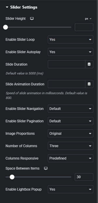
In the first sub tab you can select a layout for your slider. You can either go with the content side or standard layout.
General
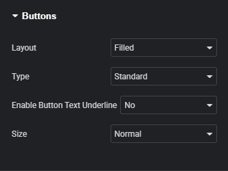
Here you can add the individual items or slides you wish to display.
For each of the items you can add the image, adjust background color, input a title, add some textual content, input some text for the item button, and add an item button link.
The final option found in this sub-tab lets you choose the order in which you'd like the images and content in your slides to be displayed.
Slider Settings
This sub-tab allows you to make adjustments to the slider and its behavior.
Here you can adjust the slider height, enable slider loop (if you would like the slider to start over from the first image when it comes to the end of the list), enable automated slider play, and input a value for the slide duration and the slide animation duration.
On top of that, you can choose whether you wish to display slider navigation arrows & pagination bullets, configure slider image proportions, choose a number of columns you wish the carousel slider to contain, choose a predefined number of columns for different screen sizes or input custom values for separate responsive stages, and choose a size for the space between the items in your slider.
The final option found here lets you enable a single-click lightbox pop-ups for slide images.
Button
Here you can choose a button layout for the slider buttons. You can enable an underline for the button text, and for filled and outlined button layouts you can choose a button type and set a button size.
Button Icon
Next up you can add an icon or an SVG and choose the position of the icon inside the button.
3. Content Slider widget Style settings
After you have finished with the basic set up of your content slider, you can move on to styling the element. To access these settings, simply click on the tab titled Style, located next to the Content tab in the upper-left side of the screen. Here you'll find 11 sub-tabs for styling different aspects of the element.
Title Style
In the first tab you get to configure the heading tag, color and typography style for titles.
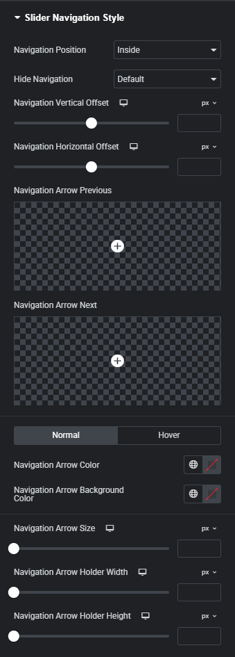
Text Style
This is where you can adjust the color and typography for slider text.
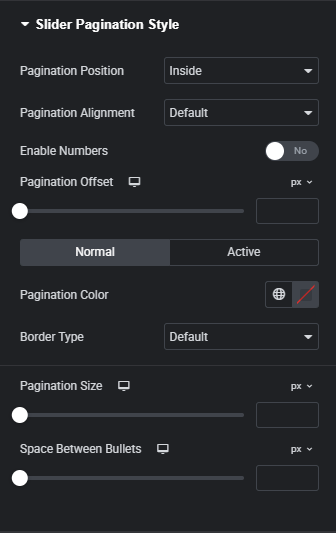
Slider Navigation Style
In this sub-tab you can make various adjustments to the slider navigation. In order for these settings to become available, you first need to enable slider navigation from the content sub-tab Slider Settings.
Here you can choose where you wish to place the navigation relative to the slider, pick a resolution below which the navigation arrows are hidden, and set a vertical and horizontal offset for the navigation arrows.
You can also add an icon or an SVG for both previous and next navigation arrows, set the arrow main & background color, arrow size, and navigation arrow holder width and height.
Slider Pagination Style
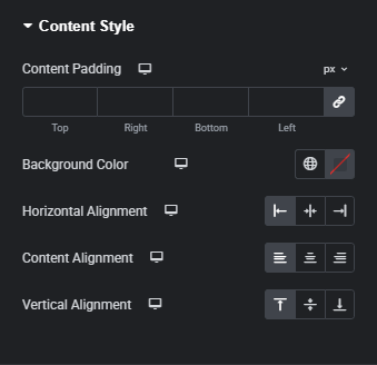
In this sub-tab you can customize the slider pagination. In order for these settings to become available, you first need to enable slider pagination from the content sub-tab Slider Settings.
Here you can choose where you wish to position the pagination bullets relative to the slider, choose how you wish to align the pagination inside the element, enable modifiable numbers for slides, alter the offset for pagination, and apply different stylizations for the pagination in its normal (idle) and active states.
Finally, you can adjust the pagination size and the size of the space between pagination bullets.
Image Style
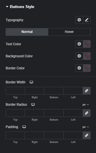
This is where you can set the slider image width, input values for image border radius, choose a hover behavior for the image, and adjust the image overlay and hover overlay colors.
Content Style
This is where you can input values for content padding, set a background color for the slider content area, set a horizontal, vertical and content alignment for the content portion of your slider.
Spacing Style
In this sub-tab you can adjust the top and bottom text margins.
Button Style
Here you can configure the button text typography, pick text colors, background colors and border colors for both normal and hover button states, as well as to adjust the background reveal type when hovered on. You can also input border width, border radius, and padding values.
Button Icon Style
Next up is the buttons icon style sub-tab where you can adjust the icon size, set icon margins, and make stylistic choices for your button icon in its normal (idle) and hover states; you can select the icon color in its normal state, and choose one of four behavior types for the button when it is hovered on.
Button Inner Border Style
In the event that you selected the With Inner Border button type from the Button content sub-tab, in this sub-tab you can configure inner border color, offset and width in its both normal and hover states. You can also choose a behavior type for button inner border when hovered on.
Button Underline Style
If you enabled underlines for buttons in from the Button content sub-tab, here you can adjust the underline color, width, underline offset, thicknes and alignment for both normal and hover button states, and choose whether you wish to enable the hover underline draw effect.
Theme Builder
The Qi Addons for Elementor plugin features the powerful Theme Builder module, which lets you easily craft custom headers, footers, single, archive, and 404 error pages.
To access the Theme Builder, you should simply navigate to Qi Addons for Elementor > Theme Builder.
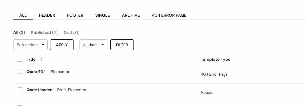
Here you'll be presented with a set of options that allow you to create any template you have in mind.
To create a new template, click the Add New Qode Template button found in the upper left.
After this, use the dropdown menu in the pop-up that appears to select the type of template you wish to create (header, footer, single, archive, or 404 error page) and name it.

The Theme Builder features 16 simple custom widgets developed to help you create any type of template you set out:
Comments Template
Featured Image
Post Author
Post Comments Number
Post Content
Post Date
Post Navigation
Post Terms
Post Title
Product Add To Cart
Product Description
Product Media
Product Meta
Product Price
Product Rating
Product Tabs
You can also choose where on your website you wish to include or exclude a created template.
To manage this, simply locate the desired template in the list of templates found by navigating to Qi Addons for Elementor > Theme Builder, and click the Edit Conditions button which appears when a template is hovered over.

This option can also be accessed from the Elementor Page Builder; while you're in the process of editing a template, you'll find the Edit Conditions button at the bottom of the vertical Elementor menu found on the left side of the screen.
Now you'll be able to choose between include and exclude options, and select whether it is included or excluded from the entire site, single pages, or archive pages.
WPML Plugin Compatibility
The Qi Addons for Elementor plugin is fully compatible with the WPML plugin which lets you create multilingual websites with ease.
Getting Started
Once the plugin is installed and activated, you need to ensure is that the WPML Multilingual CMS, WPML String Translation and WPML Media Translation plugins are installed and activated.
WPML Translation Tools
WPML provides you with two translation editors for translating the content on your website:
- WPML classic translation editor (CTE).
- WPML Advanced Translation Editor (ATE) which offers affordable automatic translation, a glossary, spell checker, and more.
The most common way of using the WPML plugin usually includes translating your website content yourself, however there are also some additional options available.
One alternative is to send your content for translation to a professional translation service.
Another option is to assemble your own team of translators. You can do this from the Translation Roles tab in Translation Management and assign translation jobs to them.
Translating Pages
You can translate your page in the Language of this page section; this is located on the right side of the page editor. Here you get to choose between translating the dynamic content of the page with the WPML’s translation editor, and creating a new page and building the content for another language yourself.
Translating Texts From the Plugin and Other Places
Aside from the content that comes from posts and pages on your website, you’ll most commonly also have some textual content coming from other sources. Most frequent examples of this type of content are themes and plugins.
If you wish to learn more about translating these kinds of texts, you can check out this documentation page about translating strings.
Translating Menus
WPML lets you easily synchronize menu languages. Alongside this, you can also edit menu languages manually. For more information on translating menus, you can check out this menu translation tutorial.
Translating WooCommerce elements using WooCommerce Multilingual
WPML features the WooCommerce Multilingual addon for translating online stores. You can check out this guide to find more information on how to translate your WooCommerce elements using WPML and this addon.
Getting Help From Support
In case you need help translating your site built using the Qi Addons for Elementor plugin and the WPML plugin, you can visit WPML’s support forum.
Social Links
This widget comes with the Qi Addons for Elementor Premium.
Social Links custom widget for Elementor provides you with a straightforward way to display social links which you can customize; the links can be icons, or textual.
Using the Social Links widget
1. Adding the Social Links widget
Simply locate the widget by typing its name in the ‘Search Widget…’ field positioned in the upper left under the ‘ELEMENTS’ tab. After this, you should just drag-and-drop the widget to a desired section on the right side of the screen.
2. Social Links widget Content settings
Now we are going to take a look at the options available in the Content tab, or to be more specific, the settings that you can adjust in the General sub-tab.
General
In the first sub tab you can choose a layout (you can display icons or text), and a direction for the links. You can also input a label you wish to display above the links, and add individual items or links.
Depending on the layout you select, each of the items can either have an icon and a link, or textual content and a link.
3. Social Links widget Style settings
After you have finished with the basic set up of your social links, you can move on to styling the element. To access these settings, simply click on the tab titled Style, located next to the Content tab in the upper-left side of the screen. Here you'll find 4 sub-tabs for styling different aspects of the element.
Content Style
This is where you can input padding values for the links, set element alignment, background color and adjust the size for the space between links.
Text Link Style
In the event that you selected the Textual button layout from the Content tab General, you can adjust the typography, color, and hover color for the link text here.
Icon Style
If you selected the Icon button layout from the Content tab General, you can adjust the icon here.
You can enable a boxed layout for the icons, set the size for the icons, and adjust color, background color, border color, stroke color and fill color for icons in both normal and hover states, as well as to input a value for the icon stroke width.
In the event that you enabled boxes around icons, you can also configure box size, border size and input values for icon border radius.
Label Style
In this sub-tab you can adjust the label text color, typography, and spacing.