Web Design Trends: That 90s Look is Coming Back
Oh, the 90s… The era that gave us so many things. Almost everybody wore flannel shirts paired with high-waisted jeans and had light-up sneakers or All Stars on their feet. Grunge was on the rise, while the East Coast – West Coast hip hop rivalry reached its peak. This is the decade that also gave us, some might say, the best sitcoms of all time, such as Frasier and Friends, not to mention animated classics like The Simpsons and South Park. And everything – pop-culture, politics, fashion – was steeped in a loud, raw look that marked the entire era.
Fast forward to the present-day: that 90s look is coming back in a big way. And there’s no stopping it.
The fierce 90s aesthetic is omnipresent and is ruling the design world. Everything screams contrast. Nowadays it’s all about big fonts, bold animations, and asymmetry. Almost every creative out there seems to be going for an unpolished and raw look.
Gone are the days when perfect symmetry and gentle-looking designs were in demand.
Even though every website is unique in its own right, there are some elements they all share. Check them out below and discover just what it takes to achieve that 90s look.
Over-The-Top Typography
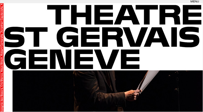
One of the most prominent characteristics of the 90s aesthetic is its eye-catching typography. Sure, you want to keep the text readable, but that doesn’t mean you need to opt for a dull typeface. Spice things up from the get-go and make the lettering the focal point of your design. Some font combinations work better than others, so be careful when making font choices for your website.
Play around with font styles, use uppercase, lowercase, make your letters bold or underlined, etc. There are many options to choose from. What matters in the end is that bigger is better, so go ahead and use large fonts that just scream for attention.
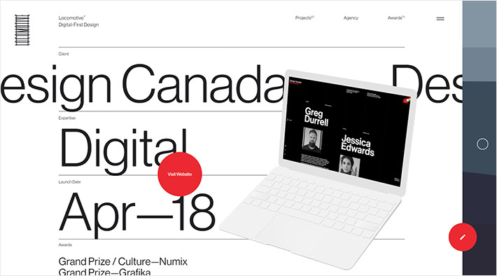
The Locomotive design agency does a great job presenting their case studies. Just look at that headline, taking up the entire screen. It really wants us to notice it, right? What adds to its prominence is the use of black lettering on a white background. Contrast is one of the key players now, remember?
There are also websites like davideperozzi.com that have gone one step further and have made typography the most prominent element of their design.
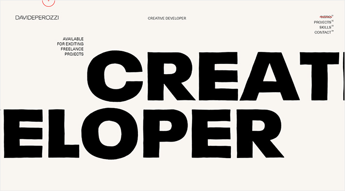
Even the portfolio section is all about the huge letters! Imagery and colors are secondary. The only time you catch a glimpse of images is either when you hover over or click on a word. This bare typography is paired with a variety of animation effects and displacements. And it’s precisely this combination of large, raw fonts and atypical animations that make the site feel dynamic, interesting, and memorable.
Contrasts in Font Sizes
Due to the exaggerated size of the headlines and their impact on visitors, all the other typography on your website should be smaller. That isn’t to say it must be small, or even what might be considered “standard” size for paragraph text. The difference should be just enough to tone down the somewhat over-the-top effect the huge headlines have on readers and signify that there’s an obvious visual hierarchy in all your typography.
The folks at craftedbygc.com did a great job at incorporating perfectly set font sizes with the images they chose to use on the page.
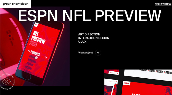
The headlines are obviously the most prominent element here, while the remaining typographic elements remain significantly smaller. Typography is what carries this page, but without overshadowing imagery.
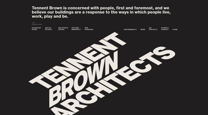
Asymmetric Layout
Until a few years ago, the symmetrical arrangement of elements was the standard of design. Every single line on a page had to be perfectly placed, and a well-balanced composition was the only thing considered aesthetically pleasing. With the 90s look back, you can forget about all that. These days, it’s all about asymmetry. While this technique may be a bit provocative, it’s most definitely impactful.
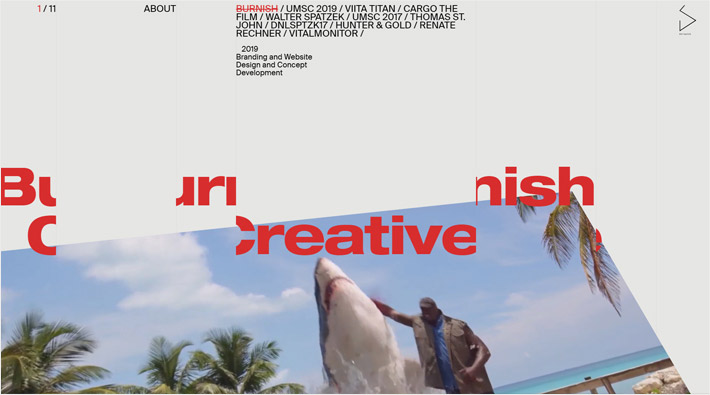
Let’s check out a great example of asymmetry done right on the Burnish Creative website.
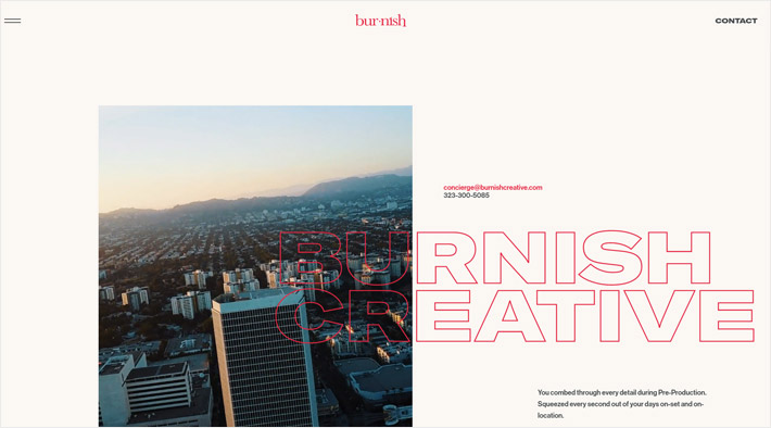
With each scroll, something surprising happens. The letters are moving, a video starts to play, the faces on images appear and, as you scroll away, they disappear, one element overlaps the other, etc… It may seem like it’s all a bit too much, but it’s actually refreshing to see a website like this one. There’s a lot of content on each page, but the minute you start scrolling, the fun starts, and you never want it to end.
Minimalism
Even though it may not look like it, the 90s aesthetics is, in its essence, quite minimalistic. Don’t get confused by large and bold typography choices and chunky designs. When you take a closer look, there are just not too many elements on any of these pages.
The design is stripped off of any elements that have no purpose. The whole point is to give your visitors exactly what they came looking for. You don’t want to distract them with unnecessary embellishments. Adding purely decorative elements will only impede the raw, clean aesthetic you’re going for. The 90s look is not about visual competition. You need to let your content breathe.
Simplicity is evocative of professionalism, elegance, and clear thinking. Keep that in mind. Making your design simple and streamlined will enhance the impact of your message. Put your users first and make sure your design meets their needs.
Outlined Typography
The 90s aesthetic is very big on using outlined typography. Hollow fonts are an excellent choice, especially for websites that are all about imagery. If you don’t want your typography to overpower the images on your site, but you still need your text to be prominent enough, outlined typography is a great choice. Take a look at the benandmartin.com website for a great example of outlined typography in use.
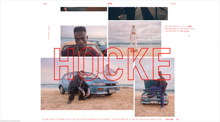
As you scroll down, their projects keep popping up, with the name of each project written in an outline font. But the best thing about it is that the letters do not dominate the page. The pictures are the main content, but the text is also prominent enough to grab your attention. Had they used a solid font and then placed the text over images, the images would’ve served just as a background for the text.
Outlined typography is great because you can play around with it and place the lettering basically wherever you want. The letters look bold, modern, and cutting-edge. And, depending on the overall composition of your page, you can easily make them big, bold, italic, etc. without disrupting the design.
Bold Animations
We want to keep things simple, right? As we already mentioned, there’s no need to add any unnecessary details on a page. What you can do, though, is pop in some animated effects here and there to make the browsing experience more engaging and exciting.
This guy did it really well:
Louis Ansa uses bold animations to turn what would probably be just another portfolio website into something fun and definitely memorable. Each time you scroll, things start to move. The transition from one project to the next is very vigorous, and the lettering he uses is just as intense. And this is not where the fun stops. As you hover over an image, you’ll notice that it changes its shape, because of the liquid hover effect. It’s also clear that Mr. Ansa is very attentive to details because he took care of micro-interactions on his website as well. As soon as you put the mouse cursor over an image or the project list button, the pointer changes its form and becomes outlined. These small things matter and make the whole browsing experience more special and enjoyable.
The Extremes of Brutalism
One of the ways of giving your websites that 90s look is by incorporating brutalism into your works. This means that raw, rugged, and unpolished looks are what you should go for.
Pascal Deville (brutalistwebsites.com) gave one of the best explanations of what brutalism is:
“In its ruggedness and lack of concern to look comfortable or easy, Brutalism can be seen as a reaction by a younger generation to the lightness, optimism, and frivolity of today’s web design.”
Brutalism is the complete opposite of the tame and austere designs that we are all accustomed to. Lots of vivid colors, bold lettering, micro-interactions, misplaced images, animations, peculiar text arrangements, asymmetry… These are some of the main characteristics of both the distinct 90s look we’re talking about and of brutalist designs.
Break the rules, and forget about perfection. Infuse the content with personality and character. That’s the essence of brutalism. And while brutalists artist often take a far bolder approach to this philosophy, it’s without doubt one of the factors that can help you achieve that 90s look you’re going for.
Brutalist designs will ensure you set yourself apart from other trends, but be careful as this style is not for everybody. It’s best directed toward an alternative and underground audience, who are interested in more than just squeaky-clean designs.
Make It Red
We already talked about how 90s-inspired designs are mostly stripped of color, using it mainly as a highlight or minor detail. But when you do decide to use some color, which one should you go with? Which color goes best with the simple yet impactful 90s aesthetic? The answer, of course, is red!
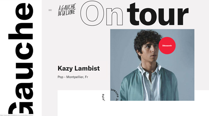
When your goal is to bring attention to a specific part of your site, red should be the obvious choice. This primary color is deeply rooted in our brains already. We associate it with strength, energy, and passion, among other things.
Go back and take another look at all the examples we’ve used in the text. There isn’t exactly a myriad of colors on those websites, but the details in red are everywhere! Your eye is immediately drawn precisely to those elements.
Had the authors used red in abundance, it would probably be over-stimulating. Most people would be overwhelmed by it. So make sure you use it in moderation, and only for the things you wish to highlight.
To Sum Things Up
The 90s had a deep-rooted underground character. Which is probably why its unique aesthetic is gaining popularity today. Especially among the more alternative crowd. Creatives everywhere are tapping into this trend and mixing the retro styles of three decades ago with modern techniques. Simple, effective, bold, attention-grabbing – this is how your designs should be when you’re going for that 90s look. Charge it with attractive typography, and don’t be scared to go big. 90s nostalgia has definitely reached its peak, and if you’re feeling it, let it show in your works!
