The Importance of Functional Animation in UX
The importance of animation and motion in user experience is something that can no longer be denied. Animation has come a long way since it made its first baby steps. It used to be all about fun. Animation was used to make someone laugh, smile or simply wonder. It was merely meant to delight and entertain.
In the 21sth century, however, animation has become a tool in service of functionality. It has a very distinct purpose and its role is not to be neglected. In short, animation is the beating heart of user interface. As such, it is an essential factor of the overall user experience.
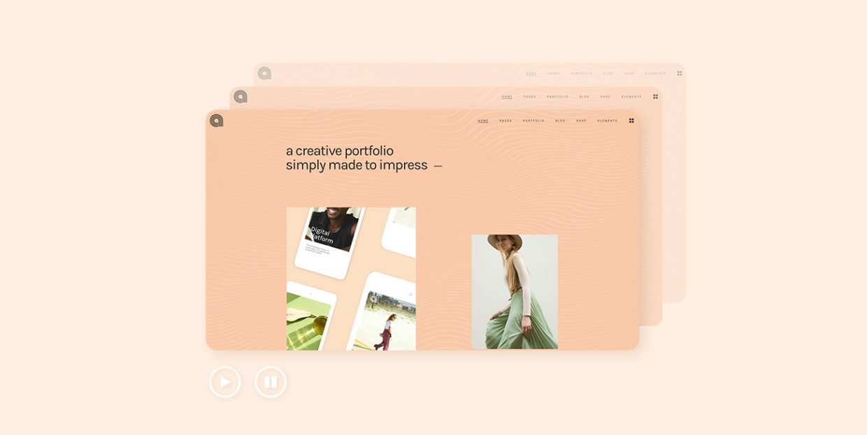
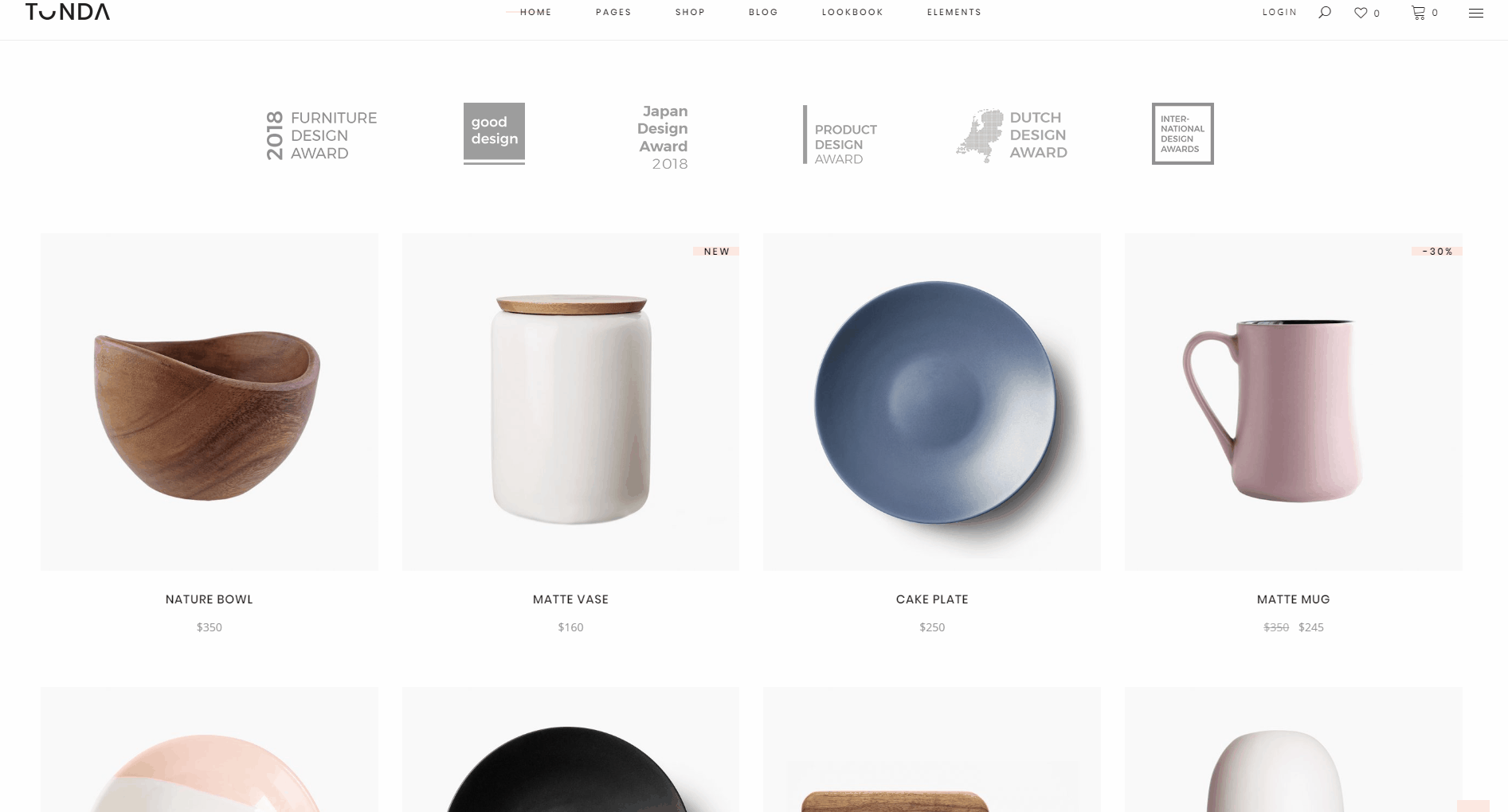
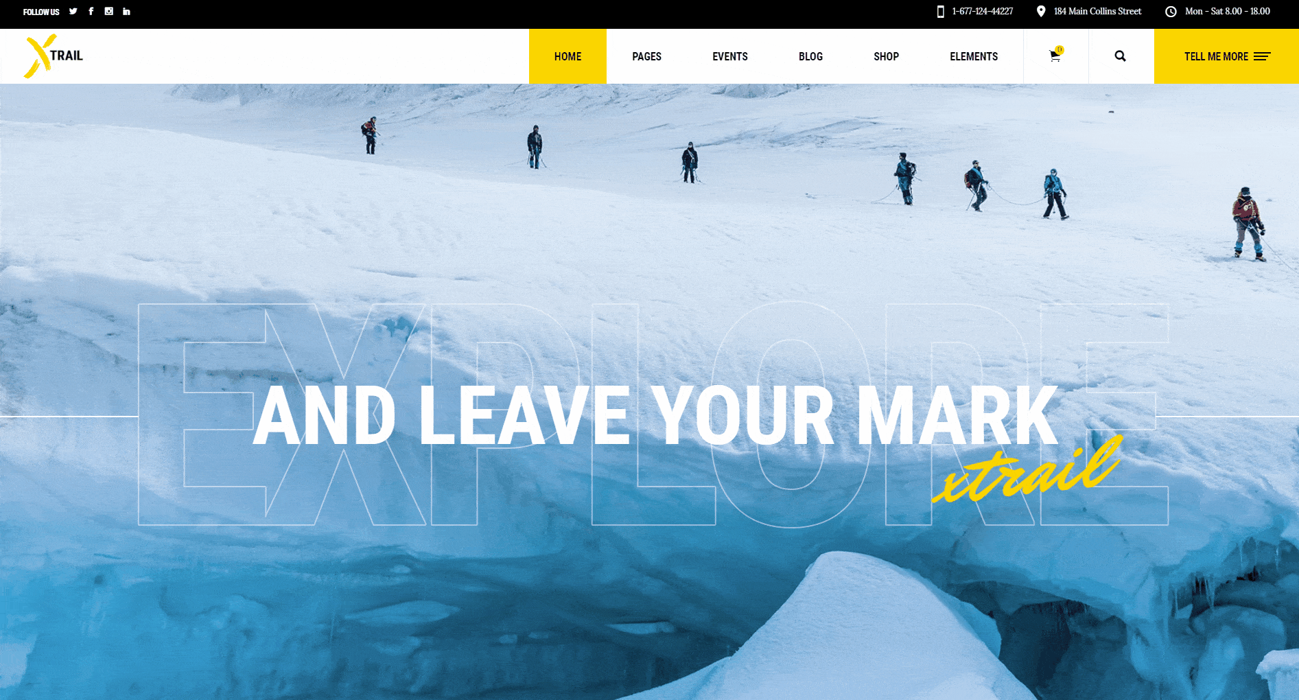
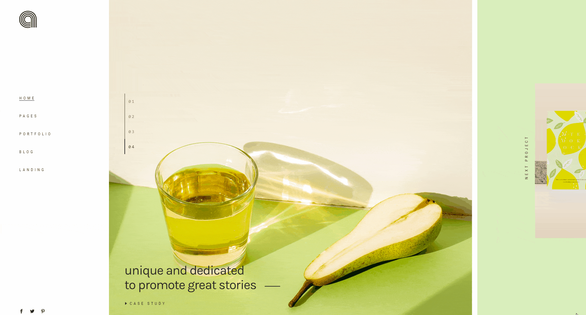
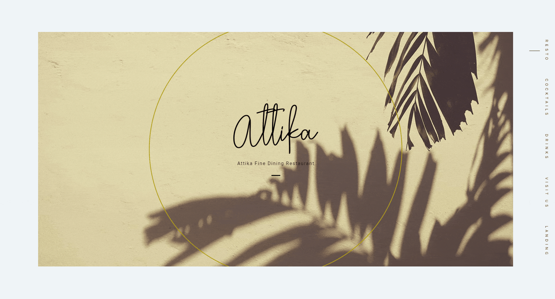
These days, animation is everywhere. WordPress themes with scroll animations are particularly popular, as are those with sliders, hover effects and other types of animations. Everyone wants a website that “moves”.
So let’s take a look at why animation matters so much and how you can use it to improve the user experience on your website.
Why Does Animation Matter?
We may not be fully aware of it, as it is one of those things we often perceive on a not entirely conscious level, but us humans – we simply love animation. There is something in that weird mix of imagery and motion that continues to surprise us even though we know how it’s made.
This, however, makes animation sound like a magic show. We simultaneously want and don’t want to know “how they do it.” But, it’s more than just that. When it comes to UX, in order to really delight us, animation has to perform a function. For example, it can show us when a process is completed or it can let us know we’re doing something right. And that’s what we call functional animation.
Functional Animation
It’s clear that animation comes in many forms and with many purposes. Animation created for entertainment is one thing, but what we’re talking about here is animation that has a particular UX purpose. It serves a very specific function, so we’ll call it functional animation.
This kind of animation is subtle, unobtrusive, doesn’t take up all of the focus to itself, and has a clear purpose. Or better – several purposes, as animation is often multi-functional.
In web design, functional animation helps the visitor understand the intrinsic rules of the page. It promotes page navigation and helps users perform simple little tasks like getting from one location to the other or completing a process, such as filling in a form.
Animation is not essential to a website. A site can very well exist without it. As we said earlier, good UX animation is so organic and subtle, we often don’t even register it with our conscious mind. But we would definitely notice if it was not there.
Imagine something as “basic” as a preloader (the animated icon that you see on the screen while a page is loading). These days, most websites have it. Now, imagine if they didn’t. Whenever it took a web page longer to load, you’d think it had crashed or that your connection was lost. The preloader is a subtle and immensely efficient way of saying that everything is okay, the content is loading and it will be handed to you in a few second.
Common Types of Web Animations
There are plenty of animation types that can be used to improve user experience and make websites more dynamic and engaging. Some types of animations are particularly common and popular, and you have probably seen them thousands of times yourself, but perhaps until now you haven’t really paid attention:
Loading
More often than not, when we load a page, there will be an animation of some sort, usually a lightly animated icon that spins or performs a similarly simple and repetitive motion – like the preloader we mentioned.
Progress
Similarly to loading animations, animations that indicate the progress of an action (which may also include loading) serve to inform the user how far from completion they are. This is important since, without such information, the user might think something is wrong with the website.
Action Complete
Pushing a button, opening or closing a menu, uploading a file, submitting a form…these are all actions that require a quick visual hint informing the user the action has been completed successfully. This is important because these interactions take place in a virtual, not a physical world, and we can’t rely on our senses to understand if they’ve been successful or not.
Navigation
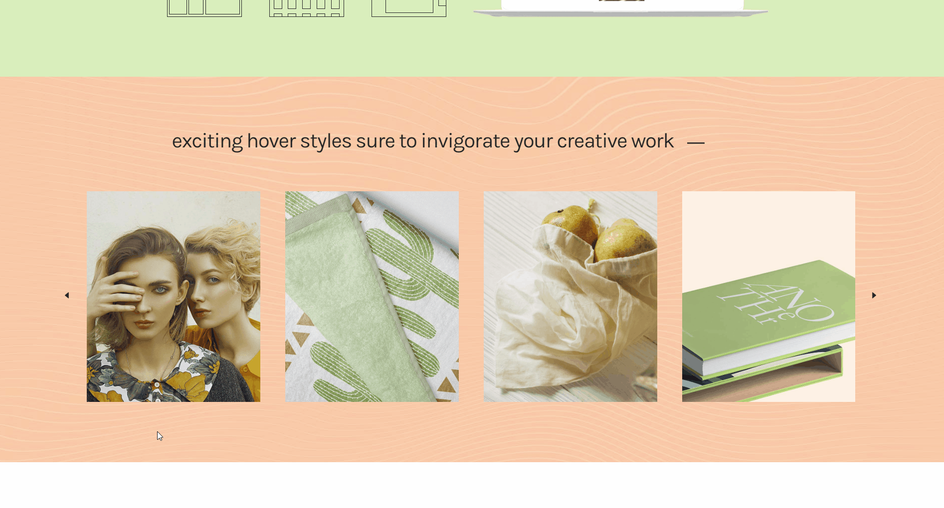
Navigational animations help the users find their way around the website and learn what’s what and where it’s located. They tell us what’s clickable and what’s not, what requires scrolling, and so on. For instance, animation on hover gives a clue about what lies beneath and improves the user’s understanding of the interface hierarchy.
Transitions
Transitions promote user engagement and make your website stand out for originality and creativity. One common example of the use of animated transitions in web design would be a page or a slide that turns like a page in a book.
Scroll
Alongside clicking, scrolling is the most commonly performed user interaction with a website. In most cases, an animated scroll is a better solution than a “plain” one, because it mimics our natural interactions with the world. It also creates an illusion of depth and more space than there actually is.
User Experience – A (Useful) Definition
Before we go deeper into the role of animation for user experience, let’s first try to define user experience (UX).
As you suspect, there are as many definitions of UX as there are UX professionals.
The International Organization for Standardisation (ISO), unsurprisingly, offers a highly precise definition. According to them, user experience means “a person’s perceptions and responses resulting from the use and/or anticipated use of a product, system or service.”
The Daily Egg blog offers a neat interpretation of this rather dry and incomprehensible definition, adding that UX “includes all the emotions users might feel as they interact with the product, service, or system, as well as their perceptions, responses (both physical and psychological), and behaviors.”
And this should serve as a good starting point for understanding what UX means, especially in terms of web design.
Top WordPress Themes for All Creatives
View Collection


The Role of Animation in UX
While animation is generally always welcome, overdoing it is not a good thing. The key is to find a balance and to allow the animation to perform its function – to play out its role. It is when it serves a clear, simple purpose, that animation is most welcome in web design.
What exactly are the roles that animation performs?
Directing Focus
One of the best ways to use animation to improve UX is to have it point to where you want your user’s attention to be. This is particularly true for pages that have loads of content. It may take a while for the user to sort out the hierarchy of relevance on such a page. This can be frustrating, and these days, even a second or two of hesitation and uncertainty can cause the user to bounce.
For example, if you have several high-quality, important images that you want to display and where you want all your visitors’ attention to be, it’s better to slide them than just slap them on the page. Sliding creates dynamicity and dynamicity draws attention. Your visitor will be gazing at the images no matter how much other content there is around them.
Assisting in Orientation
Similarly to the problem of focus, content-saturated websites can often be difficult to navigate. If the user interface is not enough to point the visitors in appropriate directions, we have to resort to other elements to serve as road signs. Animation is one such element, and a highly efficient one, too.
The main job animation has in terms of site orientation is not so much to aid navigation (getting from one part of the site or page to another) but to shed a light on the website’s hidden architecture. Understanding what lies beneath (or above) helps the user gain confidence and reduces cognitive load. User experience is, therefore, significantly enhanced.
For example, imagine a very long page with a lot of vertically arranged content. With a page like that, you have anchors near the beginning (at least we hope you do!) that, when clicked, take the user to the associated content. If you use animation to take the user all the way down to where the anchor points, he or she will have an impression of actually traveling the distance and will understand where that particular content is located within the page structure. If you just bluntly display the content without “traveling,” it will probably feel too abstract and perhaps a bit confusing.
Providing Feedback
In UX, animation can be used to tell the user if his or her interaction with the interface was successful or not. Think of hitting the wrong button. Unless it’s clear that it’s not the right button, the user will just keep clicking on it, assuming it’s a glitch or a bug with the website.
The same goes for successful interactions. A good example of this is a button that transforms into a check sign upon completion, letting the user know everything went well.
The signals animation sends should be as clear and universal as possible. A nod is always a “yes,” a shake is always a “no.” The message is conveyed swiftly and efficiently. The user is satisfied with the experience and moves on with ease and confidence.
Maintaining Interest
Web users are a spoiled bunch. They need to be kept entertained, and they need things to be served to them fast. As ISPs keep introducing better and faster connections, bounce rates are getting higher too. To prevent users from bouncing off your site, you have to keep them interested. Animation helps with that, too.
One example of using animation to keep users from getting frustrated and annoyed is the use of preloaders, which we discussed earlier. However, these are getting kind of stale, too. Everyone uses cute or funny or smart preloaders these days, and in many cases they only remind the users of the fact they’re waiting, which they already know.
Loading sequences are often a better solution. They are not hard to design and they can offer something completely new and fresh to your page’s UX. It can be a nicely designed progress bar or a skeleton screen that gradually fills up as the page loads. If your brand identity allows it, it can even be a funny cartoonish standalone animation that keeps the user entertained for the few seconds he or she has to wait.

Entertaining
This brings us back to the dimension of delight we spoke about earlier. A well-designed, honest animation can quickly find a way into your users’ hearts and win them over for your brand. Playing the emotional card is something that animation does as well as any other design form, sometimes even better. And it does a wonderful storytelling job. If your animation manages to induce a smile, however lighthearted it may be, you’ve won a bunch of points in the UX and user satisfaction department.
Big Animation No-No’s
We’ve sung the praises of animation for good UX so much, you might think you can’t go wrong with it. But actually, you can. There are some common mistakes that UX designers sometimes make with animations, resulting in user experience that becomes poorer instead of richer.
-
Don’t overdo it : more precisely – don’t animate several things at the same time. We often come across animation-heavy websites that are so tiresome, we just want to get out of there. If you do have several animated elements on your site, don’t set them all to go off at the same time. Choreograph them so they work in synergy, instead of making visual noise.
-
Don’t be too “cute” : functional UX animation has to be purposeful, above all. Otherwise, it’s not functional – it’s just there for fun, aesthetics or whatever other non-UX related reason. If your website has any purpose other than mere fun, you can’t afford to be too cute with your animations.
-
Don’t make it too slow or too long : if an animation takes up too much time, it becomes annoying, defying its original purpose. Keep the animations short, sweet and efficient.
-
Don’t wait until the end of design to add it : in web design, animation is sometimes perceived as icing on the cake, something you only add when everything else is done. Animation is not icing, it’s not the cherry or the decoration – it is a bona fide ingredient, a natural constituent that needs to be mixed alongside everything else. If you want to use animations for your interface, embrace it during the wireframe sketching phase. That way you’ll make sure everything fits well together.
-
Don’t think of it as a magic bullet : if your website has issues with poor interface design or low usability, don’t think for a second that adding a couple of animations will fix it. It won’t. Animation is not a cure-all. When done correctly, it is a great way to improve user experience on your website, but it won’t solve your biggest pain points.
Final Thoughts
One of the reasons animation is so powerful is its ability act as a guide and a driver for creativity. Animation turns bland and boring wireframes into lifelike, interactive and exciting pages that constitute a website’s “personality”.
In light of everything we discussed in this article, it’s clear that in order to help improve your websites UX, animation must be:
-
Purposeful
-
Subtle
-
Logical and intuitive
-
Well-timed
-
Natural and organic
-
Congruent with the brand
-
An aide, not a hero.
Keep these in mind, and try to ask yourself what it is exactly that you want the animation to convey. Most importantly, ask yourself: “Is it appropriate to use animation here?” That way, you’ll be sure to put it to good UX use, instead of just adding animation for the sake of animation.
