Designers’ Pick: Top Color Trends to Inspire You in 2022
Pinpointing, let alone predicting the design trends has become notoriously hard in this day and age when things move, shift and transform at warp speed. What’s in today might be totally out as soon as next month, and color trends can be particularly tricky as they tend to move with seasons and to follow current events which are, by their nature, unpredictable. Still, some things tend to stick more than others and to mark the defining trends.
We already wrote extensively about the top web design trends for the year, focusing perhaps more on the UX side of things, on animation and interactivity, on website architecture as a whole. This time around we want to welcome the warmer weather with an exploration of some of the color trends that we noticed not just in web design but also in fashion, furniture and home decor, and perhaps give our readers a few chromatic hints for the rest of the year.
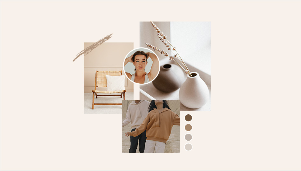
Cream, warm beige, cold beige, cream gray, gray cream, macchiato, pampas, marble, powder, ivory, nude, taupe, hazel…You name it – you’ll find it in 2022, in the streets, in the shop windows, in furniture and home decor and, yes, in web design, too. The spectrum between the lightest cream and the deep, brownish hues, with tints of red, pink, blue and even green, is marking this year’s trends and we can see it paired with other neutrals or with more saturated, louder colors.
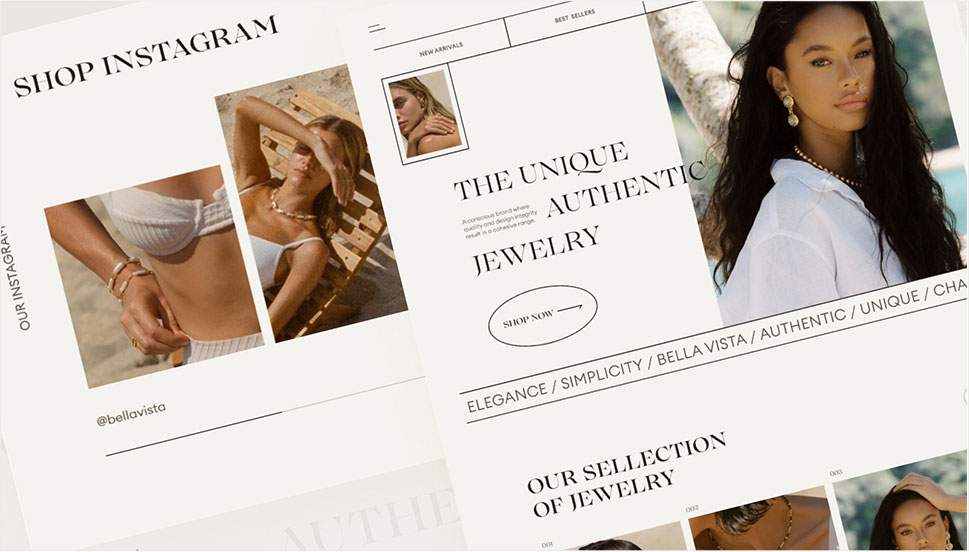
Julia Derevianko for Gotoinc proposes an eCommerce layout for a jewelry store that uses an off-white, creamy background to create an elegant backdrop for the featured photographs and jewelry pieces. Julia combines several complementary hues, from Carrara to Pampas, in a color scheme that provides breathability but at the same time adds depth and even some degree of quiet intensity.
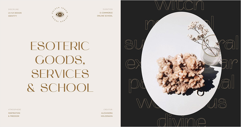
Alexandra Holodnaya made excellent use of a soft, warm beige with a hint of pink in her project for a magic and esotery shop and online learning platform Golden Venum. She skillfully alternates backgrounds in this gorgeous layout between light tones and black ones, creating an exciting tension of elements held together by the lovely old gold typography.
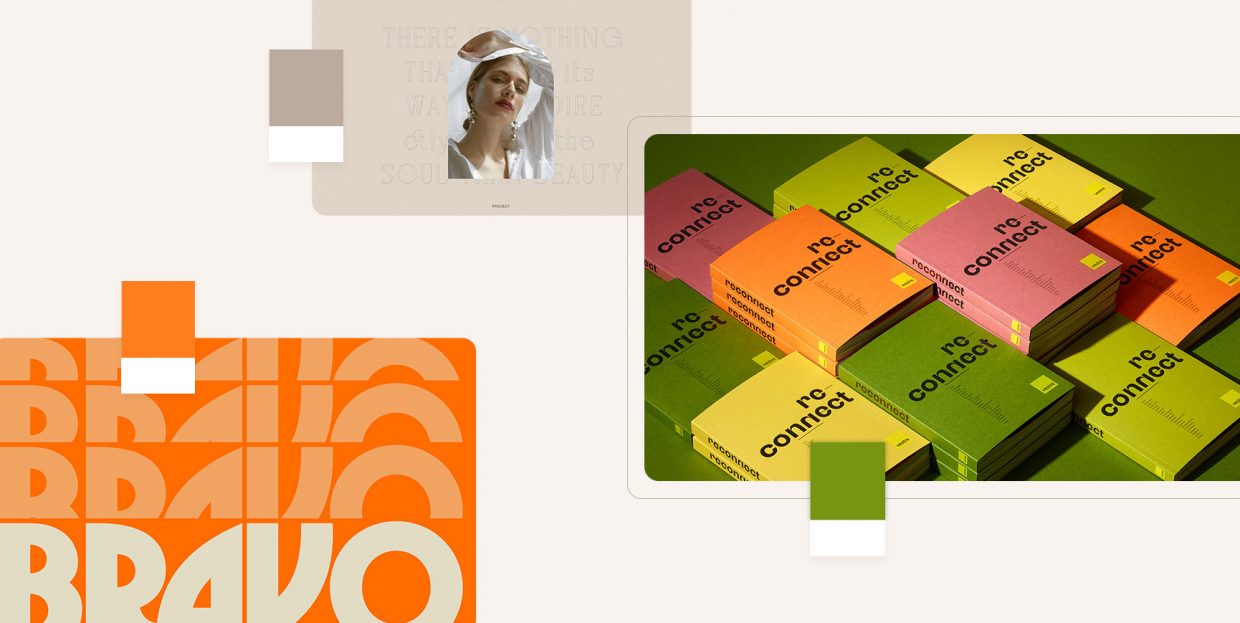
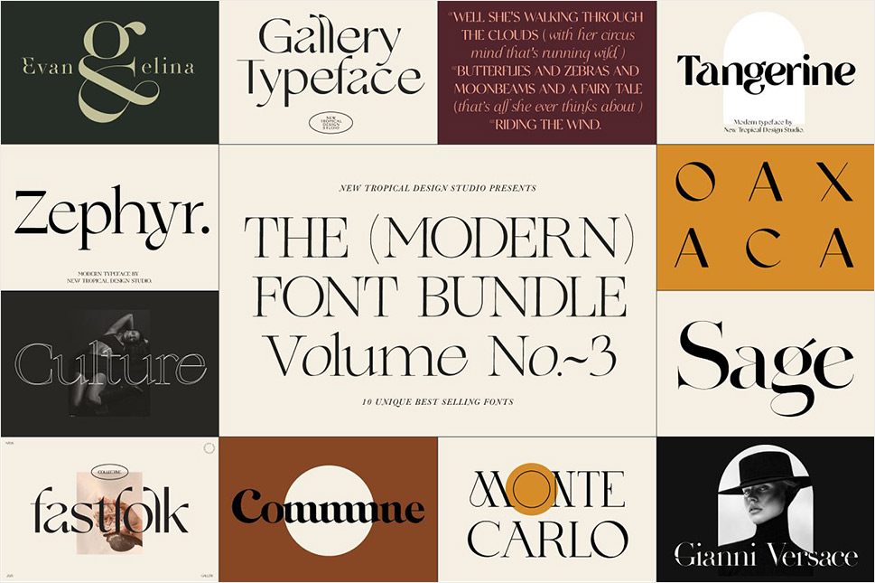
We spot a similar chromatic inspiration in the Modern Font Bundle by New Tropical Design, where the warm cream tone is paired with burgundy (which we’re going to touch upon later on in this article), as well as a deep, atmospheric orange and a dark mossy green.
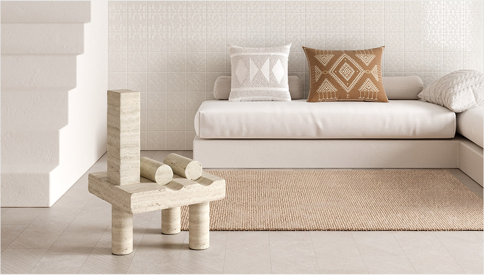
While the colors from the beige and cream part of the spectrum work wonderfully when paired with more intense, vivid colors, it’s also worth mentioning they can look amazing in beige-on-beige sets or combinations of beige with colors just a hue away. A terrific example of this combination, which is definitely a 2022 trend we’re seeing a lot, is the creative visualization project that Notoo Studio did for 41zero42, specifically for their Superclassica series of floor and wall tiles.
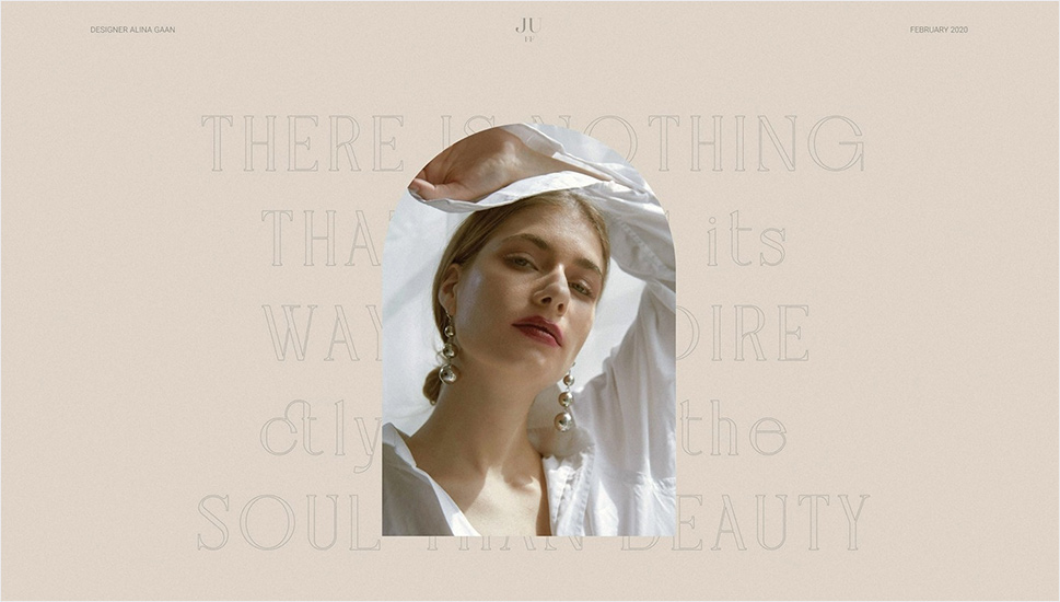
Another color that looks and works amazingly well when paired with, well, basically itself, is the warm gray. Alina Gaan explored this concept in her jewelry website project Juff, proposing a look that basically sports no contrast at all, and yet manages to work just fine for a website layout.
But enough with the neutrals, let’s move on to louder trends for this year.
Green WordPress Themes
View Collection


Green is another definitive trend for this year and it comes in all possible variants – from earthy and muddy deep greens to vibrant grass tones and, of course, neons.
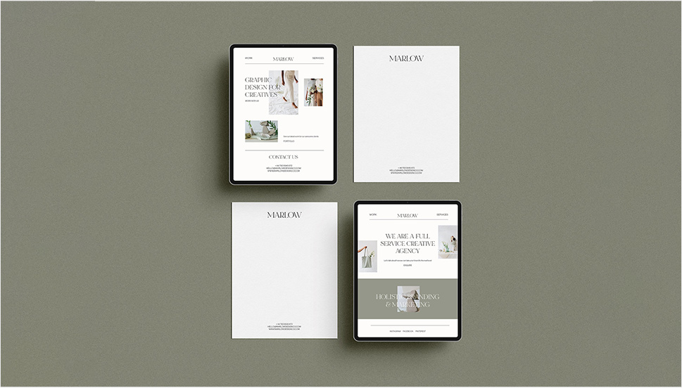
Marlow, the minimalist branding mockup scene creator by Moyo Studio, is heavily based on grays in various tones, mostly on the colder side of the range. The project includes several adjacent colors that complement the grays and give them depth and character, most notably the wonderful, elegant dark olive green, as well as browns with a significant portion of green component to them.
Semi Permanent Hotel by Highsnobriety was a short-term takeover of the Paramount House Hotel in Sydney, featuring a range of artists, musicians, designers and other creators. The website for the project is based on the monochromatic layout with colorful, intense imagery and interface details in a lovely shade of bright green with a touch of cyan. The green is used for the favicon, the pagination bullets, select typography as well as for selected (or hovered) areas of the 3D model representing the hotel. This quite moderate addition of color breaks up the monochromatic interface without hampering its character, and the choice of green adds vitality and energy to the mood.
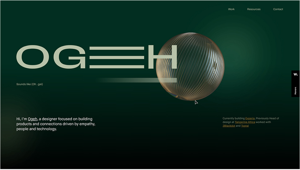
Ogeh Ezeonu opted for a green on green combination for her website, using a very, very dark forest green as the background color (in some parts of the page it comes in form of gradient, too) and a lighter, brighter leaf green for select interface details, such as the boxed sections with links and button outlines. This way, she created a gorgeously balanced atmosphere that packs a lot of character without being too loud or bold.
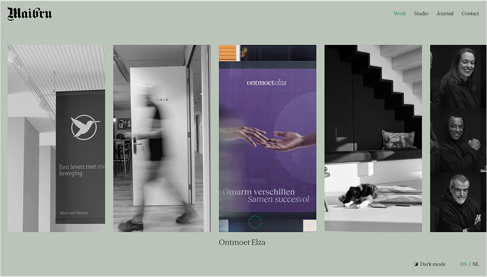
The Dutch brand development and design studio Maibru did a similar thing with incorporating a refreshing green shade to its website in form of various interface details – for instance, the menu items (indicating the current location, as well as color change on hover), language and mode switcher, cursor and navigation, and so on. The same green color is used for both the light and the dark mode, and it looks great in both instances, bringing vibrance and joy to a muted layout.
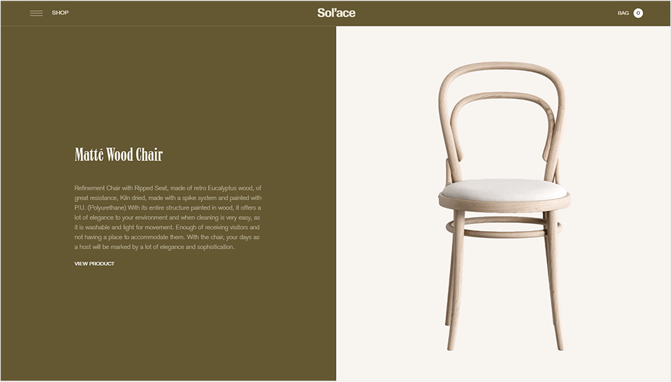
A brand we already wrote about in our piece on innovative footer design, the furniture manufacturer Sol’ace opted for an interesting brownish green (or greenish brown?) as the background for some of the page sections, combined with a lovely warm gray. A fitting choice for a brand with a strong focus on natural materials and sustainable manufacturing practices.
But muted, pastel and earthy greens are not the only ones marking this year’s color trends – in fact, we’re seeing a lot (and really, a lot) of super-vibrant greens, electric greens and neons.
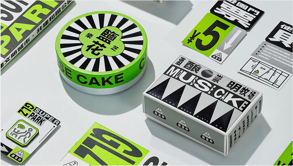
For instance, the Chinese Reesaw Studio incorporated a lot of bold, vibrant colors in their branding project for GLZ Super Park, with the neon lime green as the main color featured in the logos, packaging, even the accompanying materials such as masks, duct tapes and so on.
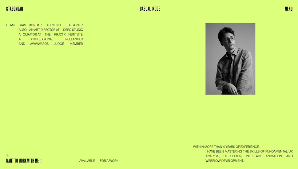
The designer and art director Stas Bondar chose an interesting and vibrant shade of green (with a lot of yellow to it) for his online portfolio, available in two modes: “casual” (black background with green details) and “fancy,” in which the said color is used for the background and combined with black interface elements. It’s interesting that the same color assumes different characters depending on the mode – in the “casual” mode, the dark background makes it appear more yellow, while in the light “fancy” mode it is definitely more green.
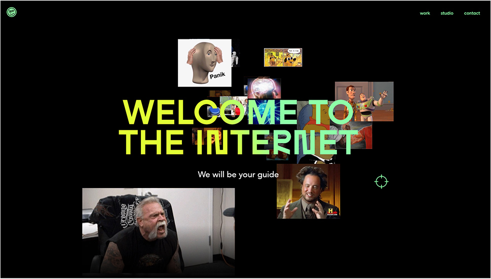
Finally, let’s not forget one of the loveliest green shades – the mint green. The digital production studio 9P featured this color in various interface details (the oversized cursor, the buttons, the logo and menu items, to name a few) on their website, coupled with the black background for a striking and modern contrast, and they also used it for one end of the gradient for the hero text.
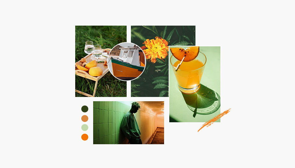
As a color that communicates joy, optimism, warmth and fun, it’s no wonder that orange is going to be a massive trend in 2022, a year when the world finally seems to take a break (hopefully permanent!) from the pandemic. From couture to streetwear, web design and even product design, various hues of this fantastic color can be seen everywhere.
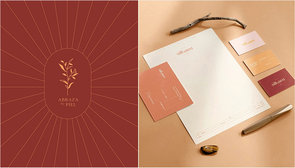
Tiare Payano incorporated a neon carrot orange into the palette for the brand identity project for Silkaen, a natural skincare brand. Payano paired it with different shades of red, burnt sienna, deep pink and other warm colors, creating a balanced, feminine and elegant palette.
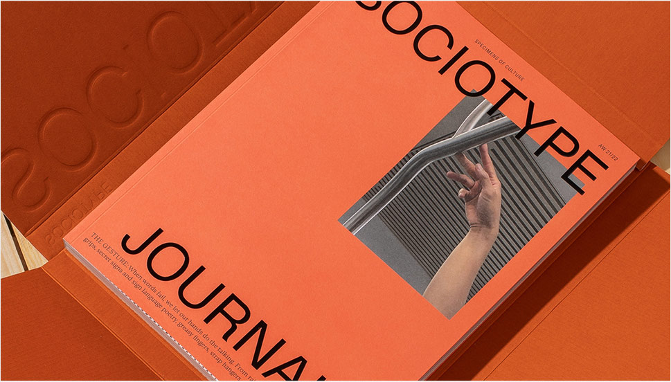
Design for the Gesture issue of the Sociotype Journal also features a lot of orange, albeit in a more toned-down variant. This particular brick orange works great on paper, as it complements the paper texture and gives the overall design a warm, deep character.
Moving on to louder, bolder tones, the design for the Bravo Musique music and artist label features a stunning, somewhat vintage range of oranges, from the classic safety orange to hibiscus and royal orange.
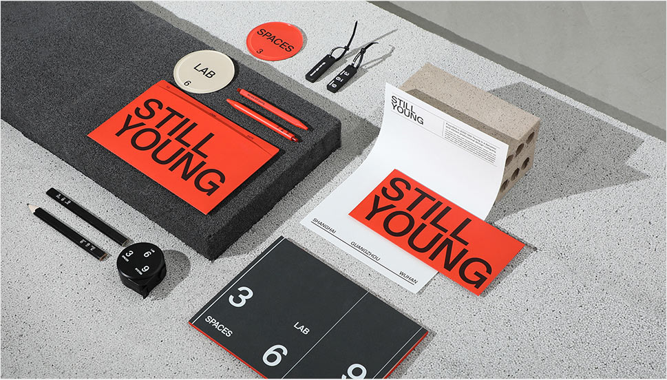
The visual identity for the Still Young interior design company by Low Key Design pairs an intense orange, almost a cinnabar, with a grayscale palette in an exciting, elaborate design concept based around the “law of three.” The entire visual system revolves around the numbers 3, 6 and 9, and the orange serves as the third chromatic element in the palette (in addition to the white and black that basically constitute the grayscale), sustaining the concept but also bringing a welcome contrast and dynamics to the design.
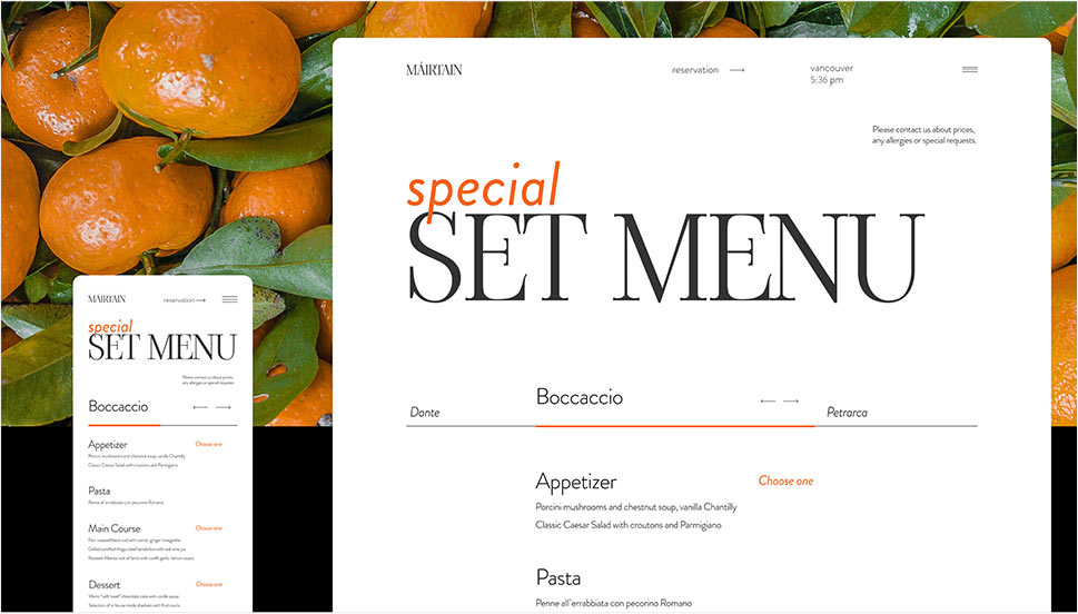
The website and redesign concept for the restaurant Máirtain by Daria Shakula features an elegant, mostly monochromatic palette skilfully broken up by a vivid pumpkin orange used for a few select interface details, the footer and the fullscreen menu. Paired with the orange in some of the featured imagery, this particular use of color reinforces the brand identity and gives it a strong, well-built character, freshens up the concept and brings vitality without appearing vulgar or loud.
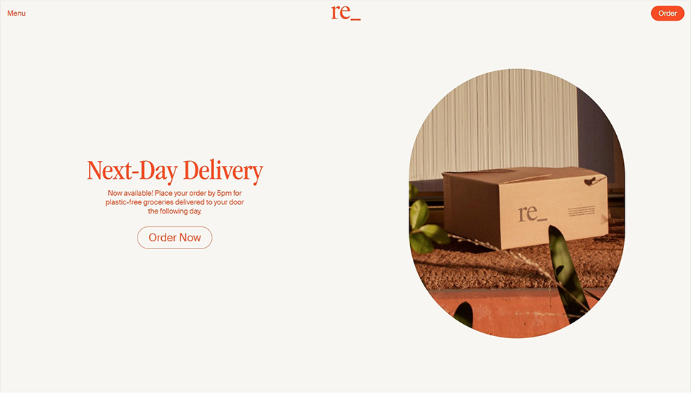
Finally, here’s a layout that celebrates the power of orange in all its glory: the web design for the packaging-free grocery store in Los Angeles, re_grocery, uses an orangish red, or a reddish orange, for basically all interface elements, from title and paragraph typography to buttons, from navigation elements to the footer, which is entirely orange. It was a risky choice but one definitely worth making, as the result is a flattering, modern and engaging design that we can only assume does wonders for the company’s business bottom line.
If this combination reminds you of a clown suit, think again. Depending on the particular hues used in the palette, the orange and green combo can actually be quite sophisticated and convey a sense of opulent elegance. Let’s take a look.
The UI Kit for Figma by Alexsander Barhon proposes modules for building web pages, with imagery that features small yet striking details in a lovely muted orange, combined with deep moss green, olive and mud, creating a wonderful sense of warmth and depth.
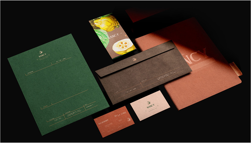
Tiare Payano did a similar thing combining deep oranges and greens on a dark background for Nancy, a family-owned cafe in the Dominican Republic. The palette is based around deep, warm, earthy hues such as orange, terracotta and brick, combined with a dark green that seems to have a touch of warmth to itself, too – or perhaps it’s the oranges and pinks that bring that quality in the otherwise cold color.
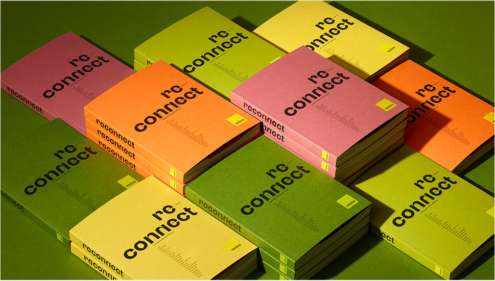
The green and orange combination works well in brighter tones with a bit of a pastel character, too, as evident from the Vestre Inspiration Book 2022. In this project, we get to feast our eyes on wonderful pairings, such as true orange and grass green, but also yellow and purple. These combinations are based on the principle of complementary colors, and as such they aim to create an intense and dynamic effect, but thanks to the careful selection of particular tones and textures, they also appear quite soothing and pleasant.
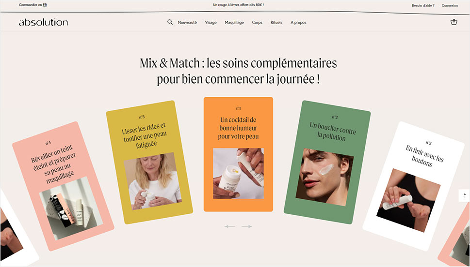
Green smoke, apricot orange and a range of light pinks and warm grays dominate the palette of the Absolution Cosmetics website, where the orange and green work as particular accents and can even be considered chromatic leitmotifs of the layout, even though they appear very sporadically on the pages. The dynamics between these two add much needed intensity to the light, airy layouts.
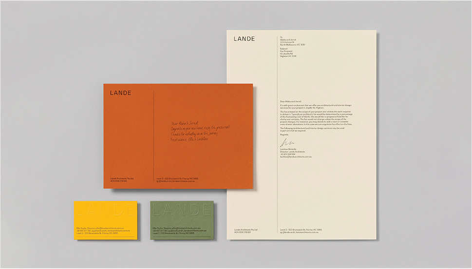
The brand identity project for Lande Architects includes a wonderful palette of muted greens, warm earthy tones and siennas, combined with a vibrant yellow with plenty of orange hints to it. The stationery and the calling cards are printed on a heavily textured paper with relief typography, which, combined with the colors, gives the project a distinct organic character.
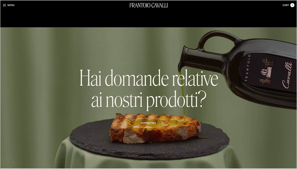
Finally, while not exactly focused on the interplay between green and orange in particular, the website of the oil and salsa manufacturer Frantoio Cavalli does play around with the two, by juxtaposing the delicate greens of oils with warm orange, yellow and red hues from salsas, both in featured imagery and in product packaging.
Timeless and sophisticated, burgundy appears to finally be making a comeback – and long overdue, if we dare say. This elegant color, traditionally associated with wealth, opulence and royalty, is actually an extremely versatile pairing color for palettes and combinations that require contrast, depth and warmth.
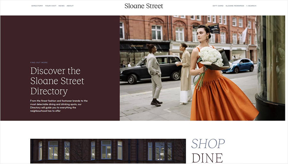
Being a dark, intense color, in web design burgundy is best if used for details or select sections, like Sloane Street did on their homepage. This choice of color adds a touch of class to the design, pairs wonderfully with the rest of the palette and the page’s white space, and even communicates with the imagery on the page.
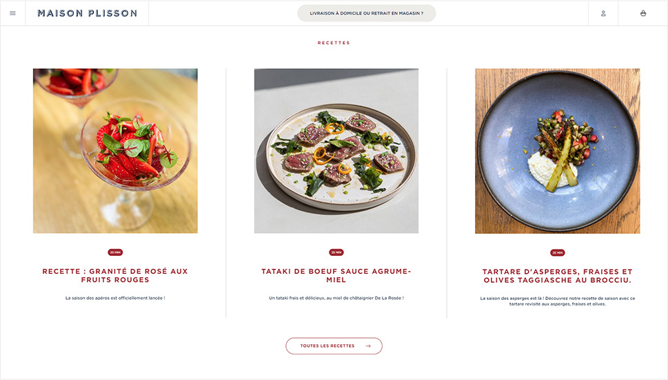
La Maison Plisson, on the other hand, opted for a very subtle use of burgundy, applying it to the button outlines, underlines, some of the typography and the wine glass icon, completing the brand narrative that revolves around exquisite gastronomy, the finest ingredients and the best wines. It may be an obvious choice, but it is done with such good measure and taste it actually works perfectly.
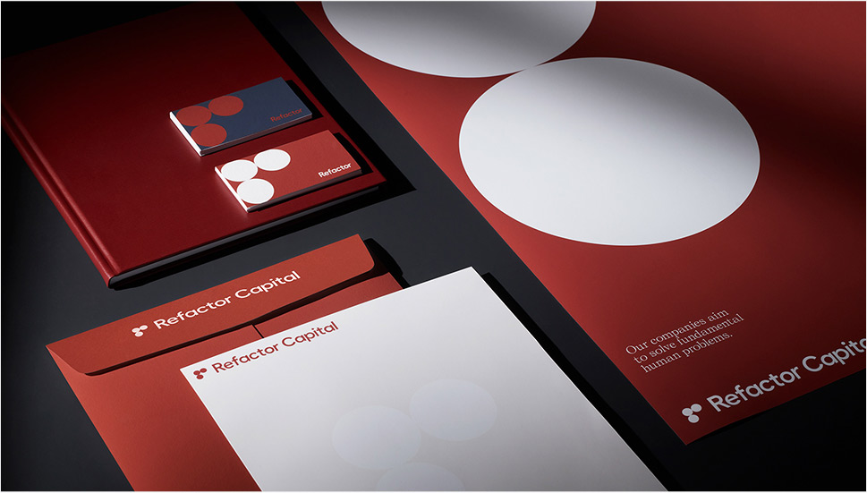
Burgundy can also be a fitting choice for various technology and industry niches, as well as for finance, which are often plagued by quite pedestrian blues, grays and plain reds. The brand strategy and visual identity for Refactor Capital by the Play Studio features a striking rusty red which, in combination with a deep grayish blue and plain white, creates a firm, stable palette that communicates professionalism and expertise.
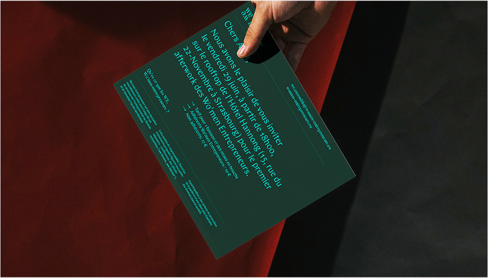
The gorgeous branding project that supports female entrepreneurship, Wo’men Entrepreneurs by Ben&Jo bases the palette around a dark green, with color accents in yellow, teal and pink. This combination is supported by a lovely warm burgundy in a slightly lighter variant, used as the backdrop in the project imagery, giving it depth and warmth.
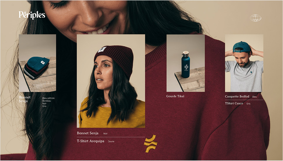
Something similar was done in the visual identity project for Périples, where a stunning deep teal was used as the main background color, combined with a range of muted warm tones, including burgundy, which adds contrast and warmth, as well as a hint of vintage character.
Wrapping It Up
Soothing cream, beige and gray, exciting orange and optimistic green, topped by the royal burgundy – it’s clear that this year’s color trends do not follow a strict, cohesive narrative but rather aim to expand the reach of chromatic potential through contextualisation. We hope that the wonderful examples featured in this article will inspire you and give you some fresh ideas for your future projects. If you have a color you feel might mark the current year, don’t hesitate to share it with us in the comments section.
